Introduction:
As I embark on the journey of upcycling Trex Wood into a contemporary environmental wine bottle holder for my kitchen, it is intriguing to explore and contemplate the opposite aesthetic on the other side of the spectrum. My current design emphasizes clean lines, angles, and a wood-like texture to add warmth and comfort to the aesthetic I am trying to achieve. When envisioning the opposite of this, I visualize a design that embraces more chaos, asymmetry, and a colder or more industrial aesthetic.
Opposite Aesthetic: Industrial Chaos
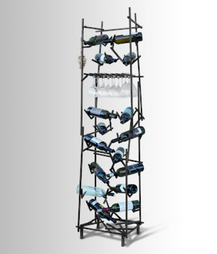
Instead of utilizing clean lines and angles, imagine a wine bottle holder that incorporates randomness and asymmetry to introduce tension and a more busy or overwhelming feel for the viewer. Something that fits this description is using a steel rod and bending it into various shapes and positions with little to no patterns. Keeping away from patterns and organization will add to the chaos of the piece. The steel will introduce a colder feel into the space. Using various sizes and lengths of steel leaning on each other would add to the disorder, creating a visually dissonant yet intriguing piece.
The industrial chaos aesthetic challenges the traditional stability of a wine bottle holder. Instead of aiming for a sturdy and balanced structure typically found when searching for wine bottle holders or racks, the design could intentionally introduce a level of unpredictability. The bottles can be placed in unconventional positions, challenging the viewer to interact with the holder in a non-conventional manner. Wine bottles can be placed closer together in one section and rather scarce in another, creating an imbalance that induces more tension.
The opposite aesthetic of Industrial chaos could also be implemented using the Trex Wood. Cutting some of the pieces into curves and random shapes and then leaning pieces onto each other can introduce a more chaotic aesthetic. It might not be as industrial as steel may be; however, one can argue that using the grain side of the wood could add some industrial flair. Overall, the design would need to allow for imperfections, irregularities, and asymmetry to define the piece. The stainless steel wire mentioned in the original designs could be repurposed to add an element of industrial strength and contrast.
Examples:


Conclusion:
Contemplating the opposite aesthetic of my upcycle project has led me to think about different perspectives, possibilities, and designs that could have been created by challenging the initial design principles. I am still very happy with my design because the opposite would attract too much attention and be more ‘in your face’ than I would like it to be. I definitely think it would be a very interesting aesthetic if fabricated properly and placed in the right setting.
References:
https://www.wayfair.com/Wrought-Studio%E2%84%A2–Darren-10-Bottle-Wall-Mounted-Wine-Bottle-Rack-X112435401-L58-K~W001324390.html?refid=GX679769023830-W001324390&device=c&ptid=359533005765&network=g&targetid=pla-359533005765&channel=GooglePLA&ireid=51627922&fdid=1817&gad_source=1&gclid=CjwKCAiA2pyuBhBKEiwApLaIO2sP4hFRYl5LiCizx-GyoWCZTShS9M5e55rzMreTM5Kufo6rgMUG5RoC1aAQAvD_BwE
https://www.google.com/url?sa=i&url=http%3A%2F%2Farishomron.com%2Fshop%2Fother-works%2Fasymmetric-metal-wine-rack%2F&psig=AOvVaw3XUxFctYZu8JfDUo7Su6XP&ust=1707720368286000&source=images&cd=vfe&opi=89978449&ved=0CBUQjhxqFwoTCKC5rqHYooQDFQAAAAAdAAAAABAK

1 Comment. Leave new
Your exploration of the opposite aesthetic, “Industrial Chaos,” provides a vivid and detailed description of how it contrasts with the clean lines and angles of your current design. How do you envision the user experience with the wine bottle holder in the Industrial Chaos design, considering the intentional unpredictability in bottle placement?