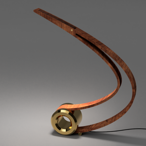
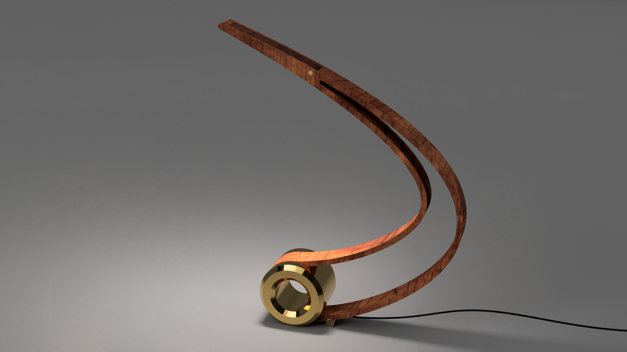
For my upcycling project, I have chosen to make either a desk lamp or a sculpture with a similar design. The idea behind this design is a modern style that uses curvature to create a balanced, yet interesting shape. The lamp shown below is a previous project that I am drawing inspiration from as I continue to explore the balance between curvature and mass to create an interesting and functional art piece.


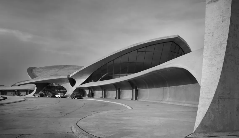
The aesthetics that I think most closely fit this design style are Googie and Mid-Century-Modern. These are two aesthetics that emerged in the mid-20th century and share some aspects of clean lines and innovative materials, while they differ a bit in application. Mid-Century Modern designs tend to be furniture pieces reminiscent of 1950s design while remaining timeless while Googie concepts were mostly seen in architecture like the YWA Flight Center at JFK airport.

The clean lines and swooping curves of this design style inspire me to create a piece with similarly clean, long curves. This will be complicated because without spending a lot of time perfecting a wooden sculpted piece, organic curves like this are very challenging to make. In the past – with my previous lamp – I simplified the curve to exist in one plane so that it could be cut with common machinery, but this time I would like to challenge myself to include more depth in the final piece.

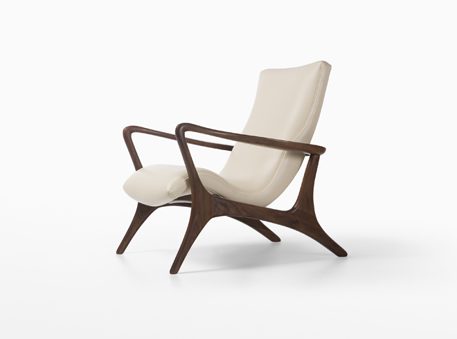
This chair by Vladimir Kagan perfectly encapsulates the Mid-Century Modern aesthetic. The simplicity of its design with smooth curvature and the use of wood and leather are common themes in Mid-Century design. The chair gains a dynamic appearance because of how the curvature draws the eye throughout the design, and I hope to accomplish a similar effect with my design.
Desk Lamp – Sam Gluskoter – https://www.sgluskoter.com/projects/desk-lamp-design-for-creation
TWA Flight Center – Eero Saarinen – https://archeyes.com/tag/googie-style/
Contour Low Back Lounge Chair – Vladimir Kagan – https://www.vladimirkagan.com/seating/Contour-Low-Back-Lounge-Chair/collection


3 Comments. Leave new
A beautiful aesthetic Sam! the play of illusion, where the curve makes it almost seem like the structures are help up by some sort of magic. This would be such a cool statics and structures project to find the internal forces that allow an equilibrium net force from a, from the looks of it, unbalanced structure.
Sam, I really like this aesthetic as well as the previous piece that you created. I am curious what specific manufacturing techniques you used in the past, and what you will use for this project.
Hey Sam, you have chosen an interesting aesthetic and up-cycle project idea. I am excited to see the 3D shapes that you incorporate into your lamp (or sculpture). I was wondering what shapes or wave features you were thinking about using?