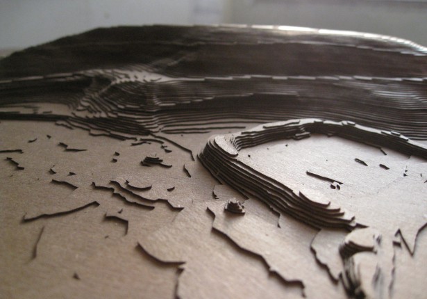
For my upcycling project, I am intending on creating a topographic sign made out of scrap pieces of wood. The debate I currently have with my self is the aesthetic that I want to go with. I have two options in mind – minimalistic or organic – and for each option I would design the sign in a different manner. I will explain my thought process behind this project beginning with what I am certain of. Pictured below in figure [1], is an example of what a topographic sculpture looks like.

[1] https://www.instructables.com/Easy-3D-Topographical-Maps/
A topographic sculpture seeks to depict a surface and its elevations and depressions through three-dimensional measure. In science, these sculptures are used to represent geographic features like mountains, plains or water. However these sculptures can also be used in an artistic way as well as a functional way and could be considered an aesthetic of its own. Although as I mentioned, I do plan on adding in additional elements to the sculpture to grow its aesthetic further. Within a topographic sculpture the vertical scale is usually exaggerated with respect to the horizontal to draw attention to the elevation change. Depending on its use, material for topographic sculptures can range from wood, to clay, to plastic or even 3D-printed sculptures. As stated earlier these sculptures can be seen and displayed in any setting. The setting I imagine it to be in is intended as an advertisement in a sense, to grab someones attention and put the visual in their head of the brand in an interesting way. To make this topographic sculpture I will be using a laser cutter and possible a 3D-printer. In regards to the laser cutter thin pieces of scrap wood will be acceptable however I may encounter difficulties when it comes to finding pieces that are of the same thickness. As you can see from figure [1] that the elevation is expressed not with the height of individual pieces of wood but with multiple pieces of the same thickness stacked on top of each other. Although as of now I do not know what I would 3D-print if i were to add that element to my project it would be for small features to add texture or color. Something I had in mind depending on the aesthetic would be miniature trees similar to ones seen in train sets like figure [2].

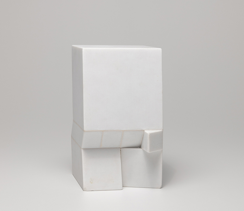
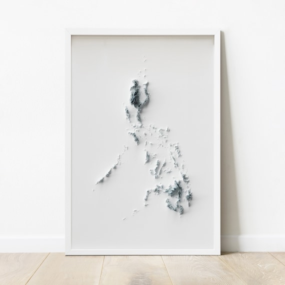
Now for the extra aesthetic that I intent to add to this my two options are minimalistic and organic. Both of these aesthetics can match the aesthetic of what will be displayed. For the minimalistic aesthetic my idea with this will be to keep the topographic sculpture as simple as possible. The sculpture will be neutral colors, little to no clutter and sharp edges on the sculpture to keep it clean. I will either keep the wood its natural color, or if too many of the pieces have different shades and it takes away from the aesthetic then I will paint the wood white. For the paint choice I will either do spray paint or whatever the ITLL or Idea Forge has in stock to keep the project as an upcycle with as few additional purchases. The art piece that will inspire my minimalistic aesthetic approach will be similar to figure [3] as it matches the color and simplicity I will try to achieve. And although there isn’t as much form and structure to figure [3] I do like how it is not cluttered and has an interesting use of space.


My other aesthetic being the organic or natural aesthetic I would lean on the side of not coloring the scrap wood at all to keep its authenticity as the of natural wood matches the organic natural aesthetic. If I were to color the wood then I would maintain Earth tones and greens to keep it as natural as possible. Regardless of the color choice for this aesthetic the addition of miniature trees or even moss from the ground can help promote this look as long as it doesn’t take away from the structure of the topographic sculpture. For this I have found inspiration in the two images below. In the first figure [5] I appreciate how it looks like it almost was carved out of a large piece of wood but through the change in elevation of the cuts you can see the depth of the forest. I also like how it appears they used real wood which I plan on doing to the closest of my ability. In figure [6] what drew me in was the color choices as it adds to the aesthetic of the mountain and immediately lets you know what the environment is. The hut on the right side of the image is also the idea I had in mind in terms of adding small objects to the sculpture.


2 Comments. Leave new
This sounds like a really neat project! I would also agree with Ethan; I think an organic aesthetic would make the most sense in this context mainly because it would allow you to convey the topography clearer without any potential confusion that might arise when doing something that’s both minimalist but also wanting to reference something specific (i.e. a specific topography).
On the other hand though, it might be interesting to try and pursue a minimalist aesthetic and see what you can pull off. How minimalist could you make your project? You might find some interesting things pop out at you. That’s just food for thought, either way I think it’ll look pretty neat!
This project sounds really cool I can’t wait to see how it turns out! Of the two aesthetics, I am leaning towards the organic one because I feel like it meshes really well with a topography sculpture. I like the idea of printing little trees or shrubbery and maybe making the ground layers look like soil. I also think making a mountain in the topography could look amazing.