Project Logistics
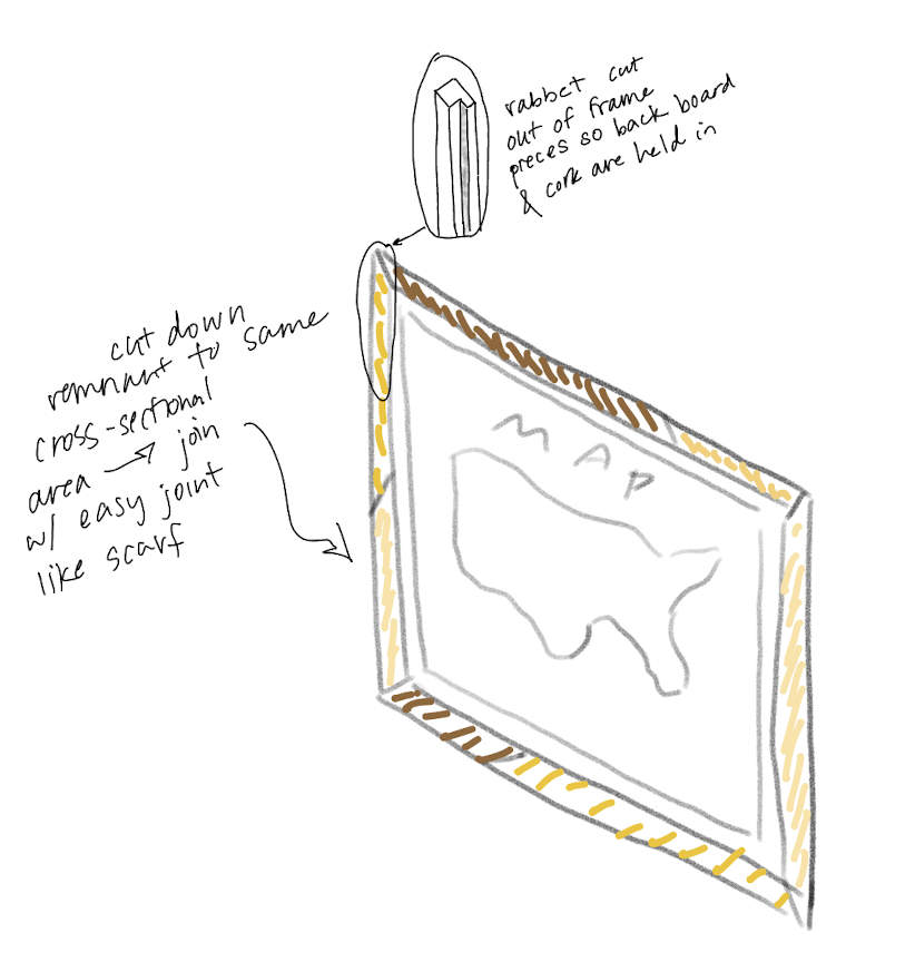
Goal: Build a bulletin board frame that will house a large poster of the United States, so I can insert pins to the locations I’ve traveled to and then display it as wall art.
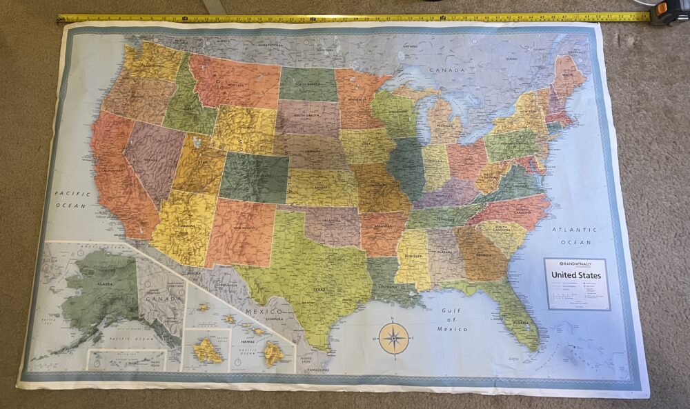
Context: I’ve owned this 50″ x 32″ poster map of the United States for probably 6 years now. Originally, I just pinned the posted to my wall and inserted pins to places I’ve visited. To preserve the wall, I purchased cork sheeting and adhered that directly to the wall and then pinned the poster to the cork. However this system was very aesthetically ugly and the cork did not stick to the wall very well. So, these materials have just been sitting at my parent’s house even though the poster is something I enjoy having in my room. I want to create the bulletin board frame so that the poster and cork can exist as one wall hanging that is more aesthetically pleasing art, easy to transport, and more robust for keeping pins in the poster.

Upcycled Materials: I will obviously be utilizing the poster and cork sheet that I already own, but in a more elevated fashion. The frame that will hold the cork sheeting is where I will truly be upcycling. I plan to undertake a woodworking project, creating a wooden frame from remnant material in the Idea Forge MakerSpace. This is wood that is scrap from other projects, just sitting on the shelf or going to the trash. I am excited to turn it into something beautiful and functional!

Project Aesthetics
The aesthetic of the bulletin board frame and the whole poster decoration itself will pull inspiration from multiple aesthetics.
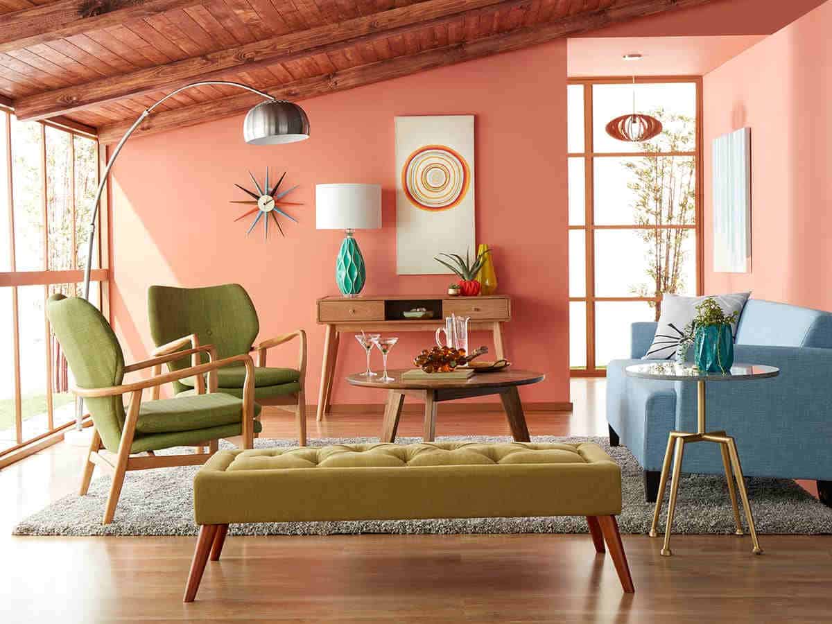
Midcentury Modern: The midcentury modern aesthetic is most commonly associated with interior design, so I think building a frame for wall art lends itself naturally to this aesthetic. Sarah Lyon from The Spruce, an interior design website, says that the midcentury modern (or MCM) is “defined by simple, functional, and wooden furniture” [1]. This is the main aesthetic I am trying to achieve.
MCM’s simple and functional wooden furniture often adds visual interest through incorporating curves and organic shapes, or using mixed materials. While my frame will likely be a rigid square, the use of mixed pieces of remnant wood on each side of my frame leans into the MCM aesthetic. The focus on functionality, rejection of overly-ornate detailing, and use of the map to add a pop of color also aligns with the aesthetic.

Light Academia: The map itself invokes the academia aesthetic, like it was pulled directly from a textbook, map log, or middle school classroom. It is to provide information through the many labeled cities and roadways, and then serve as decoration. However the colors are not dark and brooding like in most academia aesthetics; the light blue borders and bright colors are more reminiscent of Light Academia which “emphasizes a brighter and more optimistic atmosphere” [2].

With these two aesthetics combined, I hope to produce an interactive, functional, and simply pleasant wall piece from old materials.
[1] Lyon, Sarah. “What Is Midcentury Modern Style? Here’s What You Should Know”. The Spruce. January 18 2024. https://www.thespruce.com/things-you-should-know-about-mid-century-1391827[2] “Academia”. Aesthetics Wiki. https://aesthetics.fandom.com/wiki/Category:Academia
[3] Bailey, Jennifer. “Mid Century Modern Living Room Ideas”. Don Pedro Home Design. March 21 2020. https://donpedrobrooklyn.com/mid-century-modern-living-room/
[4] “oh to be a pear tree – any tree in bloom!” Archaic-Stranger on Tumblr. August 22 2021. https://archaic-stranger.tumblr.com/post/660278023235485696/the-geography-students-world-maps-hanging-on-you


2 Comments. Leave new
Hi Katie, the way you have decided to combine MCM and academia is interesting as in my mind they are academia typically leads me to think of a typically older aesthetic (just like your map)! For the frame, are you trying to create it out of one type of wood or will you be combining multiple different types? This leads into my next question of what kind of color scheme will the frame ential? Will it be constant or varied throughout? By using scrap wood it may be more difficult to get a consistent color if that is the goal. I am excited to see how this turns out. Good luck!
I had never thought to combine multiple aesthetics before, but with how you describe the map as pulling from Academia and the wooden frame from Mid-Century Modern I think the two will aesthetics will complement each other quite nicely. I don’t know if you were planning on any finishing processes for the upcycled wood, but staining the wooden frames might give the piece yet another layer of depth. Using wood stain will make the grain of the wood really pop, and can make a recycled piece of home depot pine lumber look like a nice piece of oak or cherry depending on what you choose.