I have always appreciated design that simplifies complex tasks in a beautiful (but simple) way. I feel as though a lot of design can be distracting, but thoughtful and simple design can serve as a way to allow someone to focus on what is important to them.
The minimalism movement as a philosophy had its start in the early 19th century in the United States by the likes of Ralph Waldo Emerson and Henry David Thoreau, who believed that “insight and enlightenment can be gained through solitude and simplicity”. The modern style of minimalism, however, was heavily inspired by the Bauhaus School in Germany during the early 20th century (1). It features a strong emphasis on basic shapes such as rectangles and circles. An example of this is in the Bauhaus logo itself, which was designed by Oskar Schlemmer in 1921.

We can see that this logo shows a face in side profile, however it uses only lines, squares, and circles. The color palette as well is also simple, just black and white. These shapes can also be seen in architecture. The most logical example of this is perhaps the Bauhaus School itself in Dessau, Germany:

Much like the Bauhaus logo, we can see that the building itself is composed almost entirely of simple colors (white, black, and gray with some red touches) as well as glass to allow for natural sunlight to enter the building.
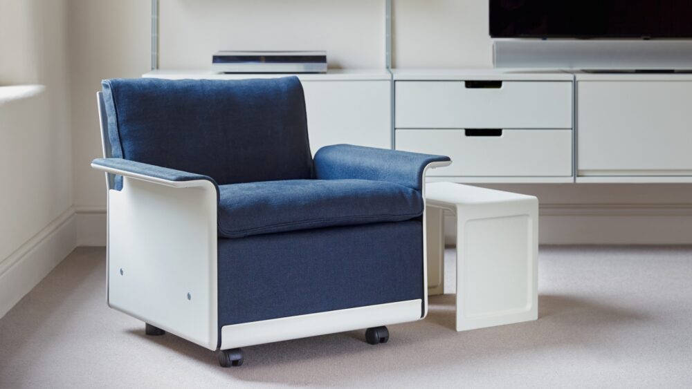
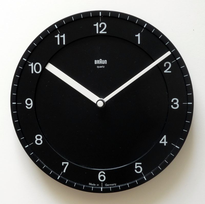
One of the most influential figures in minimalism who brought the Bauhaus ideas into the mainstream is Deiter Rams. He is a German industrial designer that is known for his “Good design” principles that many minimalist (and non-minimalist) designers use to this day to assess the quality of their designs (2). Some of the rules he outlined are “is innovative”, “is unobtrusive”, “is as little design as possible”, and “is long-lasting”, among others. Some of his most famous works are the Vitsœ 620 Chair and the Braun ABW 30 clock, both shown below.


The Vitsœ 620 Chair is able to have multiple assembled into a sofa. The two screws on the bottom disconnect the armrest and allow for two chairs to be screwed together to form a sofa, with the armrest being attached at the end of the two couches that are now screwed together. Furthermore, the chair itself is designed to be extremely easy to be assembled and is made out of high-quality components. Both of these are factors that show the long-lasting and simple design advocated for by Rams.
The Braun ABW30 clock is also extremely simple. Much like the Bauhaus logo, it only has two colors and the arms are of two distinct sizes, making it easy to tell the time.
Both Dieter Rams and the Bauhaus school were inspirations for Jony Ive, the former Chief Design Officer at Apple (3). Two examples of this are the original iPhone and the old MacBook Air model.


While both of these were groundbreaking and impressive machines when they were released, what I find most impressive and most telling about their aesthetic is that they still look good, 16 years later. To me, that is what good minimalism should do. Not only should the designs be made out of quality materials (i.e. metal and glass), but also be timeless.
Comment Responses:
Aryan:
Thanks Aryan! I originally got inspired to minimalism from Apple and really liking their design aesthetic (as basic as that sounds), so getting to trace the history of Jony Ive’s inspirations was super interesting.
Jason:
Thanks! What I like most about minimalism is how it can let us concentrate on what matters most. I personally like my workspace to be clean so that I can focus on whatever I’m working on. I think that if we have complexity surrounding us, we can’t work on some other complex task completely because our brains are inevitably distracted. I think minimalism proposes a solution to this problem while also helping people simplify their surroundings.
(1) Minimalism, https://minimalism.co/articles/history-of-minimalism
(2) Vitsœ, https://www.vitsoe.com/us/about/dieter-rams
(3) Jesus Diaz, Gizmodo, 2008, https://gizmodo.com/1960s-braun-products-hold-the-secrets-to-apples-future-343641


2 Comments. Leave new
I’ve always admired designs that simplify complexity with a touch of beauty, allowing us to focus on what truly matters. Your exploration of minimalism, tracing its origins to the Bauhaus movement and its influence on contemporary figures like Dieter Rams, is both informative and engaging. The examples, from the Bauhaus logo to Rams’ Vitsœ 620 Chair and Braun ABW30 clock, effectively demonstrate the power of simplicity and functionality in design. Additionally, tying in Jony Ive’s influence at Apple and reflecting on the enduring appeal of the original iPhone and MacBook Air adds a personal touch to the discussion on the timeless nature of good minimalistic design.
Excellent post Josh. I really like the way that you broke up the text into short paragraphs. I also find it intriguing how you explained the way minimalism seeps into the design of products that we use daily such as apple products. I would like to hear more about what you personally find interesting about minimalism. I also think it would be helpful for readers to understand the aesthetic better by including another example of an art piece that embodies the minimalist aesthetic. Overall, I am intrigued by your choice in aesthetic and I think you did a great job explaining it and formatting the post!