Minimalism Introduction
Through my exploration of design aesthetics, I chose to talk about minimalism. This design aesthetic is centered around generating art which consists of placing more emphasis on the quality over the quantity, following the ethos of “less is more.” This is an intriguing art form to me due to the care which artists must take to ensure their work is of proper quality. With so few details, the process of selecting the subject, background, or pattern can be much more important than the actual details of the art. This style of art often leads to really creative methods of depicting a scene, subject, or just combining colors in a minimalistic style.
History of Minimalism
The minimalism movement began in the 1960s, quickly rising in popularity throughout the 1970s. It’s origin is commonly associated with New York. Artists slowly began to favor simpler shapes, patterns, and colors in their works. Minimalist artwork can be seen throughout most of the 20th century, however, the movement did not gain traction until the 1960s. Once the movement started to become popular, artists began shifting away from the excessive art layers involved with other art styles from the time. “This minimalist trend permeated not only the realms of painting and sculpture but also architecture, product design, and eventually interior design and lifestyle.” [9]
Key Aspects of Minimalism
The following are often key identifiers of minimalism [10]:
- “Less is More” – The purpose of minimalism is to reduce clutter and extra details by reducing the art down to a simple, yet carefully selected form and in doing so more emphasis is placed quality over quantity.
- Solid colors – Commonly minimalist works will consist of solely solid colors or smooth gradients. This adds to the minimalist aesthetic by removing distinctive details which can arise from textured or other non-solid colors.
- Consistency – Consistency is key in minimalism. This can be stated with respect to color, shape, and patterns.
Specific Examples of Minimalism
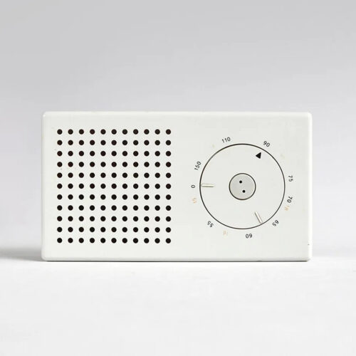

Apple is commonly known to prioritize a minimalistic look with their products. On nearly all of their products, they do their best to design with a sleek minimalistic look in mind, slightly different than the classic minimalist look which is generally thought of. Regardless, consumers love their products because of the sleek, modern, minimalist look.

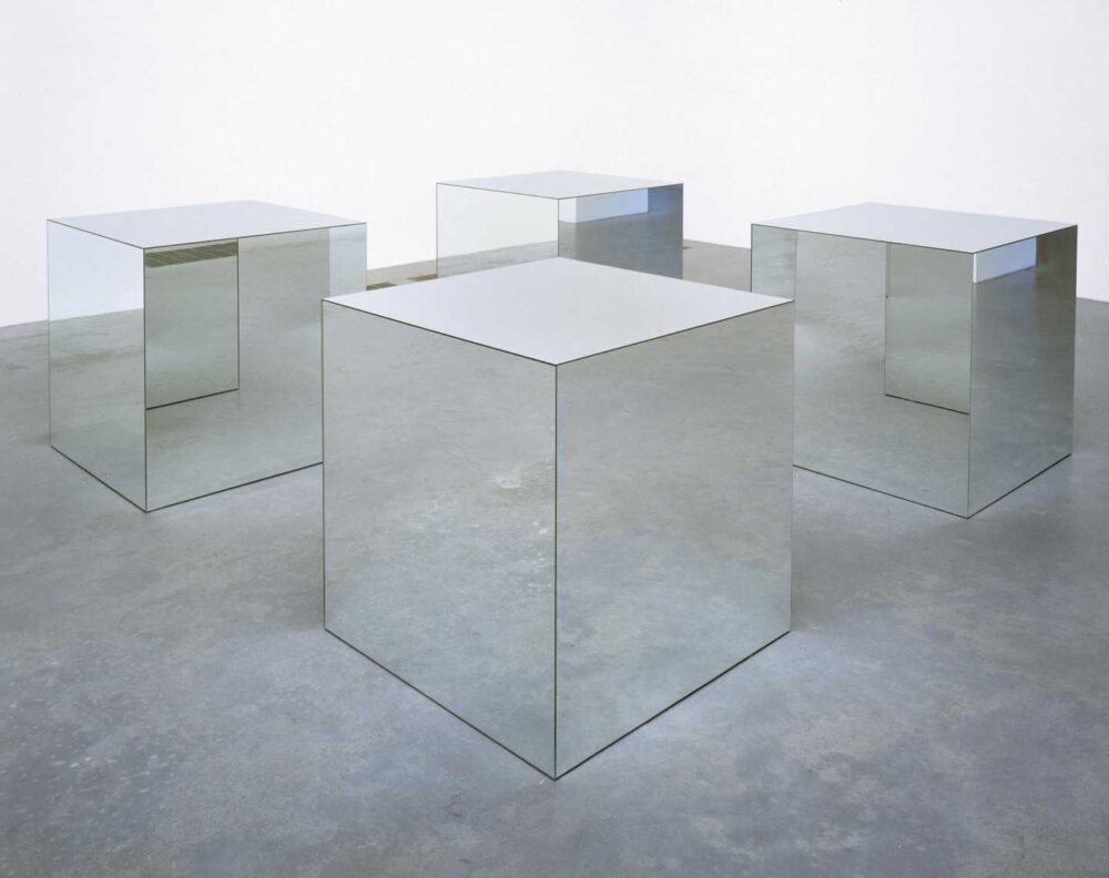

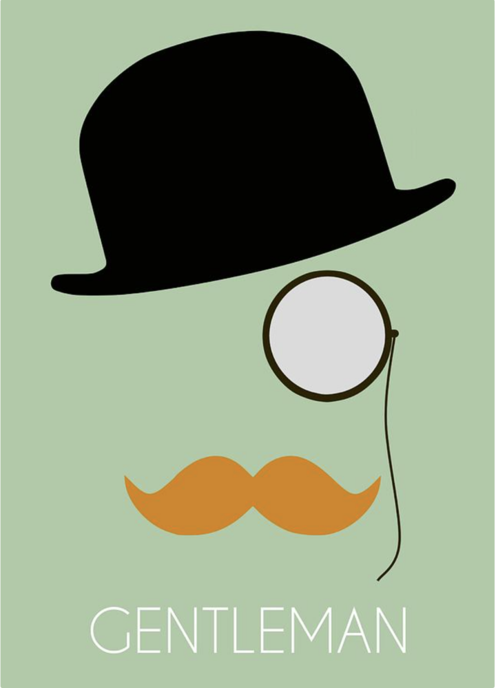
More Examples of Minimalism
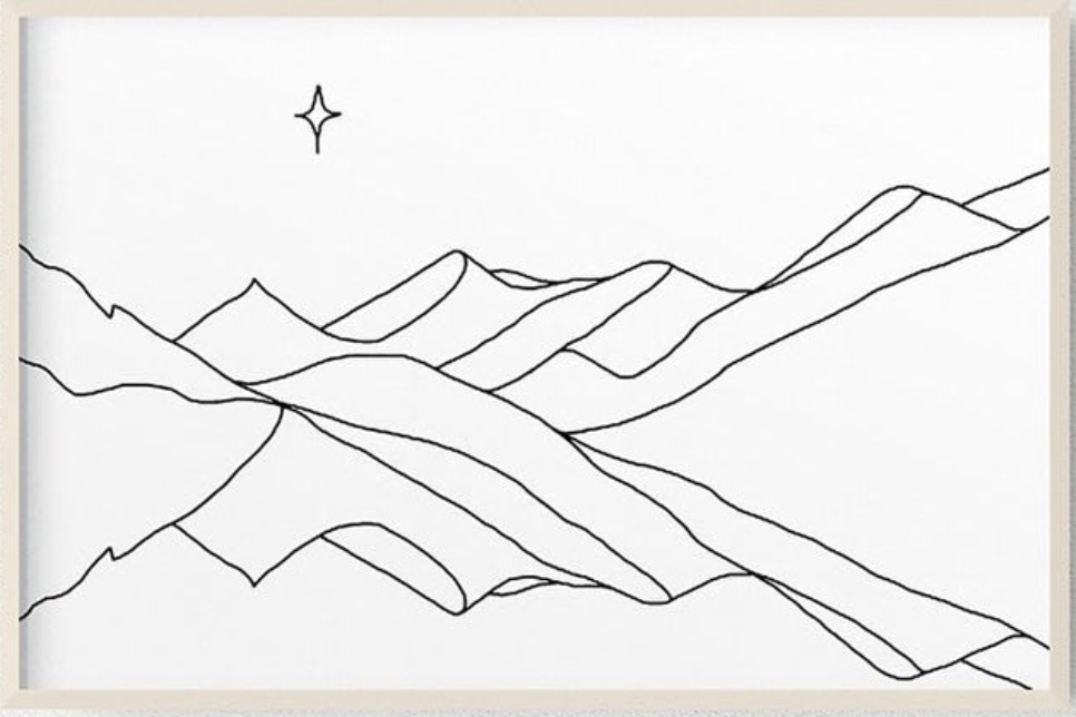
Further Explorations
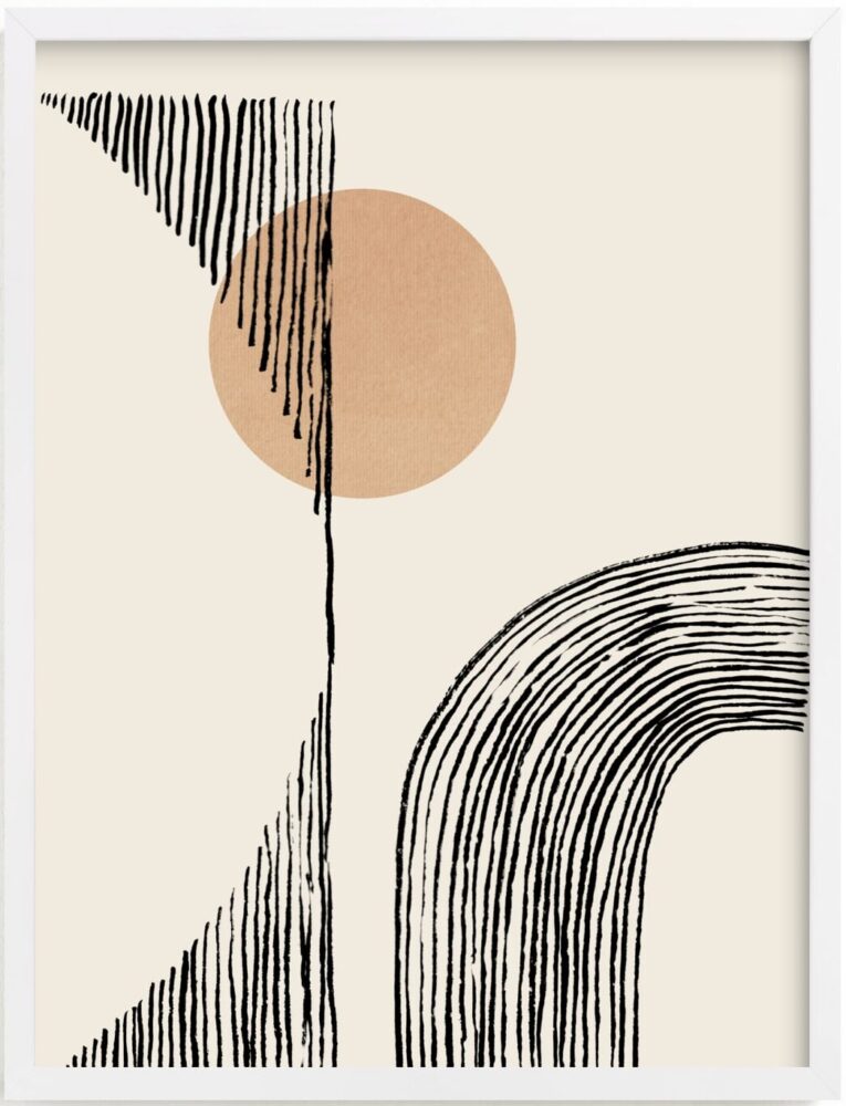
With the rising popularity of minimalism, what does the future look like? Minimalism itself is a very broad topic and can even be merged into many other aesthetics. This can be beneficial when the compliment each other, one example being formalism. Formalism and minimalism are very similar in the sense that they neglect aspects of art which are not beneficial to the core of the art piece. The example below demonstrates crossover between the two aesthetics.
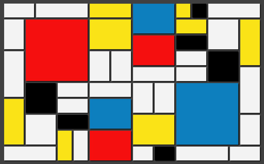
Furthermore, with the rise of minimalism, it may eventually come to a state where minimalism becomes overused. I, however, don’t see this becoming a problem in the near future. Within art, different art movements slowly shift in and out of popularity, but they rarely encounter stark changes within the art world causing a saturation of the aesthetic.
Closing Thoughts
Throughout the investigation into what minimalism really is, there really is no limit to what can be achieved. Minimalism is seen in all aspects of art, design, and more. It is even weaving its way into logo design. There are numerous different styles of minimalism, some which use similar contours, some which use minimalistic colors, and others which understand minimalism in their own way. All of these are proper minimalistic works of art which also leave a lot of room in between for newer and unique pieces to be created.
References
[4] http://www.tate.org.uk/art/work/T01532
[6] https://fineartamerica.com/featured/gentleman-lasse-orling.html
[9] https://larseneriksen.com/blogs/chronicle/the-history-and-concept-of-minimalism
[10] https://www.drypdesigns.com/blog/design-style-aesthetics/#minimalist
[11] https://medium.com/@bravengreen/why-stupid-simple-logos-are-always-better-1a73cf1d3980


2 Comments. Leave new
One of the things I find very interesting about this aesthetic is how it can be incorporated and seen in many other anesthetists. it has the ability to potentially enhance the other aesthetics it is incorporated with. Is it always a good thing to incorporate minimalism into a design? when does it not make sense to do so?
I am so fascinated by how open-ended this aesthetic is and how it can be almost an added aesthetic to other aesthetics to make a combination that tells another story still. I am curious to hear your opinion on the transition to everything becoming minimal and if the overuse of the aesthetic is almost ruining the novelty of it.