The Minimalism Aesthetic is known for having a clean visually appealing style. It is characterized by bright neutral colors and minimal distractions. This aesthetic originated as an art style back in the late 1950s. Frank Stella, an abstract painter born in Malden, Massachusetts, was one of the first major contributors to the minimalist art style [1]. In the 1960s and 1970s the style picked up momentum largely due to artists such as Carl Andre, Donald Judd, Sol LeWitt, and Agnes Martin [2]. Minimalist art, as shown below, has a low variety of shapes and very little detail to minimize distractions.
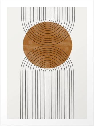
Abstract Flow by The Mius Studio [3]
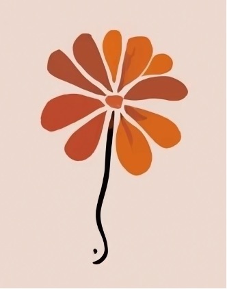
Minimalist Flower Generated by Craiyon Image Generating AI [4]
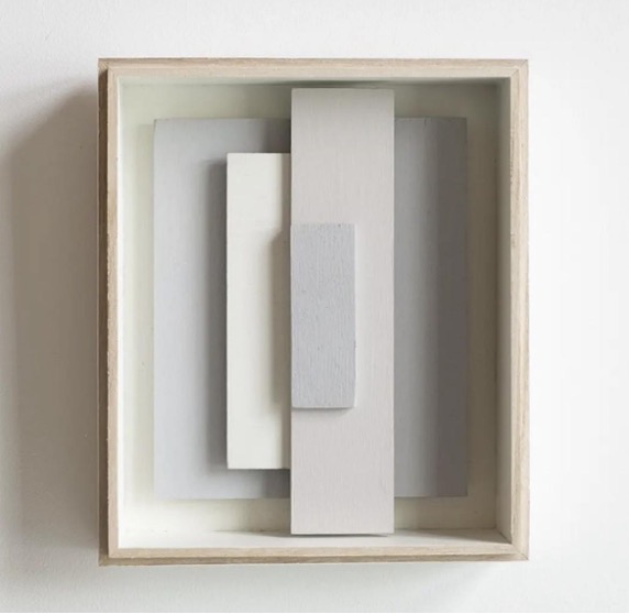
Artwork by Dennis Konijnenburg [5]
The phrase “less is more” really encompasses the minimalist aesthetic. This phrase has been attributed to Miles van der Rohe, a German architect who pioneered minimalist architectural design [10]. In architecture and interior design, the minimalist aesthetic is captured by simple boxy shapes and lots of open space. Light neutral colors, often different shades of white, are a big part of this minimalist design aesthetic.
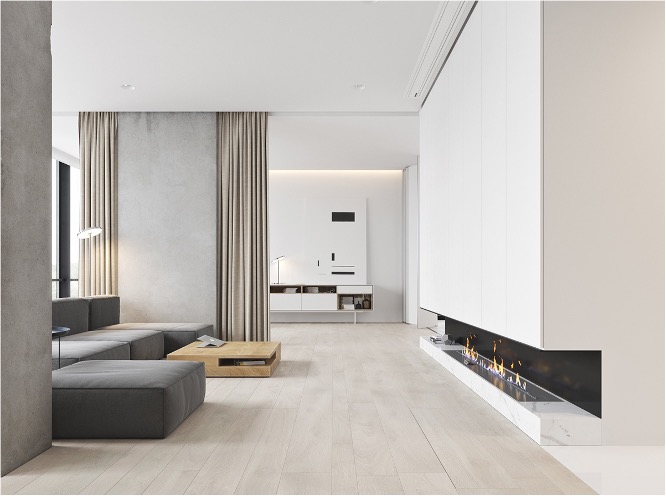
Living Room Designed by M3 Architecture [6]
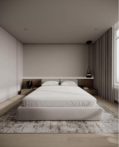
Bedroom designed by Ursa Studio [7]
The images above show how some of the common themes in minimalism are applied to the design of living spaces. Both rooms have lots of open space, minimal appliances, and white lighting. Furniture, like the tables below, can also express the minimalist aesthetic.
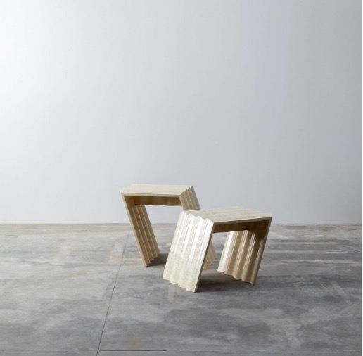
Photograph by Serena Eller Vainicher [8]
Minimalism can also be shown through fashion. Again minimalist fashion tends to stick to neutral colors and limited accessories. The clothing has no patterns and often has a loose or baggy fit, like the first outfit shown below.
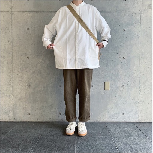
Post by @_kid.18 [9]
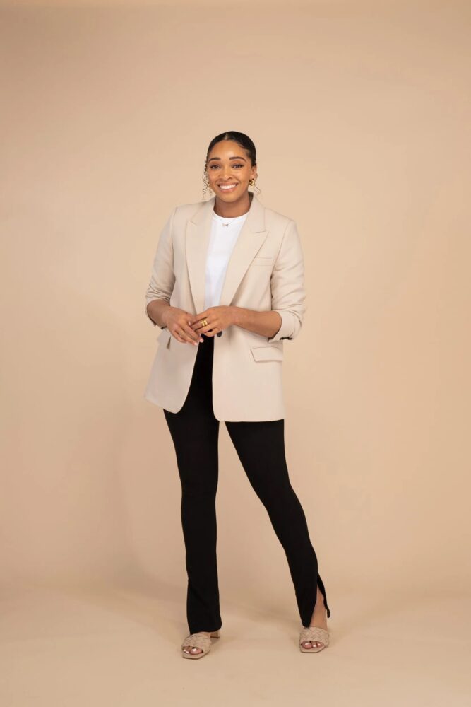
Photograph by Georgia Meramo [11]
Today, the minimalist Aesthetic has become more focused on decluttering one’s life. This can be applied to physical spaces or even virtual ones. Many app designers apply a minimalist approach to the user interface so that their app is clean and easy to use. I personally like the Minimalist aesthetic. When there are fewer distractions it makes it easier to appreciate what is right in front of you. The neutral colors can be a bit depressing so I don’t think I could permanently live in a building with this aesthetic, but overall I find the minimalist aesthetic calming. I believe this aesthetic can be summed up by the wise words of Micheal Scott, “Keep it simple, stupid!”
Citations and Photo Credits
[1] Ronald Alley, Catalogue of the Tate Gallery’s Collection of Modern Art other than Works by British Artists, Tate Gallery and Sotheby Parke-Bernet, London 1981, p.705
[2] Minimalism, https://www.tate.org.uk/art/art-terms/m/minimalism
[3] Website: https://www.themiuusstudio.com/
Instagram: @themiuusstudio
[4] Craiyon Image generating AI, Prompt: illustration flower minimalism art,
https://www.craiyon.com/image/XuWEeRYUR5GwAHR08czCbA
[5] Dennis Knijnenburg, Amsterdam, Netherlands
Instagram: @denniskonijnenburg
[6] M3 Architecture, Petrie Terrace, Australia
Website: https://www.m3architecture.com/
[7] Ursa Studio, Almaty, Kazakhstan
Website: https://ursaarchitects.com/ru/private-projects
Instagram: @ursastudio
[8] Instagram: @serenaeller
[9] Instagram: @_kid.18
[10] Less is More. Minimalism in the XXI Century., D-essentials Inc
Website: https://dessentialsinc.com/less-is-more-minimalism-in-the-xxi-century/
[11] Georgia Luisa Allegra Meramo, content creator and photographer, London, United KingdomWebsite: https://the-dots.com/users/georgia-meramo-625099
Instagram: @glameramo

8 Comments. Leave new
[…] also work beautifully in a home office, especially if your workspace is designed with a modern or minimalist aesthetic. They allow you to maintain a connection to the outdoors while reducing glare on your screens […]
[…] of in the beginning was the minimalist aesthetic. I talked about this aesthetic in an earlier post. To fit the minimalist aesthetic I would keep the base of my design very similar, but I would make […]
[…] of in the beginning was the minimalist aesthetic. I talked about this aesthetic in an earlier post. To fit the minimalist aesthetic I would keep the base of my design very similar, but I would make […]
[…] of in the beginning was the minimalist aesthetic. I talked about this aesthetic in an earlier post. To fit the minimalist aesthetic I would keep the base of my design very similar, but I would make […]
When I think of minimalism I immediately think of interior decoration, with wide open spaces and an almost cold aesthetic, and I’m glad you touched on that. Your examples here feel much warmer than what I considered prior, but I still can’t imagine that the couch in M3 Architecture’s living room design is very comfortable. I hadn’t considered that fashion choices could be considered minimalistic, but I’m seeing that now. I like your closing statement also.
I agree, the minimalist aesthetic does usually come off as cold and I think the colors play a big role there. Also because there is a focus on reducing clutter and distractions, when it comes to interior design, you can lose many of the comforts and amenities that make a space enjoyable to live in.
Hello Ethan! I wanted to start by complimenting the diversity examples that you have provided for your Minimalism Aesthetics Exploration. I particularly liked the section you had on home decor; it reminded me of the style of Kim Kardashians houses as seen on “Keeping up with the Kardashians”. One thing I did notice was that I believe more examples of minimalist clothing may have given a greater context to that particular section of your post. In the end great job buddy.
Thanks John! The minimalist Aesthetic has become quite popular so I am not surprised you recognized it from one of your favorite TV shows. I agree the clothing section could use more examples so I updated the post with another example that is a little different from the first but still captures the minimalist aesthetic.