I’ve always thought an interesting aesthetic is the comic-book aesthetic. This aesthetic can easily be described by cartoon drawings, visual flairs, and onomatopoeia to make an image or images represent a full setting and story rather than being a standalone scene. When I think of the comic-book aesthetic, I think of the bright colored, hand drawn superhero comics that spanned 1940’s-1960’s America.
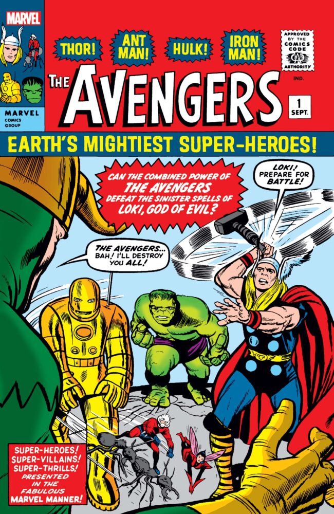 [6]
[6]
However, the aesthetic is international with comic-like cartoons being created in many nationalities and cultures. For example, the popular Japanese manga books utilize a comic like style, where bubbled text and drawing depict scenes as well as characters thoughts and actions. Interestingly, the very first time the comic-book aesthetic was used was in a comic-book called The Adventures of Mr. Obadiah Oldbuck [1] created by Ralph Topffer.
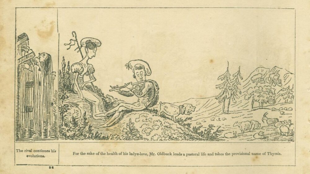 [1]
[1]
This text was originally published in Switzerland in 1837 and later in the United States in 1842. While The Adventures of Mr. Obadiah Oldbuck started the comic style, it is missing key features of what makes the comic book aesthetic unique. The Adventures of Mr. Obadiah Oldbuck does not utilize the color and visual flair that is apparent in the modern comic-book aesthetic. However, utilizing drawings and visual dialog was rooted in this comic. In the early 1900’s a publication called Funnies on Parade [2] introduced a more modern style of the comic-book.
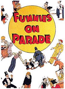 [2]
[2]
Funnies on Parade had more colors and comic cell format than previous comic-styled books before it. Yet the big break for the comic aesthetic came in 1938 as the popular character “Superman” was created in Action Comics #1 [3].
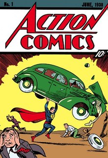 [3]
[3]
As Superheros began to become tied with comic-books, they became a staple of pop culture. In the 1940’s-1970’s youth culture accepted comic-book superheroes and the cartoony style they possessed. Companies such as Marvel Comics and DC comics popularized many famous pop culture characters during these times. Coming into the modern day, the comic-book aesthetic is as big as ever. While the original bubble filled texts may be less popular in modern day, the aesthetic lives on. Now, movies and tv shows borrow the comic-book aesthetic and pop culture characters it has created. For example, as of this year there are over 70 movies for Marvel comic characters that were brought to life in Marvel comic books. DC comics has more popular movies too that are still releasing to this day. Mainstream TV hasn’t shied away from the comic aesthetic either. Popular shows such as The Walking Dead [4] and The Boys also are comic book adaptations.
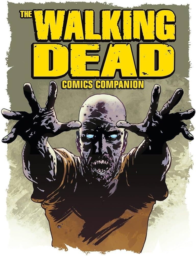 [4]
[4]
Even though these popular film and TV adaptations borrow popular comic book characters and stories, one might think that they have lost the original style or aesthetic that mainstream comic-books held. However this notion is incorrect. Many comic-book movies still utilize the cartoon style and bright colors that give off the comic-book aesthetic. A good example of this is the Jim Carrey movie The Mask . The Mask includes scenes that are colorful and extorted to represent the comic-book art style. Similarly, the popular and still developing Spider-man: Into The Spider-Verse [6] movie trilogy is the best example of modern films utilizing comic-book aesthetics.
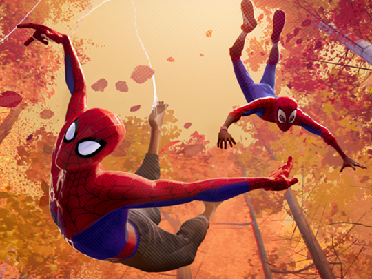 [5]
[5]
Both “Spiderverse” movies that have been released utilize visual flair, onomatopoeia, and dialog text bubbles within the movie. It is almost as if the movie is designed to be a comic-book in motion.
[1] – Töpffer, Rodolphe. The Adventures of Mr. Obadiah Oldbuck, 31 Mar. 2010, www.dartmouth.edu/library/digital/collections/books/ocn259708589/ocn259708589.html.
[2] – “Funnies on Parade.” Wikipedia, Wikimedia Foundation, 24 Sept. 2023, en.wikipedia.org/wiki/Funnies_on_Parade.
[3] – Infinite, Dc Universe. “Action Comics (1938-) #1.” DC UNIVERSE INFINITE, www.dcuniverseinfinite.com/comics/book/action-comics-1938-1/f5f6ab2b-0746-4a95-bf79-039a529bbb50. Accessed 24 Jan. 2024.
[4] – McCabe, Joe. “First Look: The Walking Dead Comics Companion.” Skybound Entertainment, 30 Dec. 2019, www.skybound.com/comics/the-walking-dead/first-look-the-walking-dead-comics-companion.
[5] – “Spider-ManTM: Into the Spider-Verse: Sony Pictures Animation.” SPIDER-MANTM: INTO THE SPIDER-VERSE | Sony Pictures Animation, www.sonypicturesanimation.com/projects/films/spider-man-spider-verse. Accessed 24 Jan. 2024.
[6] – “Avengers 1 Facsimile Edition (2023) #1: Comic Issues.” Marvel, www.marvel.com/comics/issue/105913/avengers_1_facsimile_edition_2023_1. Accessed 24 Jan. 2024.

2 Comments. Leave new
It was interesting to learn that the comic-book aesthetic is thought to have originated in Switzerland in the 1800s–I have always that it was very American in its bold and cartoonish nature, as well as its ubiquity through Marvel and DC. I personally love Calvin and Hobbes! I thought it was pretty thorough for the history given this format, though it would have been great to see better or more examples of the comment bubbles. Other than colors and text, is there any strict criteria for the cartoon drawings?
Ethan, great job on the exploration and detailed history of the comic book aesthetic. I really enjoyed the way you talked about comic book aesthetics making its way into modern animations (Another example of this could be Puss in Boots, The Last Wish). I was wondering if there are examples of comic book aesthetics in the real world that you could include, maybe Comic Con or other conventions that are known for cosplay. Overall this is a very comprehensive and informative dive into the comic book aesthetics.