An aesthetic that interested me was the unique signage used during the 1950’s. Signs of the 1950’s are defined by bright colors, fun characters, big lights, and neon. This style developed after the end of WWII, America went through a rapid economic development defined today by its movies, tv’s, and rock ‘n’ roll. To advertise many new products and services available to Americans, more signs than ever before were needed.

The first McDonalds, with its original signage, from 1953. (1)
America’s growing economy and consumerism lead to the advancement of mass production across the country. One of the largest booms was in the plastic industry. This allowed low cost signs to be mass produced for any product or company that wanted one. These bright artificial colors in combination with earlier sign advancements in neon lighting and fluorescent bulbs led to a very distinct style coming out of this era.
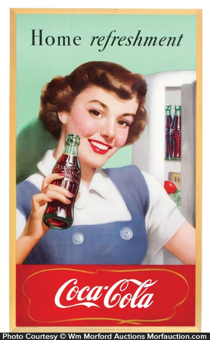
1950’s Coca Cola advertisment (2)
Lower cost of material now meant that every business could have a sign, leading to a much broader usage for signs. This accessibility led to much more creative designs for many more purposes, diners, bowling alleys, and car washes for example, could all get custom signs, letting them stand out from the competition.
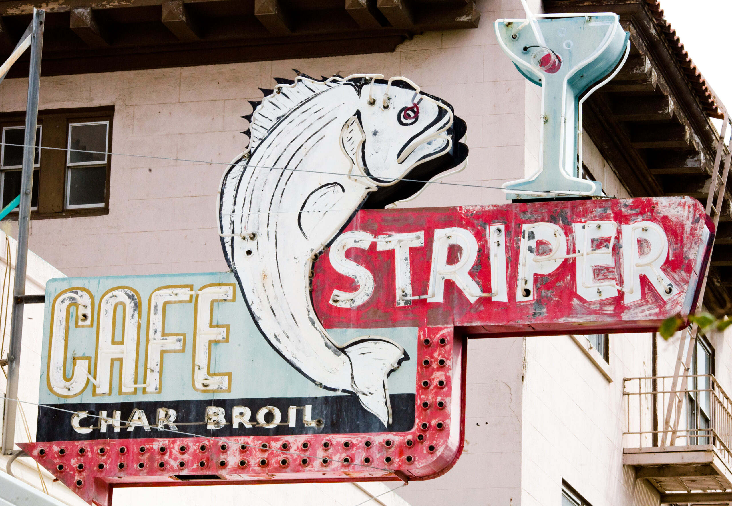
Cafe Striper, in Rio Vista, CA. (3)

Elephant Car Wash, in Seattle, WA (4)
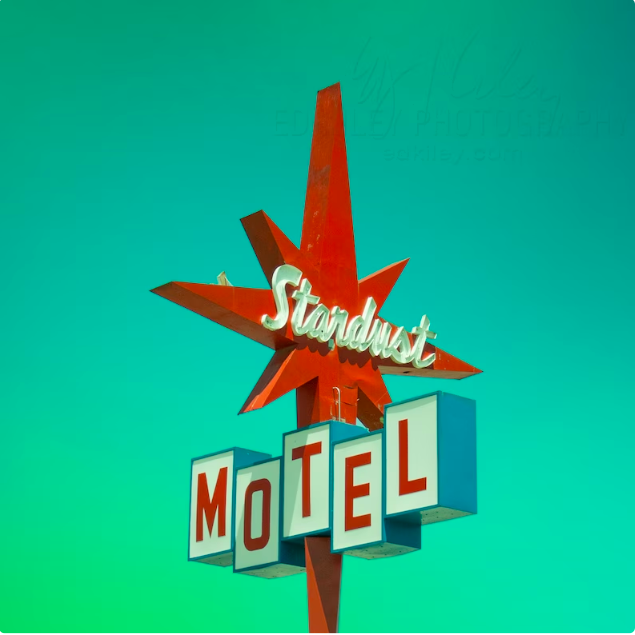
A sub genre of these signs refer to the atomic age, or space age, the designs during the time after nuclear bombs, and during the space race, that all share similar characteristics. These consist of clean, futuristic looks with a big focus on geometry and form. The signs from this age consist of bright pastel colors, large geometric shapes, and unique fonts. When I picture atomic age signs, ideas of space travel come to mind. These signs are very clean with topics focused around advancement or science, with shapes like rocket ships or atoms with big letters. One unique aspects I found are the signs containing the “starburst” (also called sputnik’s!) or large sparkle featured prominently.
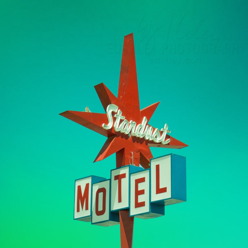
The Stardust Motel in Redding, CA, featuring a starburst. (5)
Another driving factor was the many new interstates connecting the country. Road signs appeared along these new highways, illuminating them. These are defined by their bright lights and fun characters. Neon provided highlights around words and shapes, while fluorescent bulbs filled in letters and made the signs pop. Their legacy continues on in throwback “Diner” signs, which capture this aesthetic quite well.
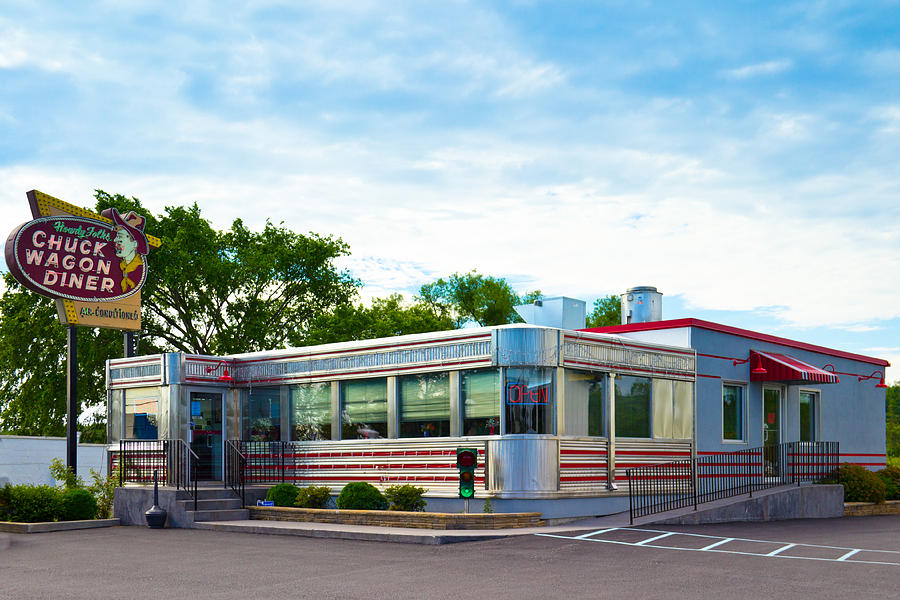
The Chuck Wagon Diner with a classic neon sign (6)
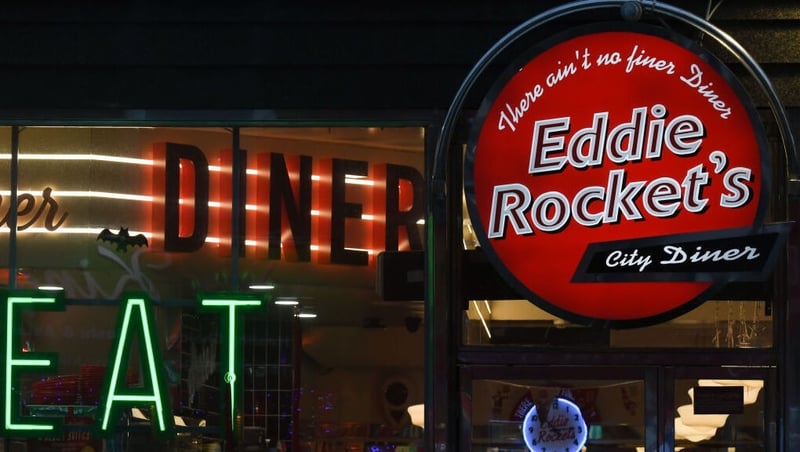
Eddie Rocket’s is an Irish, 50’s styled diner, showing the lasting legacy of these signs (7)
This style of signs fell out of style as the advancement of vinyl film caught up in the late 50’s. Eventually neon was replaced with LED and modern acrylics were brought in for bright plastics. This era of signage is now reduced to vintage, run down pieces of history scattered across the US, but we cannot forget how they ushered us into a new age of travel, of consumerism, and of the world.

A modern made, 50’s inspired sign (8)
Rescources:
- Mircea, Flaviu. “Signage through the Ages.” Medium, Medium, 14 Jan. 2019, medium.com/@flaviu.mirc/signage-through-the-ages-9e5e8bc06d25.
- “The 1950s – American Culture & Society.” History.Com, A&E Television Networks, www.history.com/topics/cold-war/1950s#1950s-pop-culture. Accessed 24 Jan. 2024.
- Street, Francesca. “America’s Vintage Road Signs: Neon Blasts from the Past.” CNN, Cable News Network, 25 Sept. 2017, www.cnn.com/travel/article/vintage-american-road-signs/index.html.
- “Atomic Age (Design).” Wikipedia, Wikimedia Foundation, 2 Jan. 2024, en.wikipedia.org/wiki/Atomic_Age_(design).
- Retrodee. “Collecting 1950’s: Signs of the 50’s.” Retro Dee’s Guide to the Best Era Ever, 8 Mar. 2021, retrodee.wordpress.com/2021/03/08/collecting-1950s-signs-of-the-50s/.
Images:
- “Historic Downey McDonalds Hamburgers Sign” by Northwalker https://en.m.wikipedia.org/wiki/File:Historic_Downey_McDonalds_Hamburgers_Sign.jpg
- “1950 Coca-Cola Sign • Antique Advertising.” Antique Advertising, 2 Sept. 2016, antiqueadvertising.com/free-antique-price-guide/antique-signs/1950-coca-cola-sign/.
- “Cafe Striper.”, by Thomas Hawk. Flickr, Yahoo!, 25 Jan. 2024, www.flickr.com/photos/thomashawk/3237498323.
- “Through the Lens of an Iphone: Seattle, WA.”, by Paul Gordon Brown. Pb, 2 Jan. 2023, paulgordonbrown.com/2015/12/11/through-the-lens-of-an-iphone-seattle-wa/.
- “Stardust Motel Print”, by Ed Kiley. www.etsy.com/ca/listing/571745057/stardust-motel-print-kitschy-mid-century?gpla=1&gao=1&utm_source=affiliate_window&utm_medium=affiliate&utm_campaign=ca_location_buyer&utm_custom1=_k_Cj0KCQjwguGYBhDRARIsAHgRm49wZ1LA9PQjgg3_5YRmQRi5rt0SjYixl7Zve-L6wtn1nyOMo0PX1A8aApV0EALw_wcB_k_&utm_content=468979&utm_custom2=318286125&gclid=Cj0KCQjwguGYBhDRARIsAHgRm49wZ1LA9PQjgg3_5YRmQRi5rt0SjYixl7Zve-L6wtn1nyOMo0PX1A8aApV0EALw_wcB&sv1=affiliate&sv_campaign_id=468979&utm_term=0&awc=6939_1706155088_d0575782462ba7c13e7bcbaaa0af5286. Accessed 24 Jan. 2024.
- “1950’s Diner” by Lynne Albright. Pixels, pixels.com/featured/1950s-diner-lynne-albright.html. Accessed 24 Jan. 2024.
- “Eddie Rocket’s”. RTE.Ie, RTÉ, 9 Nov. 2021, www.rte.ie/news/business/2021/1109/1258893-eddie-rockets-results/.
- “Lost in the 50’s”, by Retrodee. Retro Dee’s Guide to the Best Era Ever, 8 Mar. 2021, retrodee.wordpress.com/2021/03/08/collecting-1950s-signs-of-the-50s/.

2 Comments. Leave new
Hi Brandon,
I love the topic you chose. When I scrolled past it, I thought “wow, I’ve never even thought about it, but it’s so true.” My favorites are the ones you referred to as the “Atomic Age” signs. When I picture the era of signage from the 1950s, I instantly picture the Atomic Age signs. In general, it seems these signs are the ones most commonly referenced in modern day environments. I am curious to hear what your thoughts might be on why this seems to be.
Hello Brandon,
Your topic is super interesting and aesthetically pleasing! I really enjoy that you focused on a specific decade instead of just signage in general. Do you know why the bright colors, neon, and fun characters were so popular for signage during this time? Overall really good job!