Initial Ideas and Inspiration
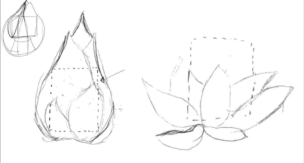
For my final project, I wanted to create a custom deck box for Magic The Gathering cards and was inspired by this flower night light. My initial idea was to create a deck box that opens like a flower. I decided on a natural aesthetic mirroring the real forms of a flower as closely as possible. This decision is intended to accent the deck contained within the box which is built around a card decorated with a serene field of lotuses. Below are some of my initial ideation sketches which helped me to understand how the form of a flower could be integrated around the negative space required for holding a deck. What these sketches revealed to me is that the box would have to be bigger than initially expected to maintain its flower-like form and that an automated method of actuation was probably not feasible without compromising the form of the box.

Figure 1: initial sketched ideas
Constraints and Vision
The most critical constraint for this project is that the final box must be able to adequately fixture and protect the cards contained within it. Initially, I thought the next most important constraint would be that it maintained the approximate size of a deck box, but as I continued exploring potential designs I realized this would compromise the flower-like shape of the box. As such I choose to prioritize a realistic flower-like aesthetic over the size of the box. I also realized that increasing its size would actually help me adhere to another critical objective, which was to make an eye-catching and visually interesting deck box. The abnormally large size would naturally help it to draw attention, and as such I choose to de-prioritize size as a critical constraint. One last constraint that greatly impacted my design was time, and my solution to decrease the time of manufacturing. In order to get the quickest turnarounds, I designed all my components to be manufactured on my own 3D printers at home. In order to achieve my aesthetic goal of creating an organic and natural feeling deck box, I choose to use realistic colors in the petal and base as well as nature like curves in my design. This aesthetic constraint drove much of the form of this deck box.

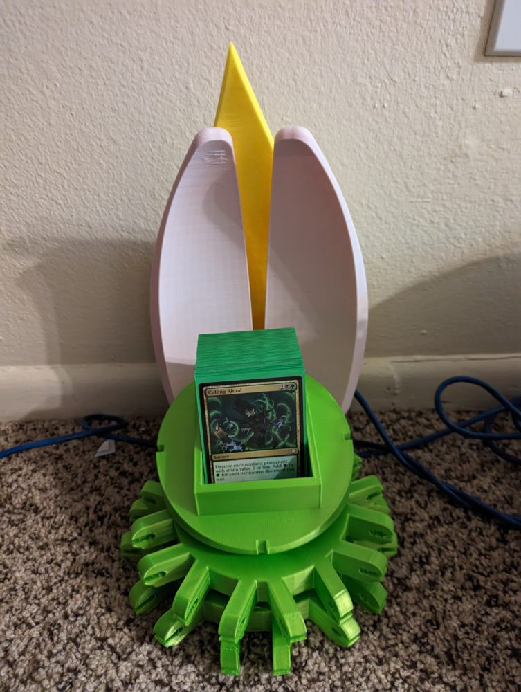
Figure 2: partial printed assembly
Final Design Plans
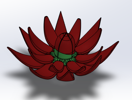
The final design I created consists of 8 outer petal components, 8 inner petal components, two base components, a spacer component, and two deck box components. The petals are attached to the base components by a 45mm M5 bolt and nut allowing them to pivot up and down for opening and closing. The outer pedals have small indents on the side to allow for 3mm magnets to be press fitted into them. This ensures the deck box remains closed when the petals are put in the upright position. The deck box imitates the most inner petals of the flower and is held together by a light interference fit. The use of magnets allows for no extra actuation or locking parts which keeps the form closer to a real flower. The colors used for the petals and base as well as the gloss of these materials were selected to imitate that of real petals and stems. Finally the curvy, organic forms mirror those of real petals, all helping to achieve my aesthetic goals.
Figure 3: final full CAD assembly

All CAD Files Below:
https://drive.google.com/drive/folders/1PPahVteOK-pv-Ze816EFsi72VBrF4rmY?usp=sharing

1 Comment. Leave new
Its cool to see that you stuck to your initial sketches as much as you could. was it difficult to print the petals?