
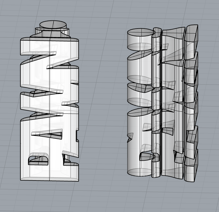
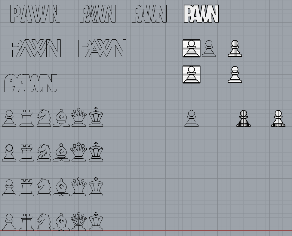
Whilst the technical aspects of my project shall remain unaffected by my chessboard’s aesthetic, the pieces are a definitive characteristic of the game. Inspired by this Blender artist, I decided to put my own spin on it by using the icons from chess.com and combining them with text saying the piece type (Pawn, Rook, etc.). I attempted to 3D model this design and decided it works better in a digital environment, and wouldn’t translate well in real life. The design was far too complex, and didn’t align with my Modern Vintage aesthetic. Instead, I chose to spend hours browsing Thingiverse for the perfect design. Alas, I did not find a design I absolutely loved, but I did find some useful inspiration.
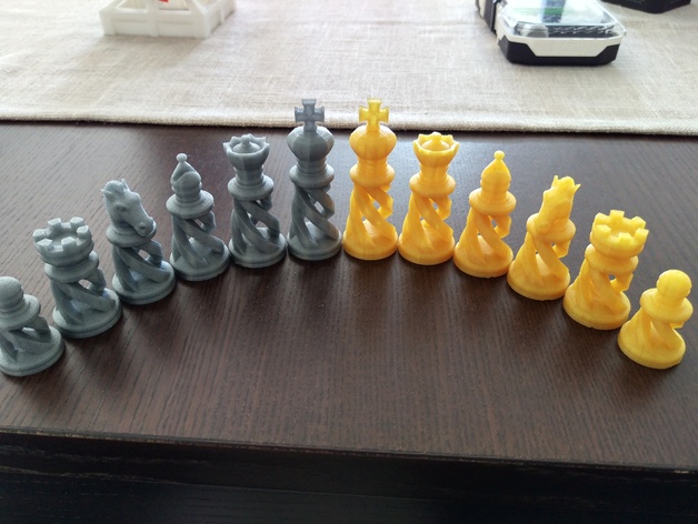
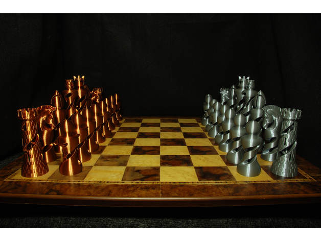
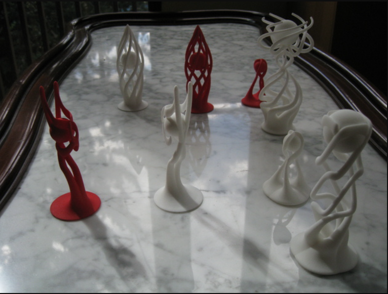
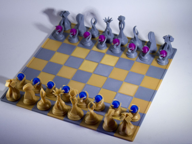
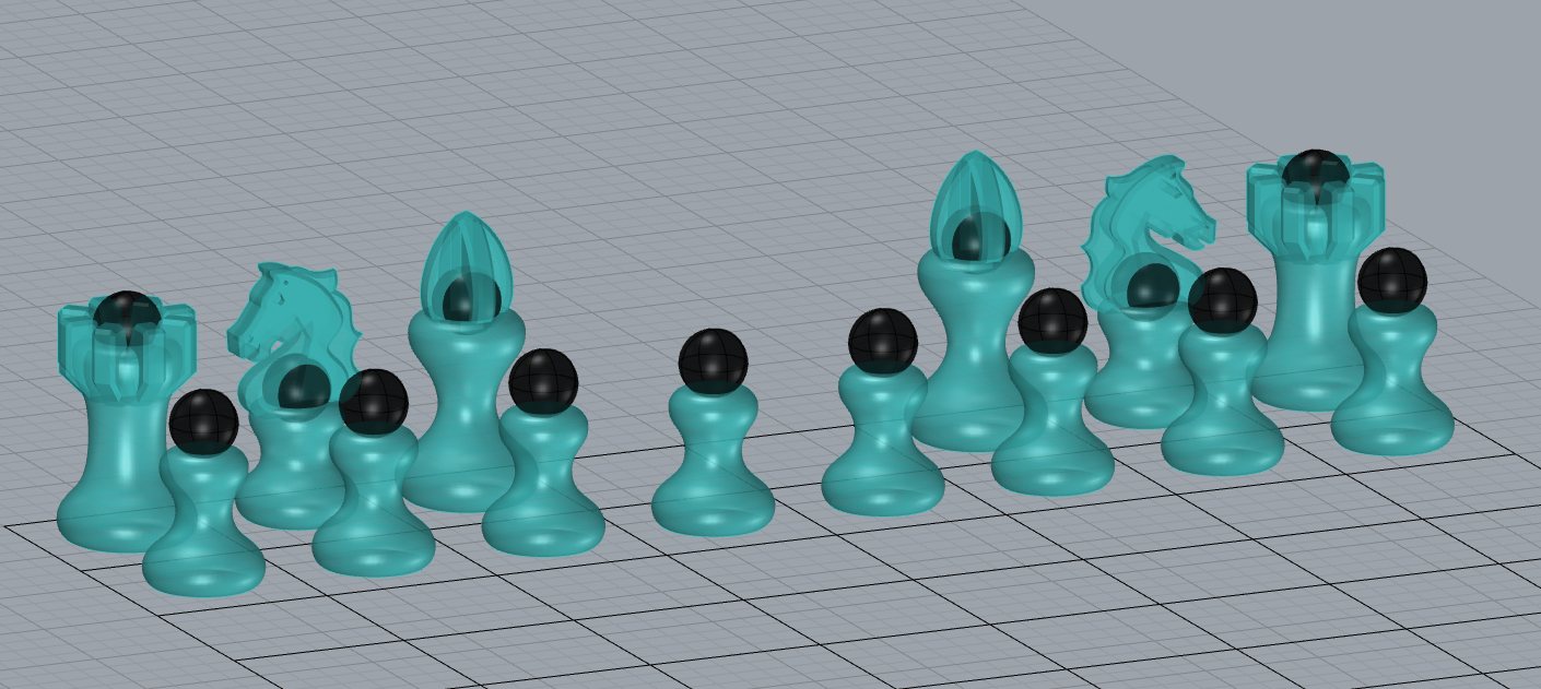
In particular, I was quite fond of the double helix present in these piece designs, maintaining the core characteristics of each unique piece, while giving them a more modern flair. Despite this being a great option, I had a particular image of the pieces in mind, and decided to 3D model them for myself. I also relish the idea of placing marbles inside each of the pieces, giving them some personality without losing their identity. So far, I’ve only modeled the Pawn, Rook, Knight, and Bishop, without the helix incorporated, and have yet to make the King and Queen. However, I am quite happy with the path of this design, and I believe it stays in line with my central aesthetic while still having some personal flair.
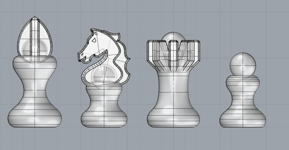
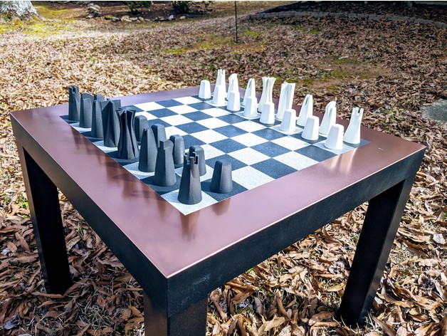
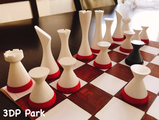
While browsing Thingiverse, I encountered several different aesthetic designs I could’ve approached for my chessboard. I quite like the Art Deco design, which simplifies the pieces into more natural, organic shapes. However, I think these designs would be a bit hard for beginner players to differentiate and recognize as the iconic pieces they know. It is still a fun concept that more closely lines up with my Modern Vintage aesthetic, but sacrifices my main goal of creating a chessboard for beginners. Alternatively, there are the more dramatic and abstract designs, which really push the boundaries of how chess pieces can be identified. I quite like these creative takes, and both designs were the inspiration for my idea of including marbles in the pieces. I wanted to create a blend between these two aesthetic styles, honoring their core traits while still creating something new.
[3] https://www.thingiverse.com/thing:1094870
[4] https://www.thingiverse.com/thing:3547967
[7] https://www.thingiverse.com/thing:4181010
[8] https://www.thingiverse.com/thing:3844162
[9] https://www.thingiverse.com/thing:952393
[10] https://www.thingiverse.com/thing:1732292

9 Comments. Leave new
[…] a party or game table, or even an office workstation. Crafted from solid wood, it boasts a unique chessboard design that blends style and retro charm. With dimensions of 140cm x 80cm x 74cm, the spacious […]
Hi Perry
It’s fascinating to read about your journey in designing your chess pieces. It’s great that you are exploring different aesthetic options and finding inspiration from Thingiverse designs.
It’s also interesting to see how you considered the practicality of the designs for beginner players and the importance of maintaining the iconic pieces they know.
Good luck with the rest of your design process!
Thanks Abhishek! I was surprised with the lack of variety for chess piece designs on Thingiverse. I know many other versions exist, but I still wanted to bring my own to life. Unfortunately, I do not think I will be able to print my designs in time, but that’s definitely a future goal!
I like the varied design consideration you did for your pieces. I have a glass chess with transparent chess pieces, at the time I bought, it was most unique chess design I got to see on local market. It is nice to see unique designs in your post. I love chess & excited to see how your project turns out to be!
Thanks Rishabh! I also have a glass chess set at home. I think the design is very eye-catching and works as a great centerpiece in my living room. I can’t wait to replace it with this new Chess Board though
I like the consistency on the marble placement in terms of chess theming. You’ve achieved a consistent set of physical motifs throughout the pieces.
Thanks Will! Ensuring the marbles were a consistent design element that didn’t distract from the core identity of each piece was a definite priority for me.
I really love the wide variety of unique styles here – the concept of the PAWN spelling fitting into its shape is clever and certainly provides for a distinctive set of pieces. Playing around with chess pieces is interesting because you must also strike a balance between creative and different aesthetics of expression and practicality, as the pieces have to be recognizable by certain well-established motifs and patterns. I am excited to see what you create!
Thanks Nate! I was quite enthralled with the PAWN lettering concept, but it serves as a great example of the difference between digital and physical fabrication. I still found a way to incorporate those 2D versions of the pieces into my final Chess Board, so this was exploration was definitely a necessary step in the process.