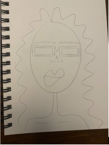
Alternative Aesthetic 1: Minimalism
If I were to do my project in a minimalist aesthetic, it would feature neutral colors, simple frames, and no additional decorative elements. The main focus would be creating a low profile, functional item.

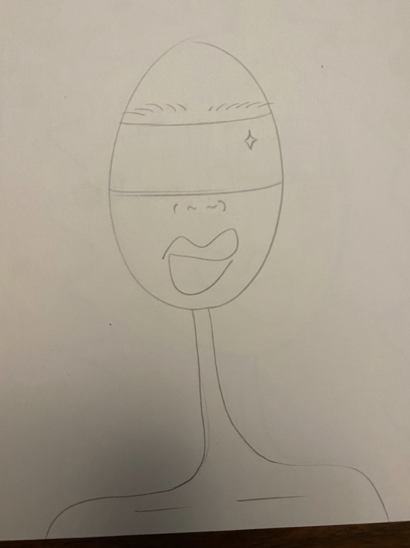
Alternative Aesthetic 2: Futuristic
If I were to do my project in a futuristic aesthetic, it would have uniform design features, have a reflective surface, and take up more space on the users face. This would create a mysterious and robotic feel to the design.


2 Comments. Leave new
I really like the style you used for both of these sketches, and I think both aesthetics would look great, no matter which one you choose. I’m not sure if I’ve seen your other posts about this though. What is the dynamic component you plan on incorporating into the design? Is it going to be 3D in some way? I’m excited to see what you do.
I like your drawings and your ideas about other aesthetics you could try. I am a big fan of the glasses added to the futuristic aesthetic. What material would the frame be made out for the minimalistic aesthetic?