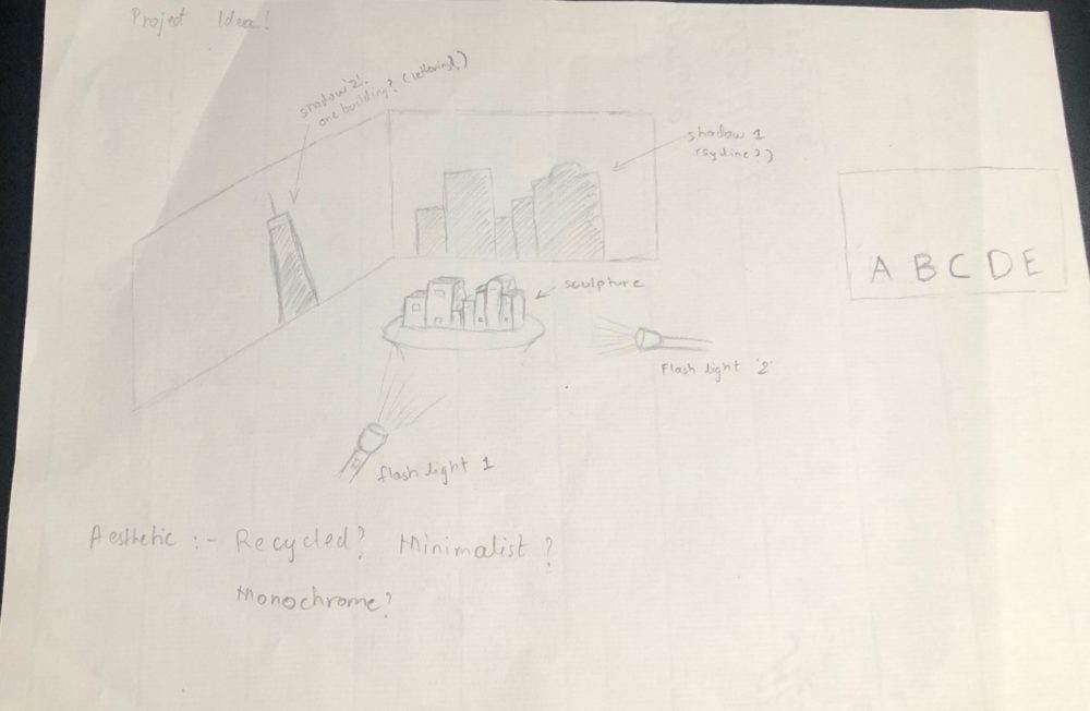
 Following up on my aspiration of creating a sculpture that is both Anamorphous as well as is able to generate a meaningful shadow, I have come up with the following project plan. The most difficult part till now was the figure out exactly what sculpture should I design that can fit both the briefs. After considering the time remaining in the semester, I decided to keep it extremely simple (unwillingly). The idea is to create a front view of the sculpture resembling of cramped up buildings which will project a shadow of a city skyline. The same sculpture will be carved/modified from the side to cast a shadow of either one peculiar building or maybe the city name or a famous food item (undecided yet).
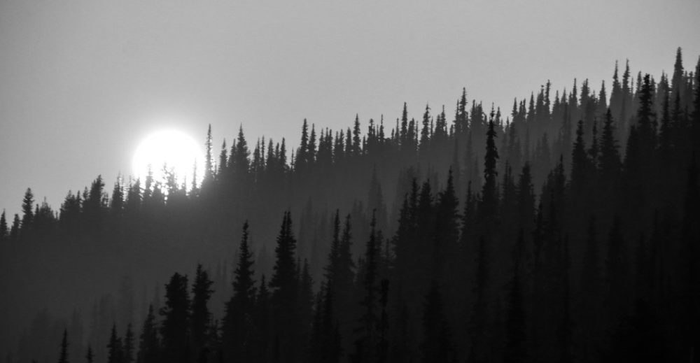
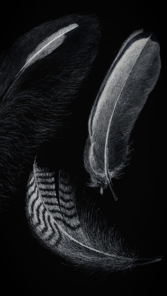
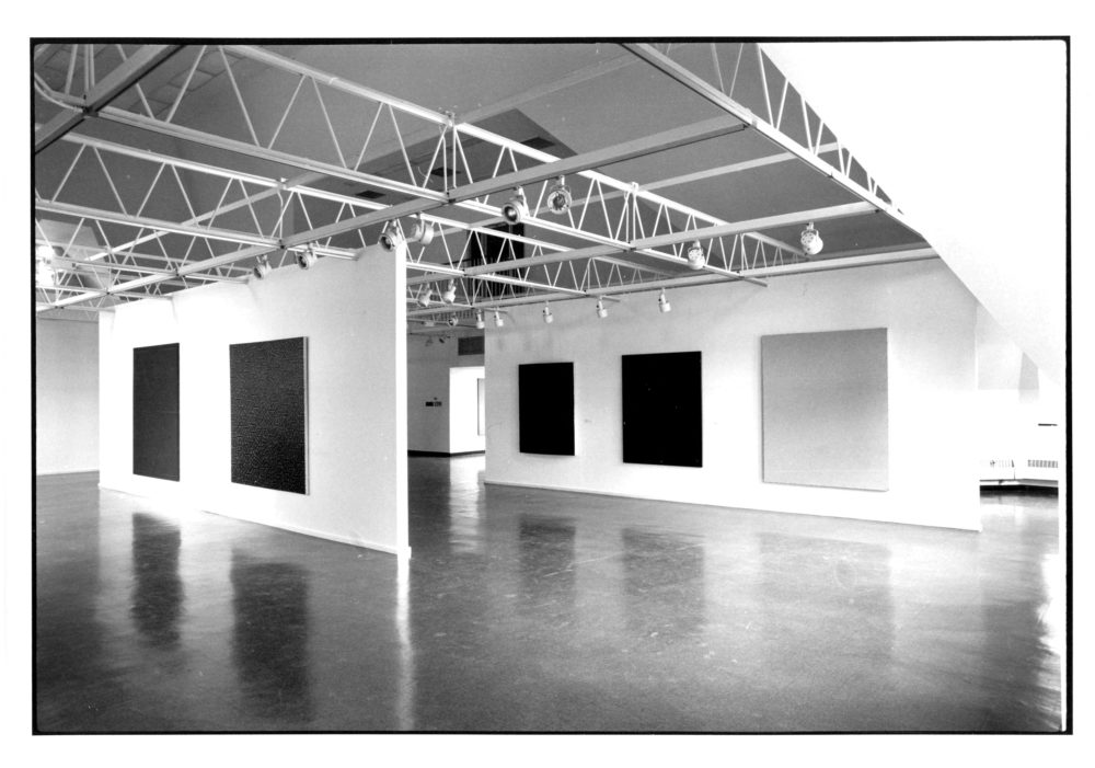
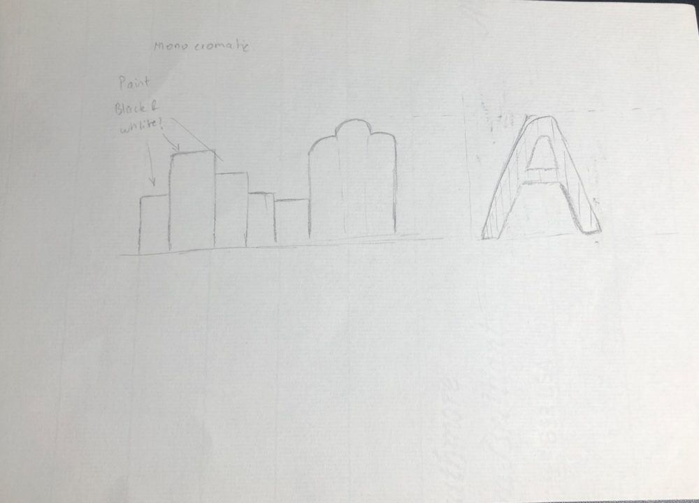 The next difficult task was to fit this artifact into a certain aesthetic. Honestly, just getting the sculpture down took most of my time to think of an appropriate aesthetic. But I plan on sticking to the theme of simplicity as the design and construction of the artifact is complex enough. As the artifact celebrates the harmony of light and shadow, the first thought to cross my mind is monochromatic. Monochromatic aesthetic in terms of decorating, means that the color will be represented in a few different hues, tints, and shades to elevate and create a specific effect throughout a space. And If i stick to light and shadow, monochromatic aesthetic gives me the best tools to celebrate every tone from bright white (light) to black (shadow) and every grey in between.
Another thought that followed the monochromatic aesthetic, which can make my task even more simpler is to wrap the whole artifact with a barcode.It is more of a minimalist approach having a white background with solid black lines varying in thickness. In my view, it can add another dimension to the artifact, but I am still undecided on which one I might pursue further.
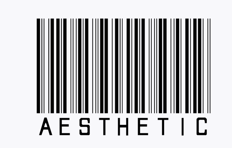
Image Sources:
Featured Image : (https://www.wedgeandlever.com/work/upton-mmxv-campaign/)
Monochromatic 1: (https://cloud9marketing.ca/blog/less-is-more-monochromatic-minimalism/)
Monochromatic 2: (https://www.peakpx.com/en/hd-wallpaper-desktop-fypii)
Monochromatic 3: (https://renaissancesociety.org/exhibitions/299/in-the-realm-of-the-monochromatic/)
Barcode 1: (https://picsart.com/i/sticker-300911620332211)
Barcode 2: (https://wallpaperaccess.com/barcode)

2 Comments. Leave new
The concept of different directional perspectives giving very different images is fascinating. To what extend do you envision using the shadows as the primary focus vs the sculpture itself to fulfill the aesthetic you desire?
I’ve experimented with making amorphous sculptures in the past. They’re a surprisingly difficult, yet fun, challenge to 3D model! I found that the clarity of the shadows cast by the object can vary highly depending on lighting and the distance the object is from the below surface. I would recommend taking this into account when considering the size of your final product.