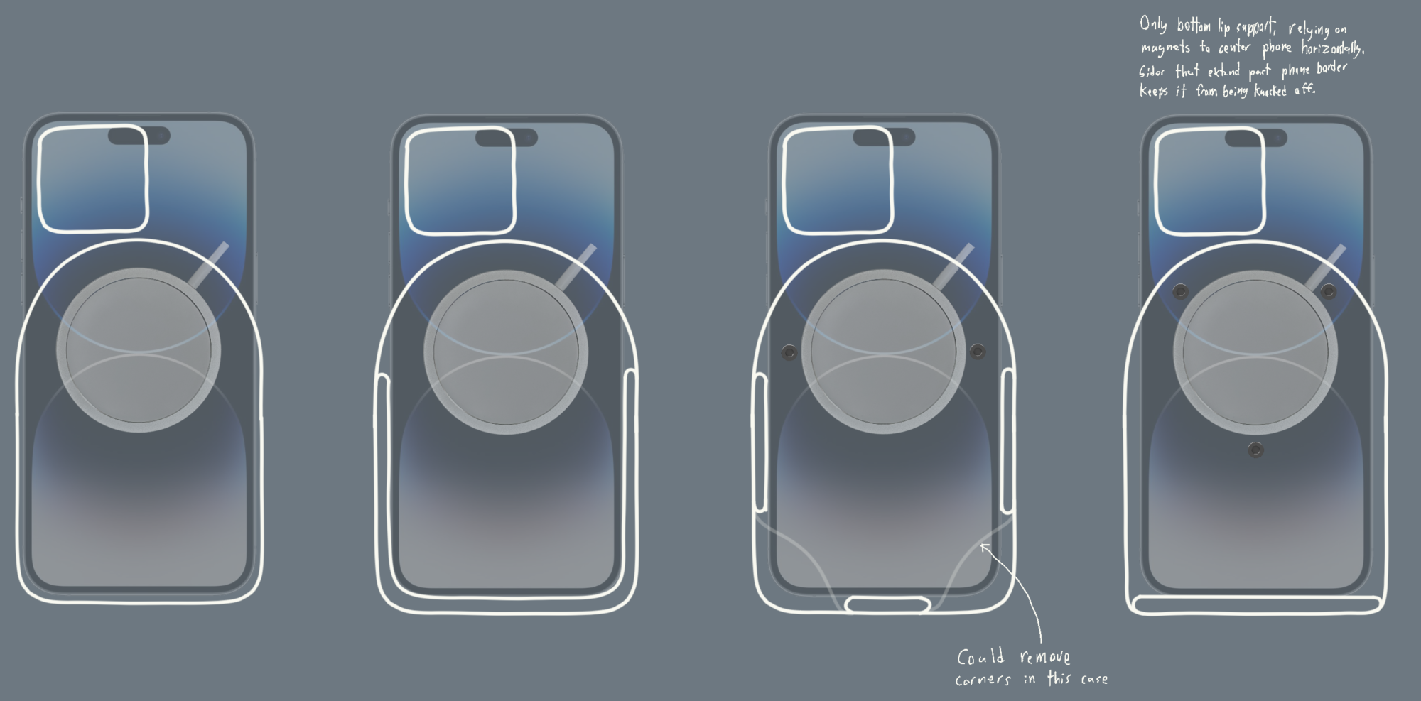
Sketch your project in two wildly different aesthetics than the one you are planning.
 Here are a couple quick sketches. One in a modernism style, and the other in a gothic revival aesthetic. The modernist version cuts down on unnecessary edges and features. Meanwhile, the Gothic Revival rendition has a bunch of quatrefoils because they were terrified of negative space and had to make everything look like a church.


2 Comments. Leave new
Hi,
I enjoyed reading your post and looking at the renders. Do any of the alternative designs sacrifice important features over your original design? You mentioned for the modernist design some features are removed, are any of these critical to the wireless charger working according to your specs?
I am kinda confused about what this project is supposed to be. I am assuming its a phone holder. I am curious if there is a reason modern and gothic stood out to you the most.