I considered two alternative aesthetics to my retro futuristic alarm clock project. The two other aesthetics I considered were minimalism and space age. Below are sketches and ideas I had related to those aesthetics.
Minimalism
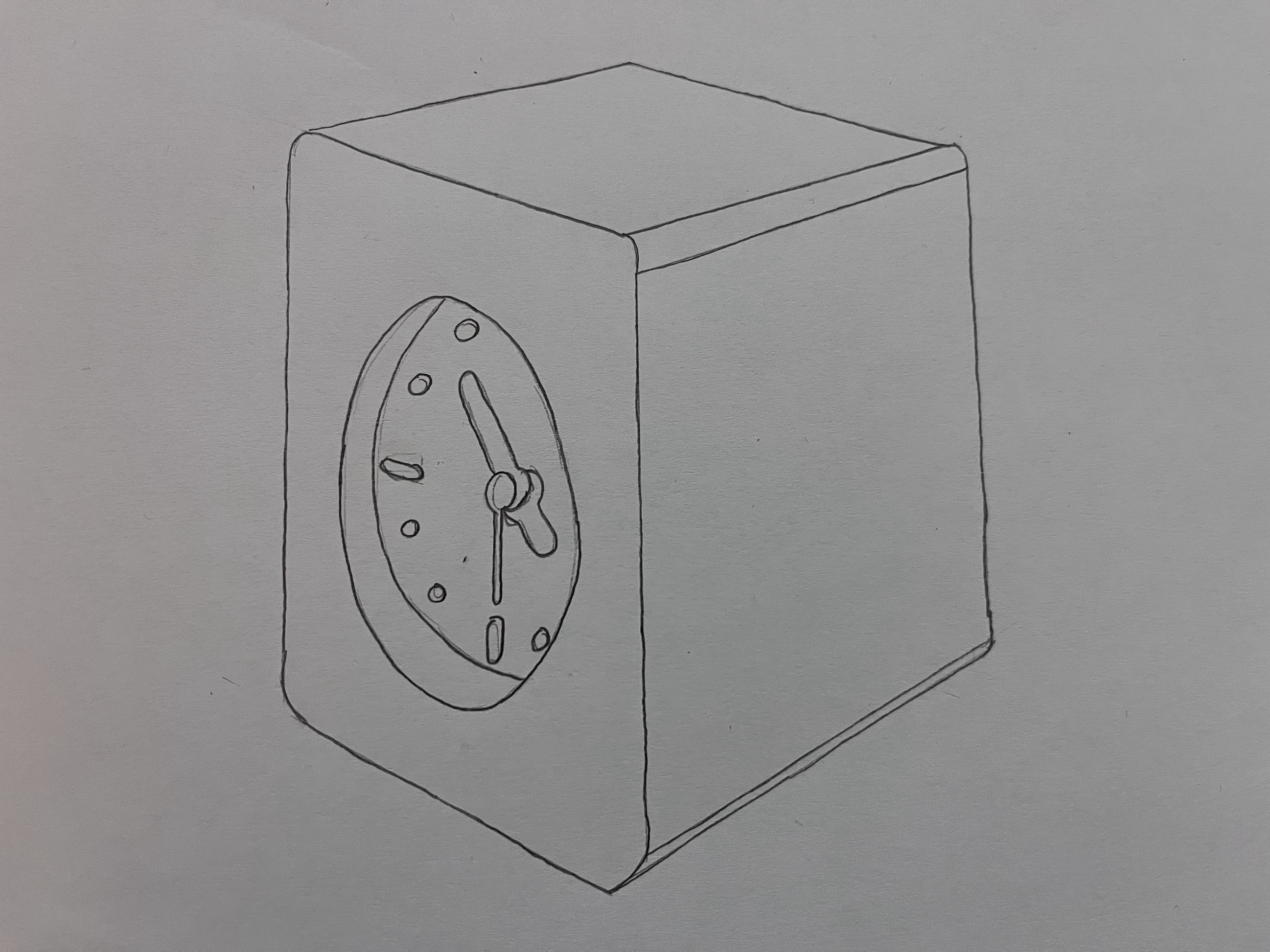
Minimalism is a concept of only having what is absolutely required. In a way, it is similar to utilitarianism, where only what is needed is provided and nothing more. This aesthetic would work with the conceptual alarm clock I desire because it is not distracting and blends well in to any environment. I have sketched a design I believe would be minimalist and meet my project requirements.

Example of the Minimalist Aesthetic [1]

Sketch of Minimalist Alarm Clock
As you can see, the design features only the bare necessity: a clock face. There are no dials or switches for this clock. This may seem impractical but because I want to make my clock WIFI enabled and part of a great Internet of Things (IoT) I am creating, all settings can be configured externally from a computer. This lends well to the minimalist design because it removes the need for anything but the bare essentials on the device itself.
Space Age
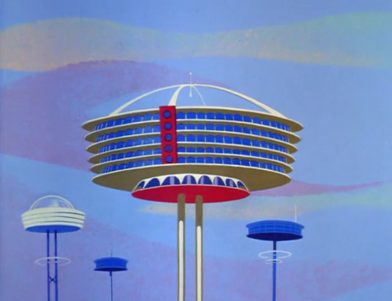
The “Space Age” was an aesthetic born post WW2 with the advent of nuclear power and a desire to explore space. A familiar representation of this aesthetic can be seen in the cartoon “The Jetsons”. I included a picture of an electric cooker from the 1960s that I believe best exemplifies this aesthetic.

“A Party Chef electric cooker by Cory from the 1960s”, NPR [2]

“The apartment building shot that opens most episodes of The Jetsons” (1963) [3]

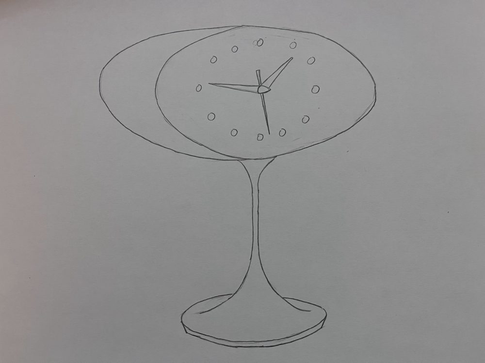
Sketch of Space Age Alarm Clock
This clock design fits the space age aesthetic with its sleek curves and oval shaped clock face. Buildings in “The Jetsons” look impossibly made with large, circular structures supported by narrow supports. I wanted to emulate that look in my clock design.
References:
[1] – https://blog.shillingtoneducation.com/minimalist-graphic-design/[2] – https://www.npr.org/2011/07/14/137763046/out-of-this-world-designs-of-the-space-age
[3] – https://www.smithsonianmag.com/history/mid-21st-century-modern-that-jetsons-architecture-2494820/

2 Comments. Leave new
Hi Nic, I kind of like the Jetson, space aged alarm clock, but I think it would be impractical. I would knock it over all the time. For the minimalist version, I think you could go even more minimalist. Who needs hour markers or fillets on the edges. Reject circle, Embrace cube.
I really like the clock design for the space age aesthetic. It might clash with its surrounding but it’ll look very cool and different compared to most other objects in our lives.