When thinking about my project and how I could make it look drastically different given limitations I have, I thought of a minimalist vs maximalist aesthetic difference in the geometry, layout and color of my design.
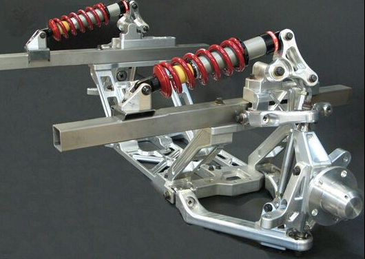
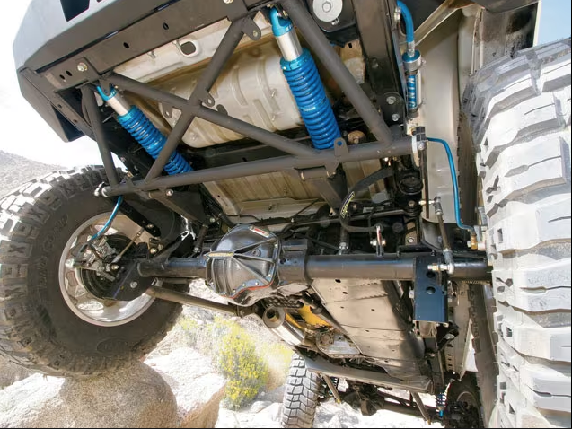
For a more minimalist and hidden aesthetic, I would have the suspension components be positioned parallel to the length of the car. They would be on each side of the car and as far out of the way as possible. The colors of the components would not stand out much and either be unpainted metal, muted colors or paint matched colors. While still attention grabbing, the suspension might not be the center of attention and noticeable. The upper portion of ref [1] and ref [2] show the general geometry I’m thinking of for this aesthetic (the suspension would not be under the car like in ref [2]). While still being a showpiece that grabs your attention when you see it, these designs don’t scream “look at me”.
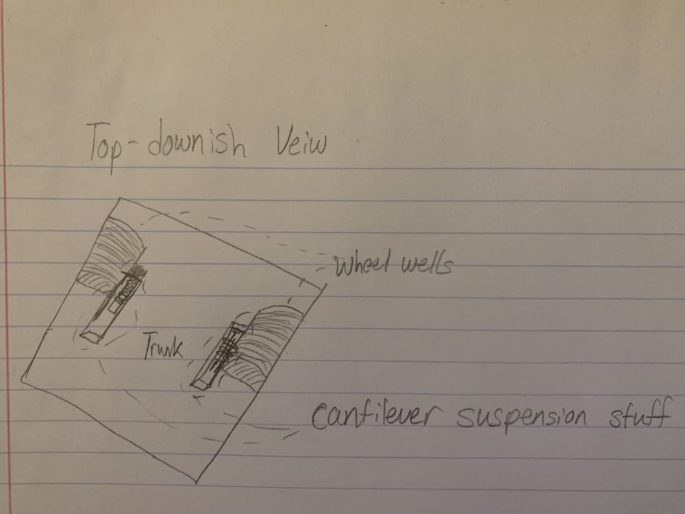
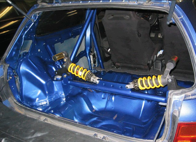
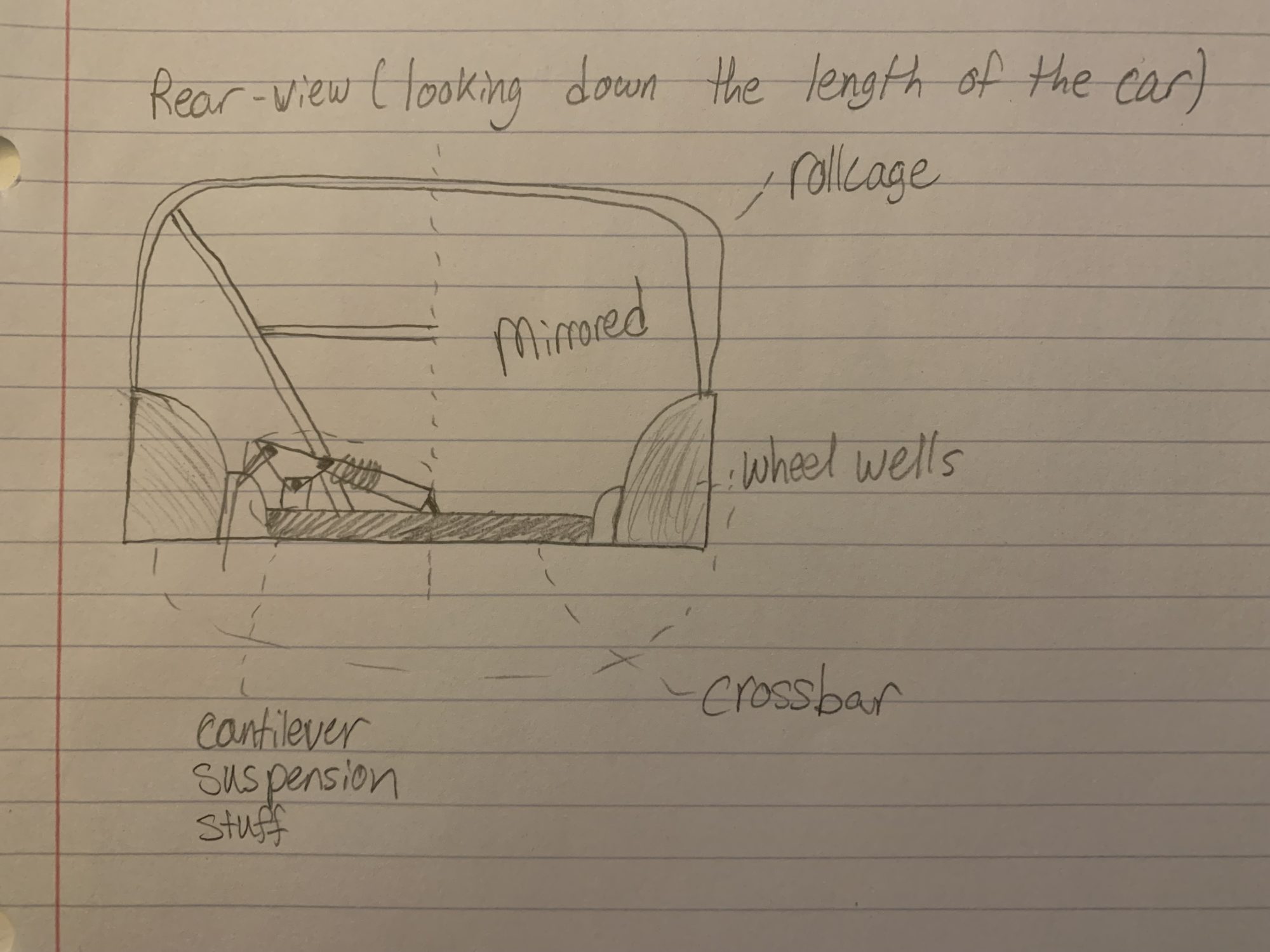
For the maximalist and more eye-catching aesthetic, the suspension components would be positioned perpendicular to the length of the car. This would be similar to most cantilever suspension setups for the rear suspension and be the center of attention when looking into the rear of the car. The suspension components would be brightly colored and contrast against the interior colors to pop more.I would also implement a roll cage element into the design by connecting the crossbar and roll cage together some way for example. The Image from Ref [3] shows what this would generally look like. The suspension would be right in the middle of your view and the yellow springs of the coilovers contrast with the blue interior paint and black seats.

I think I’ll probably design something in between these two aesthetics.
References
- https://www.pinterest.com/jakebrake9/cantilever-suspension/
- https://www.motortrend.com/how-to/131-0809-jeep-wrangler-jk-evo-lever-coilover-suspension-kit/
- https://forums.nasioc.com/forums/showthread.php?t=2452016

6 Comments. Leave new
I really like what you’ve done; I can’t wait to see what the CAD/templates will look like with your vehicle. Do you plan on 3D scanning the original undercarriage to get an idea of sizing and fitment or are you going to just measure everything out by hand?
Thank you! I tried 3D scanning the trunk to help prototype sizing and fitment stuff in CAD but the scans from the ITLL iPad were not great and merging them was not working so I gave up. I’m just going to measure everything by hand which I don’t think will be to great of a challenge.
Hey, It’s clear that you’re putting a lot of thought into the design and considering how the suspension will fit into the overall look of the car. I think you’ve done an excellent job of exploring different aesthetic options for your project, and I’m excited to see how it turns out!
Thank you! I’m extremely excited to design and work on this and try to make it in time for this class.
Hi Austin. I’m super excited to see this as it starts to come together. I think the maximalist approach with the contrasting colors would work awesome here. This suspension modification seems to be very in-depth and I think contrasting colors would help to highlight the function of your design. Since they are a showpiece of the car I think they should be highlighted.
Thank you! I also think the maximalist approach works better and having contrasting colors would help make the design pop.