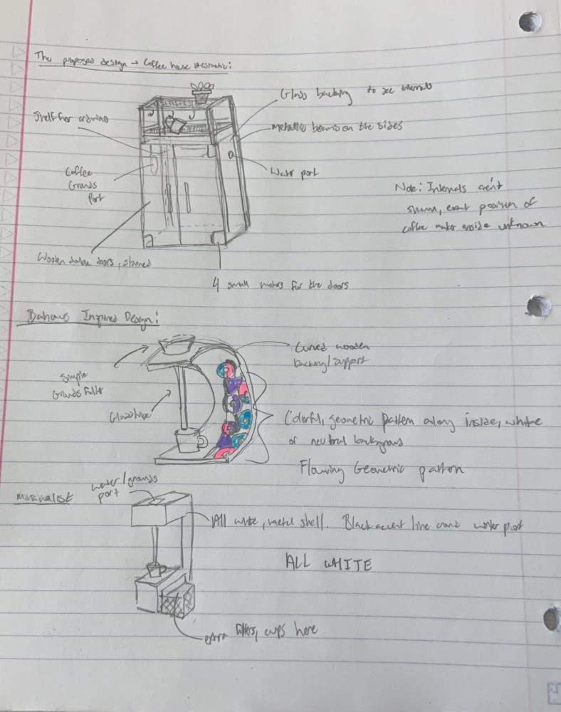
My automated coffee maker will likely utilize the coffee house aesthetic, and have wooden doors, a glass backing, and dark metallic beams on the side. The top will have a rack for cups and small plants as well, bringing greenery into the space. I have discussed this piece in more detail in my previous post.
In the image below, I sketched this primary design as a reference to what I am envisioning for my piece, and then continued on with my exploration of aesthetics.
The Bauhaus style has long been an interest of mine, as the flowing geometric shapes can be easily propagated, and yet, are all unique in their own way. The flowing pattern is subtly maximalist, and bring a nice color to whatever space they are a part of. I sketched out a Bauhaus-inspired coffee maker directly below, complete with a rounded shape. The rounded shape is really key to the Bauhaus aesthetic, as most of his chairs and furniture pieces feature subtle curves.
My second aesthetic exploration was looking into the minimalist aesthetic. This aesthetic is generally considered modern, and features a solid color scheme, usually in all white or black. This aesthetic is typically used within modern homes or gaming computers, and is well-liked with the public due to its sleek features.
I still believe that I will stick to the coffee house aesthetic as I want this piece within my home, and most of my other furnishings are in the coffee house aesthetic as well. Should I have different furnishings, I believe that I am more lenient towards the Bauhaus aesthetic, as I prefer the geometric patterns over the harsh simplicity of the minimalist design.


4 Comments. Leave new
I love the design choice, and the project choice. It’s cool, interesting, and has a utility factor which is pretty cool for this project. If you need any help testing it’s functionality you can always hit me up lol.
Thanks for the encouragement!
I like your aesthetic exploration pertaining to a specific product, the automated coffee maker. The Bauhaus aesthetic I feel like is not one we see much anymore these days. It seems that most companies are too focused on materials costs and manufacturing efficiency rather than ergonomics and aesthetics. Of course, some of these aesthetic design products exist on the higher end but it would be nice to see some affordable options as well. Is it just me or is the scale entirely different for your drawing in the coffee house aesthetic vs the other two? I’m excited to see what you make!
That’s a great point! I agree that the material cost is really the limiting factor on the lack of interesting and complex aesthetics today, but hopefully, with some innovative engineering, these complex pieces can become more accessible to the public. It’s meant to be the same scale as the other two, but I think it just looks smaller as I wasn’t too exact with my drawings. Thanks!