My original project design took inspiration from mechanical swiss watches. These are very complex and have an emphasis on the finish of the metal on the gears and back plate of the watch as well as exposing the internal workings of the watch so the craftsman ship can be seen. This also includes high lighting the bolts that hold everything together because the size of the fasteners are incredible on their own.
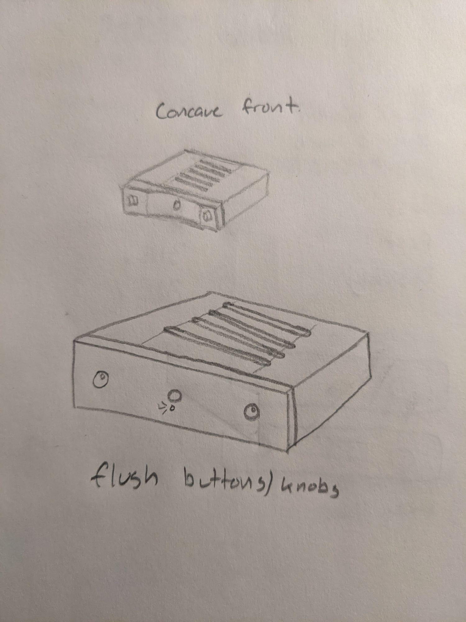
My first alternative design took an opposite approach to the watch aesthetic by covering everything and hiding the features to make a minimalist looking amplifier face plate. In my original design the knobs and power button were incorporated into the design and extended out from the aluminum panel, but in this design the knobs and power button are counter sunk so they sit flush with the surface. The knobs would have a small dimple in them so the user can still operate the knob by turning it with the tip of their finger. I would try to have as small of a gap as possible between the panel and each of the knobs and buttons to create a seamless look to it. To finish of the piece, the surface would be sanded/brushed with all of the pieces in the same direction to add a uniform finish over the whole face which would also act to hide the knobs and buttons.
The knob would have a small dimple like the one above, but instead of having rounded features the one I would make would be a right cylinder with sharp corners to sit more flush with the aluminum panel. Also it would be raw aluminum, not black.

The last operation I would do would be to add this finish to everything at the end.
The second design takes a more post modern aesthetic by anodizing the aluminum black and adding a curve to the front to add dimension and depth to the front panel. On either side of the curve would be a knob, one for volume and another for input selection. Right in the middle of the curve would be the power button in a bold and isolated way. All of the corners would be filleted and it would have a sand blasted finish to soften the look and incorporate the piece into the background a bit more.


2 Comments. Leave new
I appreciate your consideration of a complete aesthetic reversal. I like both ideas, either completely hiding inner workings, or showcasing their beauty. Excited to see which you choose. How did you come up with the idea of using the Swiss watch aesthetic in this medium?
Hi Cameron,
I really like both of the ideas you have proposed. Each have promise for accomplishing their intended aesthetic. I personally am biased towards function over form and having the knobs flush with the front panel might impact the user functionality but each is clearly a personal design choice. I’m excited to see how this turns out!