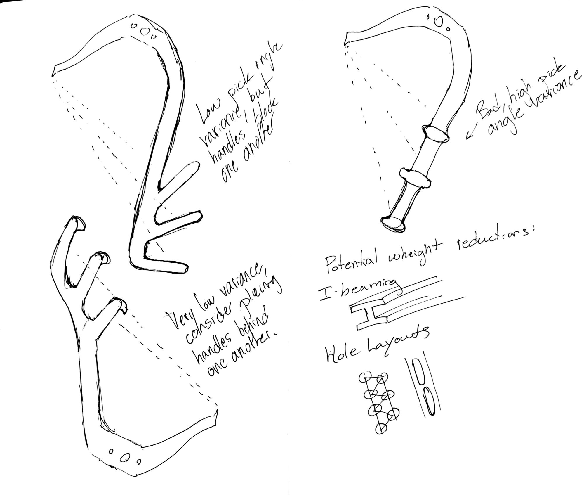
As I mentioned in my last post, my final project will be to design and build a pair of ice axes. On this front there has been some progress, I have my cad model finished and refined, and I’ve allocated some material with a classmate’s (Elvin’s) help. I’ve also reverse-engineered the pick I’ll be using: Petzl’s Pure Dry competition-style dry tool.
However, today’s post is about aesthetics. The fundamental shape of an ice tool is defined by its function, and so there will always be an element of functionalism in the design, however, in the finishing details and specifics of the handle layout I believe there is room for alternate aesthetic expression.
The UIAA, the governing body of competition ice climbing and dry tooling, establishes a set of standards that all tools must meet to be used in competitions (where I intend to use mine). However, it’s a short list, there’s lots of room for iteration. A tool only has to:
- Have no mechanical attachment to the hand or wrist
- Fit in a 50 x 30 x 6.5cm box
Obviously, there are vastly more practical considerations for the tool, from the geometry of the pick angle, the grip spacing, pommel protrusion, ect. ect..However, within these constraints, I decided to sketch some options.


1 Comment. Leave new
Hi Aidan. Can you talk more about the aesthetics, and how different aesthetics might be incorporated? Etched designs on the side, for example? What would you want there? Overall colors perhaps?