For my main project, I plan to make a lotus blossom shaped deck box for Magic the Gathering Cards. The dynamic component of this project is that as the box opens, the flower blossoms to reveal the cards contained inside. This means that the outer housing of the box will be composed of multiple layers of overlapping petals joined to a vertically actuating base plate. This method of actuation seems the most feasible and was inspired by this Blooming Flower Night Light from Make Magazine. However, if possible I would love to include a rotational effect in the blossoming in which the petals rotate about the vertical axis as they unfold. As of yet I do not have a plan for how I would accomplish that added level of dynamism, but will be exploring solutions in the near future.
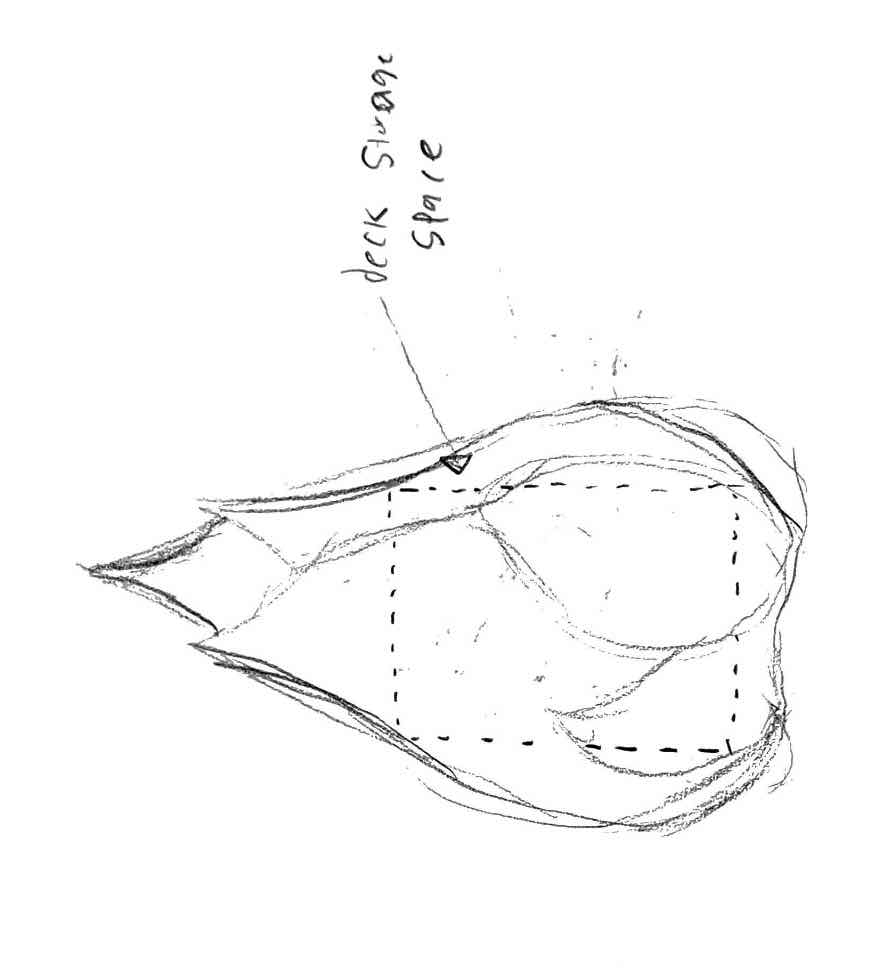
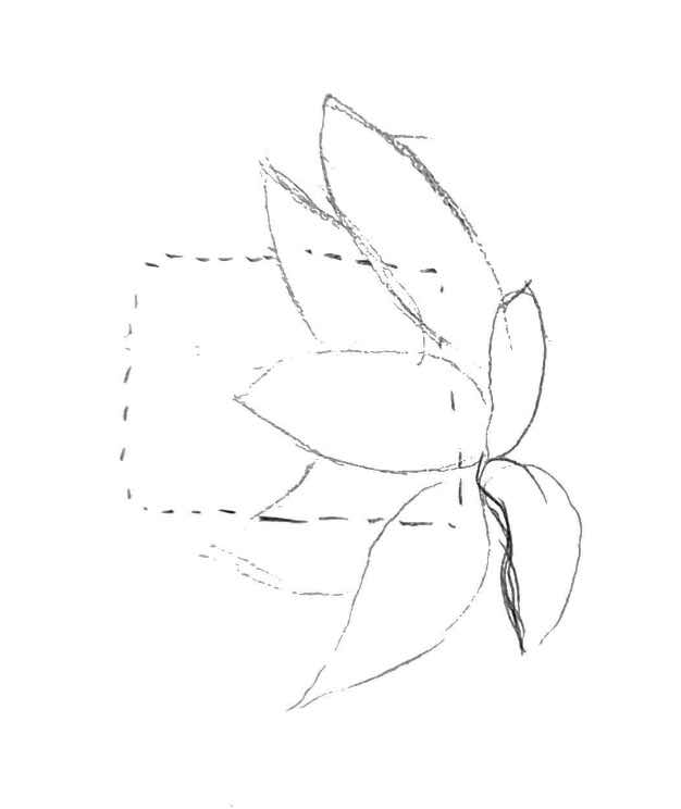
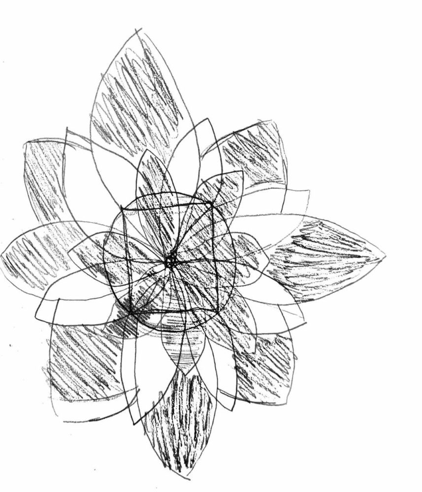
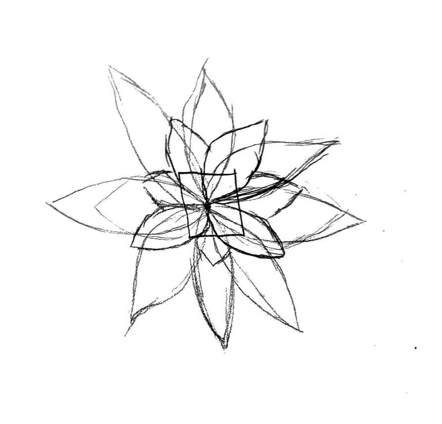
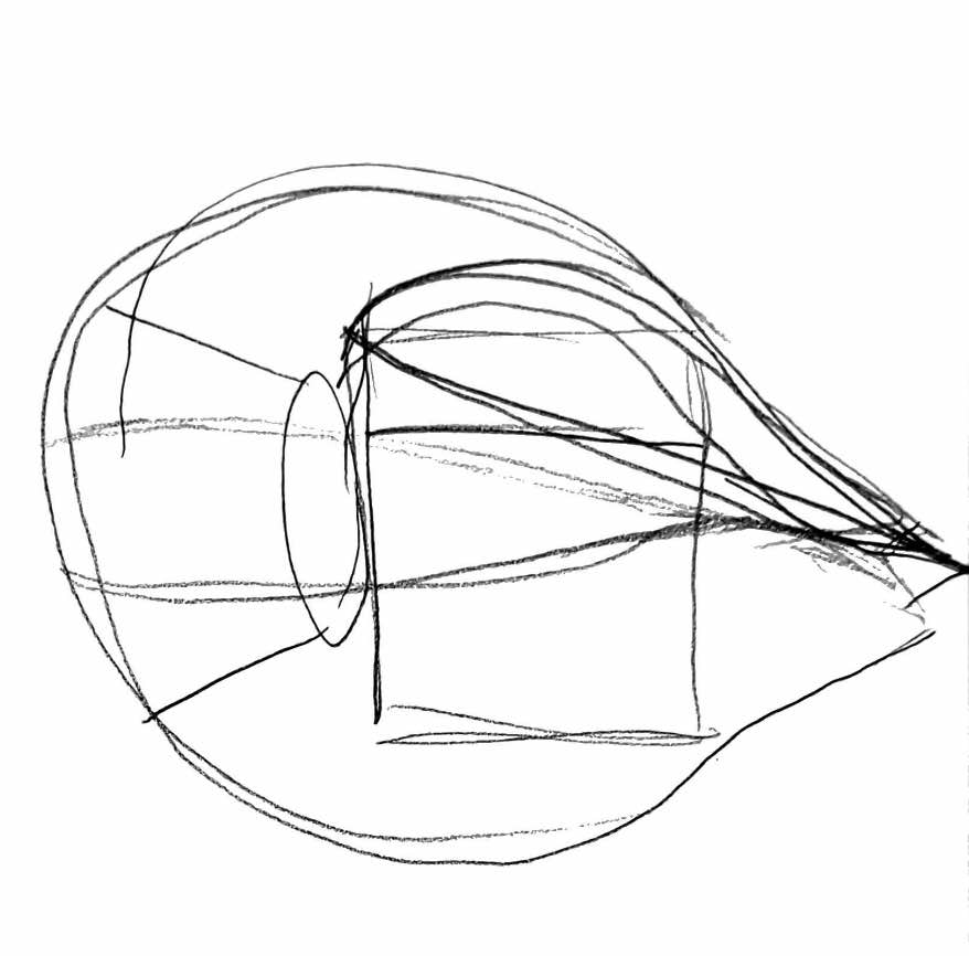
Figure 1: Initial Prototyping sketches
In terms of manufacturing, I plan to prototype the design in 3D printed PLA to help me rapidly iterate it, but if time permits I would like to manufacture the final design with a higher quality plastic or metal. I plan to make the opening mechanism completely mechanical, but in the event this ends up taking up too much space in the design, I am considering the use of a small microcontroller and stepper motor to create the dynamic actuation.
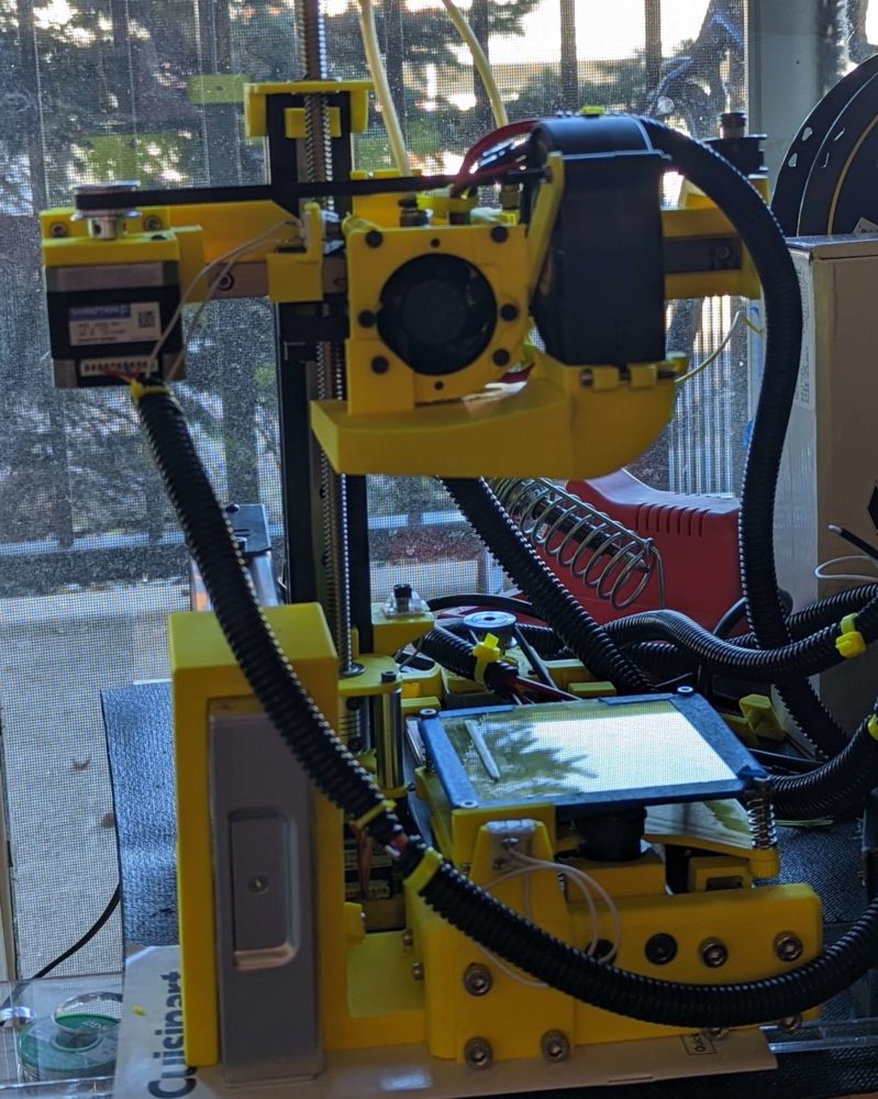
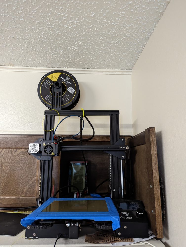
Figure 2: Available prototyping machines
I have a variety of ideas for the aesthetic of this project and am still debating which is most appropriate for the design. The goal of the aesthetic of this project is to highlight the unique features of the deck that it will house. The deck centers around a set of artifact cards and a land card called Lotus Field. One of my current top aesthetics would be a nature centric aesthetic in which the box is designed to look as close to an actual lotus flower as possible. This would further highlight the central card of the deck and harmonize with the art on the said card. My other top aesthetic would be to borrow cues from the design of the artifacts in the deck which sit somewhere between Art Nouveau and SteamPunk in their appearance. This would allow the design to highlight both the central card of the deck and some of the larger themes of the general cards in the deck. As of now I lean more towards the later aesthetic but will continue to explore potential aesthetics for the final iteration.
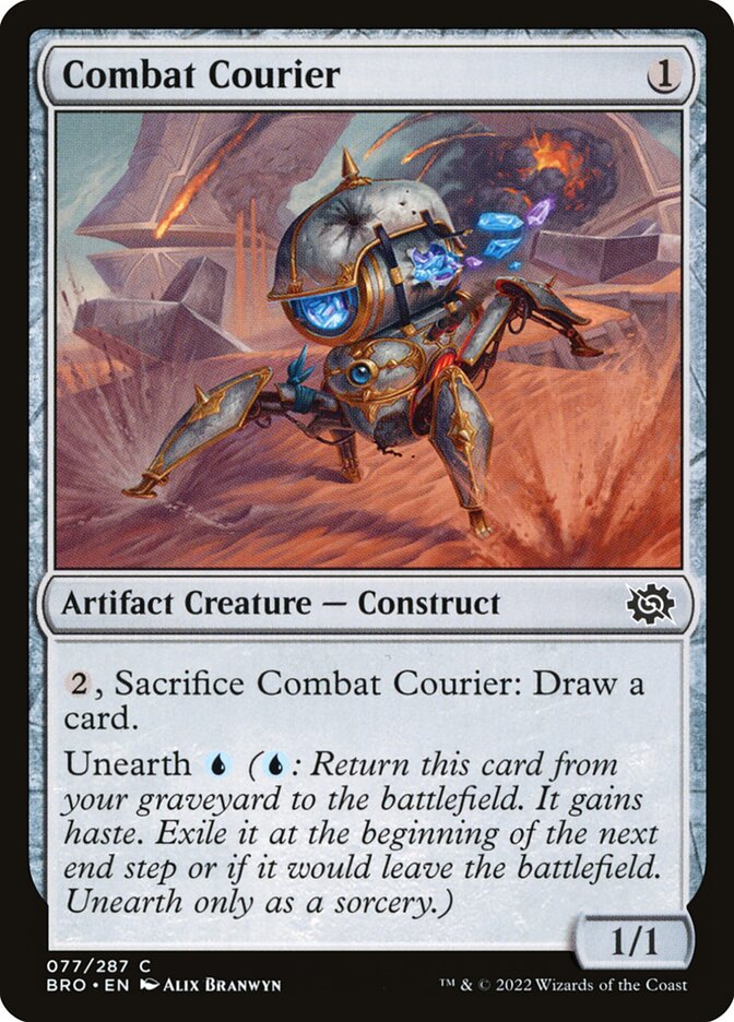
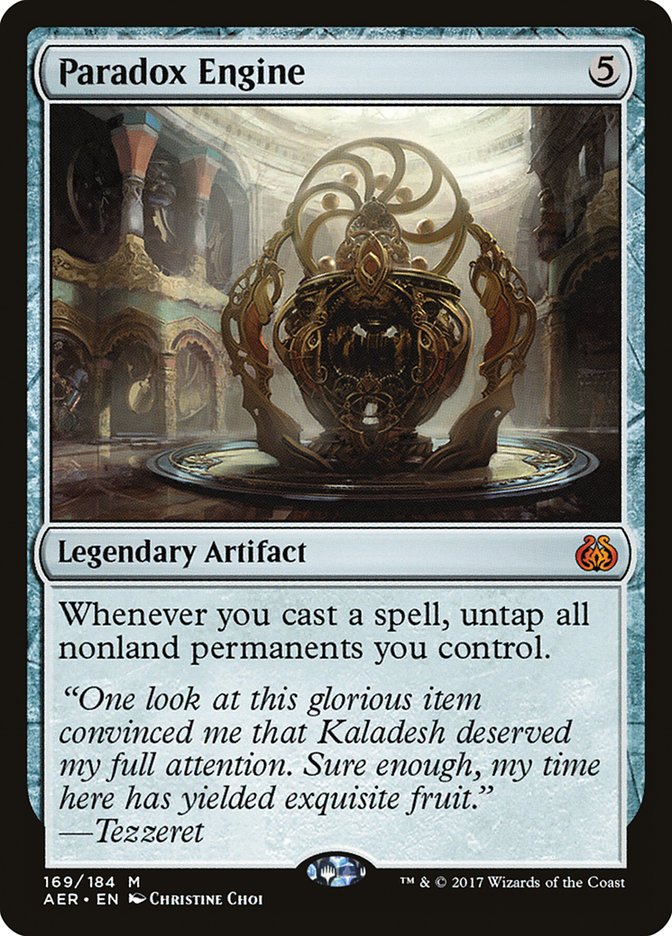
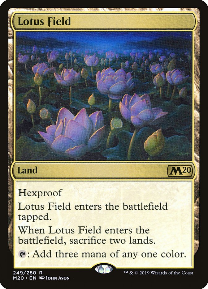
Figure 3: Example card arts from cards in deck.
Sources:
“Scryfall Magic: The Gathering Search.” Scryfall Magic: The Gathering Search, 2019, scryfall.com/.


2 Comments. Leave new
Hi Alexander,
I think that this is a really cool idea and I am planning on doing something somewhat similar, with a table that opens up. I’m curious, have you done any research/have any ideas for how you’re going to create the mechanism?
I love the idea that you can show personal aesthetics on the deck box! And it will be so cool that you actually hold this Lotus card in your deck inside the box! I’m curious about what software would you like to build the model for 3D printing?