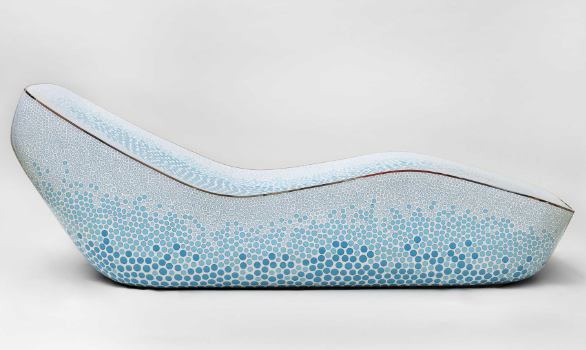
Mark Newsom, a multi-disciplinary designer, is a designer who I greatly admire. Much of his furniture design appeals to me in its minimalistic design, often utilizing smooth, flowing lines and natural shapes. Furthermore, his color palette is interesting to me. Most of the time, he seems to focus on metallic elements of design. However, Newsom often combines pops of bright or pastel colors seamlessly in his minimalistic design. It seems that bright color and minimalism are opposite, but by using pastel tones or sparse repeated design with a surplus of open space, Marc Newsom is able to create and maintain a unique aesthetic.
Search for content or authors
This Year’s Students
-
Abby Rindfuss
-
Adam Hosburgh
-
Airyl Dayrit
-
Alex Jessop
-
Xander Johnson
-
Allister James Sequeira
-
Annie Cai
-
Andrew Chamberlain
Anjali Shadija
-
Anthony Makuch
-
Andrea Marks
-
Anthony Papaianache
-
Andrew Perper
-
Andrew Widner
-
Ariana Ramirez
-
Arjun Ramachandran
-
Arden Villanueva
-
Ayesha Rawal
-
Ben Erickson
-
Ben Harming
-
Ben Haley
-
Brian Ahn
-
Bryce Johnson
-
Bryan Moreno Najera
-
Brenton Yu
-
Cason Lane
-
Cecelia Shoenfeld
-
Chris Adami-Sampson
-
Chrisanna Bertuccio
-
Witt Young
-
Claire Markus
-
Clemens Pacher-Theinburg
-
Cooper Kramis
-
Cole Romig
-
Cole Sites
-
Cort Sommer
-
Daniel Carranza Valenzuela
-
DawnMonique Cantu
-
Seth Strayer
-
Danny Vesselovskii
-
David Whisnant
-
Delos Ashcraft
Dev Mahajan
-
Ellyse Jensen
-
Elise Johnson
-
Eli Skelly
-
Eric Fiechtner
-
Evan McCleary
-
Francine Palmos
-
Garrett Jimenez
-
Garrison Nazare
-
Rauba, Grady
-
Reilly, Greg
-
Grant Thompson
-
Isaiah Straubel
-
Jamie Blanco
-
Jacob Foley
-
Jack Franz
-
Jacob Krajnik
-
James Overberg
-
Jaks Praeger
-
Jax Whitham
-
Jessica Vo
-
Joe Yoder
-
Jules Fischer-White
-
Kalin Myers
-
Keith Hemenway
-
Kyle Chinn
-
Lia Cucuzzella
-
Lindsey Trussell
-
Luke Gordon
-
Matt Bloomfield
-
Matthew Cumpton
-
Mateo Esteve
-
Matt Sherman
-
Max Van Cleave
-
Max Williams
-
Mila Bergmann-Ruzicka
-
Min Than
-
Mia Winstead
-
Nile Brown
-
Nita Byati
-
Nick Rios
-
Pisay Suzuki
-
Robert Forstbauer
-
Rystan Qualls
-
Sam Nicastro
-
Scott Ehrlich
-
Seth Dry
-
Sean Ostrander
-
Senayt Wolde
-
Shreya Pradeep Sekar
-
Sofia Fernandez
-
Sylvia Robles
-
Tay Cummins
-
Tanmay Mhatre
-
Taylor Wittwer
-
Thomas Brentano
-
Tyler L'hotta
-
Tyler Lloyd
-
Zoe Cooper
-
Sammie Duran
-
Jean Hertzberg
-
Student Test


2 Comments. Leave new
Owen,
I like the cover image you chose to highlight Newsom’s work. It seems like his style is very unique with the smooth lines and pastel colors. I am curious about the dot painting. Is this something he utilizes in a lot of his work?
I appreciate the variety of elements you highlight from Newsom’s work. You mentioned he is a multidisciplinary designer, what type of works is he know for beyond furniture?