For my upcycle project, I chose to get my inspiration from the biophilic aesthetic. I like this aesthetic because I visually like modern styles, but find that greenery and being around living things is very stress-relieving. I chose to create a pencil holder because it is something that I would use every day and it also located on my desk next to windows, so it could support plant life. With it being on my desk, I thought this was a really appropriate place to have something that is stress relieving and living and growing amongst all of my stressful studying and working.
Some pictures that I used for inspiration of biophilic architecture can be seen below [1] [2].
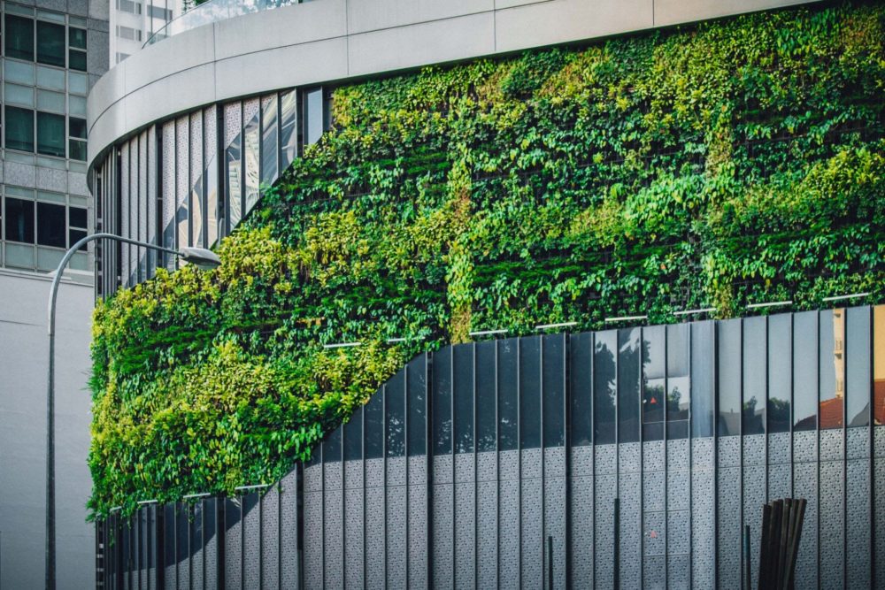
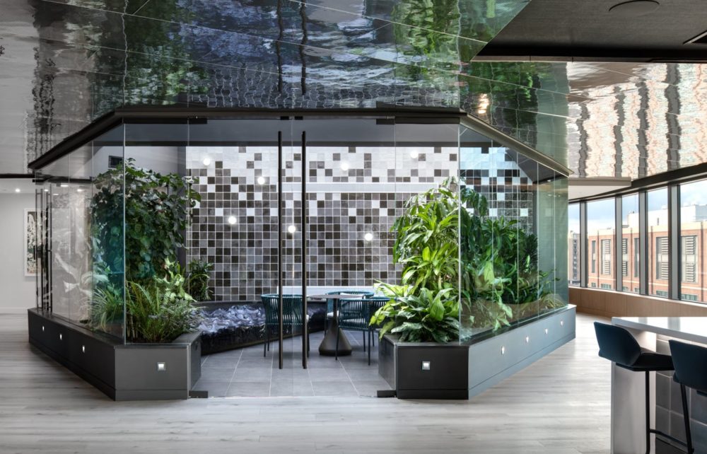
The inspiration I took from these pictures was the contrast between the green plants and then the shiny modern windows and mirrors surrounding it that give a more modern look. The biophilic aesthetic comes from research that humans tend to want to be connected to nature even during the everyday lives [3].
The specifications I had were that the pencil holder must fit on the ledge of my desk and hold at least three pencils since this fits my needs for my space and work. I used old logs cut from trees in my parent’s yard for the pencil holder part, cut these to size using a chainsaw and then drilled out holes that would fit pens/pencils.
IMG-4019 (a video of drilling out the logs)
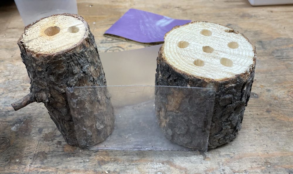
I then used old plastic from trash I found from an empty container as well as plastic from a folder to create the area needed to enclose the soil and plants that would be in-between the two log pencil holders. I glued these pieces to the logs using epoxy and then sealed the edges to prevent any leaks.
The next aspect was my “modern” detailing. I used old DVDs and cut square pieces from the DVDs after removing the plastic. This gave me the modern, reflective look I was inspired by in my inspiration photos while using an upcycled material.
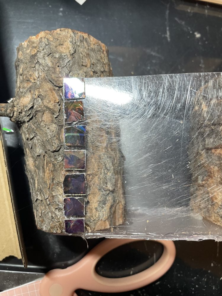
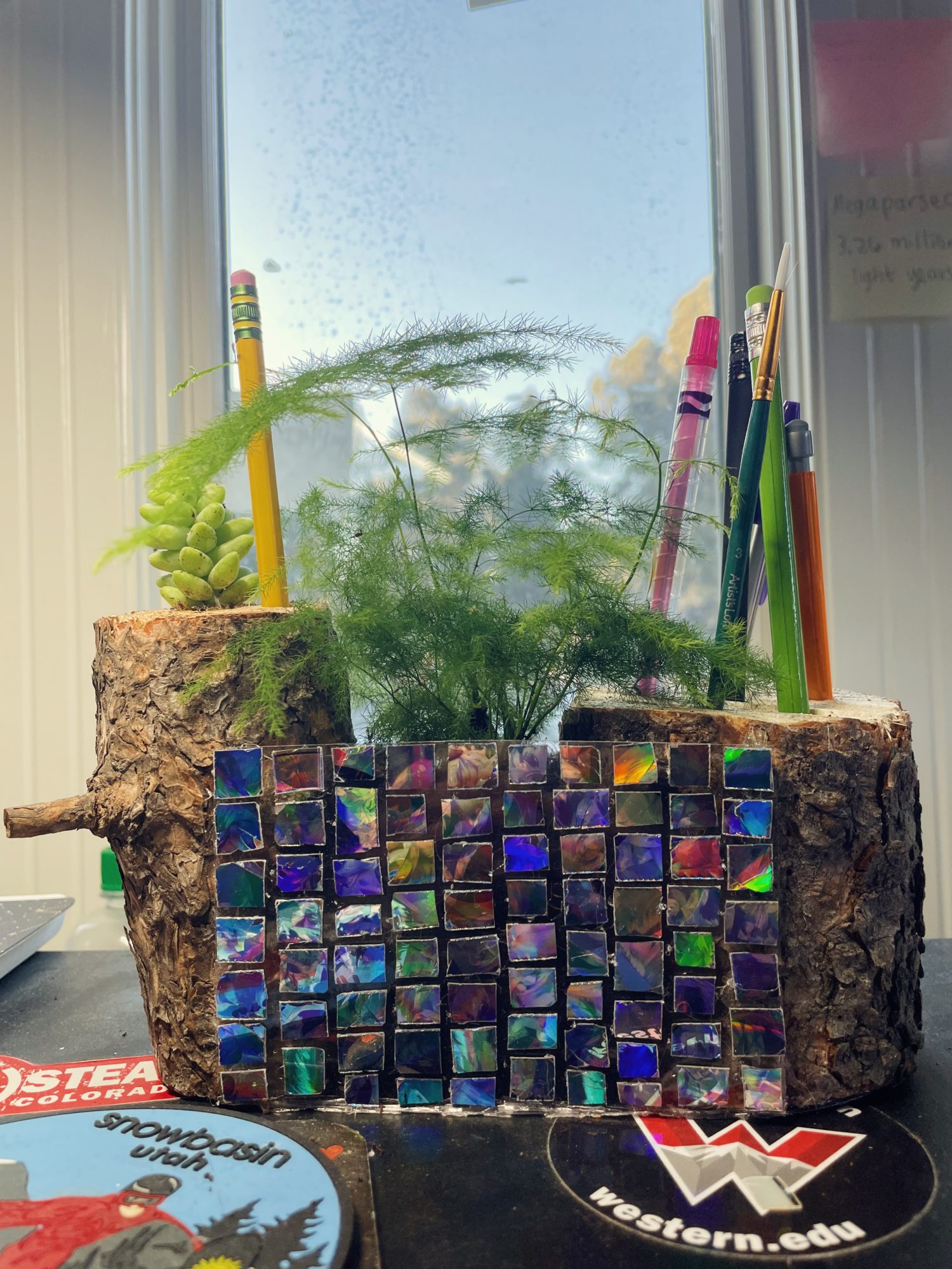
After this was done, the last step was to add the plants. For this, I was able to use some larger clippings from my grandmother’s indoor garden. I included some leafy plants in the middle and then a succulent on the left pencil holder, but this succulent could be replaced by another pencil slot. The final product can be seen below.

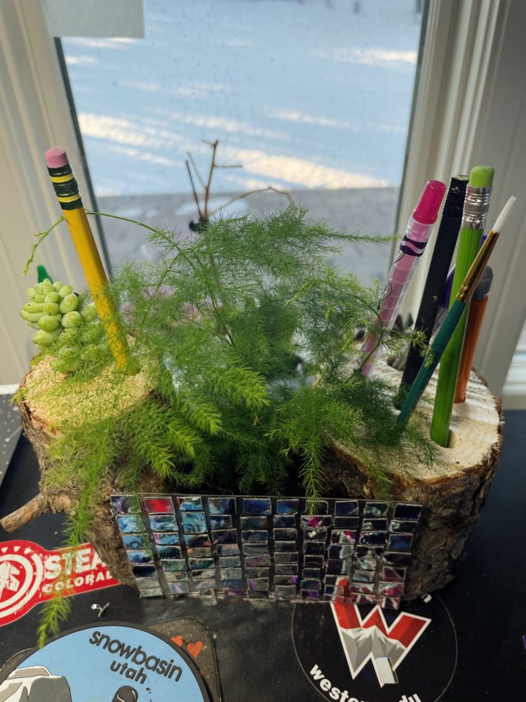
I think it definitely achieved my functional goals because it successfully holds up to 8 pencils/pens, which is plenty for my needs at my desk. It also adds a bit of plant-life to my workspace, which accomplishes my goals with creating a more stress-relieving space. Artistically, I am fairly happy with the way the DVD pieces contrast with the log and plants and I do think it follows my inspiration aesthetic fairly well. I would have liked to get cleaner lines and better uniformity in those square pieces like they were windows, but given I only had scissors, I am still happy with the result. I think in the future, I will try to expand on this project by making it bigger, so I have more room for the plants to grow or to create more of a mini garden instead of just one pot’s worth of space.
[1] https://www.google.com/imgres?imgurl=https%3A%2F%2Fplanradar.com%2Fwp-content%2Fuploads%2F2022%2F05%2Fbiophilic-office-building-singapore.jpg&imgrefurl=https%3A%2F%2Fwww.planradar.com%2Fgb%2Fbiophilic-design-10-great-examples%2F&tbnid=AE9XVSoadYMJgM&vet=12ahUKEwjWuenuiav9AhVtNN4AHXziCCQQMygBegUIARC4AQ..i&docid=Okbiu_zC3zb6CM&w=826&h=552&q=biophilic%20building%20exterior&ved=2ahUKEwjWuenuiav9AhVtNN4AHXziCCQQMygBegUIARC4AQ [2] https://www.google.com/url?sa=i&url=https%3A%2F%2Fgreencities.com%2Fnews%2Fbiophilic-design-creates-better-environments-in-residential-buildings%2F&psig=AOvVaw3lXPDSoO-WCXUPHBlkvGPX&ust=1677008606442000&source=images&cd=vfe&ved=0CA8QjRxqFwoTCKCxlojupP0CFQAAAAAdAAAAABAE [3] https://www.terramai.com/blog/biophilic-design-making-humans-happier/#:~:text=The%20concept%20was%20introduced%20by,and%20structures%20in%20everyday%20life.
4 Comments. Leave new
I really like the elements of nature that you’ve introduced in this project – it makes it more special that the plant clippings are from your grandmother’s garden too. The small photos add color and pop to the project while also providing contrast with the logs and plants. It’s also very cool that this is an item you can use daily and has plenty of functionality as a stress reliever too!
I remember reading your update post and thought that this was a great idea, I’m actually really glad it turned out well. I like how you have the outer log mixed in with the leafy green since they tie in together. I won’t lie, I was expecting a boxy pencil holder with a plant shoved in the middle of it. This, however is much better than I would have expected. Great job!
Hi Holly, I really like your final product! I also really like the plants that you chose to include, as I think that the fern and succulent add a good contrast to the DVD pieces. The differing colors of the plants also helps to add more depth to the piece, instead of making it one flat sea of green. I was wondering why you chose to include the logs as the main structural component. I agree with Ethan that it gives a bit more of a cabin feel, which seems like it might stray a bit from your mentioned aesthetic. Especially comparing it to your reference photos, it feels like the body and accent themes were interchanged in your design. However, that isn’t to say that it doesn’t work or look good because I think that it does. I also wonder if in the long term you see any problems with the wood absorbing water as you care for the plants. I look forward to seeing any of the expansions that you talked about in your post if you are able to make them this semester!
I really love the nature esque design. The natural wood gives a really nice wood cabin feel and the addition of the asparagus fern really gives a forest vibe. The little panels really show the inspiration of the biophilic building. I am curious why you decided to have the sudden transition from panels to bark by attaching the panels to the outside of the log