As this upcycling project started, I began to wonder what I could do to develop my architectural skills. With a fascination for residential homes and contemporary design, a small-scale model seemed like the emerging leader for my design process. While I did know I wanted to create a house, I had yet to know if I would be designing my own or modeling an existing structure. After much consideration of the time restraints and materials on hand, I decided it would be more efficient to create my own design that portrayed certain characteristics of contemporary design.
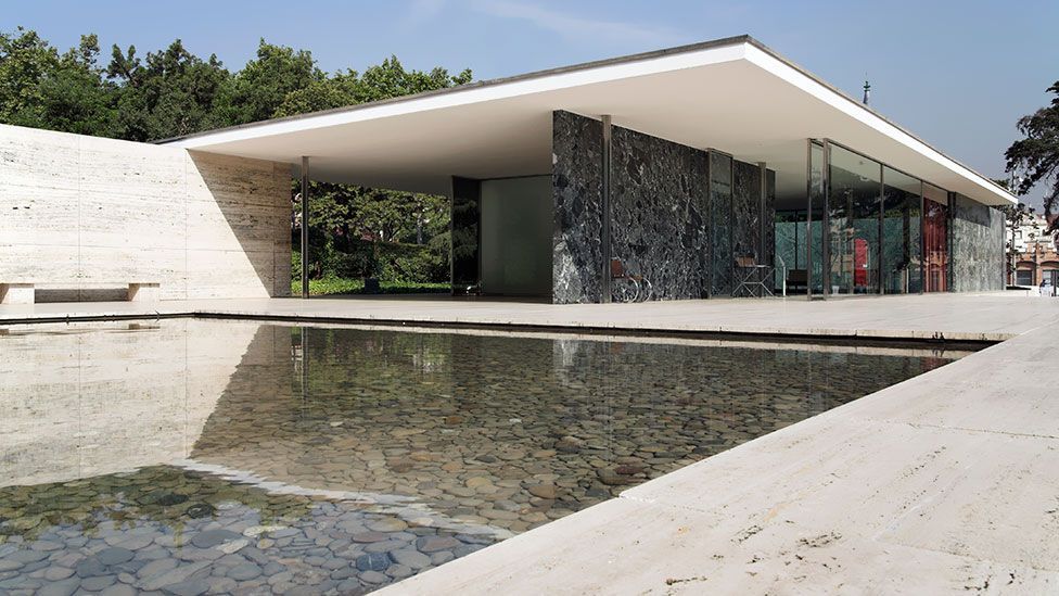

One structure that I have always found inspiring and intriguing is the Barcelona Pavilion in Spain. Designed by Mies van der Rohe for the 1929 World’s Fair, this structure was extremely successful at using techniques that are commonly used in modern contemporary design today. While this pavilion is considered to be a part of the International Style, some of the main elements like book-matched surfaces, indoor-outdoor spaces, and open floor plans were carried over heavily into contemporary architecture in the modern day. I knew that these elements were crucial to my design and conveying my aesthetic.
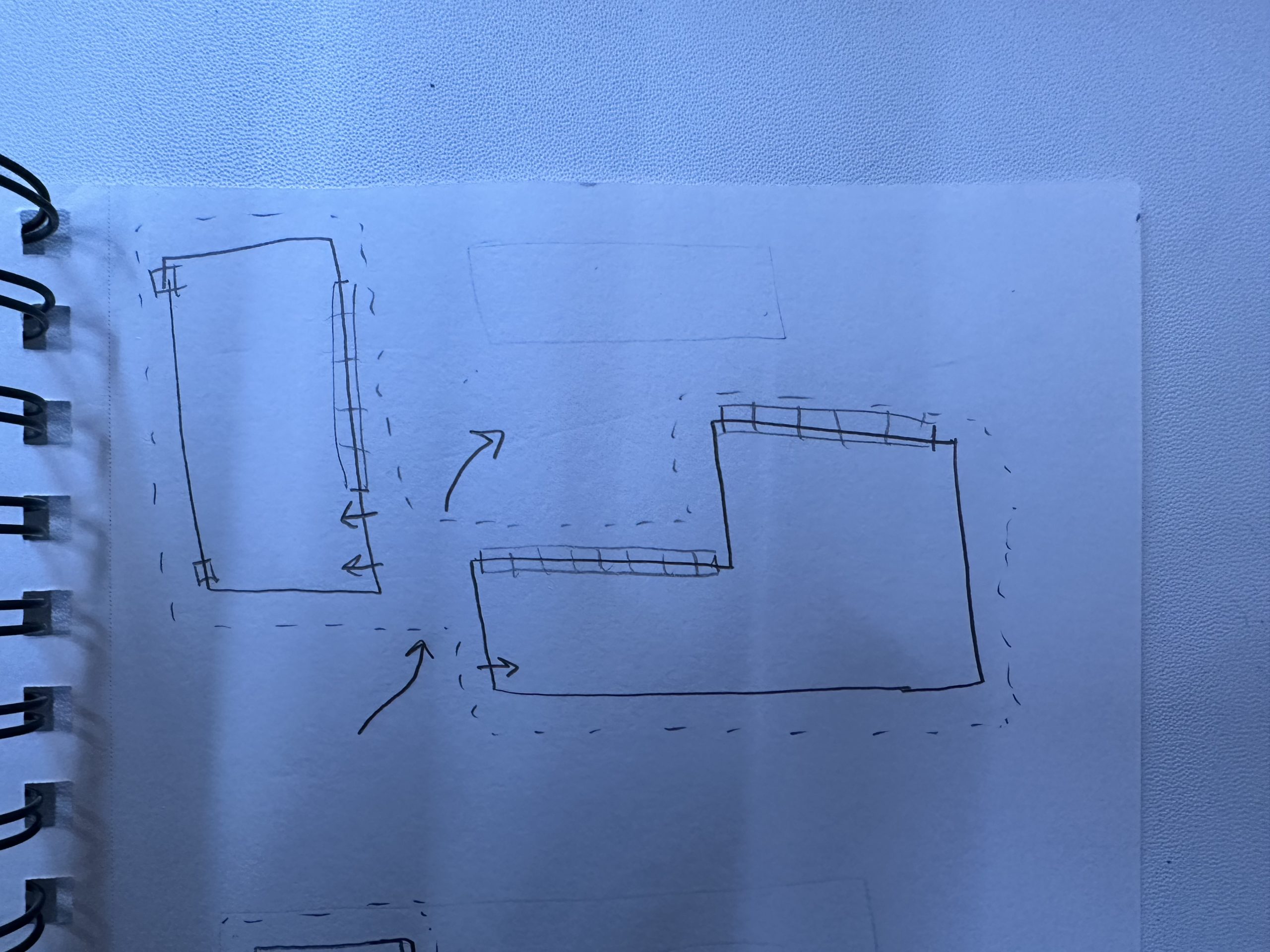
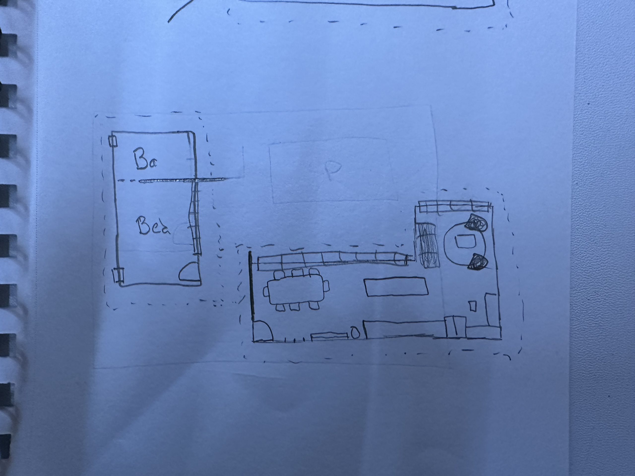
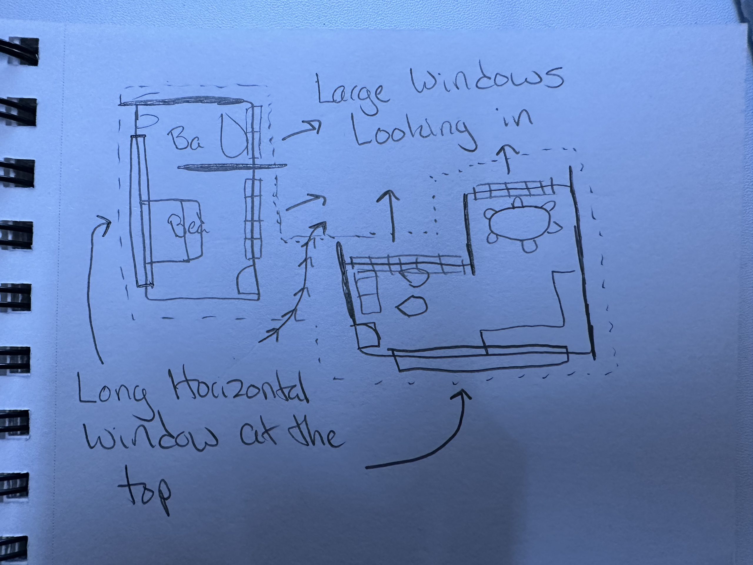
When starting my design process, I initially create sketches that contain very basic geometric forms, This allows the scale to be variable and elements to be easily changeable. After a few iterations, I move forward with one design; making more sketches that provide different details that help me understand the scale and dimensions with which I will be working with. Once these initial sketches are finished they provide me with a great foundation for moving forward toward my final model. I can now begin to use a program called Revit that can be used to design architectural structures and landscapes. Because I do not have any exact dimensions yet, this program will be extremely beneficial in the sense that it allows me to create walls, floors, roofs, etc all at an exact scale. With the addition of being able to place components like beds, doors, windows, and other basics, this program is the perfect medium for creating the final floor plan and design.
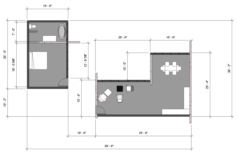
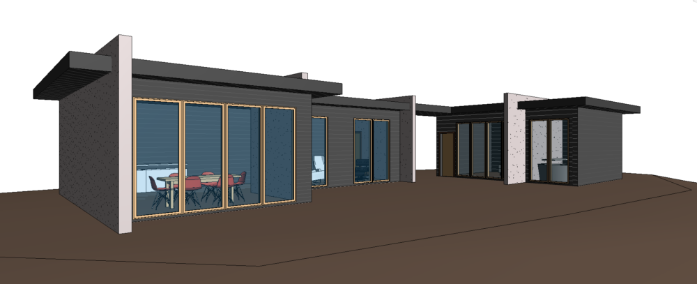
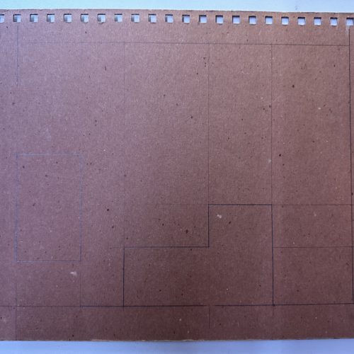
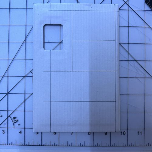
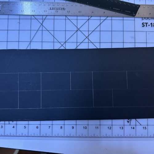
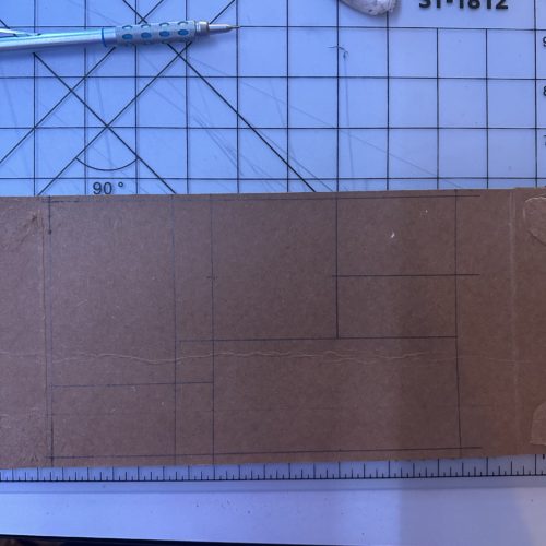
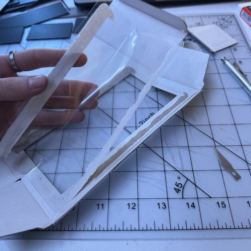
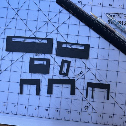
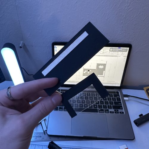
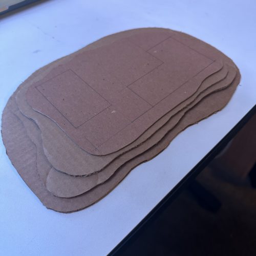
After all of the wall types are made, floors are placed and roofs are decided on. This allows me to have final dimensions that I can work off of for my physical model. With all of the necessary dimensions clear and concise, I am able to draw and lay out each necessary surface on the materials I decided to use. Once traced out, I would cut the shape with an exacto knife. For the main walls of the house, I used scraps from an old architecture project that were black. I thought that they really did a nice job of fitting the contemporary aesthetic. The large white structural walls were made to mimic the book-matched effect except on the horizontal planes, not the vertical ones. This technique is also how I achieved the terraced landscaping, window details, and roof element. In addition to the open floor plans, the residential model contains two main structures that look in on a main open space. The use of large opening windows allows for each main space in the building to have indoor-outdoor elements. These windows are identifiable by the transparent material on the large central openings, whereas all of the frosted windows were designed for privacy by using trace paper. Once all of the wall elements were cut out and detailed, I placed and glued each wall together on the base foundation. After the foundation was stacked, the walls were assembled and the roof was attached, my project was nearly complete. Last, I added a few toothpicks that I cut tree-shaped limbs into. I believe all of these elements together really help convey the contemporary aesthetic through an architectural model.
Now being finished with this project, I am very happy looking back on it. I think I did everything I strived to do in exploring an aesthetic that interested me while also benefiting my architectural skills was achieved. This model not only conveys the aesthetic that I wanted to design but I also think I did a good job of craftsmanship. I plan on keeping this model because I think it is very aesthetically pleasing and put countless hours into its development of it.
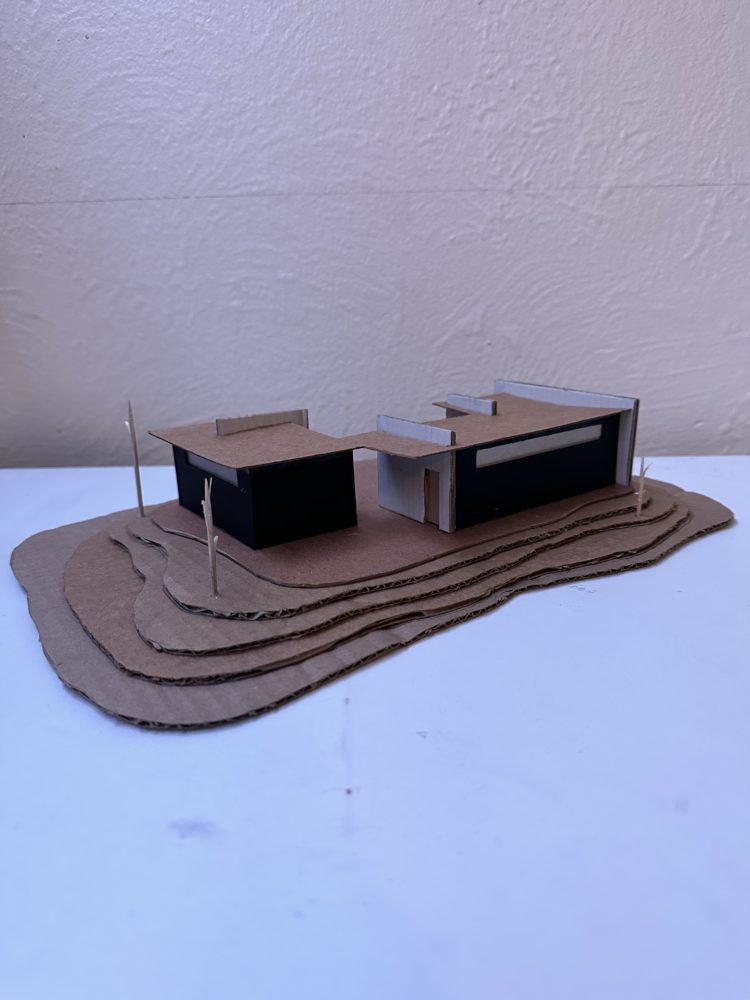
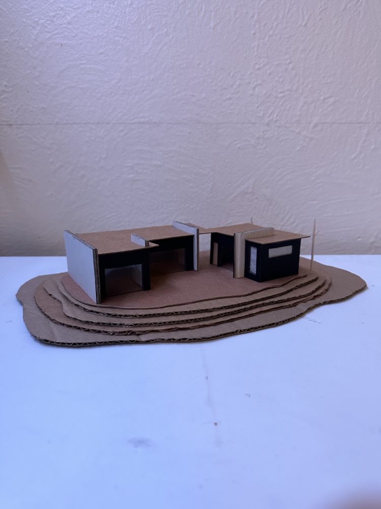
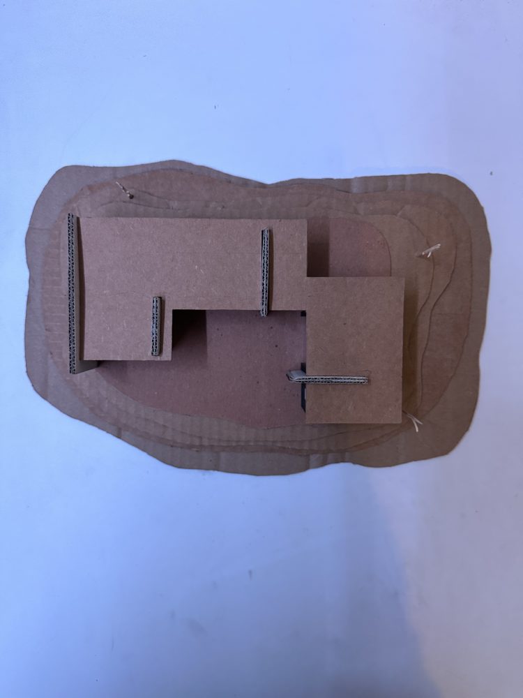
Image Links :


2 Comments. Leave new
I love the attention to detail and the level of effort you put into this project. The planning and preparation phase was really impressive, especially outlining your through process on keeping the forms basic, allowing for easier scaling. It’s really cool that for a project like this you were able to think and plan ahead to ensure that your project could come together even if it wasn’t perfect in scaling. Did you have any plans to paint it at all? Also, I’m not super familiar with architectural engineering, what was the software used to model this?
Hi Matt, I really like the detail you went into while describing your process. Your project looks very clean and has an interesting design that draws the eye. I wonder if laser cutting the cardboard would have made getting the edges of the cardboard more precisely cut easier.