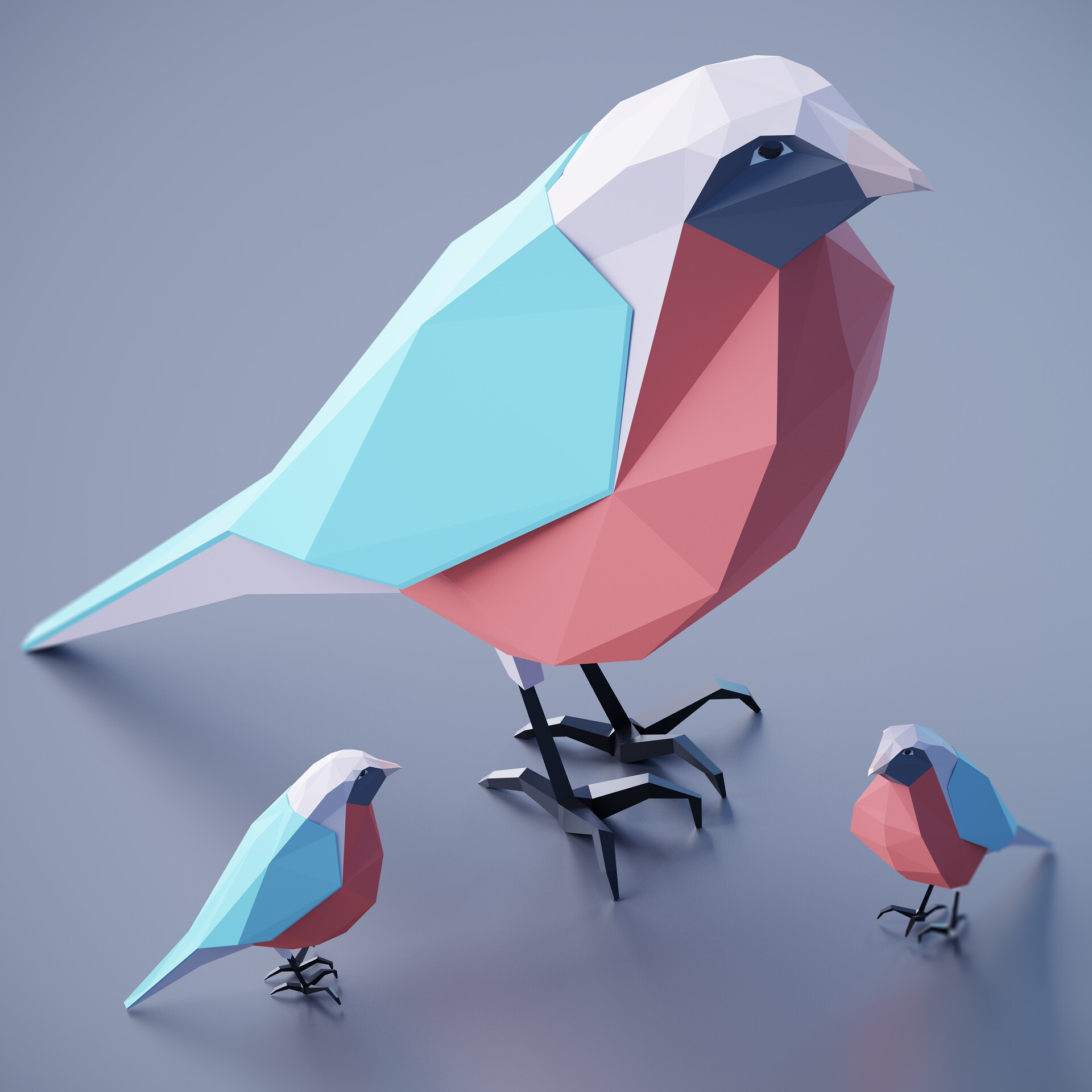
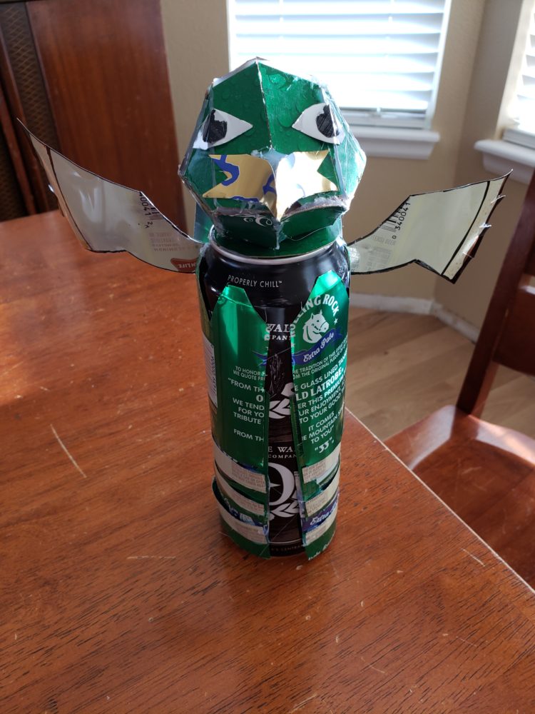
For my upcycling design project, I chose to recreate a Xatu Pokémon only using recycled cans as my resource. The final product is shown in the featured image and below. The original aesthetic I was going for was low poly, however there were a few complications. One of them was that low poly uses only a few shades of color, and adds details by different angles and manipulating the lighting. As I was using recycled cans, it was difficult to try and isolate only a few colors, and was forced to use more. Another complication was the fact that it’s extremely difficult to force recycled cans into a flat plane. Low poly only uses flat surfaces, so the roundness of the cans made it impossible to stay aligned with the aesthetic. The only part that I was really able to keep in the low poly aesthetic was the head, and that was because it was the cardboard of a box, and not sheet metal itself. Below is what a low poly bird should look like:

https://www.artstation.com/artwork/v1Xmm6
Meanwhile, my Xatu looks like the following:

And this is what I’m trying to replicate:

https://www.serebii.net/pokedex-swsh/xatu/
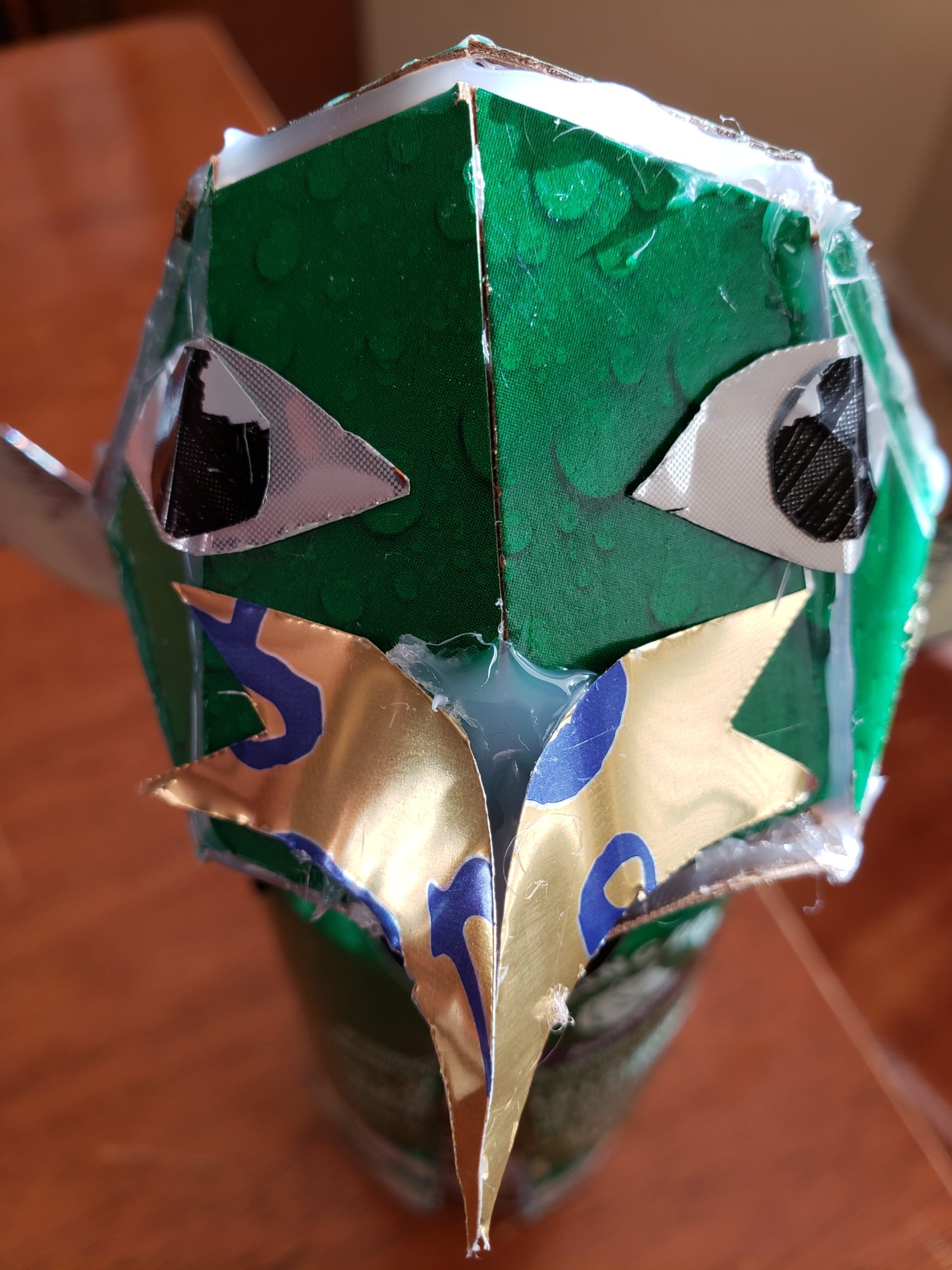
While I believe that I did a decent job, there is definitely room for improvement. My original idea of using recycled cans didn’t work out too well for my aesthetic, I wasn’t able to flatten the metal, and I also wasn’t able to easily mount the cans to each other since hot glue created weak connections that easily broke. This caused any attempt I made to increasing the volume of the coat area to immediately break resulting in the skinny bird. One of the main successes was the “hair” on the back of Xatu’s head as seen in the image below.


2 Comments. Leave new
Heider, great project, I could instantly tell this was supposed to be a xatu the moment I saw it. I think you did well on the aesthetic given the complications. If you did this again, would you use hot glue again or something else?
Hi Heider,
I enjoyed reading your post, it was very interesting learning about your project. You did an excellent job explaining difficulties you had with the material and how they impacted your desired aesthetic. I think that the final artifact looks great, and follows the low poly aesthetic closely in addition to matching the Pokemon you were trying to replicate. One aspect of your artifact I particularly like is the base being a can, as it shows off original material the artifact is made of to the viewer.