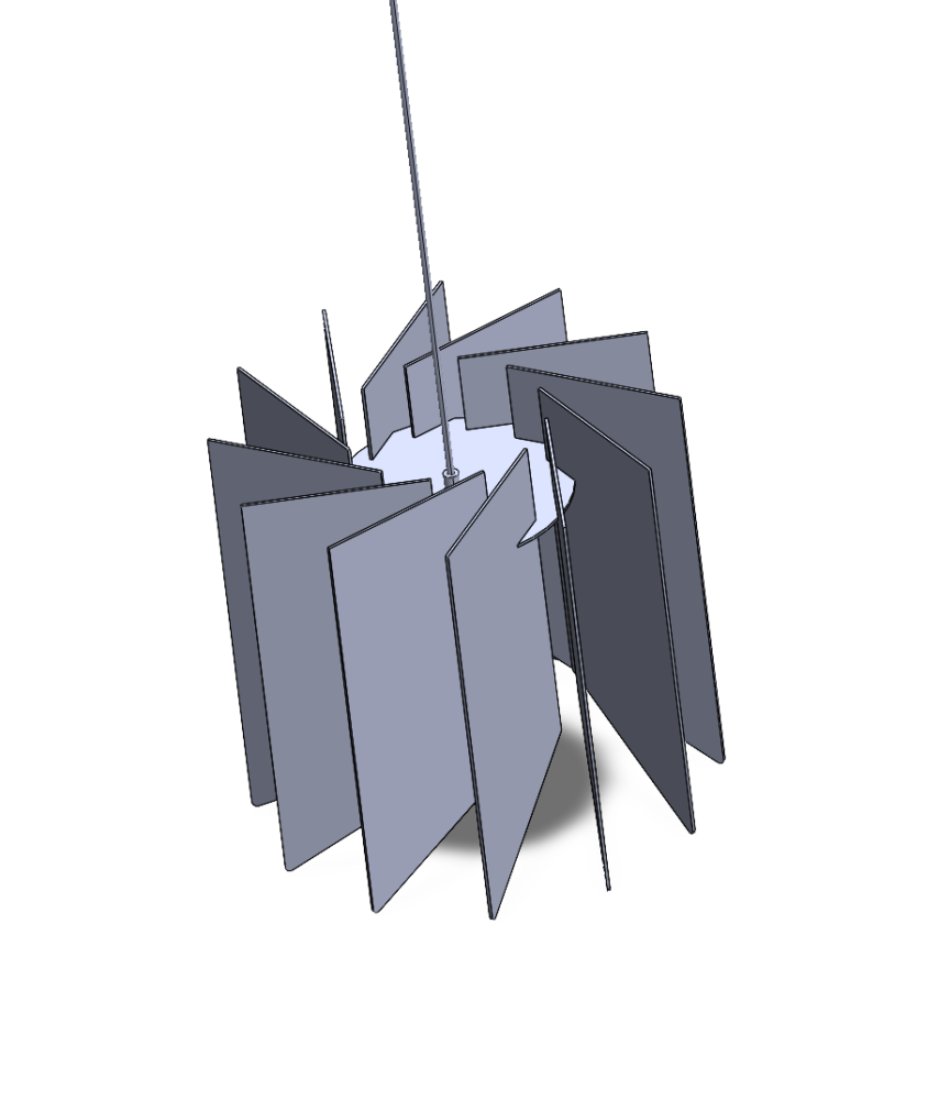
My upcycling project changed from what I originally posted about in last week blog post. My first idea was to make a wooden light out of some scrap pallet wood from my senior design project, but after talking with josh and looking at the scope of the project, it wasn’t very feasible. I then designed a hanging light that could be made out of either MDF or cardboard using the same light fixture as the original idea. After a few design changes I settled on a pattern that consists of trapezoids that radiate out from the center where the bulb is. Each of the panels is slightly rotated so when you view the light, you don’t look directly into the bulb. Most of the light from the filament bulb is aimed downwards which creates a smaller and more intimate aesthetic.
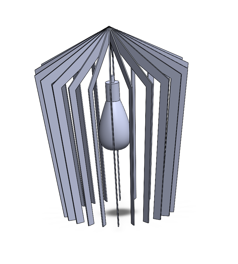
Here are a few of the other designs I made for the light, this first one was inspired by the shape of a wine glass which I find very aesthetic.
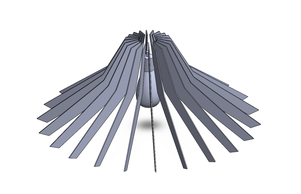
The second design takes the shape of a more standard light shade, but I found it to be too 70’s for my liking, so I decided not to continue with this design.
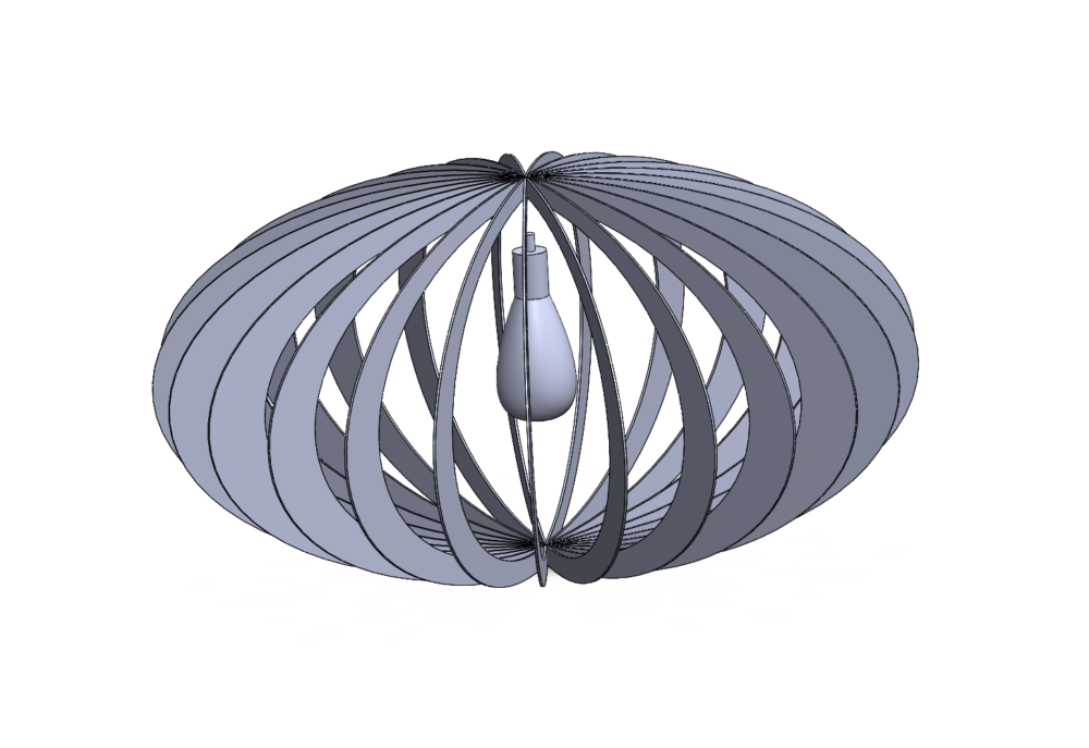
Lastly, this oval shaped light is much more modern than the other designs which I like, but the orientation of the panels emphasize the brightness from the lightbulb in the center which is good for lighting a room, but goes against the aesthetic I was going for.
The design I decided on making focuses the light downward instead of out to light a smaller area. I found some recycled cardboard and brought it to the ITLL for laser cutting. I began by cutting the cardboard boxes into smaller pieces which could fit into the laser cutter. The solid works files needed to be converted into DXF then I cut out the 14 pieces that make up the light.
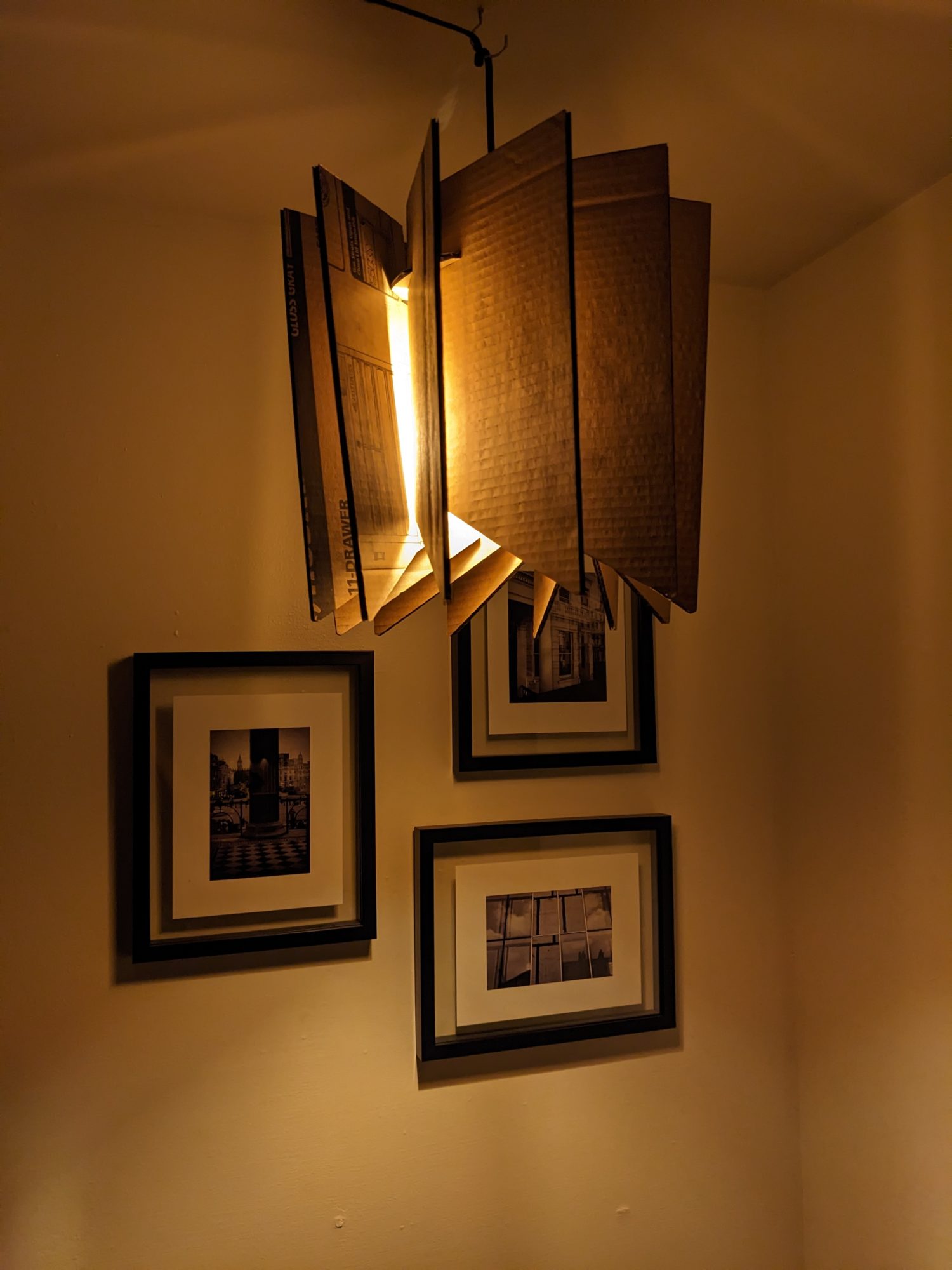
Currently, the light is pieced together to test fitment and to see how the light is projected from the bulb. I still need to add a finishing coat on the pieces because some of the cardboard had text printed onto it and the texture of cardboard is not very pleasing. I’ll paint the pieces a warm white-ish color to increase the amount of light that reflects out.
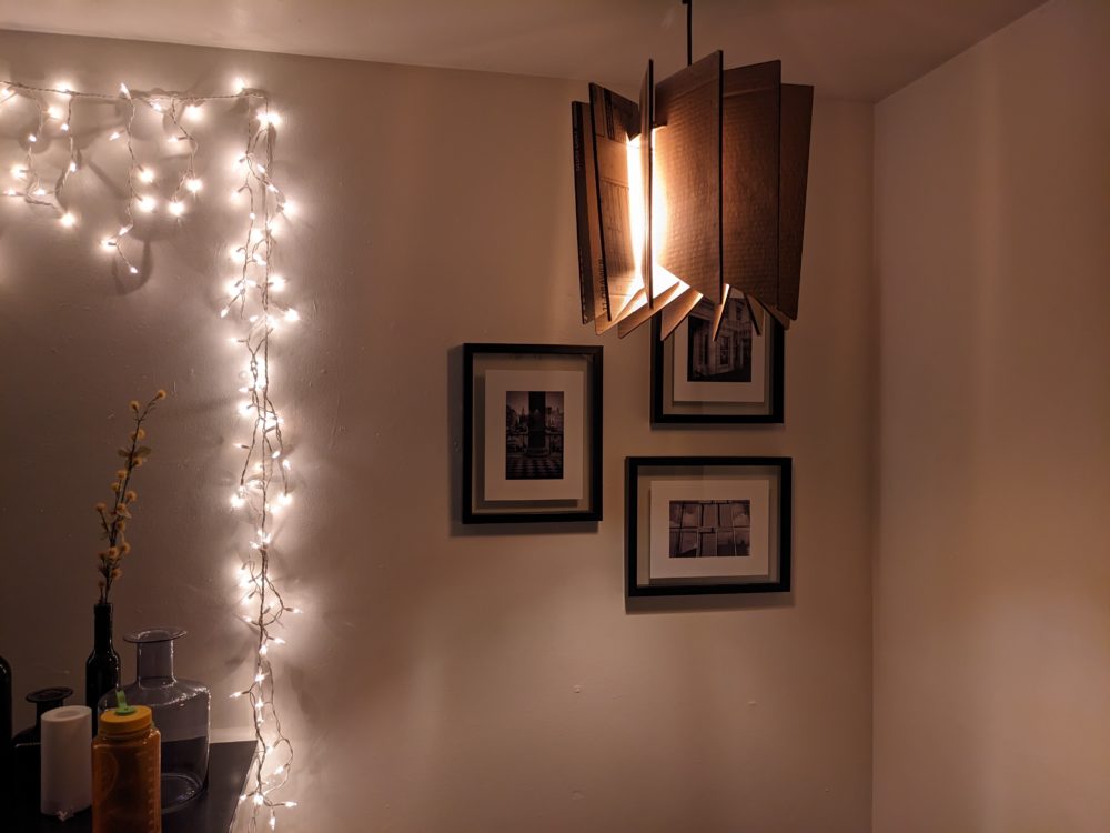

After I paint each piece I’ll glue everything together so it’s more sturdy. Right now the light is delicate and the panels move around easily which changes the alignment of each panel relative to each other. The design is very focused around symmetry and perfection, so the loose panels don’t look great. I might try to find some better material to make the light out of, but for the time being I’ll leave it as is. I’m happy with the affect the light creates and the look of it, but there is a bit of refining I could do if I have more time.

6 Comments. Leave new
I’m glad that you switched materials with the scope of the project, it was a smart choice. If you still like the wood aesthetic, then maybe consider texturing the cardboard to look like it. Either that or explore other methods. Either way, I hope it works out well.
That is definitely something I could look into doing. Given by artistic ability, it’ll probably come out terrible, but it would be fun to try and experiment with.
Cameron, thesis a very interesting design! I’m glad you included your SolidWorks files as a reference so that we could see the progress as you worked through multiple iterations. I’m very excited to see what it looks like upon completion, and I hope all goes well with finalizing the piece!
Thanks!
Solid works was a great way of getting ideas down quickly to see if the design would work with the aesthetic. In the end I’m happy with the shape of the light, now I just need to make the cardboard somehow look nice.
Very cool design Cameron! I like that you chose a shape which prevents the user from seeing the bare bulb, which I think greatly increases its aesthetic value. I’m excited to see what it looks like once it is painted.
Thank you!
Right now the side pieces are a little to droopy so the bulb is too contained inside the light, but if I can better support the pieces it should end up looking like the solidworks model and project the light as intended.