Before I could begin creating my model, I had to come up with a basic floor plan/design that would allow me to know the dimensions needed to build this small-scale house. While I did decide to start from scratch and create my own building, there needed to be a starting point of inspiration. As I’ve always been drawn to simplistic yet beautiful elements, my mind traced back and remembered Mies van der Rohe’s creation of the Barcelona Pavilion in Germany.

This work of art technically resides in the International movement and aesthetic, which was Europe’s first taste of this kind of architecture and design. Characterized by flat surfaces, rejection of ornamentation, free-flowing spaces, industrialized materials, and asymmetry was my main reason for choosing this aesthetic. As my eye catches contemporary houses, I realize that many of these characteristics were passed on and used in extremely similar ways. Material use, Lack of symmetry, and openness become some of the most important factors when designing these houses now. With this idea and Mies’ inspiration in mind, I started creating a house of my own.
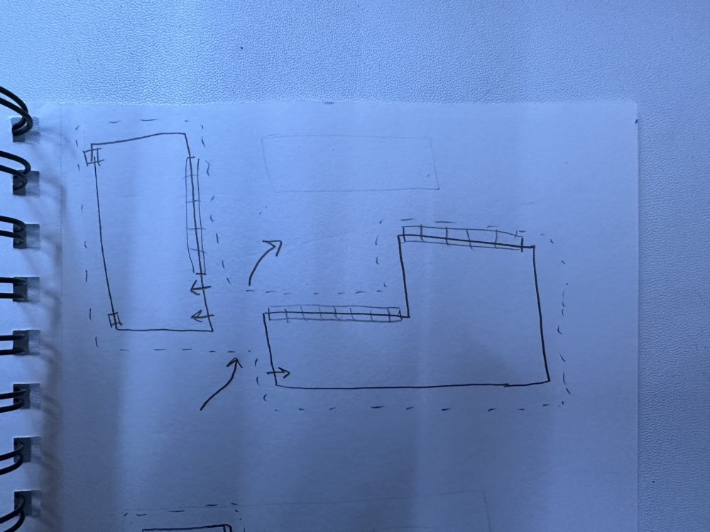
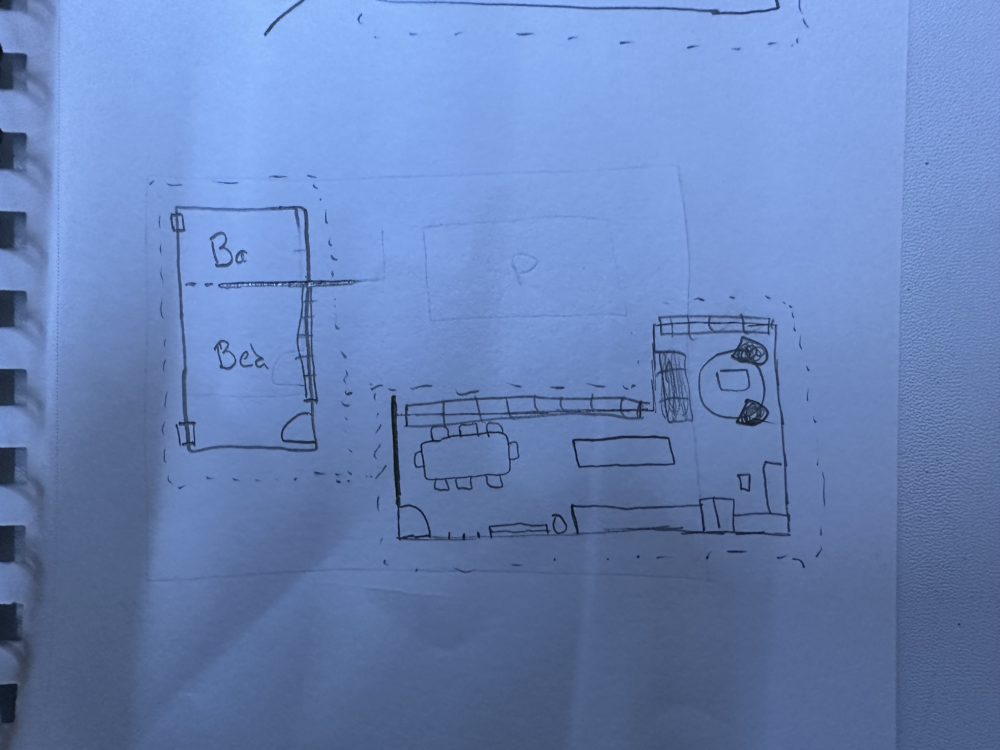
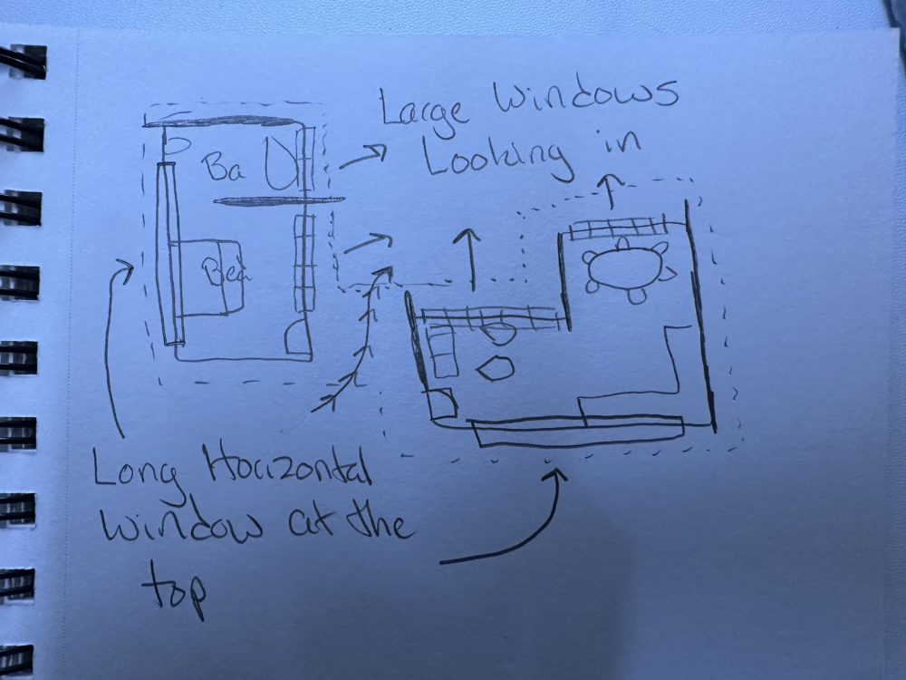
These initial sketches are how I normally start my design process. They allow me to express basic forms that will develop into more complex spaces. I decided to explore the possibilities of having two different buildings that function as both private and public spaces for the home. After knowing this idea is something I wanted to proceed with, I opened a computer software that allows me to design and build anything I can imagine. After some tinkering and adjustments, I finally came up with a Floor Plan I was happy with.
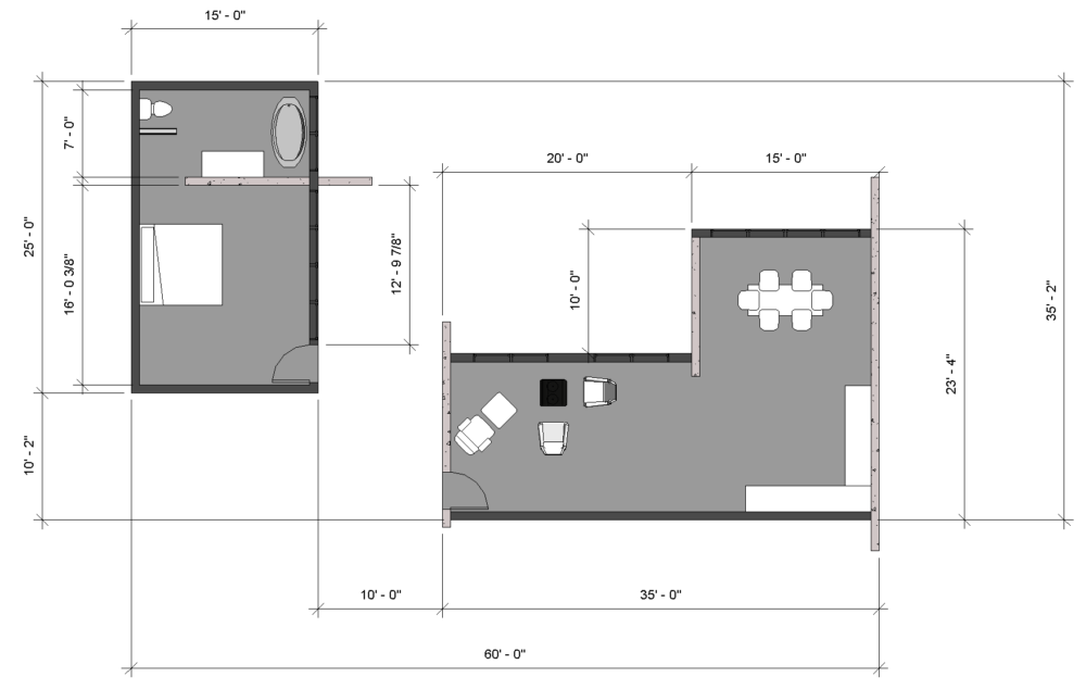
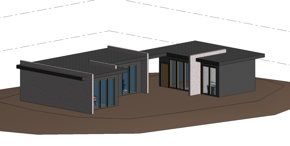
After some basic components are placed in the project, I know my dimensions work and each room should have enough space for the prevalent tasks needed to be performed there. Once this is finalized, I can finally start transferring my design to a model. My first step in this process is copying the floor plan to scale so I have a foundation to build on. I decided that building at 1/4″ scale would be ideal for this model and would properly show detail without blowing anything out of proportion. After my floor plan is copied down, I decided to start with the landscape and topography which is just stacked cardboard cutouts to resemble elevation changes. This not only provides a strong base for my house to sit on but helps provide surrounding context so this house is not floating in the middle of nowhere. Before this project is done I plan on adding a few more topography layers as well as constructing the 2 buildings.
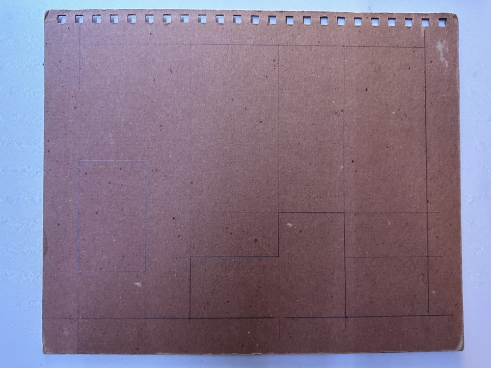
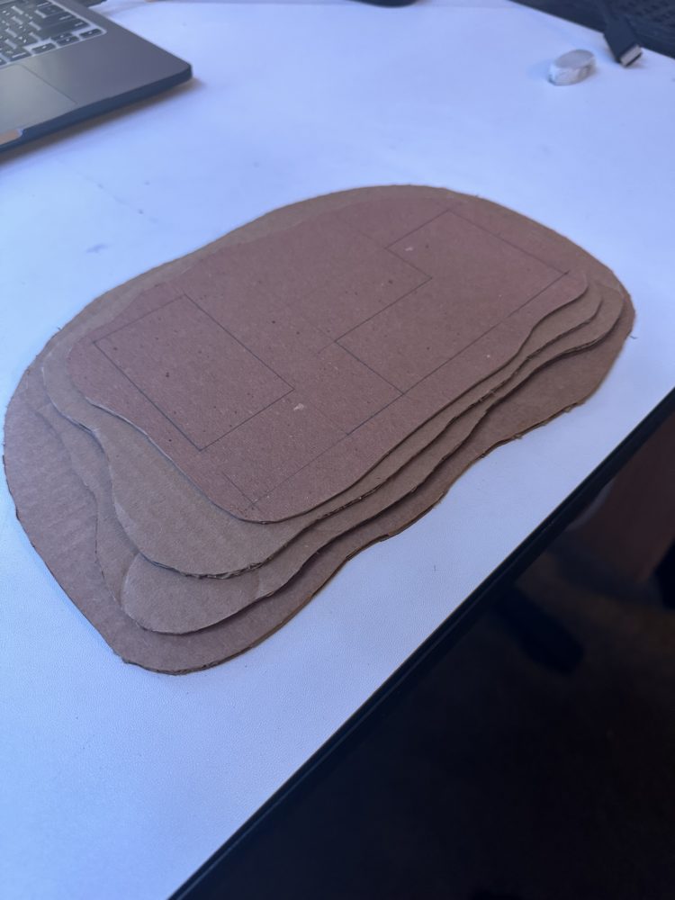
Image Resource
- https://jasonmkelly.com/jason-m-kelly/2013/09/30/mies-van-der-rohe-barcelona-pavilion


1 Comment. Leave new
These models are really impressive are you using Revit to make them?