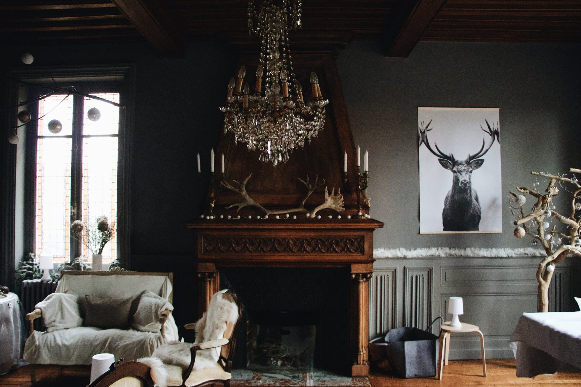
Photo source: Matt Cameron (1)
Introduction
Tracing back to its roots in 12th-16th century architectural styles, modern gothic design is an impressive style. While the modern style may be more free and open, some similar themes include use of ornate embellishments and focus on light and shadow. There is an emphasis on functional geometry and repeating shapes and textures, as illustrated by Laboratorio Simbirizzi’s Gothic Patterns paper (2). While there are many aesthetics, for example in fashion and music, which are part of the “gothic” style, my goal in this post is to describe themes from modern gothic architecture and interior design, while putting these themes in context with historical perspectives.
Historical Influences
Authors on The Art Story explain, “The architecture that informed the Gothic period drew upon a number of influences, including Romanesque, Byzantine, and Middle Eastern.” (3) For example, the awe-inspiring pointed arches seen in gothic churches were adapted from Middle Eastern architecture such as the Al-Aqsa Mosque (780) in Jerusalem.
A popular player in classic gothic architecture was Lorenz Lechler, who developed and documented an instruction booklet for gothic design (4). Modern Gothic design became popular in the late 1800’s, and was popularized by designers Christopher Dresser and Charles Eastlake. (5) The gothic subculture and design trend is still evolving today after seeing another resurgence in the 2020’s.
Gothic Architecture and Geometry
In his book entitled “The Geometry of Creation,” author Robert Bork explains that the ornamentations in classic gothic architecture follow rigorous geometric choices rather than being prescriptive and favoring certain shapes in particular. This leaves a lot of freedom to interpretation with modern goth design styles, though a focus on sacred geometry and repeating patterns are still prevalent in modern styles. “In the Gothic tradition, in other words, treated the finished building as the physical trace of a dynamic design process whose internal logic mattered more than the shape of the final product. “ (6)
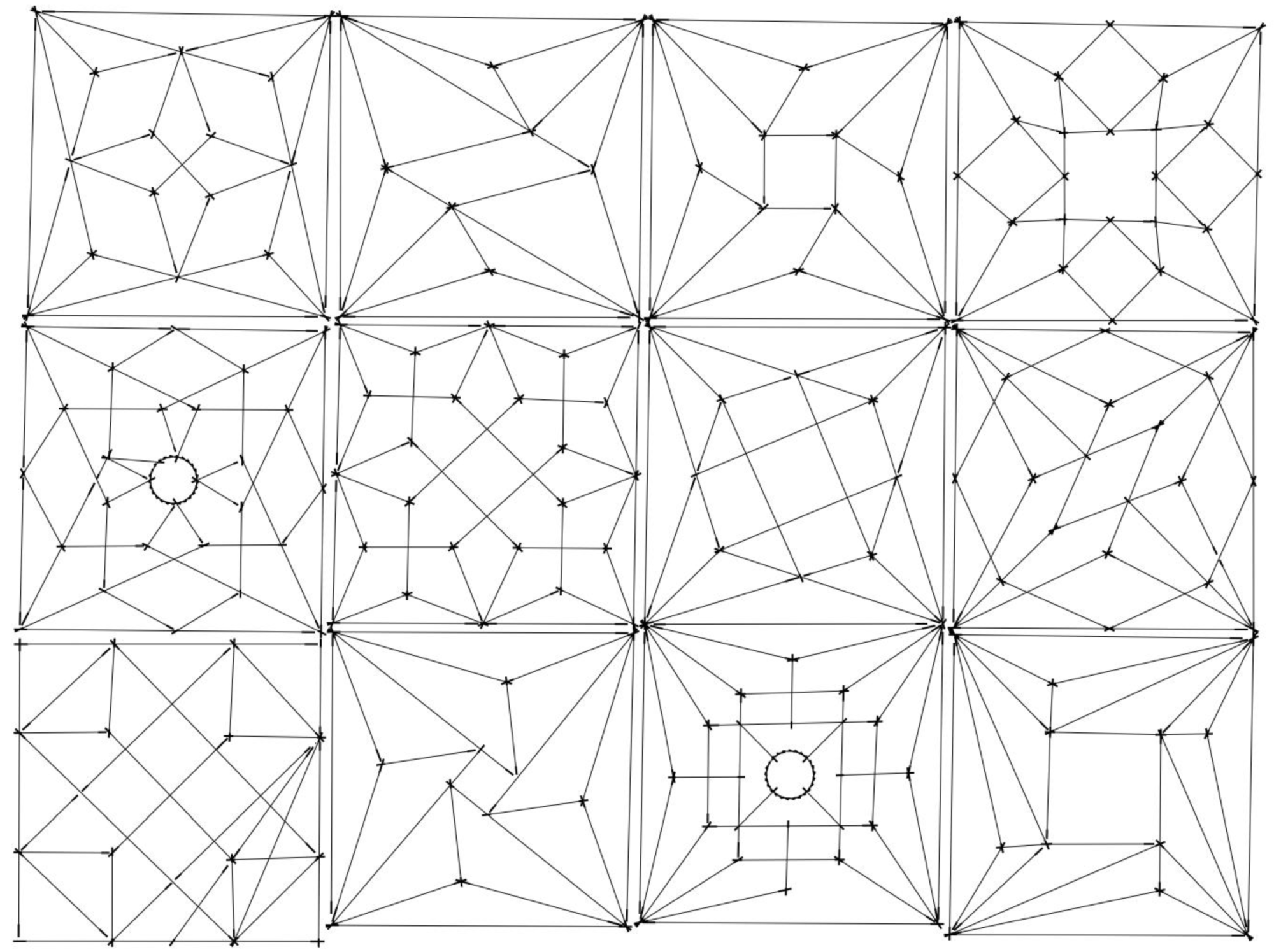
Gothic geometry examples (7)
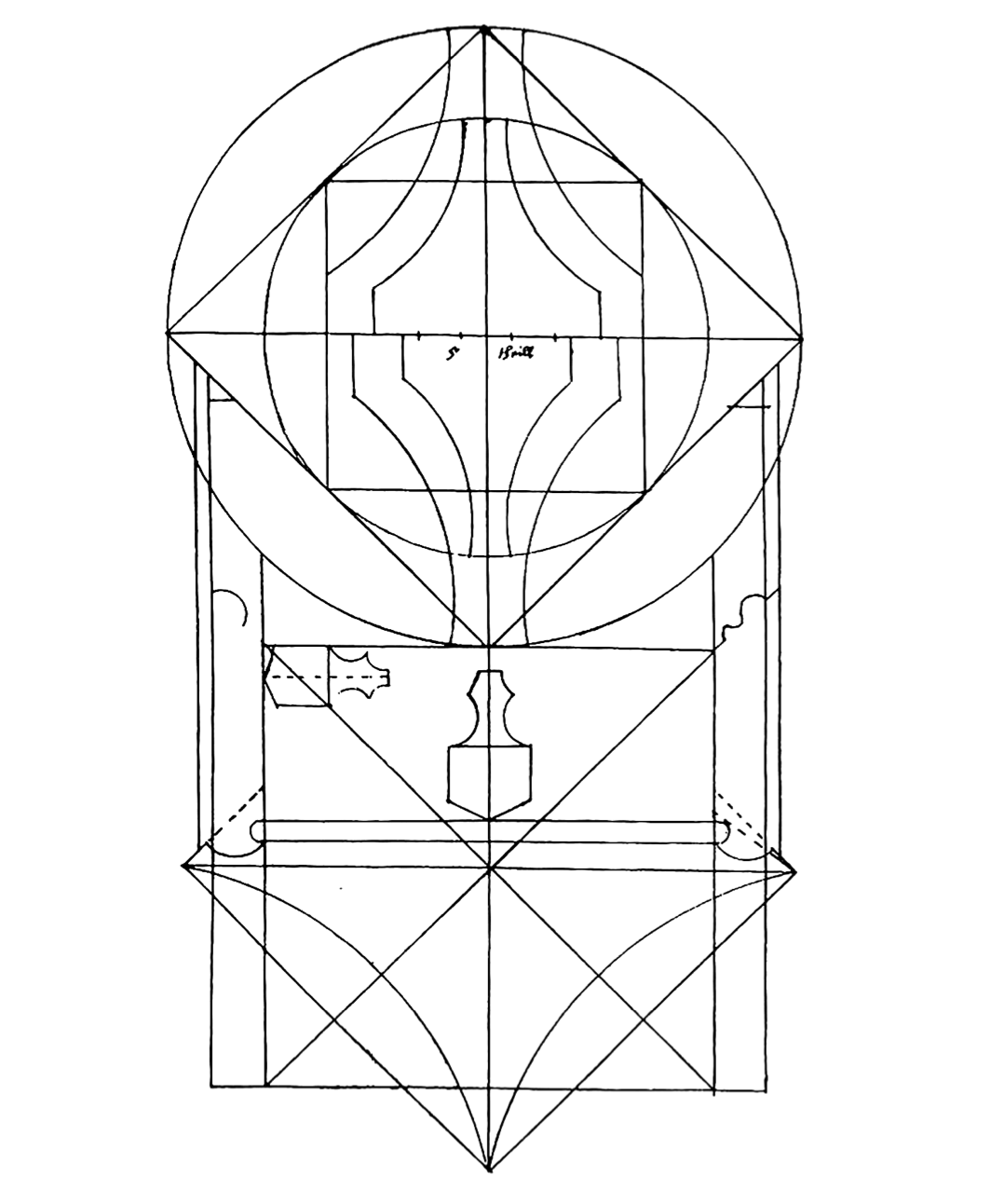
Photo from Lorenz Lechler’s “Instructions” (6)
Key Design Elements
Most examples incorporate some type of chandelier or other sorts of elaborate lighting fixtures. My favorite examples are those that incorporate rich colors with shadows playing across the surfaces, and those that incorporate high arches and semi-circles that are reminiscent of traditional gothic architecture. Some examples are more minimalistic rather than ornate.
Use of elaborate tracery, such as in stained glass windows, is another example of how classic and modern gothic style makes use of light and shadow for dramatic effect. A commonality between 13th century gothic design and modern gothic design is the use of creatures like gargoyle statues and deer heads, bones and gemstones, and hints of the occult.
Whereas author A C writes in 2019 that just 9 steps are needed to achieve a modern gothic look (9), other authors emphasize that the aesthetic is more than just being creepy and dark. Matt Camron describes a focus on light and shadow rather than just going straight for creepy vibes. (1)
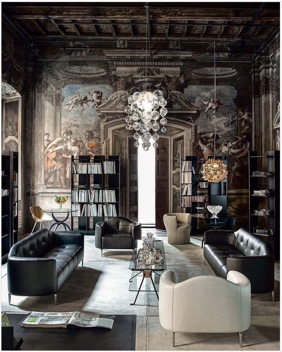
Photo attribution: @thedesignstoryy (8)
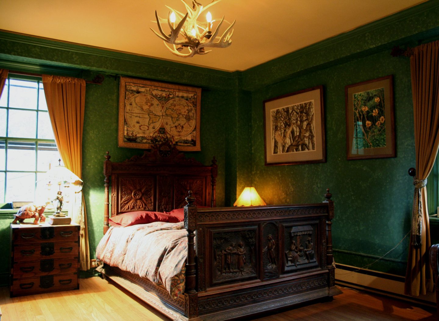
Photo Attribution: Anoldent (10)
Summary
This is an evolving aesthetic genre. What was declared passé in the late 1800’s (5) has seen a resurgence that continues to have a subculture presence. The design aesthetic for modern gothic is also influenced by other gothic aesthetics such as seen in media and fashion. Today, this aesthetic is still evolving. In 2020, Adobe produced a video showing the modern Gothic aesthetic as it pertains to digital art. (11)
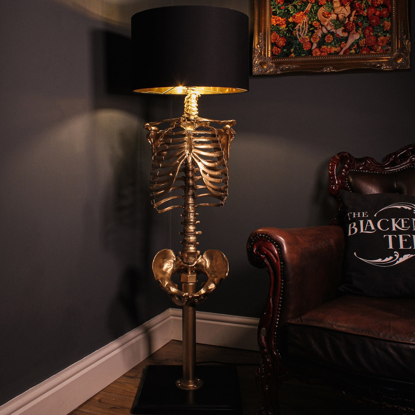
Lamp on Etsy, created by theblackenedteeth (12)
References
- Cameron, Matt. “Modern Gothic Decor: What It Is & Isn’t” https://www.mattcamron.com/blog/modern-gothic-decor-what-it-is-isnt
- Laboratorio Simbirizzi. “Gothic Patterns” https://www.etsy.com/listing/1335890747/gothic-seamless-patterns-digital-paper
- The Art Story. “Gothic Art and Architecture” https://www.theartstory.org/movement/gothic-art-and-architecture/
- Wikipedia. “Lorenz Lechler” https://en.wikipedia.org/wiki/Lorenz_Lechler
- Wikipedia. “Modern Gothic Style” https://en.wikipedia.org/wiki/Modern_Gothic_style
- Bork, Robert. “The Geometry of Creation: Architectural Drawing and the Dynamics of Gothic Design” https://geometriesofcreation.lib.uiowa.edu/wp-content/uploads/sites/67/2020/06/BorkGEOMETRYintro.pdf
- Schwarz, Christopher. “Introduction to Gothic Tracery (with a router)” https://www.popularwoodworking.com/editors-blog/introduction-gothic-tracery-router/?et_mid=700734&rid=249158210
- Thedesignstorry. https://www.instagram.com/p/Bo74JzHhLm5/
- A C. “9 Simple Steps to Modern Gothic Design” http://padstyle.com/9-simple-steps-to-modern-gothic-design/21025
- Anoldent. “Gothic Bedroom” https://www.flickr.com/photos/anoldent/2124818104
- Adobe, “Design Trend: Modern Gothic” https://www.youtube.com/watch?v=LtM5VainrcM
- Theblackenedteeth, “Gothic Macabre Home Decor https://www.etsy.com/shop/theblackenedteeth

3 Comments. Leave new
[…] Aesthetics of Modern Gothic Design – Aesthetics of Design […]
I have been always attracted towards the Gothic design. There was always something deeper about it, which appealed to me. You highlighted that very clearly about how light & shadow – an either end of spectrum, complements each other to bring out a varied range of shades of gray & give a feeling to this entire form of design.
The importance of geometrical aspect was surprising to me & make me delve in to gothic design more.
What I wonder now – Is there a relation between highlighting shades of gray & how calculated geometrical aspect constraints are in this design? Does geometry and duality of light complement each other? Or they are just isolated parameters in Gothic Design form?
I was fascinated with the section you included about the sacred geometry of gothic architecture! I had no idea that such design “rules” were implemented in an environment that, at first glance, appears to be intentionally random. The images that you chose to feature also really emphasize this duality between “light and shadow” that prevents the design from becoming too creepy or off-putting. It is clear there is a fine line to balance the differing elements in these interiors, making it a difficult aesthetic to replicate.