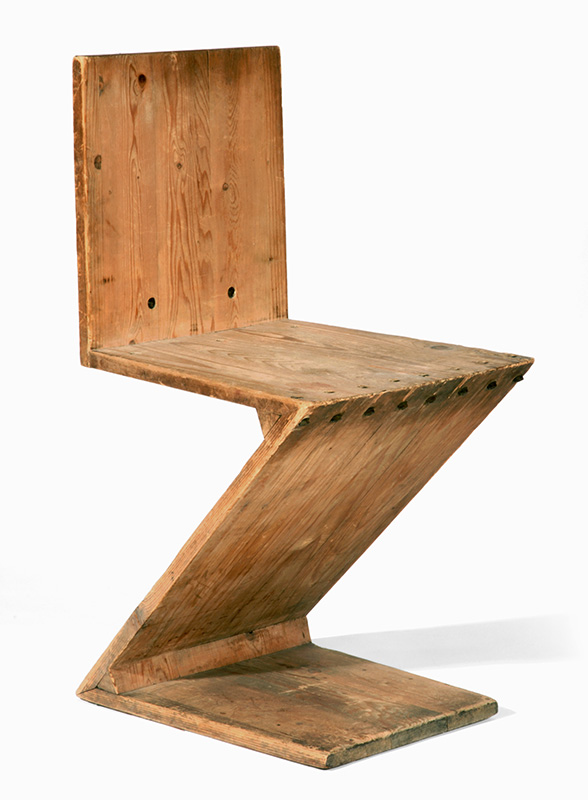
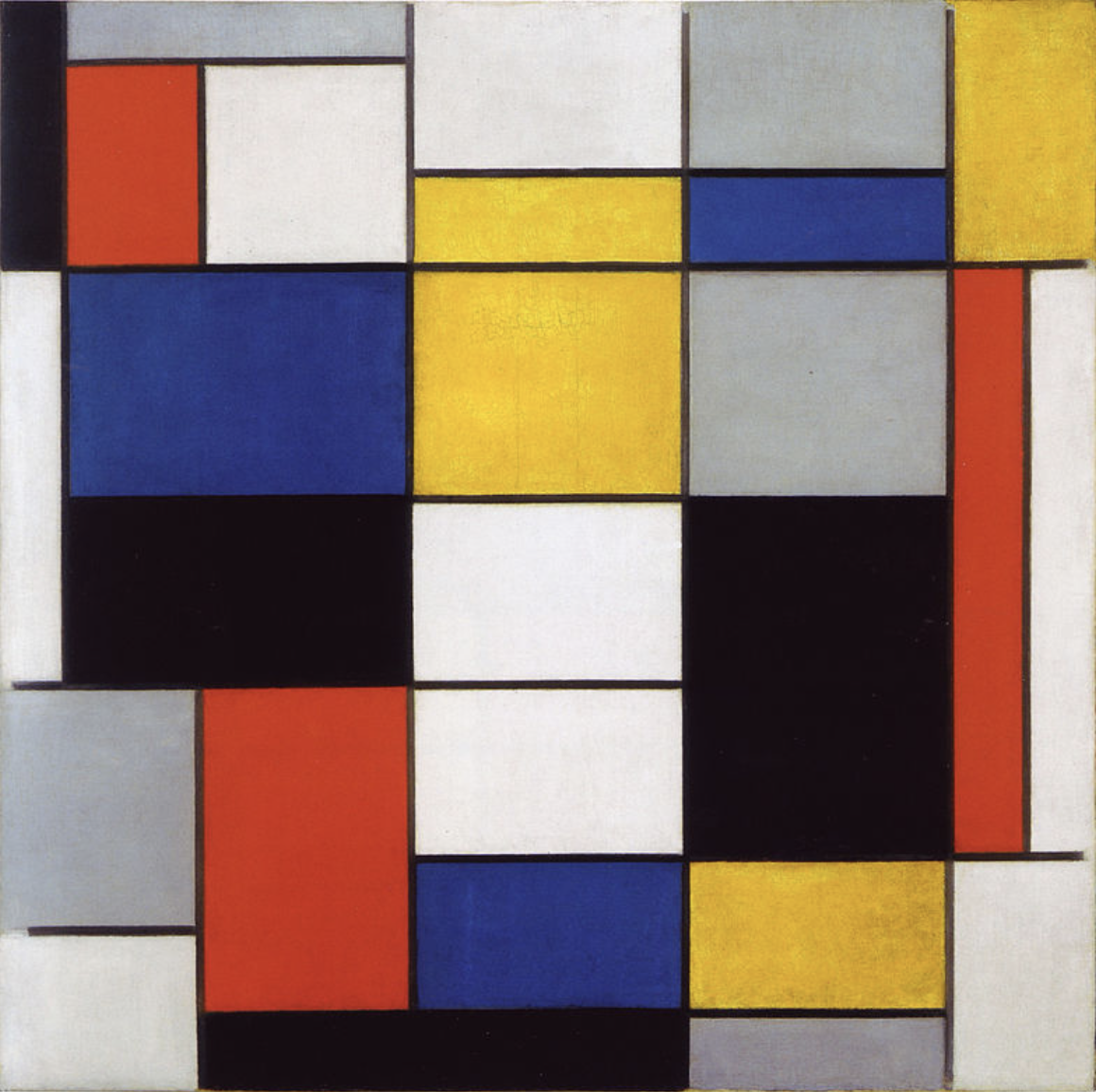
The De Stijl movement was founded in 1917 and is known for having major contributions to the artistic and architectural world. Considering that the De Stijl aesthetic began towards the end of the Expressionism era, which was known for its unusual massings, distorted forms, and natural influences, there is no doubt that the primary “fathers” wanted to start a new art movement. Designers like Theo Van Doesburg, Piet Mondrian, and Gerrit Rietveld were some of the first to create a new set of rules and vocabulary that followed the De Stijl aesthetic. In fact, together they wrote The De Stijl Manifesto, which talks about this new “plastic” art. Essentially referring to plastic as a 3D form. Terms like “Abstract” and “Universaility” were presented for the first time, and it truly opened up new windows for designers during this period.

Also known as Neoplasticism, this new plastic art had heavy connections to art, sculpting, painting, and the need for simplification. Through multiple manifesto iterations, it becomes clear that a few major elements stood out. De Stijl’s ideologies followed this main idea that the art and architecture found around us should embody a more powerful form of life, which is seen in Utopian Ideals like harmony and order, the hope of a creation of a universal language of art, and that abstraction leads to purification. These ideas were so strongly portrayed to other designers, that soon enough there was a group of characteristics that were easily identifiable during the De Stijl movement. Characteristics such as the reduction of all forms and order to the essentials and simplified compositions were the foundation for everything else. The term abstract was so commonly referred to because of its meaning for the most basic form of something, this led to greater use of horizontal and vertical planes, asymmetrical features, and the use of primary colors (Red, Blue, Yellow, Black & White).


While the De Stijl aesthetic was mainly developed within the first few years of its existence, the style continues to live on through art and architecture in our world today. Further development of the De Stijl aesthetic has come to a stop, although the continual use of De Stijl characteristics seems never-ending. Between paintings, clothing, buildings, furniture, and anything in between, there is no doubt that simple and essential forms are constantly desired in our everyday lives. That is why the De Stijl aesthetic can still be seen today.


Image References
- https://www.kirklandmuseum.org/collections/work/zig-zag-chair/
- https://www.wikiart.org/en/piet-mondrian/composition-a-1923
- https://onartandaesthetics.com/2016/03/21/de-stijl/
- https://www.archdaily.com/99698/ad-classics-rietveld-schroder-house-gerrit-rietveld
- https://store.moma.org/products/de-stijl-storage-tower


2 Comments. Leave new
An interesting aesthetic. Very visually appealing, and bold but still minimal. It’s cool to hear about how the aesthetic came to be and some of the context surrounding it. Thanks for the information.
This post is very informative, and I love the descriptive use of picture and video throughout. The simplicity of this style is attractive, and I find it personally interesting.
How do utopian ideals figure into the art created in this period? The simplification and harmony & order are obvious, but I’m not quite sure how utopian ideals figure into this aesthetic.