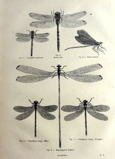
 Art Academia is the aesthetic that characterizes biological and naturalist illustration, patent diagrams, and DaVinci’s sketches. It is an old aesthetic, and a contemporary one. It spans various techniques and styles from pencil sketches to ink drafting. In all of its iterations however, it is characterized by largely black and white illustration with minimal earth tones. Shading is executed in uniform ink washes, stippling, or hatching.
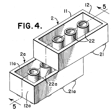
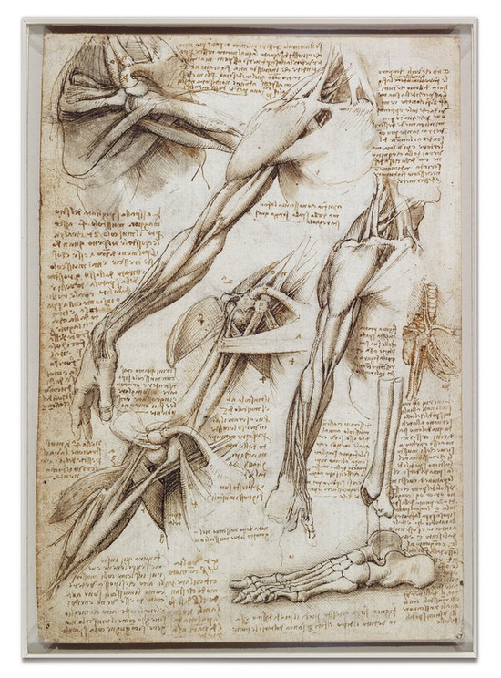
The aesthetic is generally highly detailed and technical, with its high detail serving as an attempt to increase its readability. Also in service to that readability, labels, captions, diagrams, legends, and even multiple angles or cross-sections of the same illustration are included and are one of the most defining characteristics of the style.
 From its purely empirical roots however, it has evolved into an art style all its own, taking on some of the aesthetic characteristics of the rigidly defined originals, but abstracting away from the harsh restrictions its functionality once placed upon it.
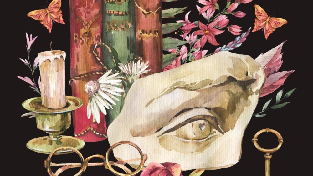 As the style evolves it can become a celebration of intellect rather than an enactment of it. Retaining artifacts of the original content but abandoning even some of the aesthetic properties, and beginning to diverge into a new aesthetic entirely.
Citations:
Tattoos from Scientific Illustration, a Pinterest board
US Patent Office’s website – Search for Patents
Da Vinci’s Notebooks – Anatomical study of the shoulder and arm
Mashable- Digital Culture – The academic aesthetic

3 Comments. Leave new
This is fascinating. I really enjoy this aesthetic. I like how it involves complex academia and talented artists. The drawings of the dragonflies reminds me of the book “Where the Crawdads Sing”. This is what I assumed Kya’s aesthetic was when she created her drawings. I find it interesting that this artwork that DaVinci did has become an entire aesthetic. How do you think this aesthetic has influenced other forms of art?
I thought it was very interesting how you tracked the evolution of this aesthetic over time. What factors do you think drove the aesthetic away from its original function and towards a representation of it?
I agree with Aidan that this aesthetic has definitely moved away from functionality and instead portrays information in a satisfying way. The examples in this post are definitely pleasing to the eye while also conveying figures and notes, almost how a student would. It’s interesting to see how this aesthetic has further evolved into objects of intelligence itself, with a collage of books, glasses, candles, and classic art. Who are the people who use this aesthetic, and do you think this aesthetic is restricted to those in higher education and beyond?