



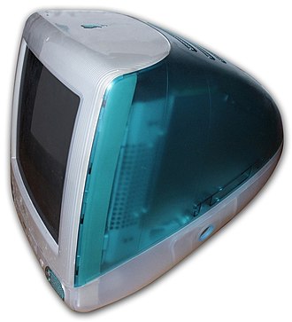
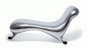

A blobject is characterized by flowing curves and the absence of sharp angles or brutalist styles. They’re typically brightly colored and feature friendly childlike design. This style reached ultimate popularity in the early 2000s, especially with the rise of Apple iMac computers, which took a much different path than the boxy, gray, sharp Commodore 64 and other early computing models (photo featured above). This aesthetic rose to popularity because it appeared futuristic in a world where such designs were not as prevalent. Companies like GEMCAR, GK Dynamics, and even Volkswagen, were early adopters of blobject aesthetics, as were many furniture designers. Homes gradually began to include abstract-looking and unusual “bendable”, “melted”, “soft”, or “malleable”-looking interior design objects and principles characteristic of this aesthetic. These loose and shapable characteristics applied to rigid and structurally secure objects, cars, and even buildings, gave a juxtaposition that was very attractive to designers in the late 90s and early 2000s, before the aesthetic eventually fell out of popularity. Even web design began to shift in this direction, as scroll bars on official OS layouts and design schemes began to have a “pop out of the page” blobby appearance as opposed to the square sharp-edged scroll bars you probably see right now. Buttons became rounded and lifted off of the page instead of flat and rectangular. This is an example of how this aesthetic has left a mark on the world of today, but most of the world has since shifted towards rigid structures, especially in automotive designs where the flowing, bubbly curves of the Jaguar have since turned to sharp, boxy Teslas. Some brands still use some of the design principles laid out by blobjects, even including large companies like Nike, who released their Triax watch featuring fluidity in design, a core element of the blobject aesthetic. The challenge of incorporating fluidity, motion, and character into products that still have significant functionality and integrity is a difficult one – sometimes sacrifices of function must be made to enhance the form. For example, the Apple iMac has a significantly increased size in order to allow for smooth curves and symmetrical design, but suffers from imbalanced weight distribution and excessive volume. Yet, it is likely that a product that is balanced and small would not sell quite as well because for almost 10 years the computer’s blobject aesthetic made it more desirable and noticeably different from other boxy styles on the market in the 90s. This aesthetic is beginning to make its way back into the public eye in modern times however, but this is primarily through web and mobile design, as well as technology products. The application of this aesthetic to technology evokes a slightly more futuristic feel, and the rounded bezels, simplistic button interface, and absence of sharp or boxy edges make the iPhone flow a bit better and appear softer. Even in UI/UX design, many developers use techniques which incorporate this aesthetic to appear more inviting and modern to consumers – design principles such as glassmorphism and soft parallax certainly fall under this umbrella.
Citations
https://www.10bestdesign.com/blog/taking-a-leisurely-scroll–a-brief-history-of-scroll-bars/
https://en.wikipedia.org/wiki/Blobject
https://www.vox.com/the-goods/2018/12/21/18145000/blobject-blob-home-decor
https://sjmusart.org/exhibition/blobjects-beyond-new-fluidity-design

1 Comment. Leave new
This is a really interesting aesthetic that I had never really noticed before, even living through it. The free-flowing shapes are pretty interesting, especially given how impractical they are as anything other than a statement piece.
Could this post be reformatted for easier reading? The separate blob of text and pictures feel like they could be speaking to each other instead of separate.