For my final project, I decided to create a topographical map of Copper Mountain. Copper Mountain is a ski resort that holds a lot of meaning for me, because it is a place where I have a lot of memories from my childhood, and also continue to go to for fun. Currently I have a few ideas of how to express the aesthetic that I am going for with this project.
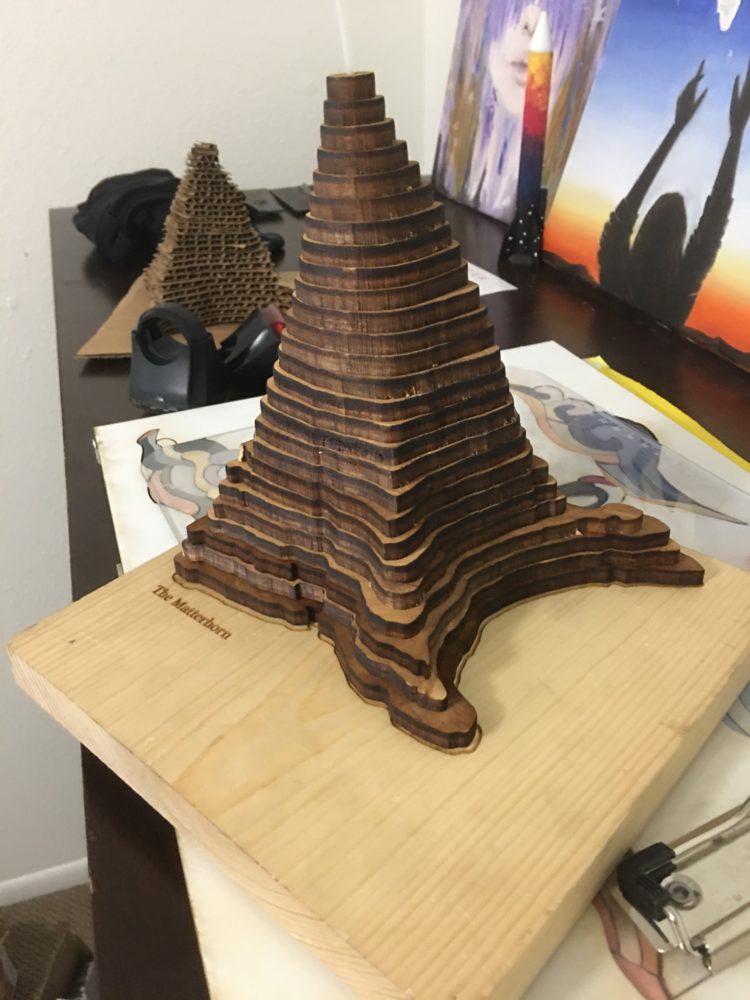
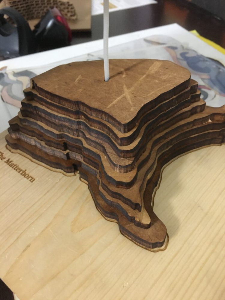
I chose to use laser cutting to create a three dimensional map of Copper. This would involve taking slices of the elevation, and adhering the layers together to build up the form of the final project. I created a prototype of a similar idea several years ago, as pictured below, but I learned a lot from that project that I would change. Creating Copper would be a much different process, because it would be more of a landscape, as opposed to a single shape, which would make it a more complicated assembly. I also want to choose different materials to achieve the aesthetic I want. I would not use chip board or cardboard, because I found in this prototype that I was displeased with the final aesthetic. Finally, I also want to and I would scale the height of the layers properly to the size of the landscape so that the elevation had the correct ratio to the surface area, which I did not do in this case. Finally, I want to use LED lights to illuminate the part of the map that represents the ski village. This goes back to my personal aesthetic post, where I mentioned alpenglow, and the illuminating of the mountains at night time. This is one of my favorite aesthetics, so I want to be sure to include this. I also think that it would look super cool at night time, when the LEDs could illuminate the shape of the mountains. I also wanted to figure out how to capture the color of a ski resort at night, with the glow of the lights on white snow.
![]()
(personal photos)
This represents an example of the product that I was hoping to create. I loved the shapes of this, and wanted to make something similar in my own aesthetic.

(An example of laser cut topographical maps, by Carved Lake Art)
To do this, I used a program to generate elevation lines on a map of Copper, and took the lines to a resolution I was happy with. I decided to use 21 lines, set an equal distance apart. By calculating that the area of land that I took was about 17,900 meters (square) and the peak of Copper is about 2600 meters vertical from the base, I found about a 6.9:1 ratio. From this, I was able to calculate that the thickness of each slice should be a little less than 1/8th of an inch, which I rounded to 1/8 for ease of material location.
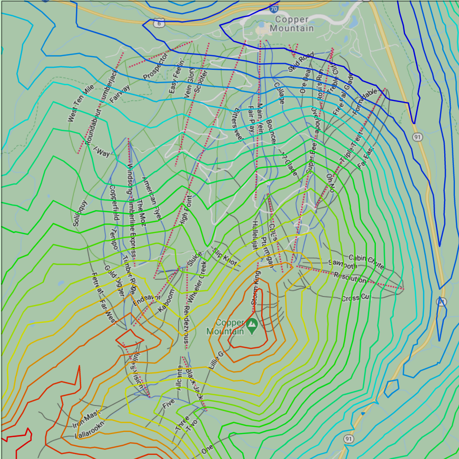
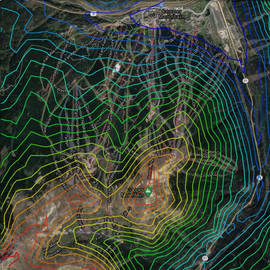
(Images created via Dr. Christoph Hofstetter‘s program at this webpage)
I then took each of the layers from the contour map, and put them on an individual square to be laser cut in the program CorelDraw. I added an additional square cutout in the bottom left corner of the bottom layers (which would get covered up by the upper layers) to leave room for electronics such as a battery pack. I fit the smaller pieces into this cutout to save on material costs. Finally, I added a small rectangle into the highest pieces in order to be able to orient all the layers, both in position and in angle.
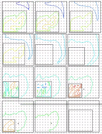
(personal image from CorelDraw2020)
I separated each of these layers into sets of two so that they fit the dimensions of the laser cutter.
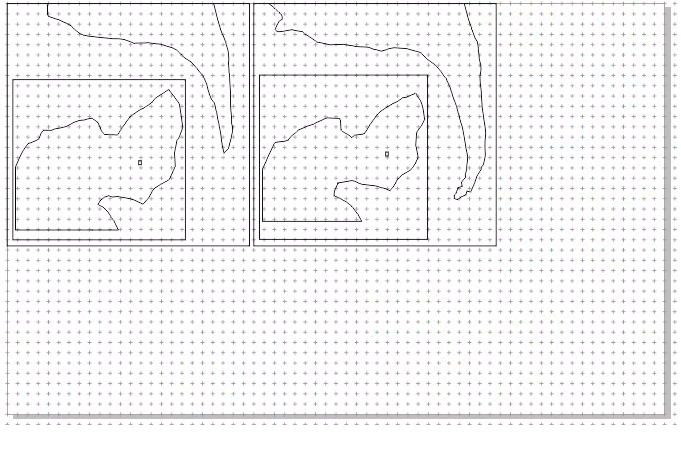
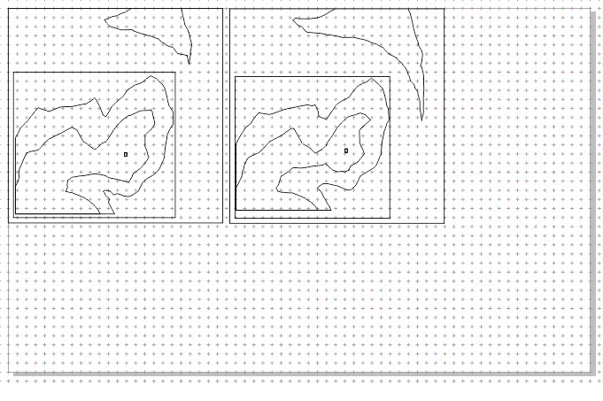
(personal image from CorelDraw2020)
Finally, I cut these layers out of a sheet of foam core. I assembled each of the pieces, and hot glued them together, all of which took about four hours.
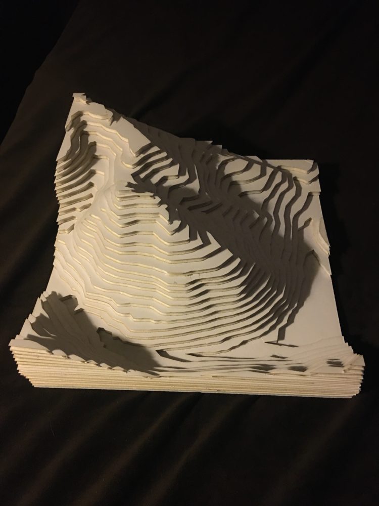
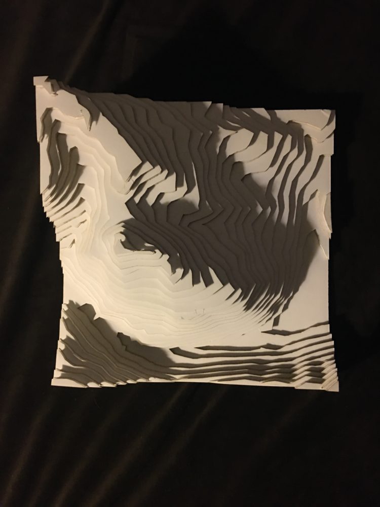
(isometric view, top view – personal photos)
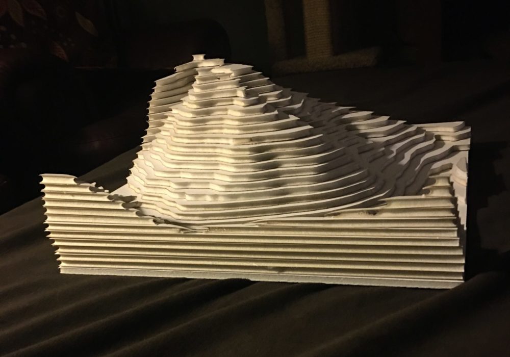

(side view, bottom view – personal photos)
Here, I have shown isometric, top, side, and bottom views. The cut out of the bottom is for the electronics, which I will prototype next. I was surprised by how much I liked the foam core material. I thought that this would be a “throw away” piece just to plan out the wood version, but I quite like the white color, and how the difference in texture and the burning of the foam in the center make for very distinct layers. Another plus of this material is that it is extremely light, and would make it very easy to mount, or leave somewhere.
From here, I had intended on making a final version out of wood. However, my computer stopped working at this time, and was not able to connect to its own hard drive. Effectively, I lost all of the files I needed to create this project. Since the creation of the CorelFiles for laser cutting took me about 8 hours, I did not have enough time to remake, then print 12 new files. As such, I ended up sticking with the foam core that I used as a prototype.
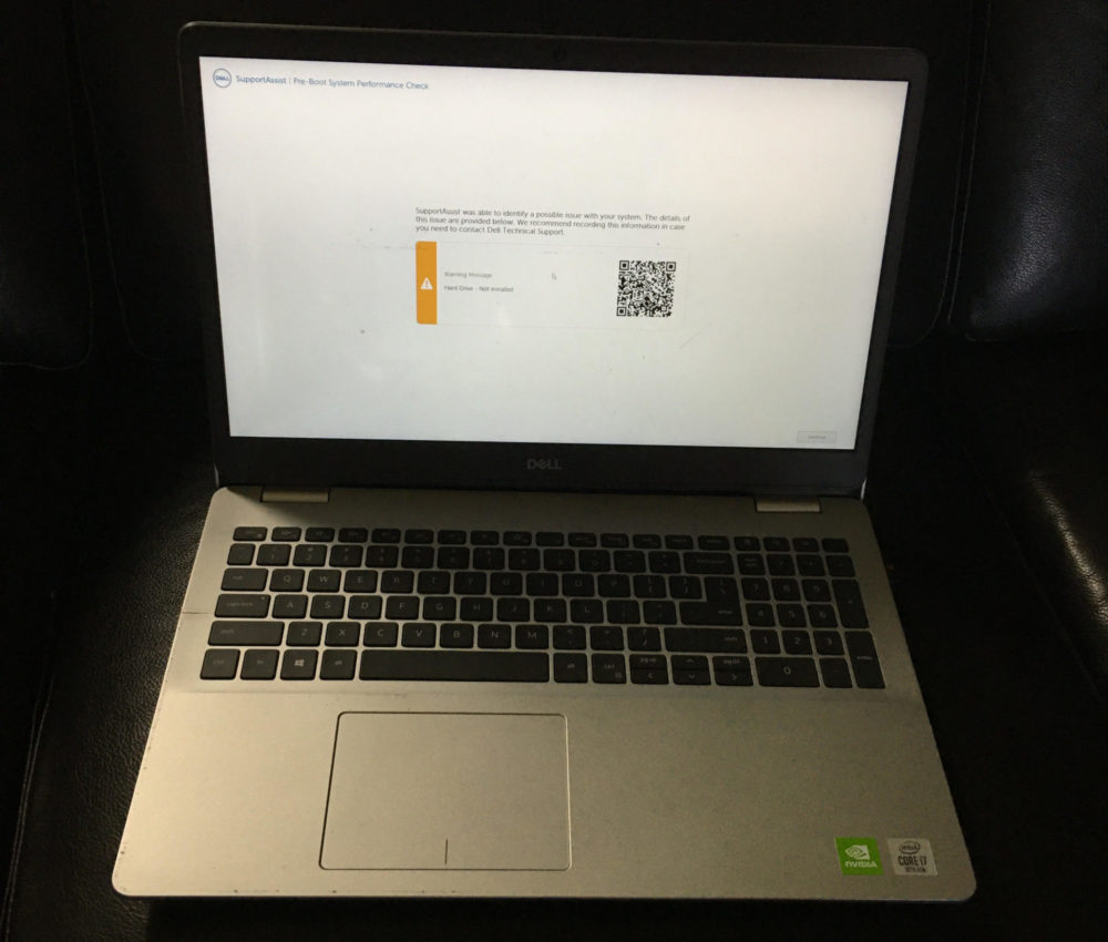
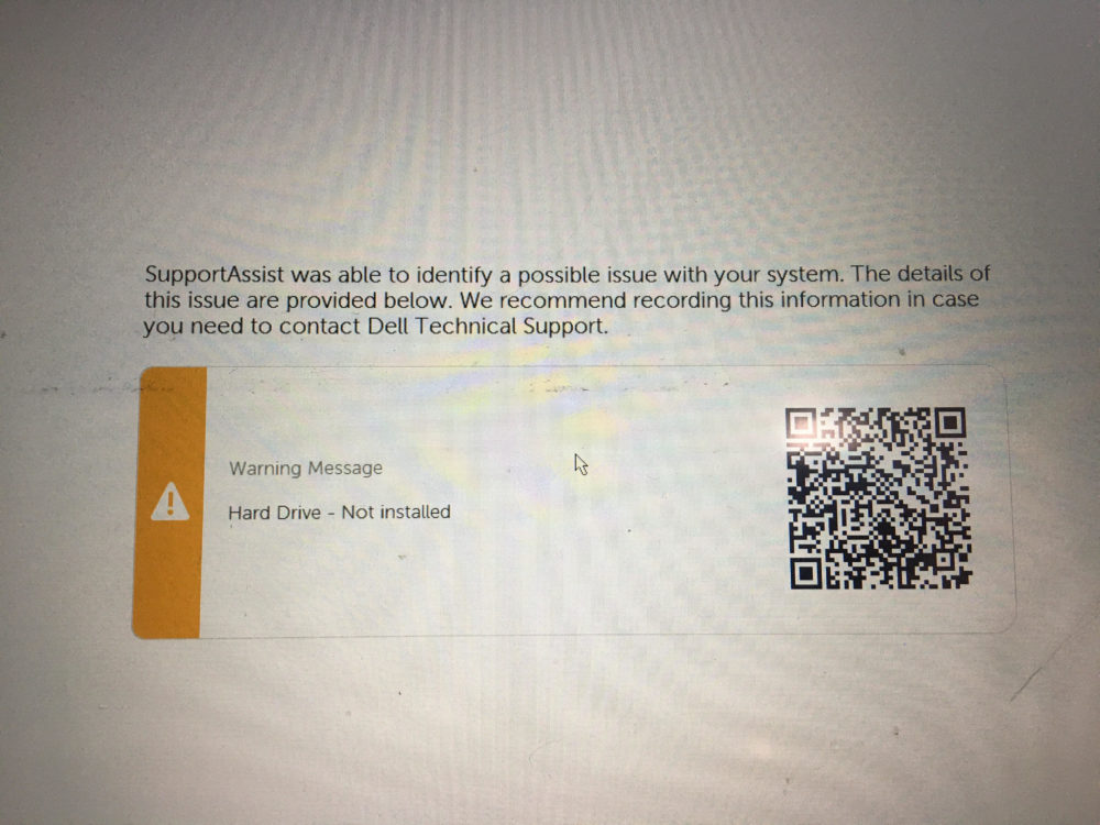
(personal photos)
Because of this, my overall timeline was affected. Since I was still hoping to recover my files from my computer, I lost about 1-2 weeks with the replacement of it. However, I later found that I was not able to recover anything that I needed, so I would be using the parts that I already had. I will detail below how the assembly worked with these materials.
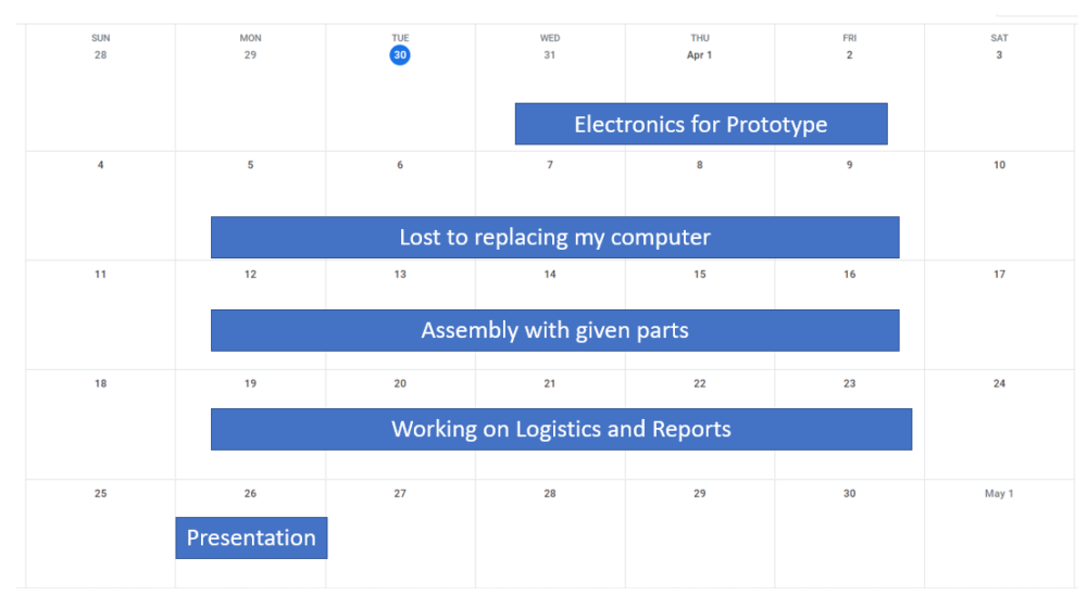
(personal picture)
I added the lights that I wanted to the foam core prototype. The lights that I used were 3 foot fairy lights off of Amazon from a previous project. This was the most cost effective and simple option for me, since it meant that I didn’t have to wire anything myself, and that it came with its own battery pack and on/off switch. Since I wanted the lights to represent the glow of a mountain town, I didn’t want them to be too harsh. As such, I began this process by punching holes in the bottom layer of the foam core, then cutting out the bottom paper and foam with a knife to leave a cavity. This way, the lights would have a layer of paper over top of them, so they wouldn’t be direct or harsh.
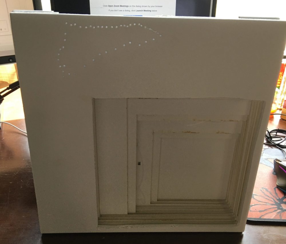
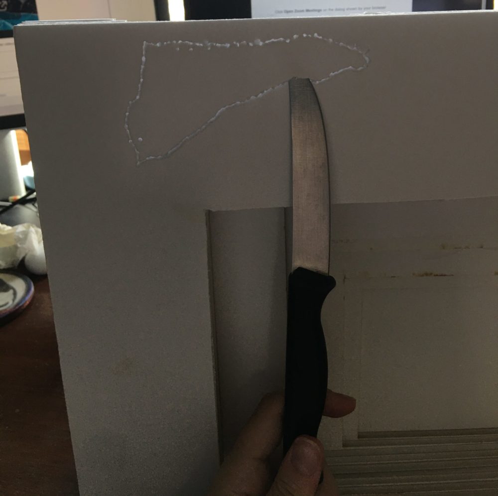
(personal photos)
I then added LED lights to the cavity to see how they looked. I noticed that a lot of light was leaking out of the back of the map, which was not ideal. Since the back will be against a wall, or other surface, the light serves no purpose. Because of this, I decided to use some material to reflect the light back through the top of the map. I wanted to use a material that was pink colored, to give the lights a pink glow for my Alpenglow aesthetic. After testing several different types of fabrics and materials, I decided to go with tin foil, since it was the most reflective. I also decided to color the surface of the tin foil with a fuchsia Sharpie, in order to play into that Alpenglow aesthetic that I was previously struggling with. Out of all the materials, this gave the lights the nicest pink glow, and made me much more happy with the color.
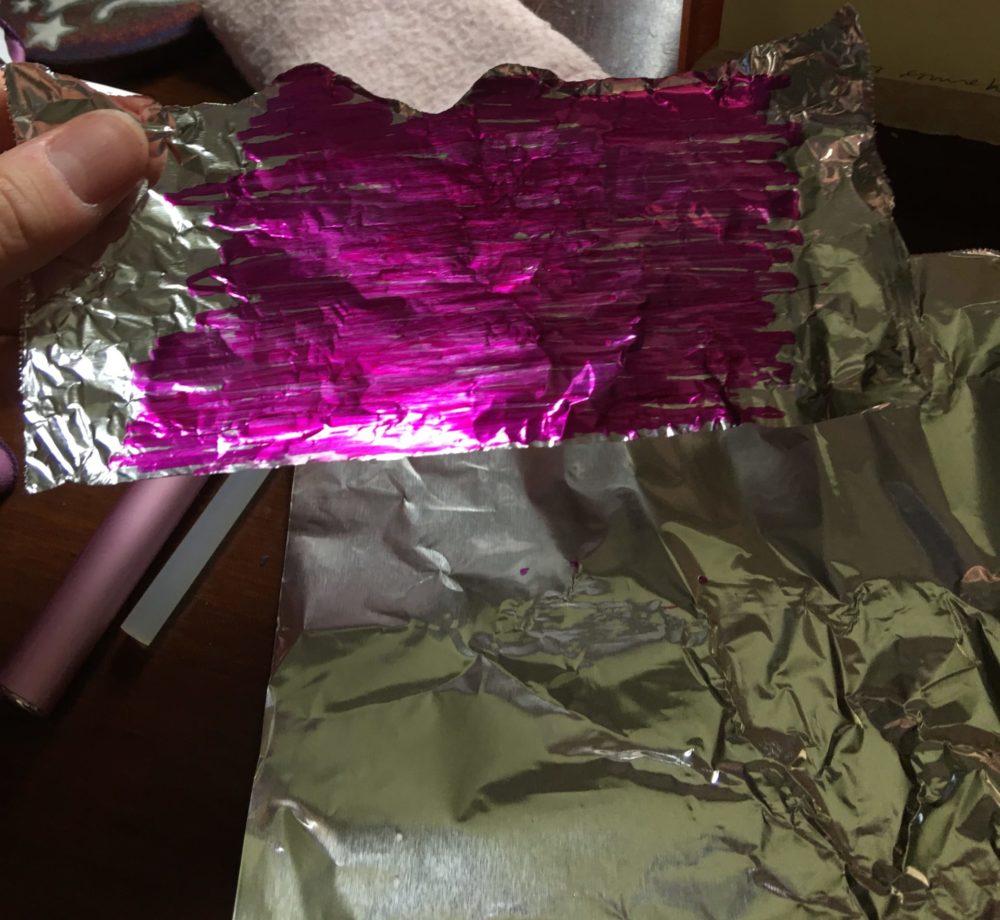
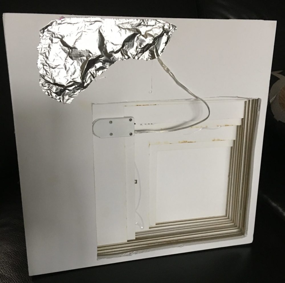
(personal photo)
After turning the lights on, I took a picture of the product. Since the map has a single light source, its difficult to photograph as is in a dark place. Here, I photographed it at the lowest exposure, in order to capture what the light hit. I wasn’t happy with the light, because it was super isolated. I wanted something that cast light against the sides of the mountain tops, so I could get the “glow” that I was looking for. Here, the light was too isolated beneath the foam core.
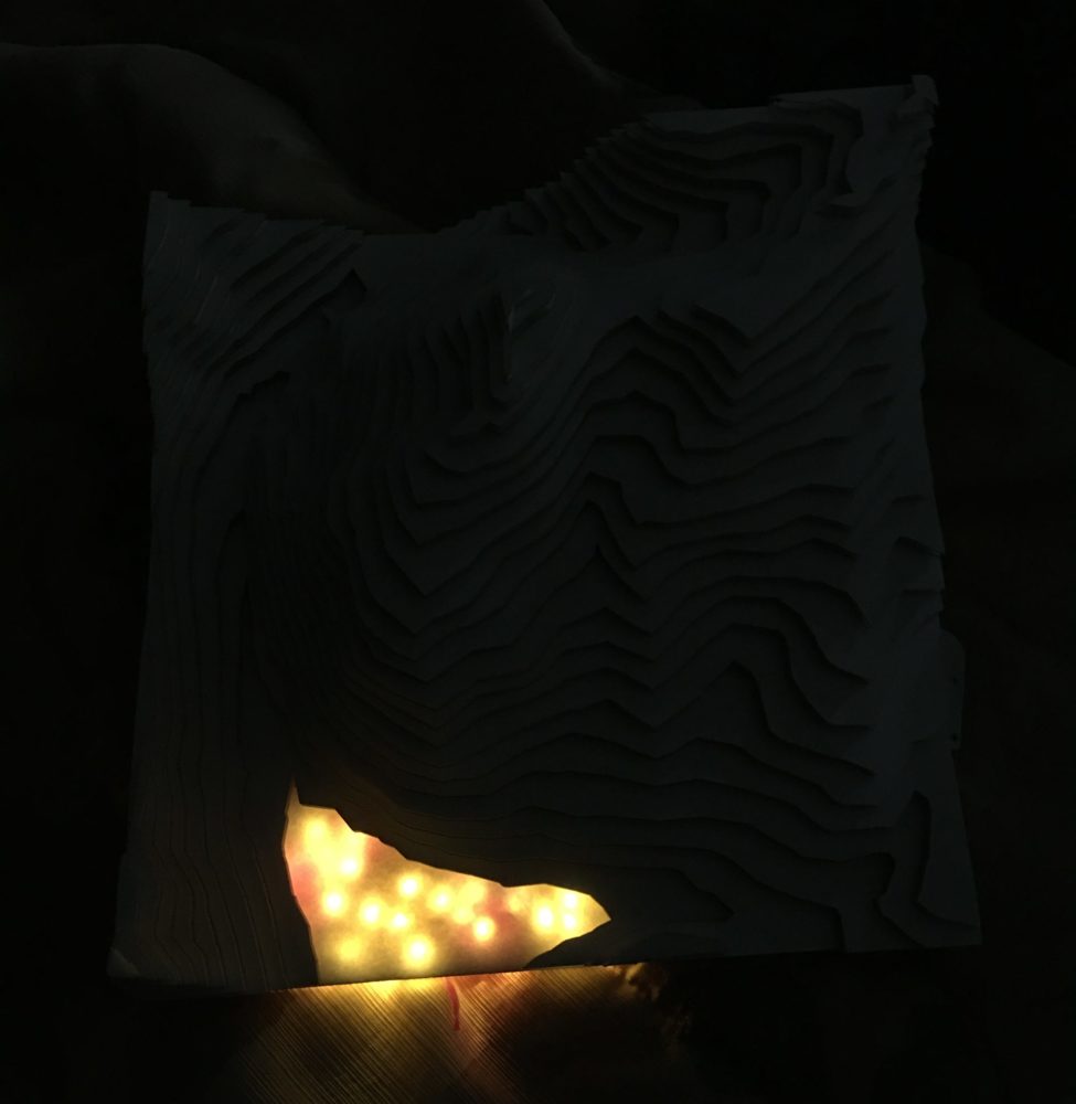
(personal photo)
As such, I decided to make some of the LEDs go past the surface. This was something that I was hesitant about, because I knew it would ruin the smooth aesthetic of the surface. However, I decided that it was necessary in order to achieve the aesthetic that I was going for. I chose to put three LED’s on the surface of the mountain to represent the three villages in Copper Mountain, East Village, Center Village, and West Village.
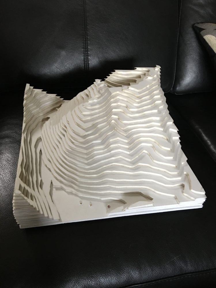
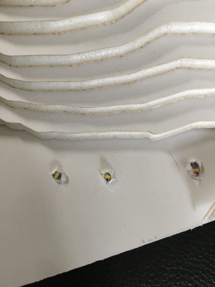
(personal photos)
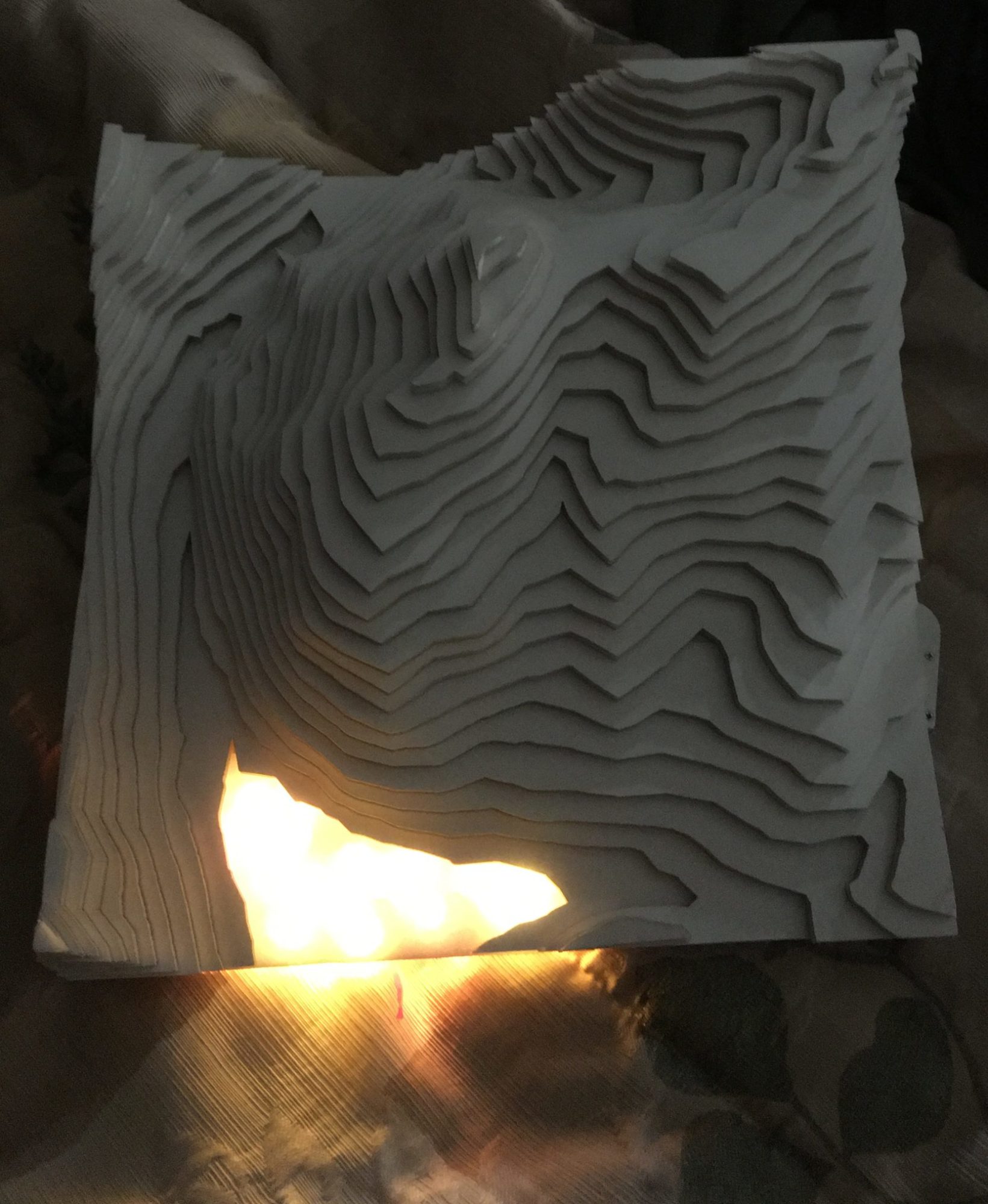
However, after turning on the lights, and taking the map to a dark location, I knew that I made the right choice. Below, I have pictures of the project at three different exposure levels. As you can see, the lights cast far more glow on the mountain sides, and greatly improve the aesthetic of the project.

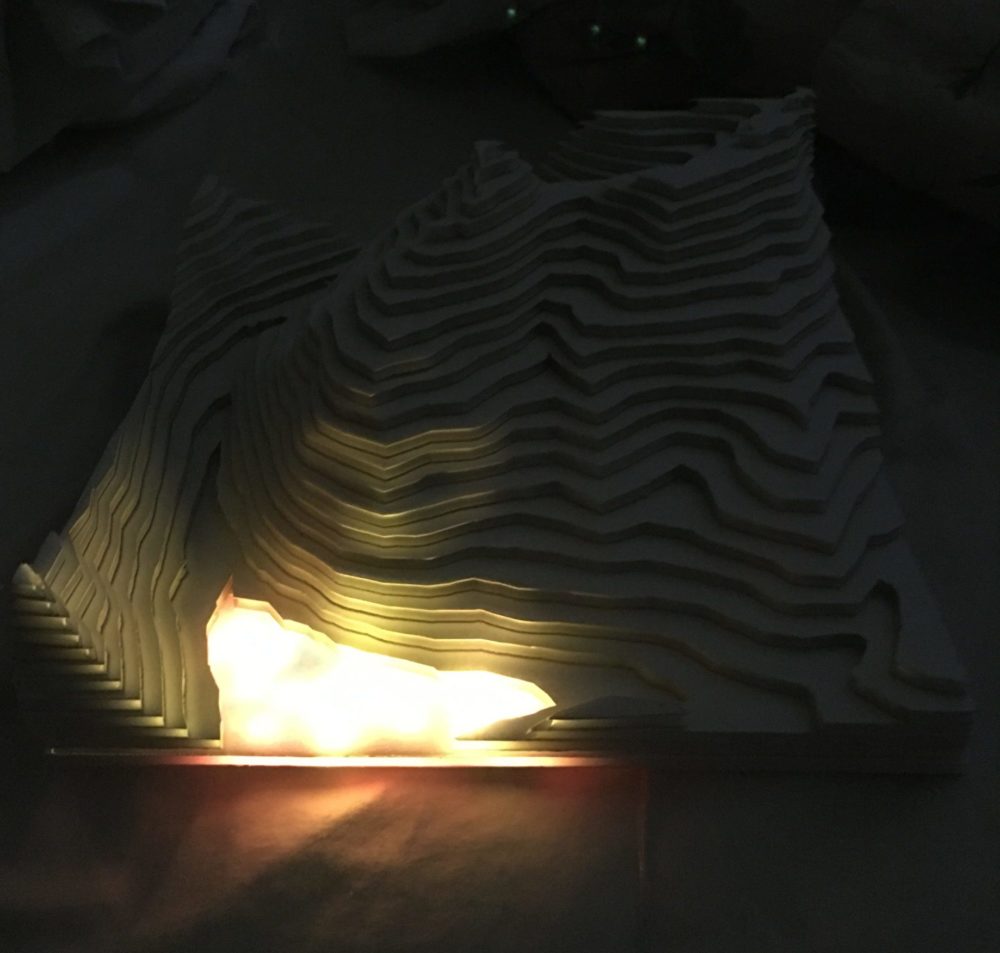
(personal photos, highest exposure, mid exposure)
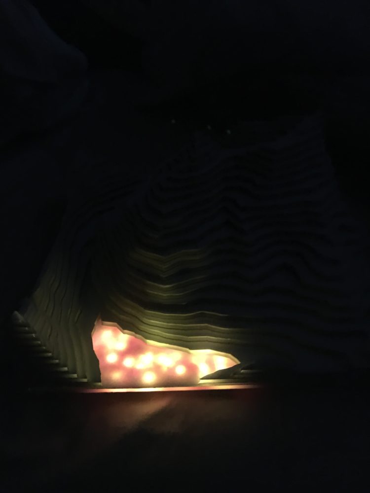
(personal photo, lowest exposure)
Overall, I was very pleased with how the project turned out. I was happy that I was able to make the best of it, even though I was not able to create a wood version like I originally intended. I had hoped to make something similar to the Grand Canyon art piece that I referenced in the beginning, but ended up with something that was a bit more modern, and minimalist looking. However, I feel like I was able to tie in the Mountain Night Life and Alpenglow aesthetics that I wanted, through the glow of the LEDs and the subtle color that I was able to add in with the colored tin foil on the back. I also feel that the white of the foam core adds to these aesthetics, since it looks a little bit like snow on the mountains. I think that the project embodies the aesthetics that I was aiming to achieve, so I feel successful in my goals.
If you would like to hear me talk about my design and its progress, I have my presentations below.

2 Comments. Leave new
Hi Jillian,
You’re project turned out really great. I think you did an awesome job from starting with your initial idea and then getting to your final project. The LEDs you chose look great, but I do agree with the above comment. That being said, if you aren’t looking to spend anymore money you could use cotton balls and stuff them in the area with your lights to diffuse it. I know that someone else used cotton balls to do that exact thing in their project this year, I believe it was the light up bear.
Hi Jillian,
I like how you improvised after the problem with your computer. I love the idea of colouring the foil with pink to give a pinkish back-lit effect with the LEDs. Do you think adding a polystyrene/acrylic diffuser would be a good idea to give a more diffused spreading of the LEDs and could remove the distinct spots of LEDs that can be seen in your last picture?
You can probably order a sheet of the diffuser and cut it to the shape of the landscape you have. Here is a link:
https://www.1800ceiling.com/products/led-light-diffuser-lens-060-white-23-75-x-23-75?variant=34563429433388&gclid=Cj0KCQjwsqmEBhDiARIsANV8H3aTp5MoJVSJv7_-20KJlsqFfRkPfOnz0wqrRVQKeR7mw84zk_E0LL4aAlnbEALw_wcB