For my upcycle project I was really inspired to explore further the low poly aesthetic. The low poly aesthetic while visually stunning in it’s simplicity has two different forms. 3D and 2D. The 3D low poly art is a fully rendered computer model with triangular facets which is shaded in accordance to simulated light. It feels like a real, if simplified, view of our world. The 2D side of low poly explores the use of color and texture producing images that are more minimalistic in nature. I talked in more detail about these in my aesthetic exploration post if you would like to learn more. For this project I really wanted to embrace both sides of the aesthetic by building a 3D sculpture while exploring the different effects of color on the finished product. With that in mind I sketched a simple design of a rocky archway with a gem suspended from it, not knowing how different the final project would actually be.
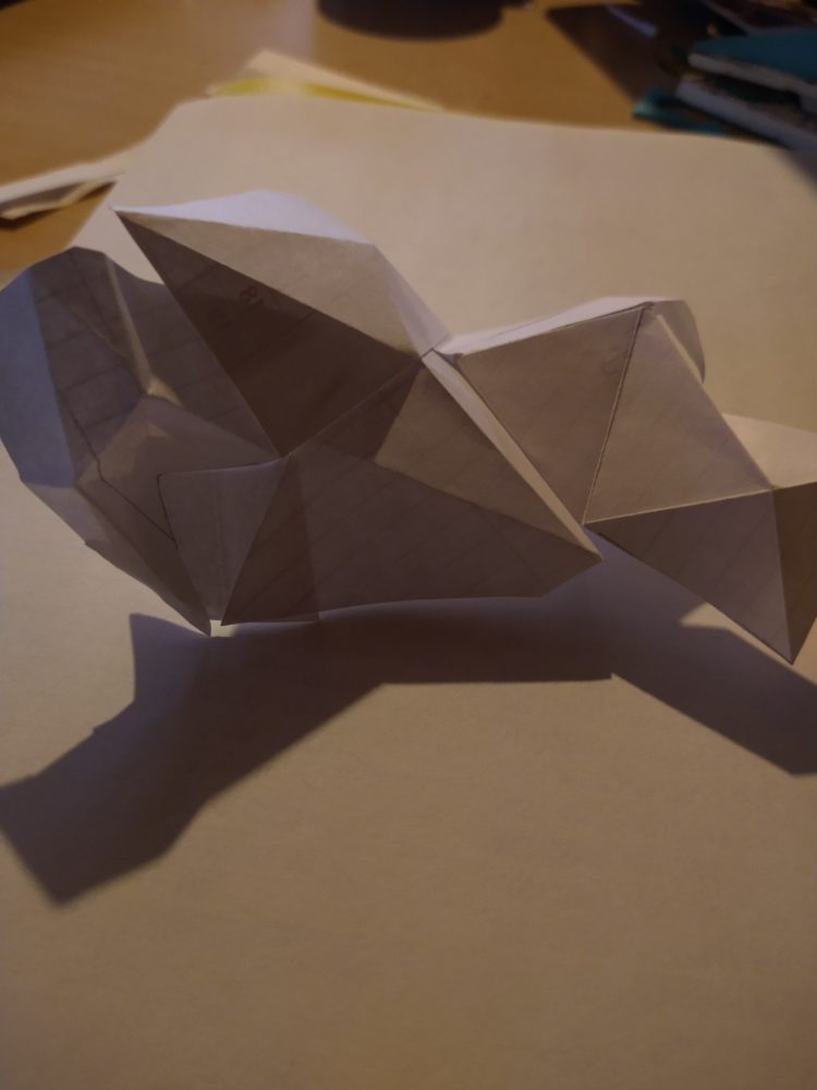
To begin I just started to fold recycled paper. Triangles, small, big, really playing with the three dimensionality of the forms that were created. Playing with the nooks and crannies, the valleys and mountains that could be created just through varying triangles. Through this I discovered that the best results came from small pieces of paper being folded and then glued and taped to the next piece. This technique allowed for the most interesting and dynamic shapes to be created without being limited by larger sheets of paper.
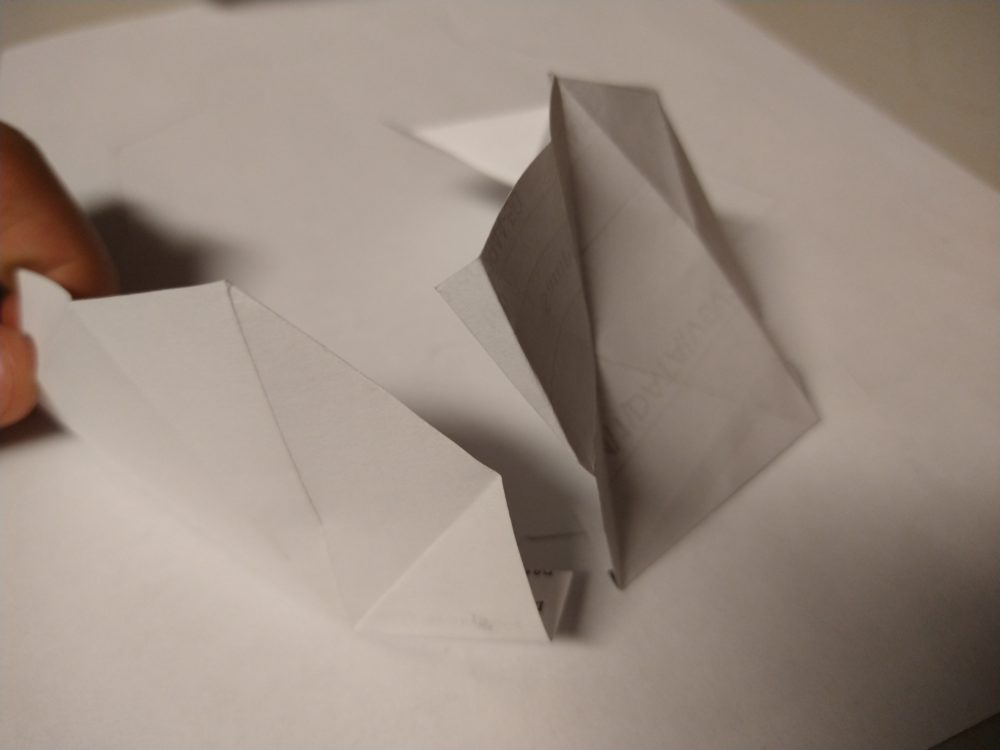
Once my technique was acceptable I jumped into making the base of my project, and this is really where it became something unexpected. Each sheet was carefully folded and glued to the base. But with each sheet added, the next sheet had to fit with the others before it. This lead to something not in my original master plan, but something better, something organic, and something that even the artist can still be fascinated by today. And I wouldn’t have it any other way. Carried by the whims of my project I sallied forth into uncharted waters.
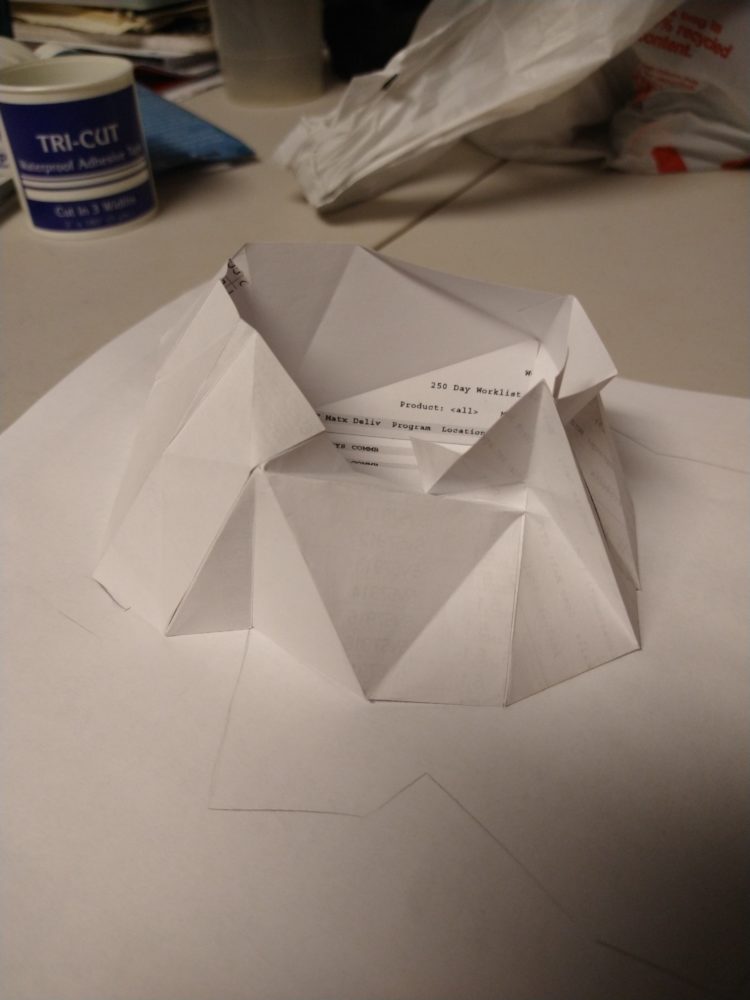
This is an almost finished version of the base and it can easily been seen how far the whims of my project carried me away from my original pencil outline. A few more small tweaks to the base and it would be complete. But it was missing something. I couldn’t leave this project with the crowning jewel, a regular polyhedron. Originally I had in mind an octahedron for it’s thinner shape to really accentuate the arch. But to me this base was really calling out for something more spherical in nature so I chose an icosahedron. To construct this, I tried an failed to glue together equilateral triangles, and instead created 20 tetrahedrons that were then glued and taped together to form the icosahedron.
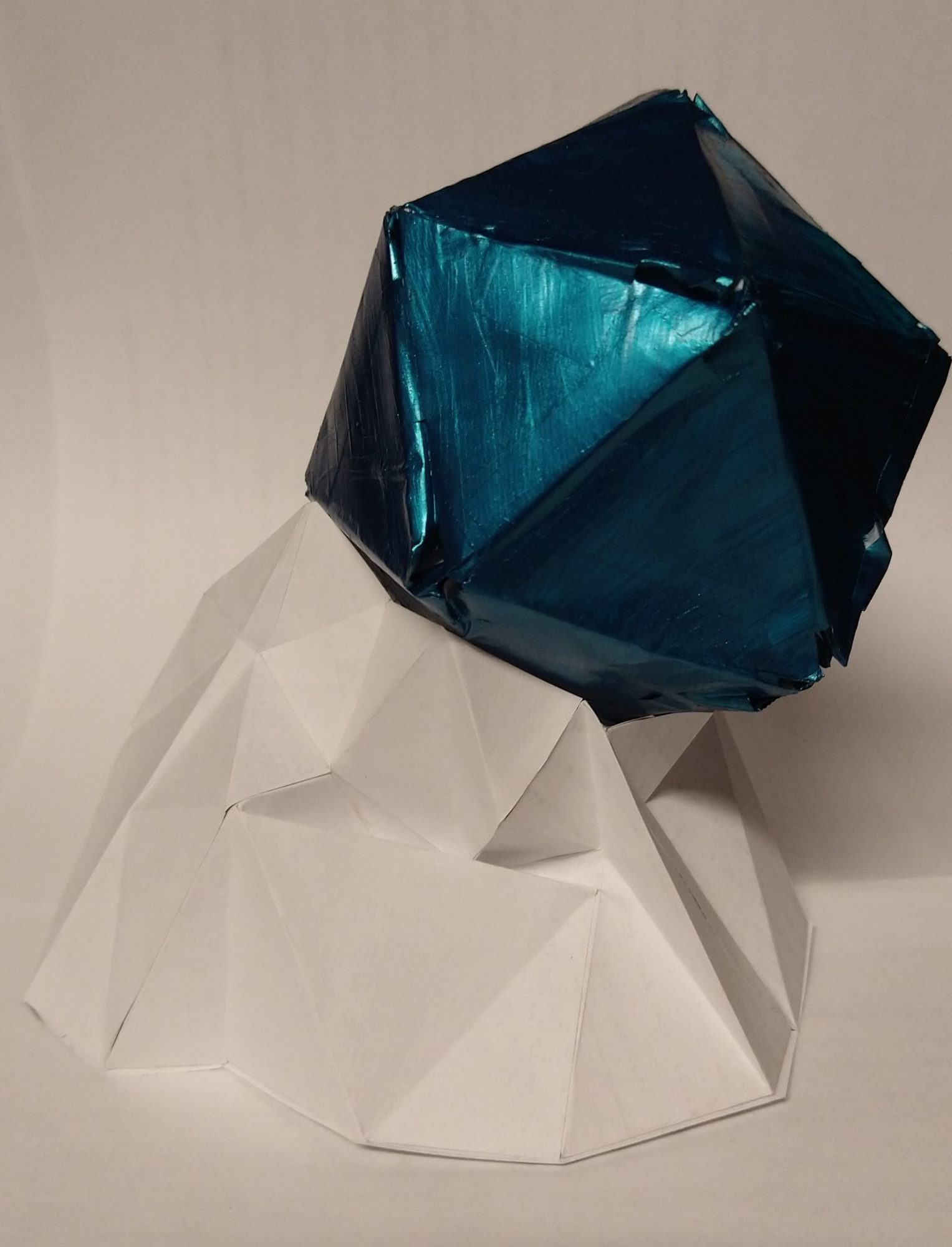
The last and final piece of my project was color. I really wanted to explore different hues and different shades much like the 2D poly art aesthetic. However I never got that far. I painted the icosahedron this metallic turquoise and It just felt complete. I really fell in love with the contrast between the jewel and the base of the project. The base was clean and crisp, showing off all the shadows with pristine white. It used smaller more irregular tringles to make a perfectly craggily texture. While the icosahedron is brightly colored with slightly rounded corners, and slightly messy with the brush strokes in the paint. It used perfect equilateral triangles, symmetric upon every axis. Everything about the two parts contrasted each other so perfectly.

Of course there are a few things that I would like to change, one being the finish on the icosahedron, the tetrahedra did not fit perfectly together and that left gaps. Also on the base some parts (luckily on the back) didn’t fit together as well as I would like. Many small things in the manufacturing could be improved. On the aesthetic side I couldn’t be happier. It fit the aesthetic really well and the contract between the two parts is my favorite aspect of the design. Overall I am very happy with how my project turned out. It became a beast of its own and in my mind became better because of it.
Listed below is the recording of my presentation and associated questions and comments.

2 Comments. Leave new
I’m a fan of the low poly aesthetic, and I think you’ve captured it well here. I like how you mention the organic development to the sculpture, it adds some nice flow to contrast with the hard edges of each piece. I can appreciate how hard it must have been to get all the papers to fit together properly, so I think you did a great job getting that to come together. I like the color variation with the top piece. I do feel as if it is maybe a bit unbalanced, as if the whole think is leaning over, tipping over, or maybe reaching. I’m wondering if that was an intentional design choice, or part of the organic development as it was built?
Hi Stephen, this is a really cool project. I like the fact that you chose to make a sculpture. I didn’t know much about the low poly aesthetic, but from your description it seems like you really matched it well, and I would be interested to learn more about low poly. I too appreciate the contrast between the top and the base, and I think this project was an all around success.