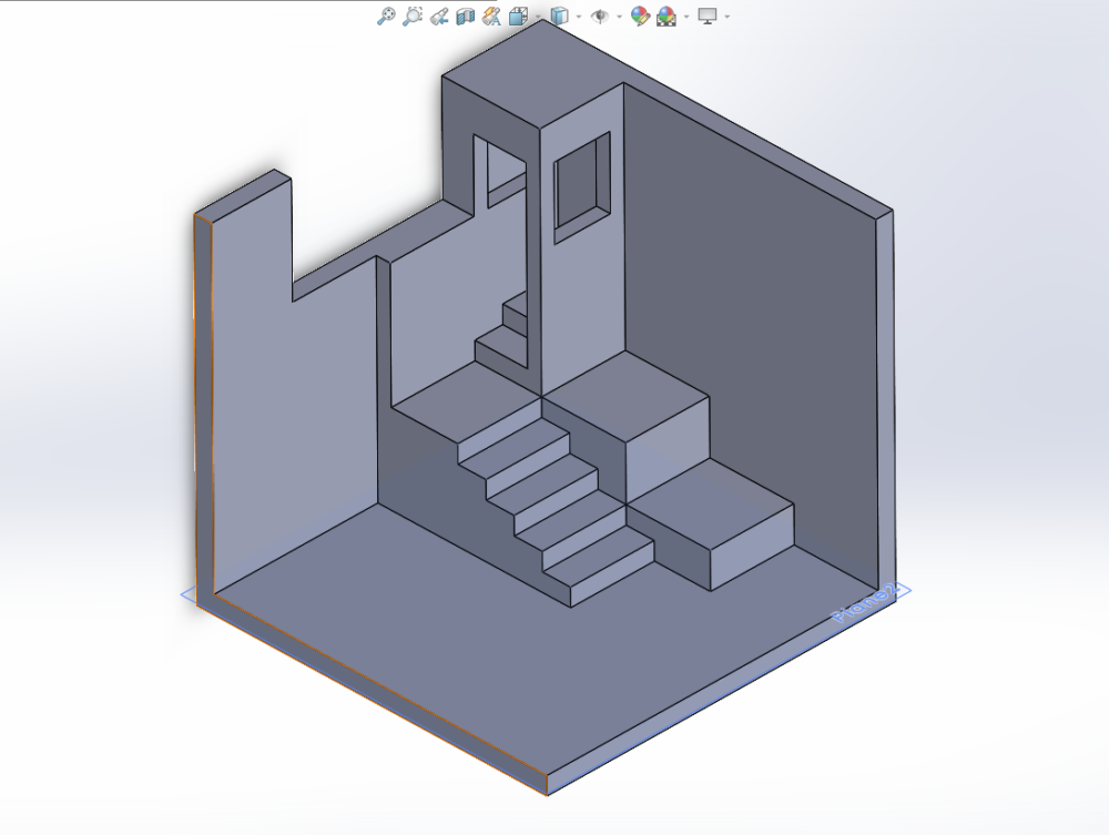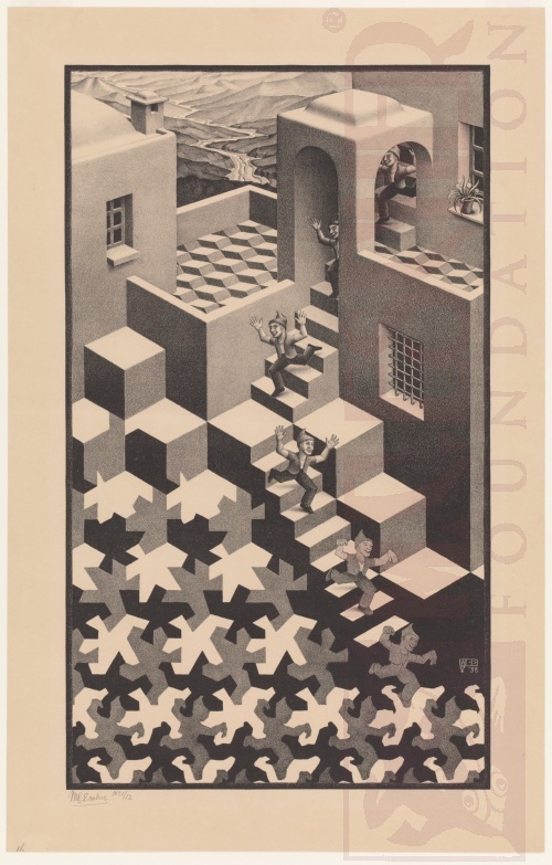

The progress for my artifact with the M. C. Escher aesthetic is that I am almost out of the planning phase. I have all of my materials that I am planning to use and I have a very general idea of what I want this project to look like. I made a rough CAD model of the general shape of my project, based off of the Cycle drawing by Escher in May of 1938. What I want in the end is for the 3D box to look like a 2D art piece when viewed from an isometric perspective. I plan on making the shapes a lot simpler then Escher, like the shapes to the left of the red line on his art piece Metamorphose. Escher was experimenting with transforming patterns instead of his usual symmetry, and he used this idea of transforming a human to a shape in 1937 with Metamorphose. You can see him take this idea and iterate it into Cycles with a much cleaner transition in my opinion. I can’t achieve the level of clarity that Escher has, so I will use simpler shapes.
I also plan on using the reflective materials (right of the box) that came with the package that I am using. Luckily, the color scheme is very simple for these drawing so I don’t need to use it too much. I am thinking about replacing the balconies with the reflective background to simplify the artifact, and also maybe covering the right wall with it if it doesn’t look horrible. It could look bad, but there is also a more white inside layer (not in the picture) that I can use as well. The main thing that I want to focus on in this project is perspective, so the colors are not as important to me anyway. One way that I can do the perspective shift is to draw the pattern in solid works from the isometric perspective. Then when I would go to work on the artifact, I can change the model to 2D and draw it like that. The image should be distorted, but when matched up with the 3D perspective all of the objects should blend into each other. There are other ways as well that are more simple that I will also probably attempt, but all of those are just drawing the shapes onto the cardboard. That is how far I am into the project, and my plan for finishing it.


2 Comments. Leave new
Hey Bryce, this looks like a really awesome project! I like your idea of translating Escher’s style into 3D space, while retaining the perspective of a 2D art piece. I am interested to see how the perspective of your pattern will turn out. That is a neat trick you thought of using the isometric view in solid works. I wonder if you might have considered adjusting the cutoff angles of your walls/floor such that the outline of the piece, from an isometric view, would be rectangular like a standard 2D art piece, rather than a diamond shaped outline as shown. Could be interesting… Anyways, I am definitely excited to see how the final product turns out!
This is a very cool project and I am excited to see how it turns out. I especially like how you made a CAD model to help visualize what you want to build. One question I have is how you plan to hold the pieces together? Are you planning to use glue and do you plan to add in any extra material for structural support?