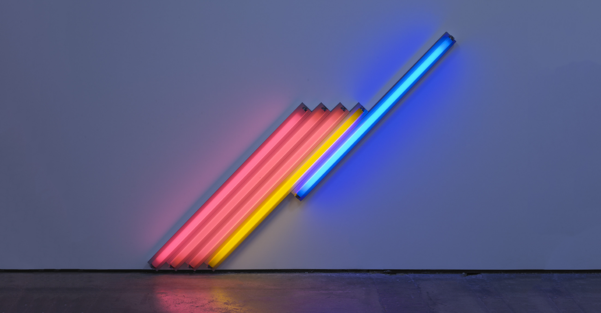
Making art from trash is an interesting experience, it incorporates creativity and recycling to generate something amazing. For my upcycle project, I used a combination of the minimalist aesthetic, but instead of leaving it devoid of emotion, as minimalism usually is, I tried to introduce some connection to my life to it. I chose to do this because I feel that while the minimalist aesthetic is beautiful, I want people to be able to relate to my artwork and understand how I feel when they see it.

For my project, I decided to use a keyboard I found in the trash because in this time of quarantine and online classes, I spend much of my time in front of a keyboard. Sometimes I feel as though my entire life is melting into the keyboard. I tried to encompass this emotion in my artwork by physically showing the keyboard melting. I also included certain keys in odd orientations to represent things that I see in my everyday life during this unprecedented time.

One of the most important components of the minimalist aesthetic is the use of open space. I created this illusion by removing a significant portion of the keyboard while leaving the underlying clear circuit. This gives a break from the dark colors of the keyboard and showcases the internal workings of the device. It took quite some time to decide how much of the open space should be filled to make the piece look complete.

Another important feature of the minimalist aesthetic is incorporating simple colors like black and white. I tried not to stray too far from this design by keeping the keyboard its natural color of black and using simple hues in my open space. This task was much easier because the internal circuit board of the computer was actually clear with white contacts.

I also incorporated three dimensional features in my design by having some of the buttons at different levels than others. This creates the illusion of depth within the artwork, which is a very prevalent feature in traditional minimalist style. This design feature originated from early minimalist artists combining their sculpture and painting skills into one piece.

All of these design components contribute to an artistic piece that is primarily minimalistic but with the added benefit of emotion. I didn’t want to produce something that conforms to one style only because usually the artwork ends up being very similar between different artists even though they are working with the same design features. I hope my design evokes feeling in the viewer, and that in some way the viewer can relate to my emotions.
Cover: https://craigberry93.medium.com/less-is-more-53142ac7c6dc
Picture 1: https://www.pinterest.com/pin/642255596831880145/
Picture 2: https://www.nytimes.com/wirecutter/reviews/best-laptops/
Picture 3: https://www.pinterest.com/pin/721842646516675042/
Picture 4: https://www.istockphoto.com/vector/keyboard-circuit-gm504737311-45001172
Picture 5: https://www.vectorstock.com/royalty-free-vector/minimal-design-abstract-lines-in-3d-vector-26909906


3 Comments. Leave new
I’m really glad to see someone putting in personal meaning into their projects and letting it be part of if not the aesthetic itself. I think it’s really neat that you’re exploring a lot of different options and I think that the final result will be better because of it. I hope you will be able to pull off the minimalism and the personal meaning of this piece together.
Hi Zack, I think this is a really cool upcycle project! I too sometimes feel as though “my entire life is melting into the keyboard”, and I think this project will be a very interesting way of expressing that idea/experience. I also appreciate the fact that you will be using minimalism as a vessel for an emotional message. I think this is one of the most powerful ways that minimalism can be utilized in design. Do you think you will add any extra color or additional components to your art piece, or will you stick to melting / altering the keyboard by itself?
Yes, in its current state it is quite bland being only black and white so I was planning on adding some color to the background. However, I want to try to keep the colors simple and maybe add only one or two to the backside of the keyboard so it will show through.