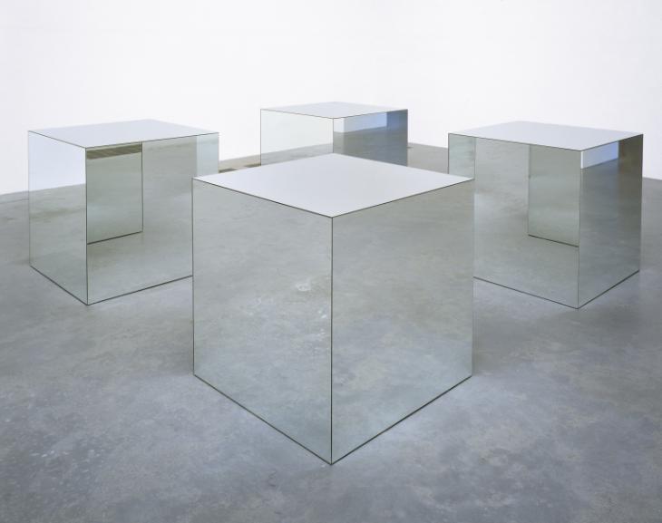
In my opinion, the most beautiful designs have the least number of parts. This goes for anything we see around us, our cars, our pencils, even our houses. The machine with less parts will be more reliable most of the time simply because there is less to go wrong. That is my ideology with aesthetics. If too many things are applied to a design, it can become cluttered and cumbersome. Therefore, the design becomes less visually appealing and less effective.

The minimalist aesthetic style was created by artists in the 1960s who were bored of classical artistic style. They were attempting to make the movement from a dramatic art style to more of a “cool” style. This style was primarily displayed in painting and sculptures of the time but could also be seen in some of the architecture of the era. In an artistic sense, minimalism can be spotted by its neutral colors and spread-out design components. This movement also attempted to go against the rules of what makes something a sculpture versus a painting. Minimalist style merges these two art forms together into something beautiful.

Early minimalist artists used a style that had more open space within their artwork and viewed things a little differently than the conventional artwork of the time. One of the most common examples of this is the use of light as a material instead of just a visual aid to evoke some different feelings in their viewers. They also decided to remove the metaphors and expressionist elements of their art in order to convey a new way of thinking that wasn’t as dramatic as the other artwork of the time.

A great example of this aesthetic style is the minimalist style that is starting to become popular in homes. Many people find it calming to reduce the number of things in their house to create a seemingly more spacious living environment. This style is often associated with neutral colors like black or white, simple geometric shapes, and minimal decorations.

The most conventional approach to minimalism is to declutter and remove any things that are not necessary to the home. This can have calming effects on the residents of the home due to the neutral colors and lack of clutter and the impression that the residence is much larger than it seems. The extremists of this aesthetic downsize their entire house to a smaller living arrangement in order to remove the unnecessary things in their lives.

While the minimalist aesthetic might not be for everyone, it offers a welcome change to the otherwise repetitive art forms that are full of references and defined by the rules of the art form. Minimalism breaks the mold and blurs the lines between sculpture and paintings to create some of the most thought evoking art we can observe. The smooth geometric features and neutral colors are an amazing change from what we usually think of when we image art or aesthetics.
Image Credit:
Cover Picture: https://www.tate.org.uk/art/art-terms/m/minimalism
Picture 2: https://www.widewalls.ch/magazine/minimalism-art-architecture-design
Picture 3: https://www.widewalls.ch/magazine/minimalism-art-architecture-design
Picture 4: https://www.mansionglobal.com/articles/designing-a-minimalist-style-home-that-feels-warm-123861
Picture 5: https://www.youtube.com/watch?v=CD6uiJOckXY

