There has always been a fascination with outer space amongst humans. However, it wasn’t until 1926 that the first steps were taken to usher in the Space Age. Robert Goddard’s historic launch of the first liquid fueled rocket in Auburn, Massachusetts on March 16, 1926 marked the beginning of a new era of technology. With this advancement came the spaceflight aesthetic as well. Although the general public was initial distrustful of such ideas, eventually they came around to advocating in favor of spaceflight.

Spaceflight is unique in that its aesthetic is one that arose out of feasibility rather than design. When designing spacecraft, rockets, shuttles, satellites, and stations companies were more concerned with how things worked rather than how they looked.

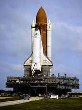
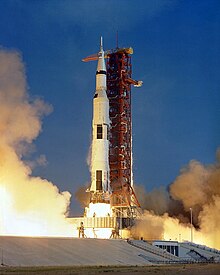
The International Space Station showcases many of the features associated with spaceflight and spacecraft aesthetics. There is a distinct lack of color with the exception of the solar panels and a few other components. All of the components need to be meticulously cleaned so the entire station appears to be in pristine condition despite being operational for years. The rockets and shuttles also tend to keep the same white, black, and reddish color palette. Rockets and shuttles over the last few decades have evolved to have much greater capabilities, but have overall maintained their same general shape and appearance with a few minor adjustments.


Spaceflight doesn’t just apply to the actual spacecraft though. There have to be people on the ground controlling the situation and that takes place in a mission control room. Whether is was during the 1960’s or present day, the aesthetic of the mission control room has essentially remained the same. A large room with giant monitors at the front surrounded by dozens of people each with their own collection of monitors. The room itself creates an air of tension which is to be expected when dealing with such a high stakes and high pressure situation.


Image 1: https://en.wikipedia.org/wiki/Robert_H._Goddard
Image 2: https://en.wikipedia.org/wiki/International_Space_Station
Image 3: https://en.wikipedia.org/wiki/Space_Shuttle_Challenger
Image 4: https://en.wikipedia.org/wiki/Saturn_V
Image 5: https://spacecenter.org/exhibits-and-experiences/nasa-tram-tour/apollo-mission-control/
Image 6: https://www.nasa.gov/image-feature/engineers-at-spacex-launch-control-center


4 Comments. Leave new
Hey Callum, I liked how you emphasized the importance of functionality over looks in the space industry, something that has clearly been seen in the past. It reminds me of the original design for the LEM during the Apollo missions—the conceptual designs had a bulbous looking pod instead of the harsh geometrical shapes they ended up with, but the changes they made were entirely due to the mass constraints that the engineers had to meet. One thing I have noticed recently is how SpaceX has done some work on the look of their spacesuits. Instead of just the practicalities of the design, they have tried to make their spacesuits as appealing and “futuristic” as possible as to inspire future generations of space explorers. This concern with aesthetics is something I haven’t seen in the space industry from NASA, at least not in any significant way. Somehow the rockets all seemed to end up looking cool anyways, though. Nice job!
Hey Daedalus, thanks for taking the time to read and respond to my post. Mass constraint is definitely a big factor when determining the design for anything and it’s even more crucial for rocket since there is limited space. I have also noticed SpaceX taking aesthetic into account when designing their spacesuits. Their new suits look really cool in my opinion and I appreciate the move to take aesthetics into account as well. I also agree that all the rockets have ended up looking cool anyway.
I like that you chose a topic like space exploration because I think that it relates to everyone in this class being engineers. As engineers we focus on the practicality of our designs above all else. Sometimes the aesthetics of things get lost amongst the necessities. I like how the aesthetic of spaceflight can show such beauty in something that is really all raw power and engineering. Why do you think that the somewhat bland color scheme and cleanliness carries over to the ground control operations? Without the certain engineering needed in space it seems like the designing of the ground control could be more aesthetic. Do you think they just try to match the aesthetic of the control room to the vehicle?
Hey Ben, thank you for taking the time to read and respond to my post. I agree that as engineers our focus is primarily on the functionality of our designs rather than their appearance. Perhaps as time goes on there will be more resources available to devote towards the aesthetics of design. I think the control rooms, like the rockets themselves, are designed in a way so that they fulfill their purpose. When accuracy and precision are of the utmost importance, the design of the control rooms are optimized to meet those requirements.