With the end of the semester being around the corner, I would like to say that I truly loved taking this course! It was a really interesting course where I got to do two great projects (the coat hanger with shotgun shells before) and I am glad that I put the time and effort to make them look good as I would be keeping them past this course. I learned a lot during this course about the meaning of aesthetic and many different types and forms of it. I also learned a lot while designing and working on the projects where I got to interpret my viewing of aesthetic into them. This course in my opinion was very enjoyable, educational, and most of all STRESS-FREE! Thank you Professor Hertzberg for making this course the way it it!
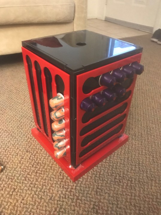
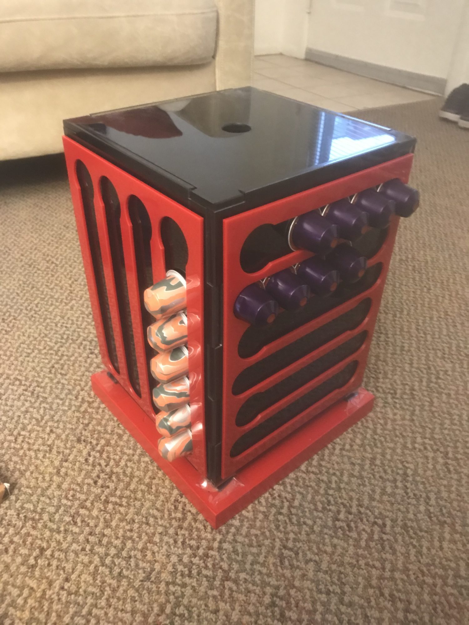
Regarding my final project, I shipped it back home and will hopefully have access to it in about a week where I will be fully assembling it. From the assembly preview I have shown in my previous posts (shown below as well), I would say I am personally surprised that it matches the design I made perfectly! I honestly did not expect it to as good as it turned out to be as the design and reality are usually different.
CAD design of the project.
 How the project turned out to be.
Note: the black acrylic is clear just like the CAD design but it is not shown here as there is a protective layer on the other side of the acrylic that I yet have to peel during my actual assembly.
The final project have dimensions of: 8.5″ length X 8.5″ width X 10″ height (excluding the wood stand (10″X10″X1″))
If I happened to do this project again, I would almost keep it the same except the following changes:
- Use a smoother lady susan as the current one is not as smooth as I intend it to be.
- Maybe apply a red and black paint to the wood stand as opposed to just red to give it a more unique aesthetic.
- Figure out what to fill it with and choose the dimensions accordingly as I currently do not have a final plan of what to put inside. I will have to figure that out after the assembly is complete.
Once I assemble the project completely, I am planning on using it myself for the red and black coffee machine I have.
Final Project Presentation:
Below is my upcycling project to sum up my work in this course in this final post!


6 Comments. Leave new
Abdul –
This will be one of my in-depth critiques for final report part 2, following the professor’s critique format, I hope you find some of my feedback helpful and best of luck with the rest of the project if you do decide to work on it further, amidst the current events.
For statements of meaning: It is nice to see an actual project come to form, instead of being digital. I think your product has both functionality and a fairly minimalist aesthetic to it. The use of magnets also showcases your ingenuity and the time appropriated behind the design process.
Artist Asks Questions: Let me know if you have any specific questions.
Neutral Questions: Do you think the current design could benefit from other aesthetics (perhaps the the body behind off-white and the holders being white, to maybe show a very simple yet clean and aesthetically minimalist design)? Will you be working or changing the design of it in the future?
Permission Opinion: I have an opinion, if you would like to hear it, please reply to this post, and I will check back by May 5th to reply accordingly.
Best.
-Will
Hello Will! Really appreciate the comment! It would definitely work with other colors like the white and clear, but the issue is that acrylic gets scratched sometimes and you would see that after some time of use. That was one of the reasons I chose darker colors. The main reason is that my coffee machine is black and red (you can see it in the presentation video I added to this post) and I love these two colors together. In addition, I think that the darker the colors, the fancier it looks, in my opinion of course. I am not sure if I would change the design in the future as I am not sure whether I will make this again or not, but everything is possible! And for sure, I would love to read your opinions! Thank you.
Abdul,
Honestly your final project turned out great! It was actually as I had pictured it when described in your earlier posts. The versatility and usefulness of your project cannot be understated, well done. Have you thought about customizing it further? By potentially making one face of the sides with bigger holes to accommodate spices for cooking?
Hello Zach! Thank you for your comment and glad that you like it! I honestly have not thought about that, but I think it is a great idea! I would definitely look into that if I would make this again as the spices idea is super cool and fits the design. Thanks for the suggestion!
Abdul, I think your final product turned out amazing. I appreciate the fact that you made something not only functional but useful to you. I also thought your use of magnets was brilliant. I think filling the box with coffee beans would work with the aesthetic, but I think the center of the box could also be used for storing coffee mugs or other coffee-related paraphernalia. Do you think it will be long-lasting (i.e. how durable is it given the amount you use it)?
Hello Fiona! Thanks a lot for your comment! Thank you for the suggestions. I am currently in between the coffee beans and the storage, but I am thinking about combining both where I would fill like 1/4 of the box with coffee beans and on top of that I can store more stuff. I hope it is long-lasting as it would be sitting in the kitchen and used only few times during the week when someone wants to pick a coffee flavor. I will be using acrylic adhesive which is super strong and would keep everything together for a long time.