I am lucky to be able to say my original project intent has not changed much from its original conception, despite the COVID pandemic. I would even go so far as to say it was made better by the circumstances, if I simply decide to complete physical manufacturing at a later date. Here you can see some of my hand sketches and initial SolidWorks sketches which illustrate my first conception of this project, vs. the final render I ended up producing.
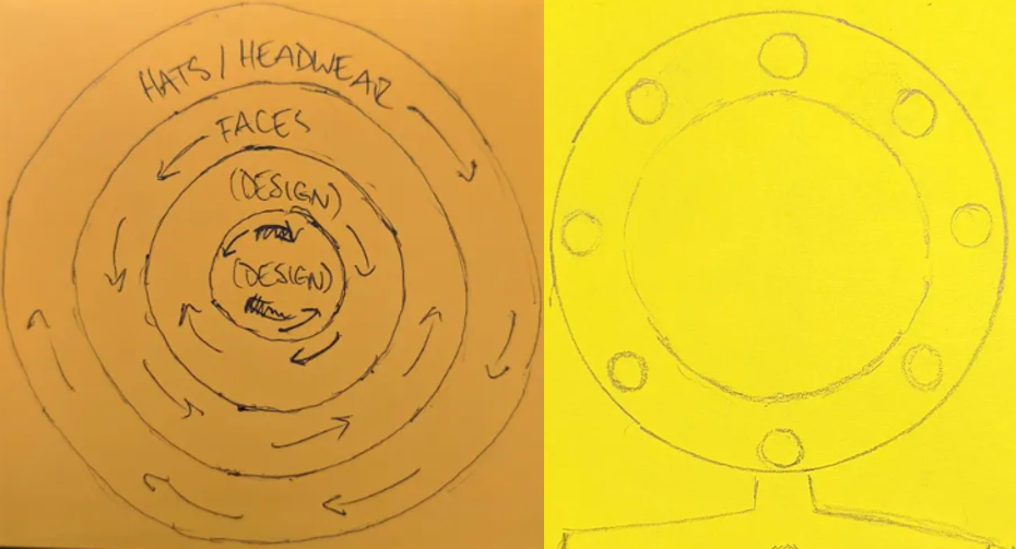
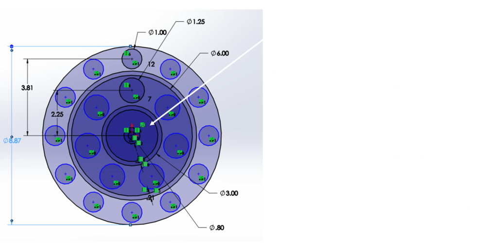
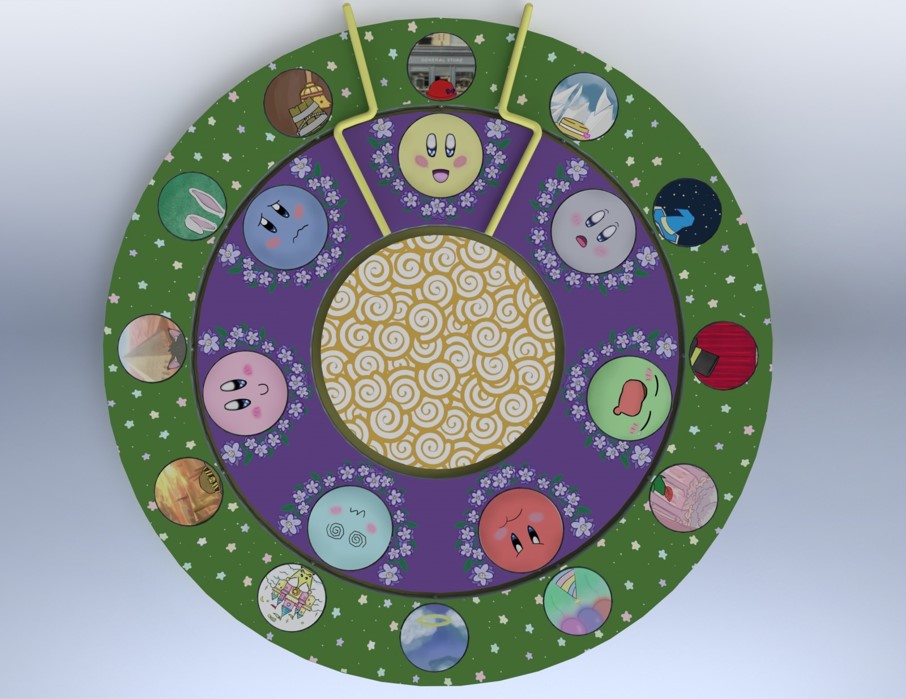
As you can see, the major difference between these is the lack of a base in my final render, which stems from one of two significant changes that occurred to the design, the first being change of the movement mechanism. I originally had a LEGO or other gearing system in mind for the movement, but upon recommendation from Prof. Hertzberg, I switched over to Lazy Susan style bearings. This was a very convenient option given the ring-shaped nature of this toy, and also resolved the issue of stability I was concerned with when considering different avenues for the base. I think it also plays into the Kawaii aesthetic better, as it gives it a bit more of a childish feel rather than an overly complicated gearing system.
Second, the change of the inner disc’s design from a phenakistoscope to a simpler spiral design. However, I don’t lament this change much, as it turns out the phenakistoscope relies on a shutter to give it the animated effect when viewing in person rather than digitally. To implement the original conception, I would have needed to cover much more of the area with a stationary façade, which I think is a lot less fun than seeing the entirety of the disc in motion with the spirals as I have in the final version. I may or may not revisit this as I could decorate the façade, and include several openings, but I would also need further considerations on how to impart a constant speed.
Here’s a link explaining the construction of a phenakistoscope, for additional context: https://www.youtube.com/watch?v=2rzwdRqsuVM
The only other slight change to this project since its conception was a minor growth in dimensions, from just under 9” in diameter to just over 10”. I decided to implement this change to give the inner most disc/ring more area for the design. Of course, there was also the change from physical manufacturing to the 3D rendering, but that couldn’t be helped despite my expedited efforts to beat the COVID related closures. In the end, I am thankful for the switch to a virtual rendering, as I was able to much more thoroughly complete the “aesthetic” part of this project.
For a glimpse at how far along the physical manufacturing route I went, please visit my blog here.

Please see my previous blog for citations here.
The buttons before the addition of the background is what I would have ended up with in the physical manufacturing route. But after receiving the order cancellation notice from the shop I was working with, I was able to immediately pivot into making the designs more fleshed out. I was also able to improve the design on the rings, which I think helped really bring this to the next level. I’m sure I would have painted the rings in the physical manifestation, but I am also sure it would not have been a design nearly as professional looking as what I was able to pull off digitally drawing/Photoshop-wise.
There are several things I would like to do next with this project, first and foremost being the refinement of the button designs. I plan to bring the rest of the emotion buttons to the level of the “tired” button. Here you can see a side-by-side of the “tired” and “sparkly” buttons so you have a better idea of what I mean.


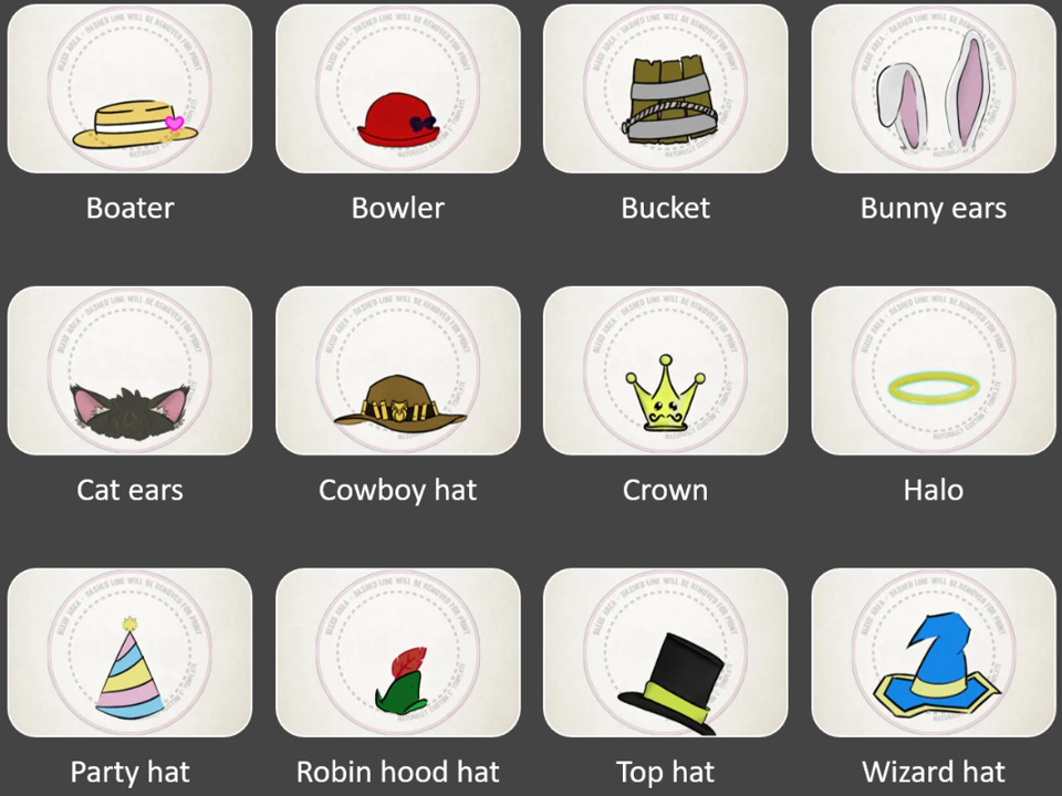
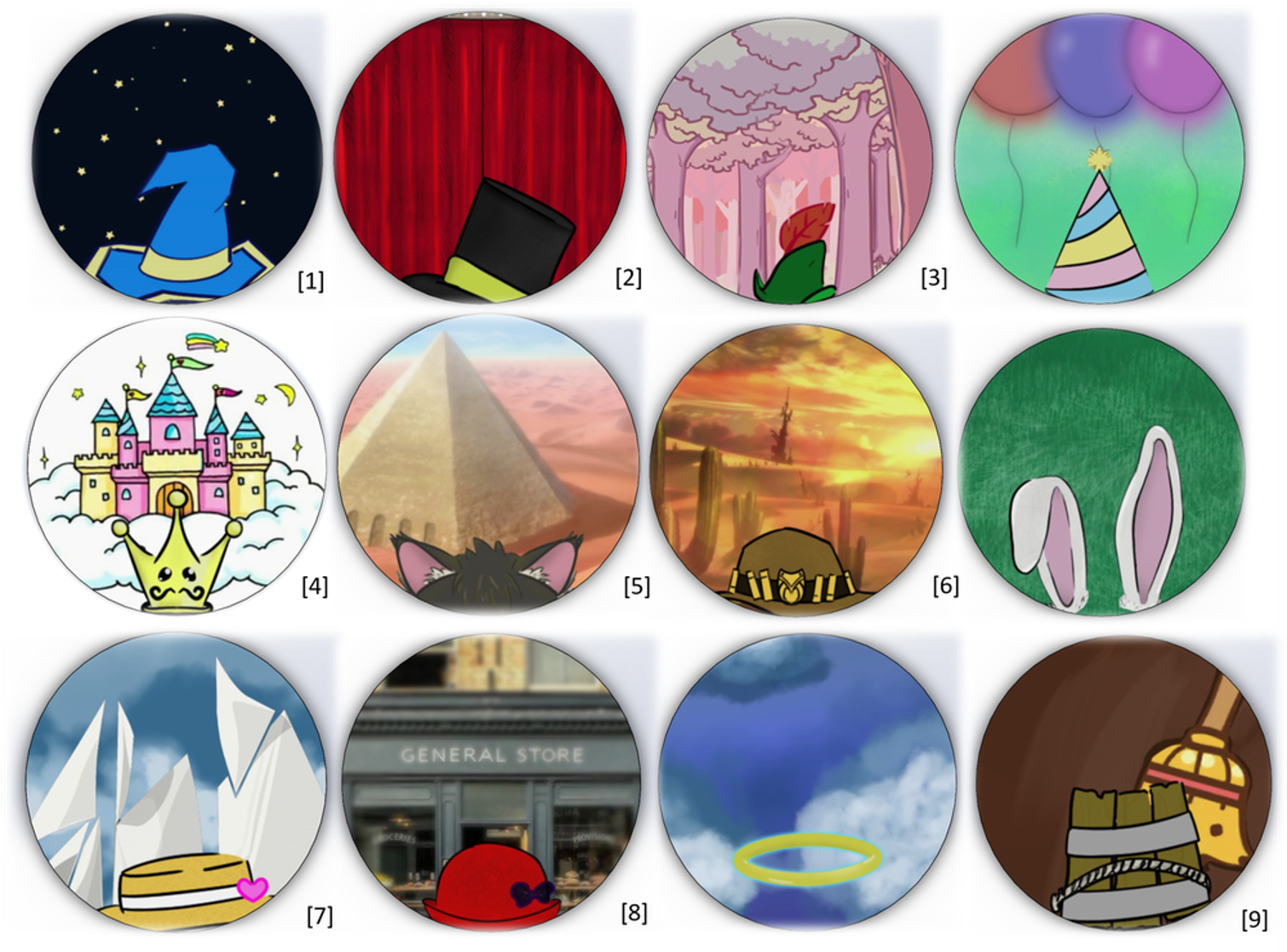
The quality difference is very clear, to me at least. I need to clean up the blush and eyes of the sparkly button, and also introduce an element of perspective to it. The tired button really feels like it’s a part of a spherical character’s face, whereas the pure symmetry of the sparkly button’s design gives it a flatter feeling. For the hat and headwear buttons, I’d like to enhance the contrast between the hat and their respective backgrounds. Thank you to Nicole for helping me notice this was an issue! Below are a couple examples of the worst offenders, followed by a couple designs which I think should serve as the standard.

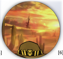
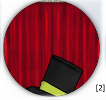
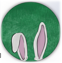
There is not too much I would have done differently with this project, given the opportunity. My only regret is not having more thoroughly planned out the headwear buttons. If I had gone through with a full proof of one of the button designs earlier in the project, I would have realized how much empty space is left on the button after scaling and cropping to help the design align to look as if it was resting on the characters’ heads. With more careful planning and scheduling, I could have ended up with a product that was 100% original work. However, I am still very happy with how it turned out, and I would argue for at least a couple of the backgrounds, I did some creative editing to get a clean background. Below for example, I took a small portion of the background, copy + pasted a mirror, then cleaned up the lines to blend the tree colors and shading to make it look seamless.
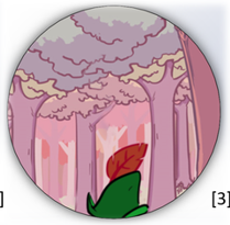
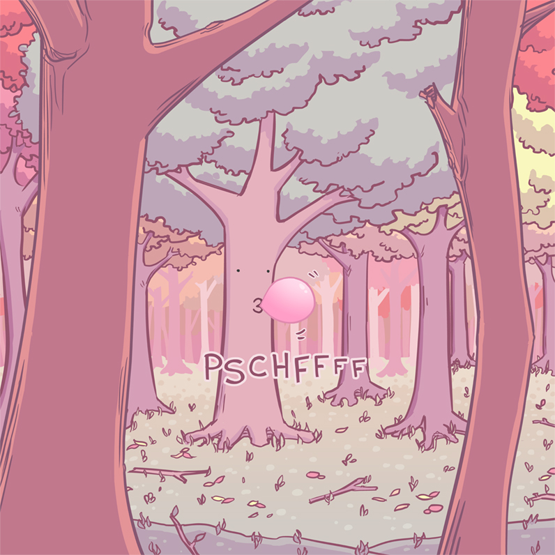
image credit: https://warnerburg.com/gallery/color/gum-chewing-tree/
Finally, I would switch the movement mechanism once again, from Lazy Susan style bearings, to thrust bearings. Thrust bearings have a much smoother, quieter, and longer lasting rotation to them compared to the Lazy Susan style, so this would be a major improvement to the overall feeling of the toy.
I learned a lot over the course of this project and semester. I’ve picked up some solid rendering skills (although these certainly still have room for growth), and more advanced Photoshopping and SolidWorks skills in general. I also took several workshops in the ITLL to ensure all avenues of physical manufacturing were open to me, including the laser cutters, manufacturing center courses for using the wood and metals shop, and the 3D printers course. I am sure these are valuable skills which I will continue to use moving forward with future projects, both course-related and personal.
This turned out to be a lot lengthier than I originally intended, so if you made it all the way through, thanks for reading!
Zoom presentation recording link: https://drive.google.com/file/d/1k7JxvmAKgtiFbbUlD90Oiipi3fMF_x4x/view?usp=sharing

3 Comments. Leave new
[…] Final Project p.2 – Why and What Next – Mood Rings […]
Thomas, your rendering turned out really well! I also liked how you documented your photoshop process. As I briefly mentioned during the critique, I think it would fit your aesthetic a bit more to make the mood ring a little bit smaller than 10”. Making it smaller would also make it more portable and desk-top-toy-sized. Do you plan to fabricate this once lab spaces open up?
Yes, I would definitely like to take a shot at completing the physical manufacturing of this project. I will likely shoot to finish out the improvement ideas I outlined above, then begin anew, rather than finish my in-progress rings. The improvements I was able to churn out in the final stretch have honestly made me feel dissatisfied with the standard I was working to before. And I agree a reduction in size would be better! 10″ is far too big to be qualified as a desktop toy, but could be a good fit for a child’s toy.