My main project is a desktop toy that consists of three independently rotating concentric rings, with each of the rings holding different elements, again playing up the Kawaii aesthetic. (Kawaii exploration and definition here). The outer and middle rings have holders for mylar buttons, the outer ring having buttons of ~1” diameter, and the middle having 1.25” diameters. The outer ring buttons have different headwear, such as a top hat, tiara, bunny ears, etc. The middle ring has faces of Nintendo’s Kirby sporting different expressions, such as angry/pouty, yawning/sleepy, and sparkly/gleeful. The inner ring has a continuous, fun design that’s entertaining as the rings rotate, with a design that takes advantage of the dynamic nature of this toy. Below is the final rendering of the fully assembled toy.
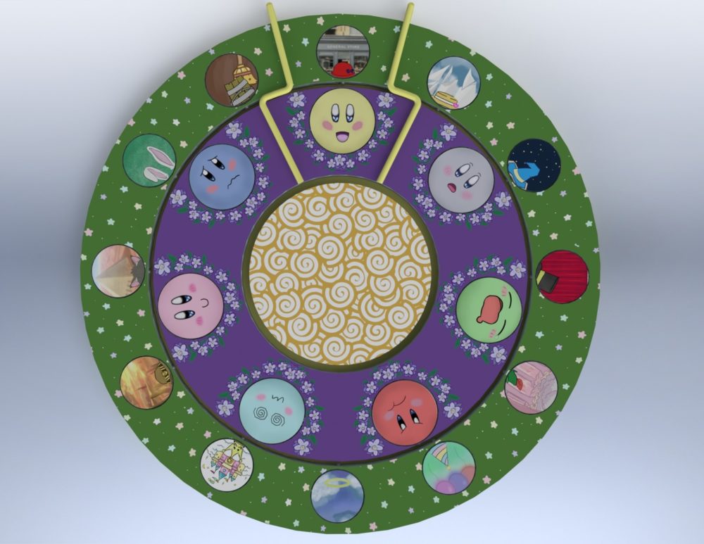
Unfortunately, after several hours toying with SolidWorks, I was not able to generate an animated rendering of its movement that was up to par. I plan to revisit that after I have more time to do so, likely at the conclusion of this semester. With the time crunch I found myself in after an unexpected cancellation in my physical manufacturing process, I decided to commit to refining the aesthetic part of this project rather than ending up with a fully functional, dull product. So instead, I will perform a short demo of the movement within SolidWorks during my presentation, to be seen in the recording at the end of this post.
The toy’s movement is built on Lazy Susan style bearings attached to each of the rings (disc in the case of the innermost) which enable independent, rotational movement of each. The ring and bearing combinations are kept in place via the mounting plate, which also has brackets which indicate the combination selected by the user. Additionally, there are magnets mounted around the inside perimeter of the outer ring, and the outside perimeter of the middle ring. This is achieved by having the rings composed of 3 1/8” layers, with the middle layer having slots for the magnets. The magnets act as detents to ensure the buttons snap into vertically-centered alignment. The final size of the artifact is ~10” diameter and ¾” height. To see how I would/will approach the physical manufacturing, please visit my blog here.
With seven different moods to choose from, and 12 different headwear, we have 84 total possibilities to match whatever whimsy strikes the user. Below are closeups of each button’s design, as well as some of my personal favorite combinations.
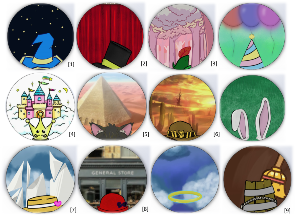
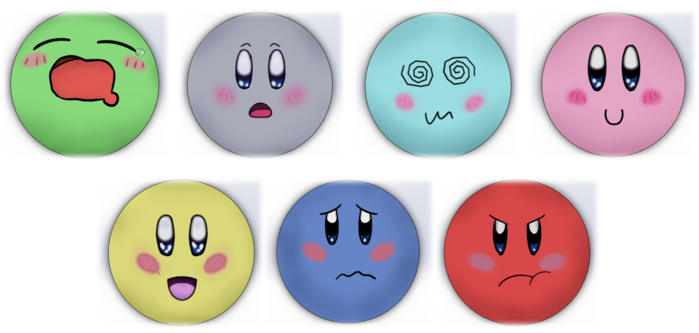
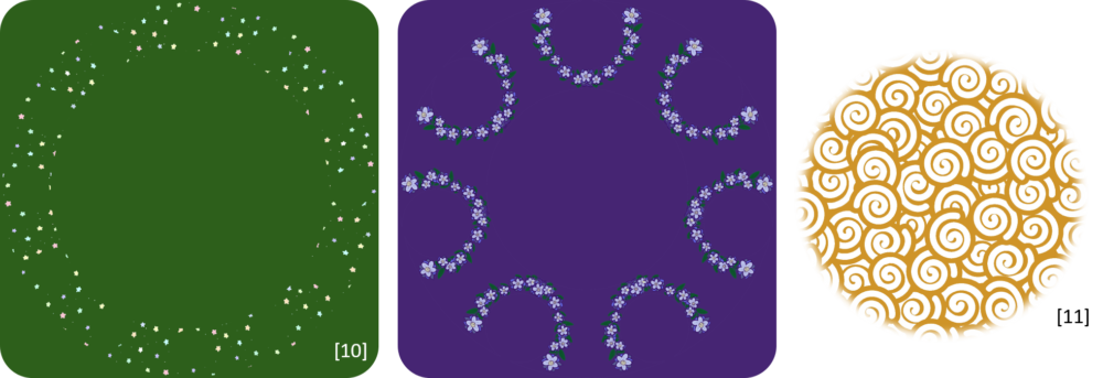

The majority of these designs are original work, please see the following for citations on modified works and inspirations where applicable. All the mood buttons use publisher Nintendo’s character, Kirby, as a basis.
I used Adobe Photoshop to draw and/or modify these designs. Below you can see how I work from layer to layer to construct each button. In the case of an original work like depicted below, I am switching brush types similar to how you would with a real-life painting, but with tons of technical advantage, like being able to instantly choose exactly the color you want, a specific opacity, an undo button, etc.
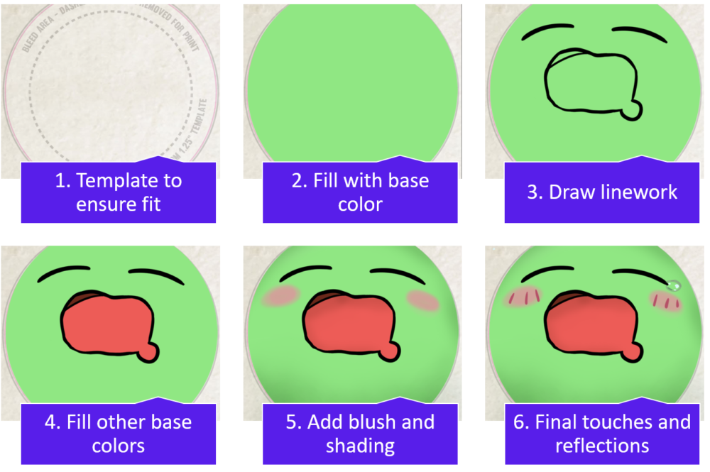
In the case of a button/design where I modified another piece of art, I did a combination of a color change, size and layout modifications, and/or blurring and blending. Below you can see an example of this work process, in this case, the outer ring’s design.
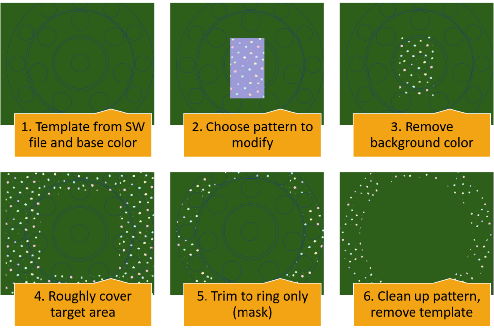
After generation of all the designs, I made the SolidWorks assembly shown earlier. I then mapped my designs onto the assembly components using PhotoView 360 (shoutout to Danny Straub for helping me), then implemented the necessary mates to ensure only rotational movement of the rings. Here is the exploded view again, to see how this assembly fits together:
Because assemblies like this are a ubiquitous task within the Mechanical Engineering department, I elected not to illustrate the work flow I am sure most are familiar with.
Thanks very much for following along my final project journey. I rate my toy as an A aesthetically, and as a C- in terms of functionality. Once things open up again, I hope to finish the physical manufacturing of this toy, and I’ll clean up the designs further. I don’t love how the indicator turned out, nor the overall movement of the rings, so these will be revisited as well. Additionally, as you may have noticed, my inner disc’s design, which was originally slated to be a zoetrope/phenakistoscope, was a bit oversimplified in my opinion. Finally, my middle ring design feels a bit empty too, but also a bit too dense and strays from the Kawaii aesthetic. Those will be the major aspects I would like to improve upon in the next iteration. Please let me know your thoughts, or any recommendations for improvement!


5 Comments. Leave new
[…] Please see my previous blog for citations here. […]
Thomas, great work here. I love the hats and the different backgrounds. The photoshop looks great. I am also impressed with your rendering. I think you pulled that together really well. This idea is extremely creative and is a great idea. I thought you did a great job explaining it in your presentation. I think this would look great as a smaller version (4-5 inches in diameter).
Thanks Danny! Yes, I agree making it smaller would make it more closely align with my original intent of having it be a desktop toy as well. 10″ would be quite a bit of desktop space to lose now that I think about it. I’ll have to do some quick SolidWorks editing to see what the trade-off be between diameter size and amount of buttons I can fit. I also thought about making the slots unequally spaced around the perimeter too, so that way I wouldn’t have to sacrifice slots in order to shrink it.
I am so excited that you got to make such a complete render of your project! When I first opened this blog post and saw the picture, didn’t even realize that it was a SolidWorks render and not a physical final project. Every artistic decision that you made feels so perfect and it all comes together incredibly well. I love the faces, I love the hats, I love the background art for each of the wheels. This is such a beautifully designed project.
Hey Mary, thanks for such high praise! I’m glad you liked it so much. Hopefully I can follow through with this quality in my physical manufacturing!