See the post titled Speaker Enclosure: Main Project Part 1 for the final renders, drawing set, budget and manufacturing plans. This post is a discussion of the design process, thoughts on the semester and outlook going forward.
This project has had a lot of changes in direction, but despite the quarantine forcing me to switch my project into a different direction I am happy with where I ended up. Surprisingly, I feel that the quarantine allowed me to move to a more interesting project by giving me the freedom of developing a digital design instead of something that I had to factor in the time to build. In short, my biggest constraints for this project were cost and time, and by being able to do a digital design I was allowed to pursue something more out there.
As a full time grad student, money and time are both in short supply. As a result, I was forced into designing something more familiar that I knew I could get done and using parts that I already had on hand. In the past I have built several unique speaker enclosures, where I focused more on aesthetics than on audio quality. I had a few speakers, an amplifier and a power supply all ready to go for my next project, so the speaker enclosure path seemed like a good one to pursue. In this project I wanted to create something that was both beautiful and had high quality acoustics. My first design was simple and channeled a minimalist aesthetic while also allowing for some decent audio quality. While it wasn’t the most exciting, it was also within my budget and could be built within the month and a half that I had.
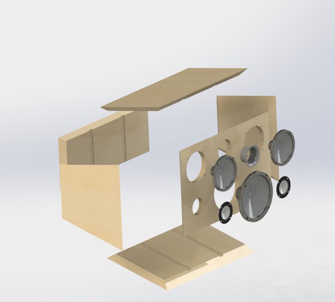
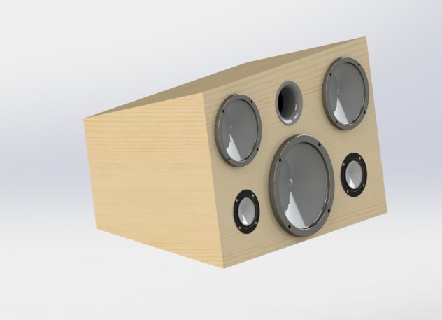
Figure 1: First final design
While I had liked the design at first, it got less and less interesting to me as time went on and I began to develop construction plans. One of the only good things that came out of this pandemic is that I was able to switch around my design and instead focus on something more interesting. I was in large part inspired by mid century modern furniture and speakers where things seemed to float and balance was a key aspect of the aesthetic. I also took some inspiration from the way the Bauhaus used repeating geometric shapes to develop something interesting. From these two ideas I mocked up a bunch of ideas, eventually landing on the idea of a series of tessellated hexagons holding speakers.
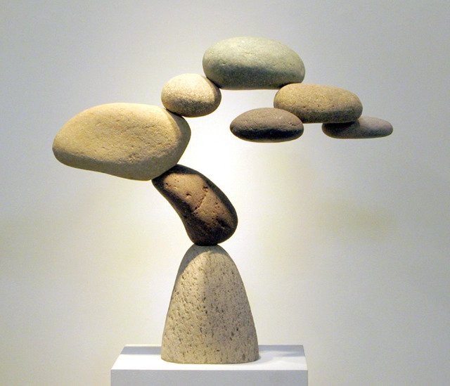
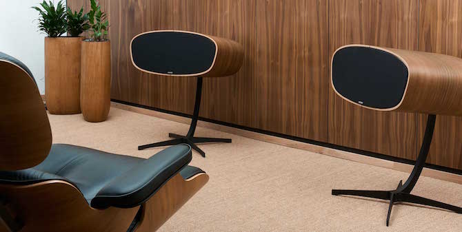
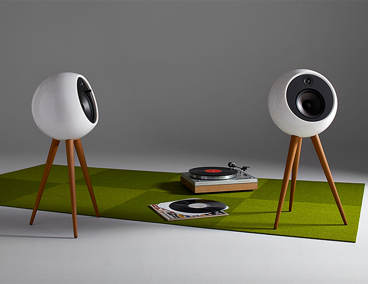
Figure 2: Inspirations [1], [2], and [3]
In Figure 2 above are some of the inspirations that I used for the final sets of designs. I really enjoy the way that larger things are suspended by small supporting members and how things magically seem both off balance and sturdy at the same time. I wanted my new design to feel like a sculpture and if possible, a floating one. At first I did away with the constraint of keeping things manufacture-able with my current materials and budget and instead made things are giant and wild as I could, while still using the original speaker CAD files that I had. Below in Figure 3 are my two main designs before I started narrowing in on my final design.
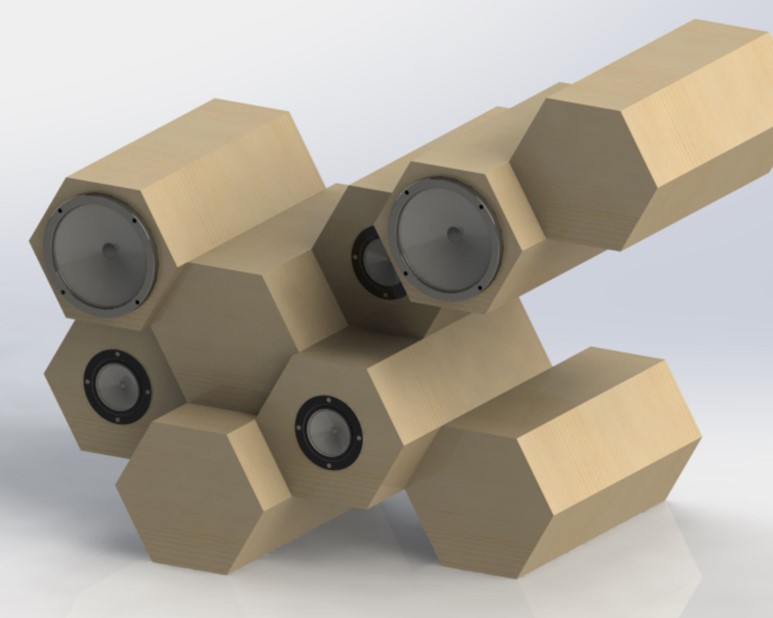
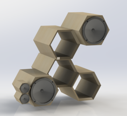
Figure 3: Designing round 2, first 2 design inspirations
While I thought that these were plenty funky, I still wanted it to be possible for me to build and for it to be more floating. Therefore I decided to switch my design to a balanced speaker set shown below in Figure 4.
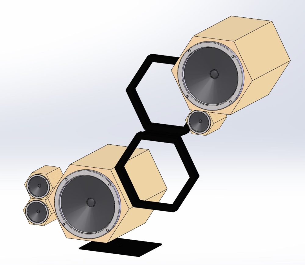
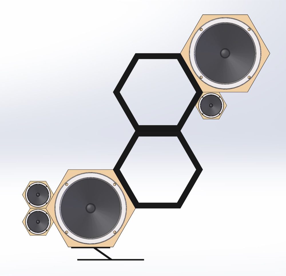
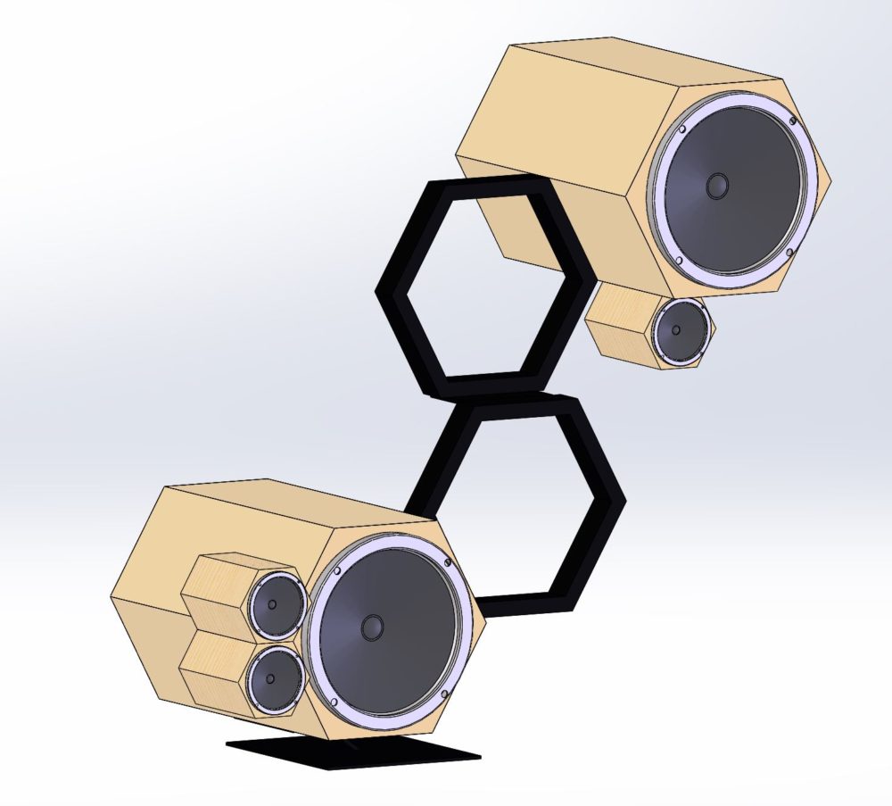
Figure 4: Final Design concept
I am really happy with this design, and if you take a look at the previous post, you’ll get to see that I have gotten the opportunity to learn rendering software! Although I did not get to actually build this project, I was able to design something really interesting, which I think is more in line with what I was supposed to be doing in this class anyway.
I’m very glad that I took this class, it helped me get an introduction to the ideas behind industrial design and how things can be elevated above being purely functional. I had always approached problems from the perspective of functionality first without ever giving much thought (usually until too late) into how something looks and how its aesthetics plays into the way that people interact with it and perceive it.
Although I designed this project to be possible to build using the materials that I currently have sitting in my bedroom, it is going to be entirely dependent on when things open back up and how much time I have to spare. Although I think that this would be a really cool project to work on, it is just impossible to tell how long things will be closed for.
I believe that the design process would have been easier if the class had been structured to expose us to as many aesthetics as possible early on. I wish we had talked about biomimicry earlier, and I also wish that more students were encouraged to work on digital projects, because that opens up a lot of doors when money, time and equipment are limited.
Going forward, I think that taking this class will be supremely helpful. I really enjoy designing products and projects alike, and I now realize how important it is to have a vision for the aesthetics as much as the function.
References:
[1] The MET: https://mymodernmet.com/woods-davy-cantamar-granite/ [2] https://www.ignant.com/2016/02/08/a-set-of-speakers-that-channels-mid-century-modernism/ [3] https://www.werd.com/46472/the-moonraker-speaker-system-merges-modern-audio-mid-century-design/

5 Comments. Leave new
Max –
This will be one of my in-depth critiques for final report part 2, following the professor’s critique format, I hope you find some of my feedback helpful and best of luck with the rest of the project if you do decide to work on it further, amidst the current events.
For statements of meaning: Nicely documented with very clear pictures of your design, documentation has flow and is easily understandable, and shows some time that you put into your project, that I can appreciate.
Artist Asks Questions: Let me know if you have any specific questions.
Neutral Questions: How do you think your project would have differed in terms of having an actual product, and how would your digital design leading up to that manufactured product would have differed, if it were not for the pandemic?
Permission Opinion: I have an opinion, if you would like to hear it, please reply to this post, and I will check back by May 5th to reply accordingly.
Best.
-Will
Hey Max, I loved your presentation! You stayed very motivated throughout the process of this course and I think your final product is very representational of how much thought you put into this. You’re final design, despite it being different then you originally planned, actually turned out to be so innovative and original which I think is cooler . Good job!!
Nicely done and I think the way you handled the changes due to COVID were spot on. The design looks amazing, and I think you nailed the concept of this course!
Good job on the overal wholistic design of the speakers. It really does look like bauhaus or some other simple aesthetic during that time. I would love to have something like this. I would have it more for the looks than the functionality, but would still use the speakers. I would definitely try to get this created becuase it is awesome!
Great presentation! I personally love how you were able to adapt to the challenges that COVID-19 presented, and were able to utilize the “extra” time gained to improve your design and make it more unique. The new design that you developed is very unique and cool and I cannot wait to see how this turns out once you start fabrication and manufacturing during the summer. However, the amount of time you put into making this design well thought out and laid out is very good!