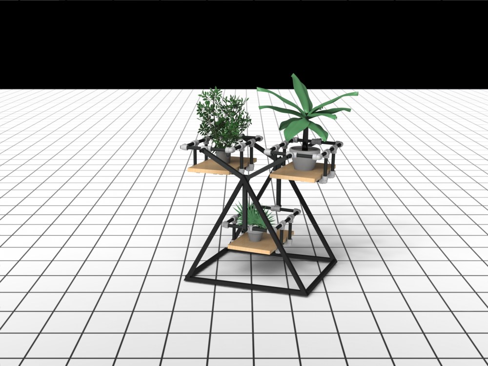
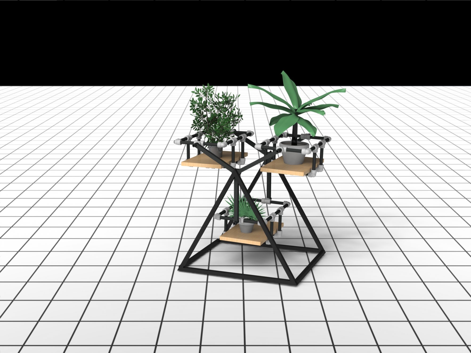
For my final project I undertook creating a high quality render in light of the affects of COVID-19 shutting down the school workshops. My rotating shelf concept came from Bramble and Hare restaurant here in Boulder. I changed their shelving to fit my particular hobby of collecting plants. I have designed a system that can stand on the floor or be attached to a wall. It is able to rotate safely in both orientations. 
Lets quickly walk through how this design developed again. I was inspired by seeing this shelf during dinner one night.

I thought that I would also make my smaller version using a sprocket and chain. I soon realized I did not have the resources and timeline to be able to create this as the chain seems to be custom modified to hold the shelves. I did originally intend to create a physical product rather than just a rendering, but that was before COVID closed down all of the school resources.

I had planned to make three sets of shelves as pictured below from materials that I could source at Home Depot.

The fabrication problem came about when it came to putting all of the shelves together. I needed to purchase hex stock and weld steel tubing to it. In addition I would have needed to use the Idea Forge coping machine to attach the square tube stock to the pipe that the shelves rotated within. I would likely also need to use a press to get the McMaster Carr bearings situated within the hex stock and later the base.

My next steps were figuring out what the base would look like. I ultimately settled on a triangular base in order to play off of the tri-part shelving separators and three equidistant shelves. I had considered adding extra steel tubing to make the triangles look like mountains but ultimately decided not to as I thought it would take the focus away from the plants and make the shelves feel cluttered and bulky.

Therefore I settled on creating a triangular prism.

Overall, I wanted an industrial aesthetic as it melds very well with modern homes and aesthetics. I tried to create this by using sharp lines where I could and by using steel piping which is often seen in industrial lofts and furniture. Furthermore, my color palette consisted of black, matte steel (grey), and the natural wooden finish of the shelves. By keeping my color palette simple it offers versatility in many spaces and also allows the design to be the focal point of the piece. For a personal touch one will be able to change the plants and pots in order to add visual interest. Additionally, by being able to rotate the shelves the overall look of the piece can change dramatically.
Sources:
- https://www.google.com/maps/uv?hl=en&pb=!1s0x876bec2625a07c8f%3A0x77a9fc2aa7393a34!3m1!7e115!4shttps%3A%2F%2Flh5.googleusercontent.com%2Fp%2FAF1QipOtUhYugh3coI_L83cp0UEPSDo4X529uQIA8Zk-%3Dw213-h160-k-no!5sbramble%20and%20hare%20-%20Google%20Search!15sCAQ&imagekey=!1e10!2sAF1QipOtUhYugh3coI_L83cp0UEPSDo4X529uQIA8Zk-&sa=X&ved=2ahUKEwig_s2BqfboAhXGGc0KHVenCboQoiowCnoECCAQBg
- https://grabcad.com/library/palm-tree-plant-1
- https://grabcad.com/library/banana-tree-plant-musa-1
- https://grabcad.com/library/ficus-benjamini-plant-1


3 Comments. Leave new
Hey Jamie,
Great job on this project! I know you will build it when you get the chance! I really liked how your industrial aesthetic plays off the green of your plants.
Also, I know you said you could have the base on the ground or wall mounted, but you should consider it being ceiling mounted too! I’ve seen some on pinterest (minus the rotating part) that look great!
Great job!
Ben Robles
Great Project! I think that the use of the pipe and pipe fittings really fits your industrial aesthetic.
Jamie,
I like the final product and vision of this project. It is a really cool concept and it is unfortunate that all the shops had to be shut down because this would be very cool to see in person. Honestly it looks like something that would cost hundreds of dollars in a store. I also agree with your decision to not add acrylic walls I think the open design actually looks better with the plants. The aesthetic looks great especially with the green of plants.