My final project started out as a simple speaker enclosure. The challenge of this project was going to be building the internal structure of the enclosure that caused sound of a certain frequency to be emitted in a manner that caused constructive interference (bass boost). While this would have been really complex to build, the aesthetics were underdeveloped. As a result I wanted to try and burn patterns into the wood using high voltage. This would have made it quite a lot more interesting to look at. My original design looked like the following:
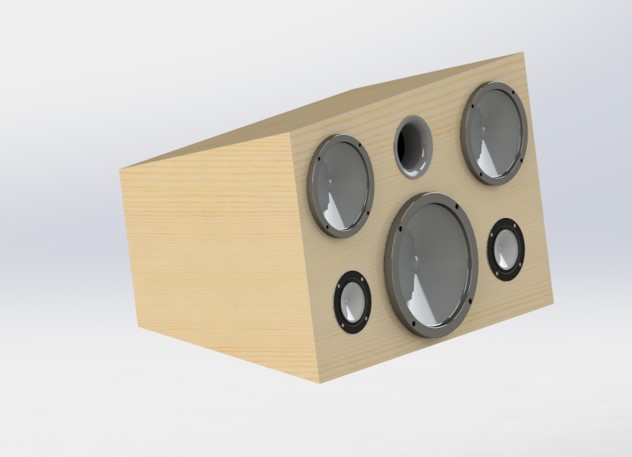
Figure 1: Original design for the speaker enclosure.
While the design was fairly simple, I felt that it would fit pretty nicely with the aesthetics of previous projects that I’ve built. As with most people, the coronavirus made building anything physical extremely difficult. As a result I decided to switch to a digital design even though I had already purchased my materials. In a way the COVID-19 disruption was somewhat helpful (only in this one instance obviously) because I felt that my design had gotten less interesting to me the farther I got into planning it. Because I already had a fairly sterile physical design, I thought that the digital design ought to be more ambitious and more interesting. Overall, my goal was to be more ambitious while still creating something that was still in line with the aesthetics that I enjoyed. As a result I returned to the drawing board with a bunch of ideas, feeling freed by not having to constrain myself to a month long building period. My only constraints were that I still wanted to build the project, so I should limit the design to the materials that I had already purchased.
I spent a lot of time digging through pinterest looking for something to draw inspiration from. One of the driving aesthetics was bohemian and mid century modern furniture. This photo of an awesome window got me thinking outside of the rectangular box and thinking a lot about hexagons:
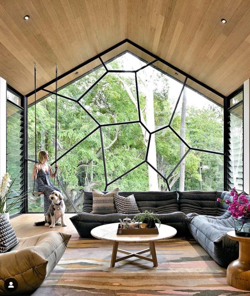
Figure 2: Funky window
I immediately started drawing stacks of offset hexagonal prisms as the design I wanted to try out. This was partially inspired by these crazy hexagonal rocks in Iceland:
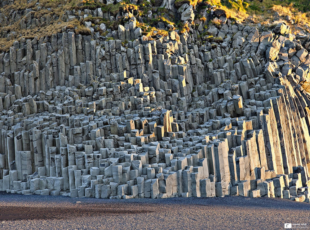
Figure 3: Icelandic volcanic rocks
A long time ago I had spent a good part of an afternoon watching an artist carefully stack rock sculptures on the beach. I was the only person around and this guy just spent hours carefully balancing random rocks pulled off the jetty into tall delicate sculptures that would eventually be knocked over and washed away. I happened on this rock sculpture displayed in the MET museum that made me think about trying to make a balancing sculpture type speaker enclosure.
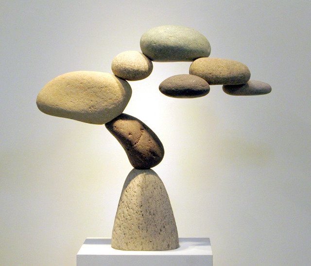
Figure 4: A sculpture in the MET
From there and several revisions that I’ll show in my final report, this speaker design was born:
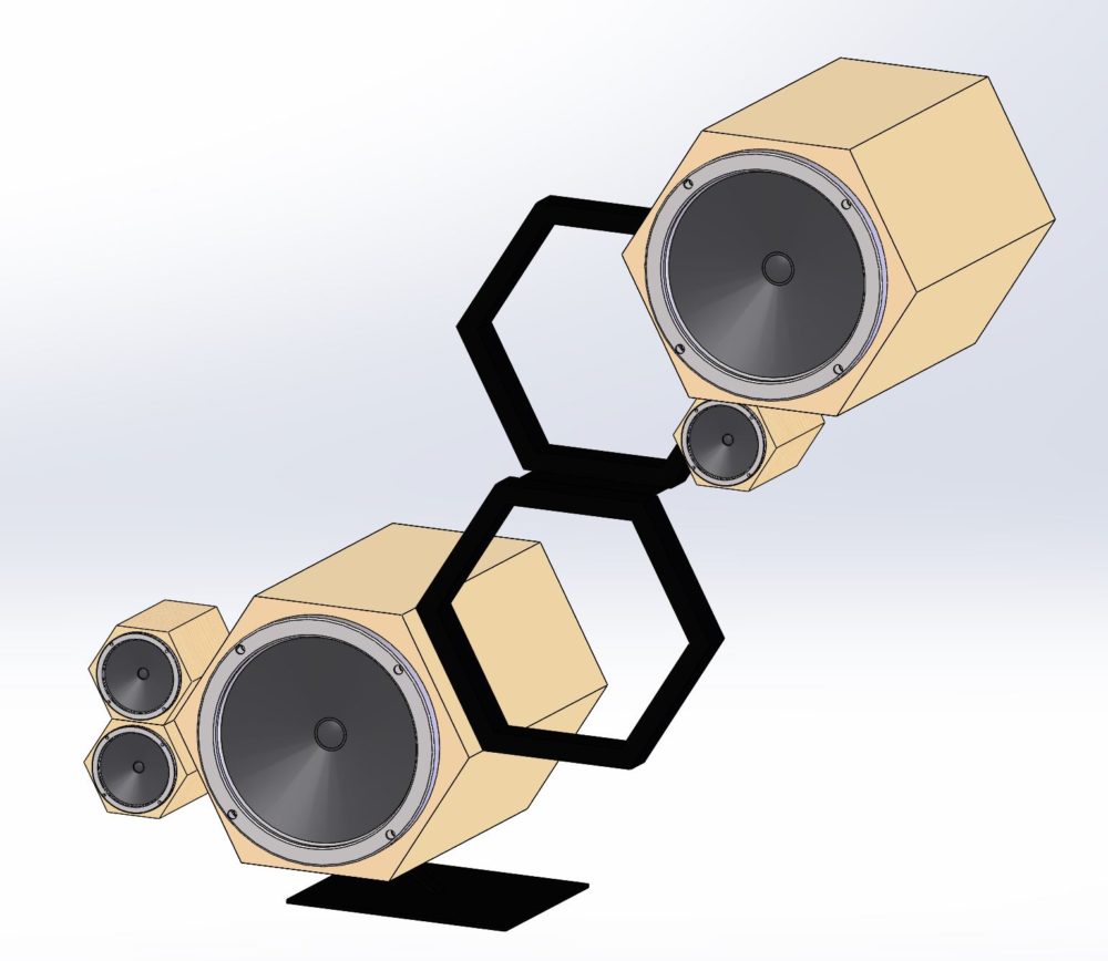
Figure 5.
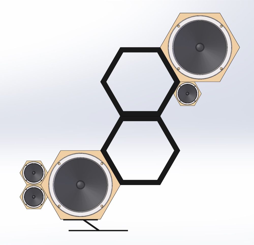
Figure 6.
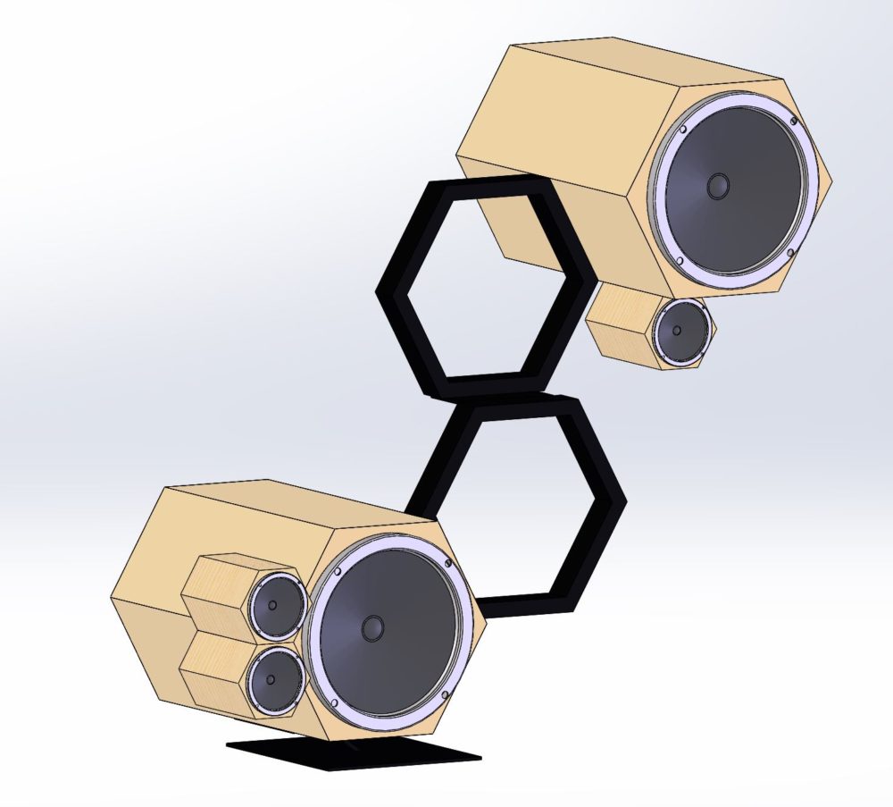
Figure 7.
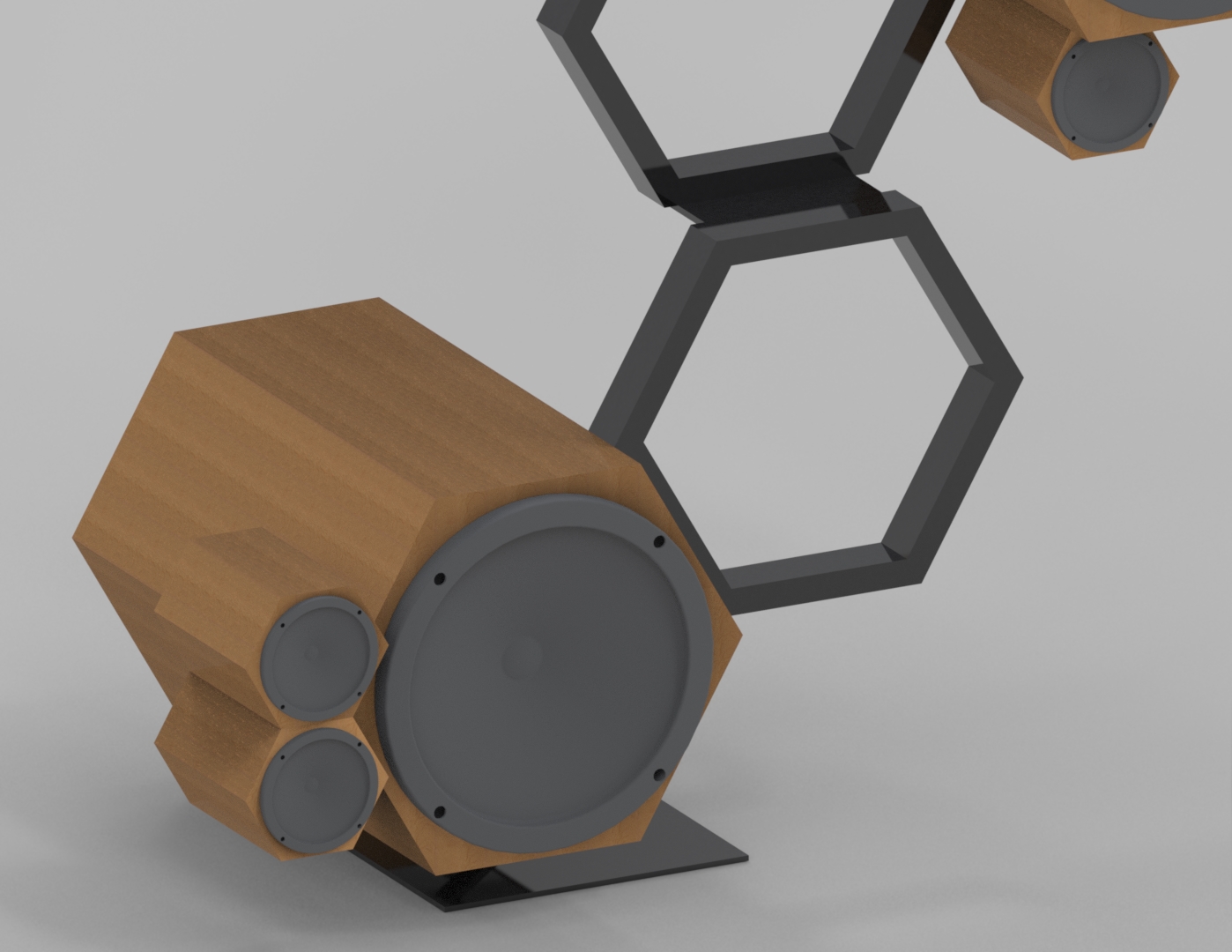
This is using the same materials that I had purchased for my original design, but I think that it is way more interesting. The only additions are steel tubing for the black hexagons and the leg and a steel plate for the foot. The idea behind this design is that the sculpture appears impossible because the center of mass is so far away from the leg. My plan is to purchase another heavy lead acid batter pack and place it in the bottom left enclosure, additionally the foot will be made wide enough to keep everything from tipping. I think that this design is way more interesting than my previous design and the good news is that if the shops open over the summer, I can actually build this!

Figure 8: Working on the rendering lighting
In the mean time, I’m making this a digital design, which means learning rendering software. I’ve spent the last couple weeks learning the basics of Solidworks Visualize, which is a separate rendering software. Above and below are photos produced in the rendering software. I’m still learning, but I am getting close to making everything look the way I want. My other digital design task is to produce a series of accurate instructions for how to build this thing!
I’m really happy with this design compared to what I was thinking about before. It gives me the impression of a piece of modern art and something that a rock star would put in their house. My one temptation for changing this thing is that it is currently only 3 feet tall as designed, but I would want it huge if I made it. Like 6 or 7 feet tall with giant rocking subwoofers and the little speakers as full range drivers.
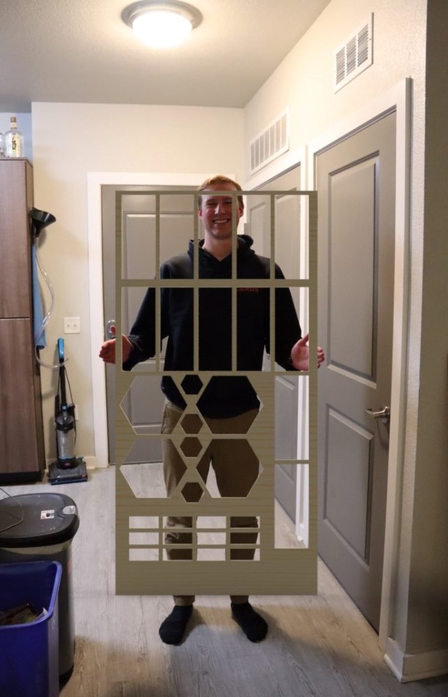
Figure 9: Render of the cut out parts
______________________________________________________
References:
[1] [2] The MET: https://mymodernmet.com/woods-davy-cantamar-granite/
2 Comments. Leave new
I really like the aesthetic you are going for the honeycomb design is classically cool! I also like the fact that you leaned to the side of making something functional that you can keep for after this class! Have you thought about the distribution of weight and the center of mass in terms of the stability of this project especially if you wanted to put something in the honeycomb.?
Max,
I really like your new speaker design. The hexagonal speaker boxes suspended with tubing brings a unique aesthetic that I have never seen before. That being said I love how it looks; it is by far the most interesting and cool stereo systems I have seen.
Have you thought about incorporating a small shelf in the hexagonal steel frame? I think that this would provide a nice place to set a phone or whatever device you plan on playing music from.