Aesthetic Inspiration
For my final project, I drew most of my aesthetic inspiration from the sculptures by Rebecca Louise Law, and the movie, Midsommar. While these seem somewhat opposing (sculptures and a horror flick) both use flowers to convey a story and represent beauty.
I was drawn to Law’s work because she really makes it look like flowers are falling from the ceiling, creating a sense of movement. I also appreciate the vibrancy and variety of flowers she uses. By using real flowers she is given the ability to play with time, letting her sculpture dry out and change.
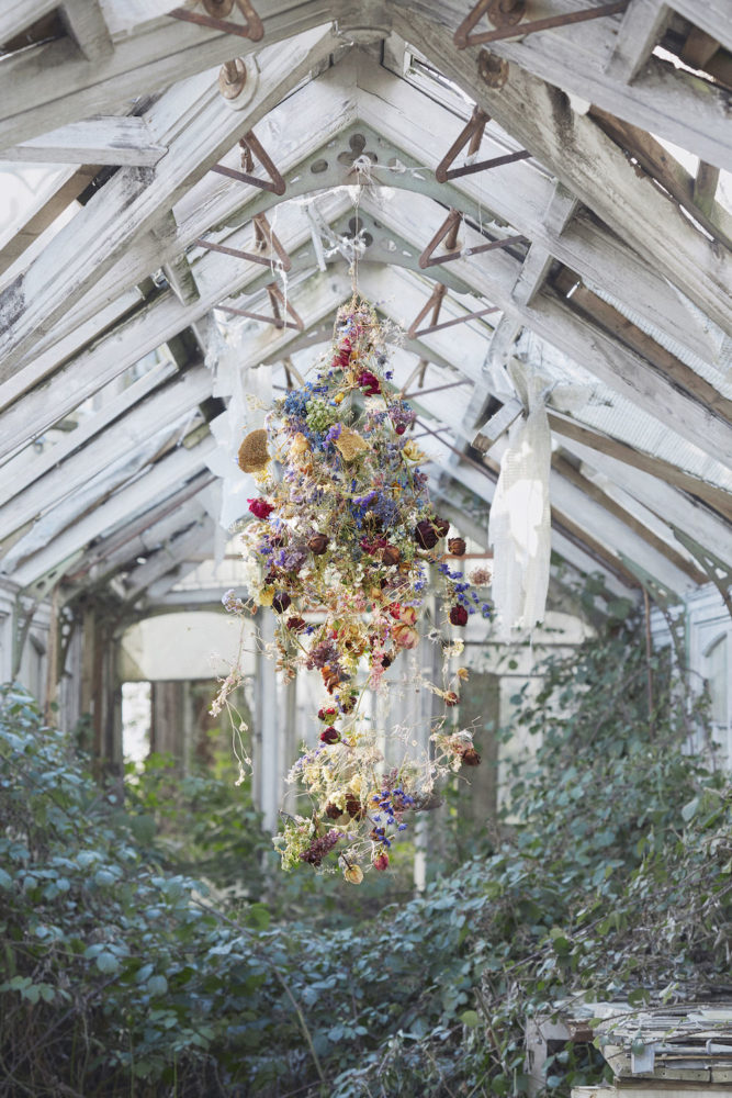
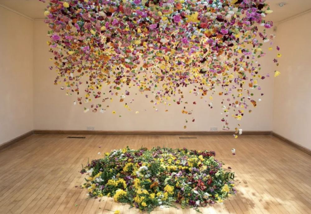
Midsommar, while extremely dark in plot, uses extremely bright and unique flowers to create an uncomfortable juxtaposition. While I do not want to make my viewers feel uneasy or scared, I do find the use of flowers extremely beautiful. On top of the florals used in costume pieces, I was also inspired by the architectural aesthetic of the movie, which employs highly painted and decorated wood.
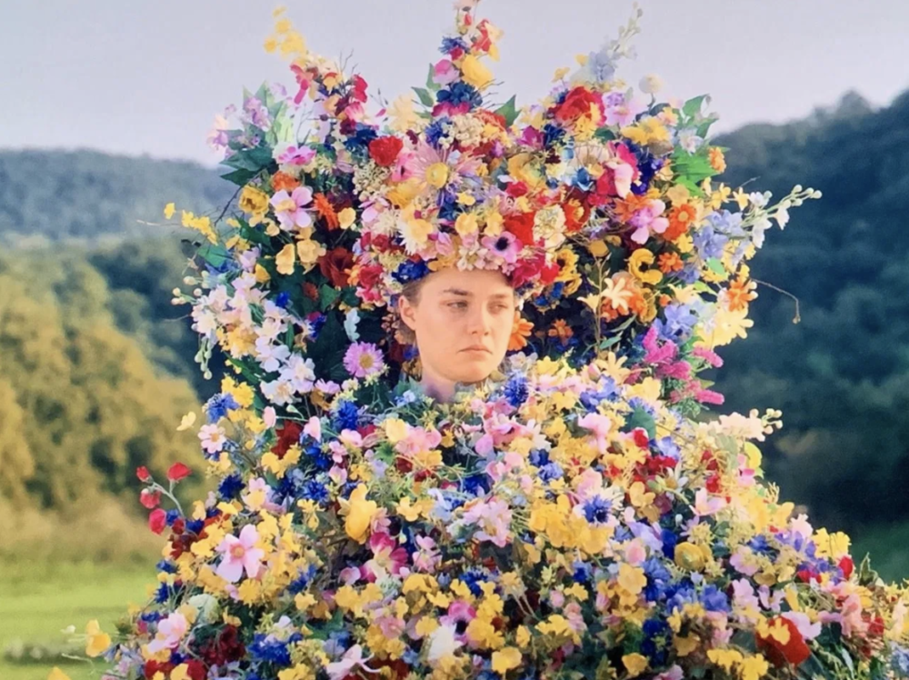
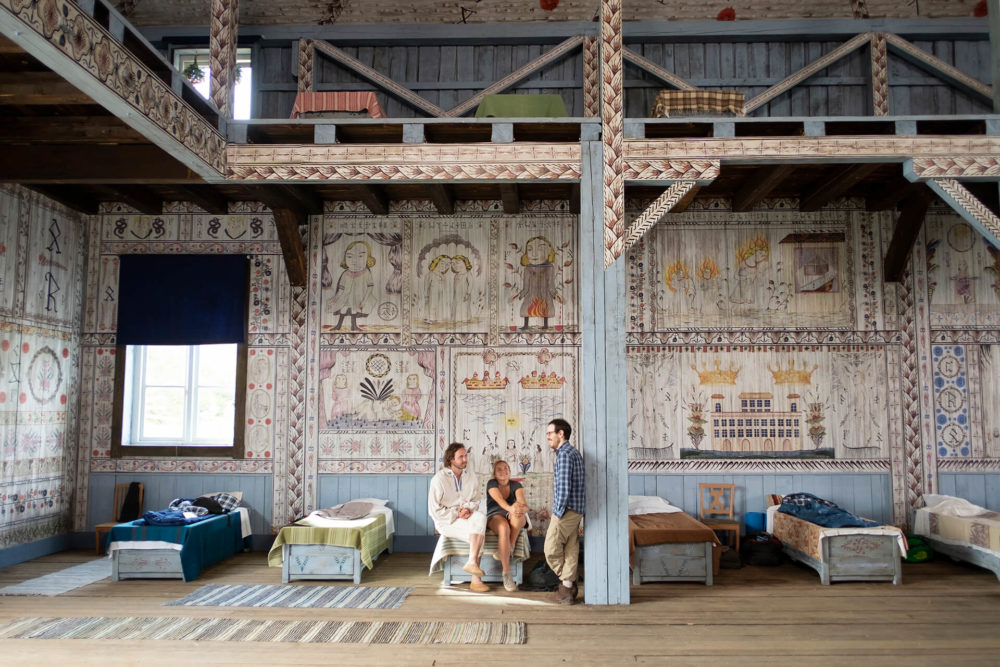
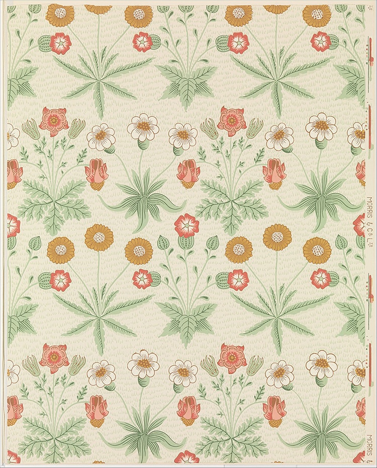
In my opinion, this floral aesthetic is deeply rooted in the Arts & Crafts Movement. Work made in the Arts & Craft style particularly idealized medieval life and designs, which meant that work made in the style was typically hand-crafted, made from natural materials such as wood, and applied patterns from nature [5]. Stylistically I wanted my piece to be rooted in the Art & Crafts Movement, however, I wanted the purpose of my piece to be rooted in the Aesthetic Movement, which was all about making “art for art’s sake” and beauty and self-expression [6].
Vision
Based on this inspiration, I decided to create a large moving sculpture where flowers are the main theme. While quickly finding clarity in theme and aesthetic, I struggled with the function of my sculpture, more specifically, I could not decide between building an automaton and a mobile. Because of this struggle, my first design iteration was a mobile automaton hybrid. The idea was to create a large automaton (based off of the image below) and then hang small floral mobiles (based off the image below) from the ends of the automaton.
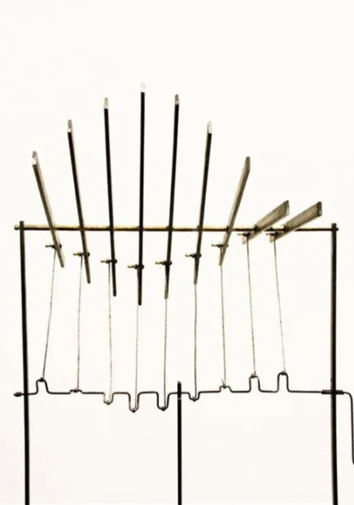
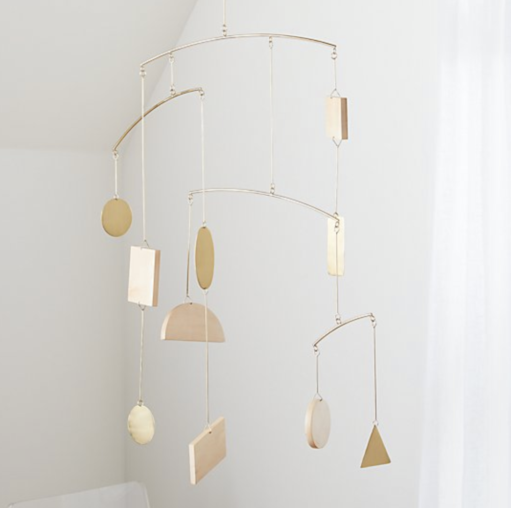
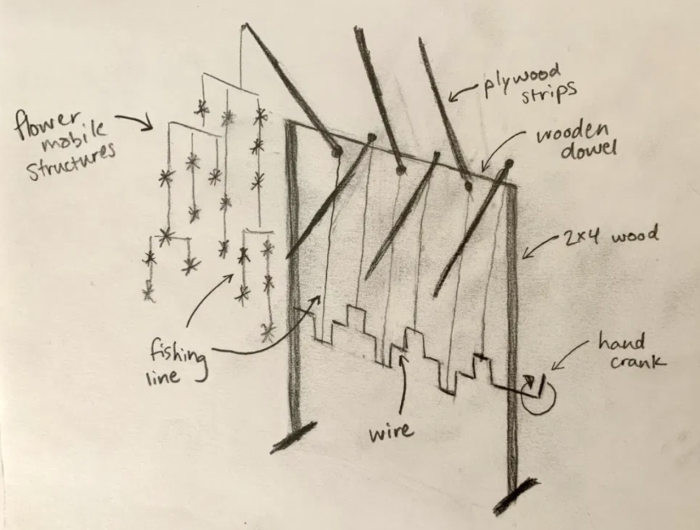
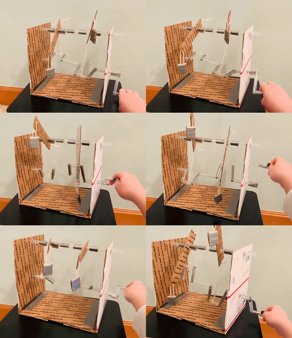
While my prototype and design review for iteration 1 went well, I had to iterate due to the new constraints on my projected provided by COVID-19. The restrictions on the machine shop were my biggest fear with my first design iteration, so I decided to pivot towards something that I could fabricate at my home, which only has basic hand tools (small hand saw, drill, etc). Because I still loved the general idea behind my first design, I decided to focus solely on the mobile portion of the project.
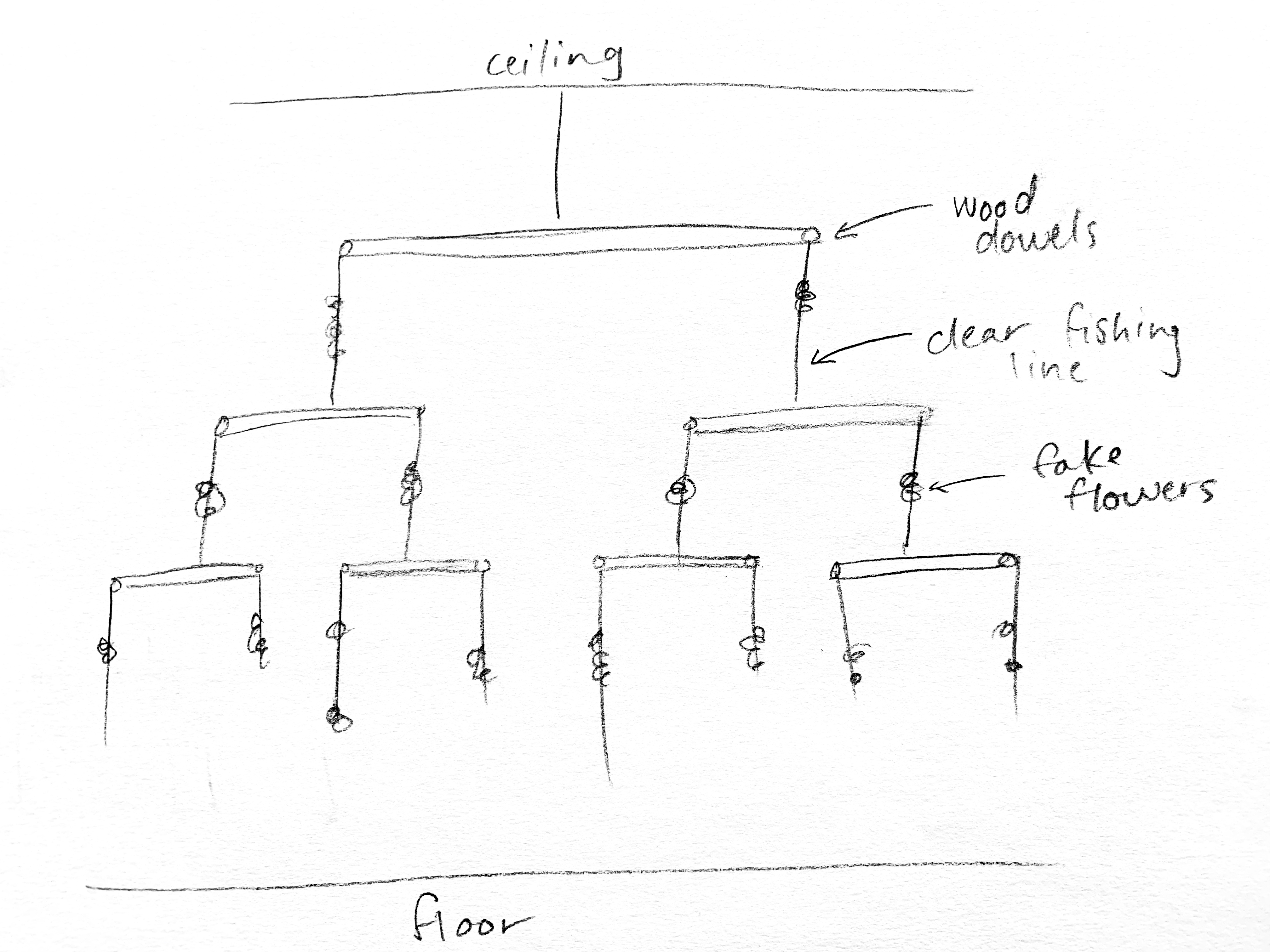
Goals
Based on this final design, I came up with a list of aesthetic and functional goals I wanted to achieve:
Aesthetic Goals
- Arts & Crafts: Should incorporate themes of nature and natural materials
- Aesthetic: Should embrace the idea of aka art for art’s sake. Its purpose is for beauty, and therefore should be pleasing to the eye.
Functional Goals
- Moves: Should be capable of translational (up and down) and rotational movement.
- Durable: Should be able to withstand human interaction (touching), a housecat, and the outdoor (on a relatively nice day).
- Balanced: Should be balanced well enough to function.
- Large: Should be floor-to-ceiling in height.
References
[1] Web, Potter. “The Beauty of Decay Series.” Rebecca Louise Law, 5 July 2017, www.rebeccalouiselaw.com/artwork/beauty-decay-series-2.
[2] Web, Potter. “Artist Rebecca Louise Law ‘The Hated Flower, 2014’.” Rebecca Louise Law, 28 Nov. 2016, www.rebeccalouiselaw.com/artwork/the-hated-flower-2.
[3] “Midsommar.” IMDb, IMDb.com, www.imdb.com/title/tt8772262/mediaviewer/rm1884590593.
[4] “The Creepiest Character in the Midsommar Movie? It’s the Spatial Design.” Frame Publishers, 19 Aug. 2019, www.frameweb.com/news/midsommar-production-design-henrik-svensson-interview.
[5] Lou, Mary, and Shovava. “Meet William Morris: The Most Celebrated Designer of the Arts & Crafts Movement.” My Modern Met, 25 Apr. 2018, mymodernmet.com/arts-and-crafts-movement-william-morris/.
[6] “The Aesthetic Movement Overview.” The Art Story, www.theartstory.org/movement/aesthetic-art/.
[7] Martin Smith, https://i.pinimg.com/originals/ec/5f/8e/ec5f8e19087905a9a3142201fa2b2f6e.jpg.
[8] “Simple Shapes Geometric Baby Mobile Reviews: Crate and Barrel.” Crate&Barrel, www.crateandbarrel.com/simple-shapes-geometric-baby-mobile/s200958.

4 Comments. Leave new
Hey Fiona, I really enjoyed seeing this project come to life. As a statement of meaning, I think you accomplished your desired aesthetic really well. As a neutral question, do you see yourself pursing the Automaton idea in the future? If so, would you keep the aesthetic the same or try something new? As a suggestion, I would try incorporating more plants (other than flowers) to help compliment the flowers and make the space a bit more full.
Thanks for the feedback Jackson! I do not know if I will ever pursue the floor-to-ceiling automaton idea, but I really like the idea of incorporating more plants if I was to iterate or make another sculpture like this. I think I would generally keep with a natural/floral aesthetic, but I might try to make it more modern rather than rustic.
Fiona, I really love this idea and I am sure it was fun to design from a mechanical engineering perspective. Great job with your pretotype! I also thought using fake flowers was a great choice. There would be a lot of challenges with real flowers, so I think you made the right choice. I still haven’t seen Midsommar, so I will need to check it out. What is your end goal with the project? Meaning, would you install it in your house, gift it to someone, etc.? All around great job, and I really enjoyed your presentation. I think you explained it all really well with figures, sketches, GIFs, etc.
I have no idea what exactly my end goal is. Right now I plan to just enjoy the sculpture as it hangs in my house. As the weather gets more consistently better, I think I might try to hang it outside. Otherwise, I might try to present it at EXPO next year. Thanks for the feedback!