Construction Update
As the COVID-19 pandemic unfolded, I decided to re-scope my project. Instead of manufacturing anything, I am using this time to really focus on the design and create renderings and an animation of the device. I have also pivoted my idea. Previously, I was going to build a water clock: water would drip over a sensor, and from this sensor reading, a digital clock would be ticked and displayed on the device’s LCD screen. Because of the campus closures and not having manufacturing resources available, it would not have been reasonable or possible to get everything manufactured within my budget and timeline. As my design of the water clock was also limited by the manufacturing processes and materials I had available, I was limited in exactly what I could accomplish. Meaning, it was more challenging to achieve my target minimalist/Apple aesthetic. Apple uses a lot brushed aluminum, curvy and organic shapes, and typically black accents. This would have resulted in a project cost that was above my budget and would have been difficult to achieve before the end of the semester.

So, I have decided to pivot towards a desktop vortex waterfall. Instead of manufacturing anything, I will be creating CAD renderings and an animation of how the device will work. I was inspired by the video below in which someone makes one of these waterfalls from up-cycled materials. I will still be targeting the same aesthetic as pictured in Figure 1.
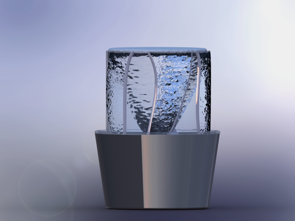
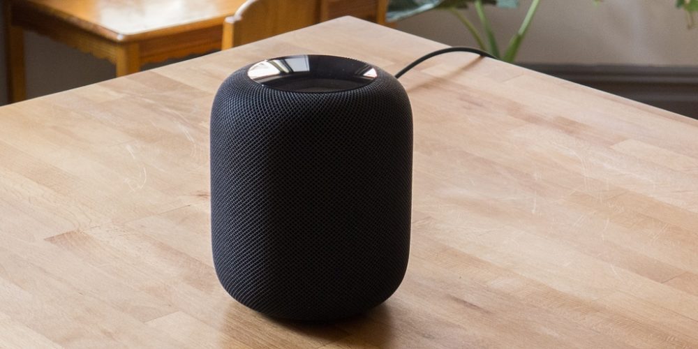
Below are some of the renderings I have come up with. The idea here is that a pump similar to the one I proposed earlier in the semester will be used to pump the water up from a bowl-shaped reservoir and send it in a spiral pattern. As the cylinder fills up with spiraling water, it will begin to spill over the top of the cylinder and return to the reservoir to be pumped into the cylinder again. I have added an LED strip and an Arduino Mini to control the LEDs. As the light refracts through the water and cylinder, it can offer an interesting glow and an eye-catching aesthetic. Because my device is no longer square-shape, it was difficult to incorporate an LCD screen. As I played with a couple ideas of how to incorporate a sensor and LCD screen for the clock, it began to take away from the aesthetic. So, I went back to look at Apple products and returned to the roots of this aesthetic: simplicity. Without the additional components, the design remains more sleek and simplifies what types of electronics are needed. I also concluded that the clock portion of this device does not add much to it. There are three main components in this assembly: the cylinder, the water pan (reservoir), and the base. I used Apple’s HomePod device as my design inspiration and is pictured below.


The pan contains the pump and the water. It fits flush with the base of the device. I have designed it to be made out of ABS, and could be injection molded or machined. The pan is transparent (or mostly transparent, difficult to achieve with injection molding) to allow for the LED lights to shine through. The wall thickness of the pan is all uniform which allows uniform cooling during the injection molded process; it also has a more than acceptable draft angle.
The base of the device holds everything in place. It is made from aluminum and I have designed it to be cast. The base will then need to be post machined to achieve the necessary tolerances, and will be brushed to match the aluminum used in Apple products. This also has uniform wall thickness to help with the casting process and has a sufficient draft angle. On the bottom of the base, a circular ridge has been included that can accommodate a rubber footing to help keep the device from sliding around on the desk.
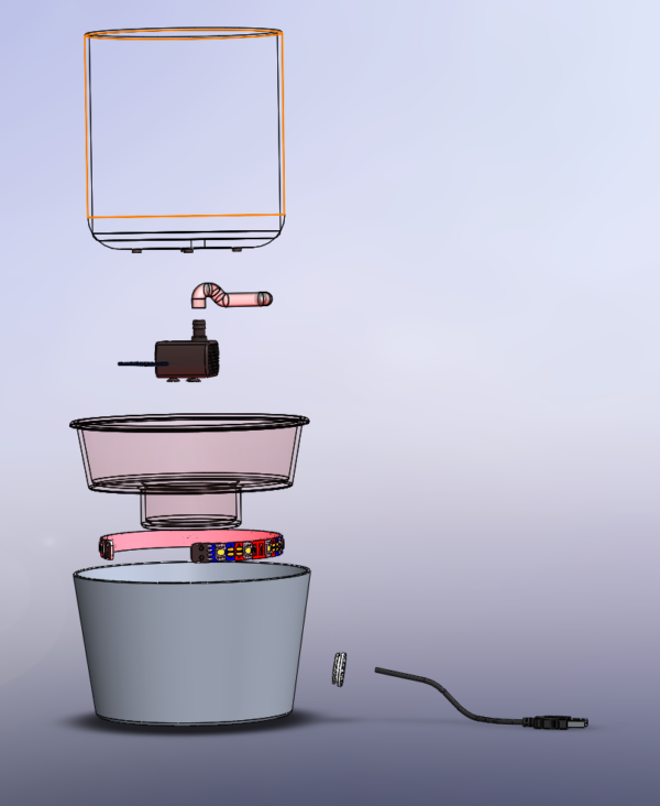
The remaining components consist of the pump, tubing to route the water into the cylinder, an LED strip, and an Arduino Mini. As of now, there is not a great use for the Arduino other than controlling the LEDs. I will be looking further into finding standalone LED strips that contain the necessary electronics to control the color and LEDs independently from the rest of the device. The base contains a cable grommet through which the power cable is routed. Two power cables may be needed depending on which LED strip is used: one for the LEDs and one for the pump. Refer to the exploded view below for the orientation of the parts.

I will be continuing with polishing the design, rendering the CAD models, and developing the animation. Please let me know your thoughts. I also welcome any suggestions or critiques.
[1] Pinterest. “What an Aesthetic. | Home Office Setup, Desk Inspiration, Apple Products.” Accessed February 24, 2020. https://www.pinterest.com/pin/427138345905993364/. [2] “How To Make Tabletop VORTEX WATER FOUNTAIN at Home.” YouTube, www.youtube.com/watch?v=j66tDFELKEE. [3] “Apple HomePod Review.” Wirecutter, thewirecutter.com/reviews/apple-homepod/.

4 Comments. Leave new
This is a really nice pivot of your idea! I would argue it fits even better aesthetically since you’ve minimized the complexity of the idea itself with the removal of the clock. Your rendering also turned out really professional, what software did you use to generate it? Do you think you’ll be able to generate a dynamic rendering as well? I also really like your take of the overall design based off the HomePod, I thought that was a very unique and well done interpretation.
Thanks, Thomas! I used PhotoView 360 in SolidWorks for the renderings (let me know if you need any help using this). I do plan on creating an animation of the device as well using SolidWorks to show the motion of the water and the LED lighting effects. Thank you for your input. I, too, believe this fits the aesthetic better than what I had before. I also agree that simplifying the design made it easier on achieving my desired aesthetic.
Daniel, I like that you took under consideration the scope of your project and adapted accordingly. The fountain is a great idea. The rendering your currently have is very indicative of the Apple minimalist aesthetic. The container reminds me of the surface of a MacBook. The exploded view of the parts is also helpful to see all of the components. If the Arduino’s only purpose is to control the LEDs, do you think it’s necessary to even have the LEDs? Do you think it would be more Apple-esque without them?
Nicole, I do think the LEDs may take away from the “Apple” aesthetic slightly, especially colored LEDs. However, I really would like to incorporate them to give it another feature. In regards to the Arduino, I think I may ditch it as it’s not necessarily needed. Thank you for your input about the design.