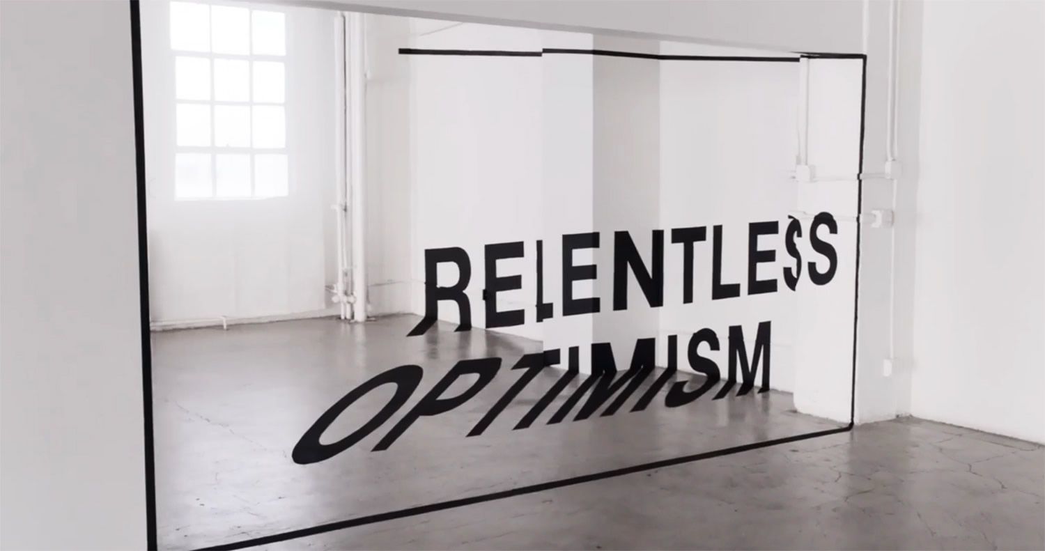
For this post, I wanted to find something that inspired me creatively. This video particularly stood out to me, after scrummaging through many “DIY” and “make it yourself’ videos. Specifically, I think it’s incredibly how the designer of this video was able to use text in order to express Apple’s message of the one thing that is the same between all of us is that we are different. The dynamic attributes of this video keep the viewer inspired from start to finish, and express emotion in a minimal, powerful way.
Citation: https://www.youtube.com/watch?v=TJ1SDXbij8Y&list=RDCMUCE_M8A5yxnLfW0KghEeajjw&start_radio=1&t=33


2 Comments. Leave new
That was a really cool video! Amazed by how many different ways they were able to layout the text to keep the viewer engaged. I would have loved to be in the room when they were designing these sets – some brilliant minds there! Thanks for sharing!
This was such an interesting and inspiring video from Apple. It’s interesting they were able to integrate many aspects of art and videography into an ad.