This post will cover the aesthetic design process illustrating the following:
- Describes the planned aesthetic: history and application.
- Describe two very different/opposite aesthetics: how would it look if applied.
I. PLANNED AESTHETIC
Looking at the aesthetics we explored in class, the two that stood out in its application to my project were streamlining and matt black aesthetic.
Streamlining aesthetic has a very shiny, curvy, and aerodynamic look to it, naturally intrinsic to electrical guitars I feel. The aesthetic emerged in the 1930s and was used in industrial design, namely: railroad locomotives, telephones, toasters, buses, appliances, and other devices conforming to the sleek and modern impression. The electrical guitar itself was developed in 1932, so I believe this type of aesthetic is very fitting for such a piece.

Figure 1: Motor Car No. 9 (without tail fin) with streamline aesthetic. Very smooth and soft aesthetic that can would work amazing on an electrical guitar. Source: https://www.nybooks.com/daily/2013/11/13/streamline-dreamer/

Figure 2: Another Streamline moderne automobile in the 1930s. Source: https://www.hemmings.com/blog/2014/05/29/1930s-auto-design-art-deco-and-streamline-moderne/
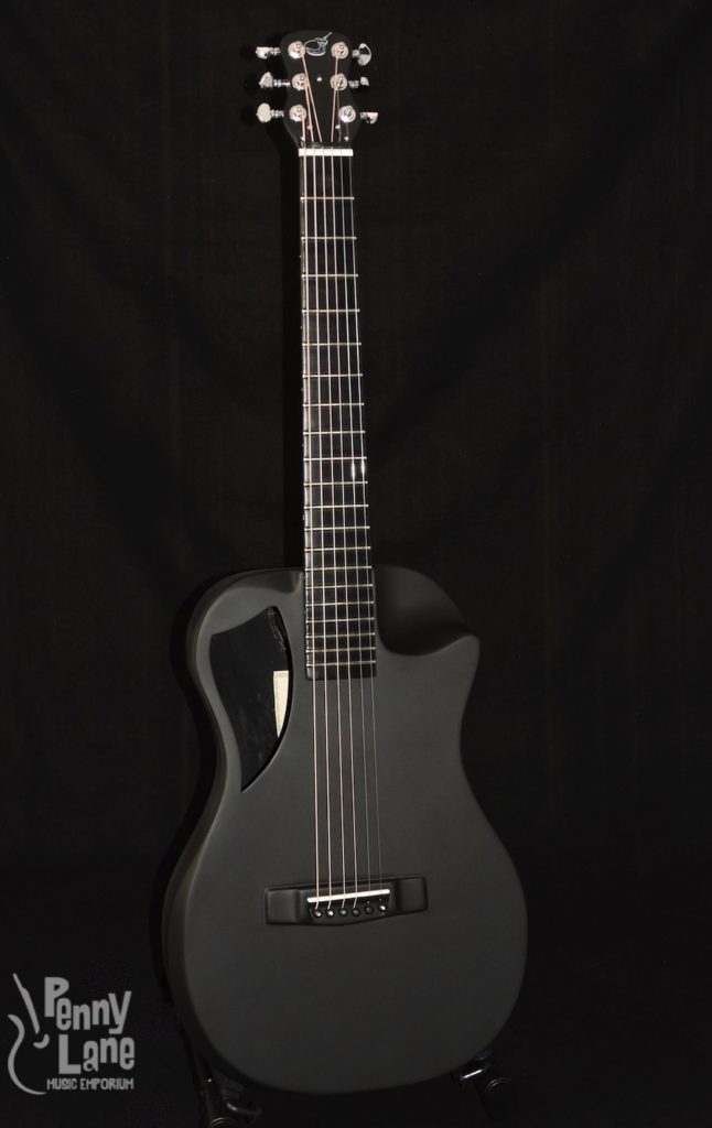
My thought behind combining a matte black modern aesthetic onto what once was considered a very modern aesthetic will try to infuse both modern aesthetics into my project. Matte finish are similar to flat finishes with non-glossy finish to diffuse reflection. However, the two aesthetics do contrast each other in some ways as streamline aesthetic is shiny, so I imagine both will exist but not be mixed on the electrical guitar.

Figure 3: There is a separate shiny piece that contrasts with the matte black finish of this particular electric guitar, something I hope to do better.
II. COMBINING DIFFERENT AESTHETICS
In a way the above aesthetics are very opposite from each other as one diffuses light and the other projects it. I was asked in class what aesthetic I dislike, and floral came to mind. I’m not sure what the opposite aesthetic would be, but probably death and destruction. I imagine that would look something like below.
Figure 4: Cindyguitars. Source: http://www.cindyguitars.com/
If anyone knows of some very cool guitar aesthetics, let me know in the comments, thanks.


1 Comment. Leave new
I think that those are great aesthetics for an electric guitar, and combined could look even cooler. How would you apply the curves in the first aesthetic you mentioned?