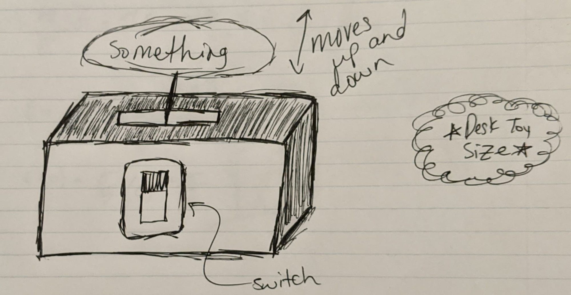
In my previous post, I discussed how I wanted to create some sort of desk toy with a moving part. The main pieces of this project would consist of the box, the electronics, and the decorative “thing” that would be moving. I would like the aesthetics of the box and the “thing” to compliment each other, although I don’t plan on making them 100% the same. If they are too dissimilar, I feel that they will clash and my final product will look sloppy, unplanned, or confusing.
For the box, I wanted to go with a minimalist aesthetic. I don’t really want the box to look too busy, or flashy, and plan on using one of two materials to construct it. Either acrylic or wood, as both can be pretty easily manufactured using the laser cutter or similar tools. If I were to use acrylic, I would use one solid color for the entire box. If I were to use wood, I would probably stain the wood one color. For staining the wood, a darker stain would suit my vision best.
For the “thing”, I had decided to make it something related to a book/movie/TV show/band I am interested in. I want whatever I create to be a reflection of my interests and who I am as a person, and the best way to do that (in my mind) is to let my inner nerd be out on full display. Most likely, this will come in the form of a 3D printed or laser cut trinket that represents one of the fandoms I belong to. This certainly doesn’t narrow it down, as there are plenty of things I feel passionate about and nerd out about.
Some alternative aesthetics that could be explored, which would specifically be applied to the box and not the “thing”, are 1) steampunk and 2) retro jack-in-the-box.
A steampunk box would have a lot of gears, and would have a more metallic finish to it than the minimalist design. It would also probably have a unique shape. The box may end up looking more like a chest than just a simple box. If I were to have gone with this idea, I think that it would also influence the choice I made for whatever my decoration is.
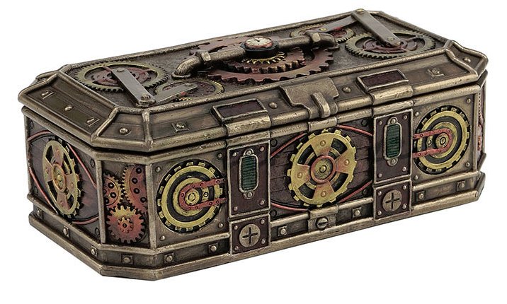
Image Source: https://www.fairyglen.com/uswu76909a4.html#.XlcuL25FzRM
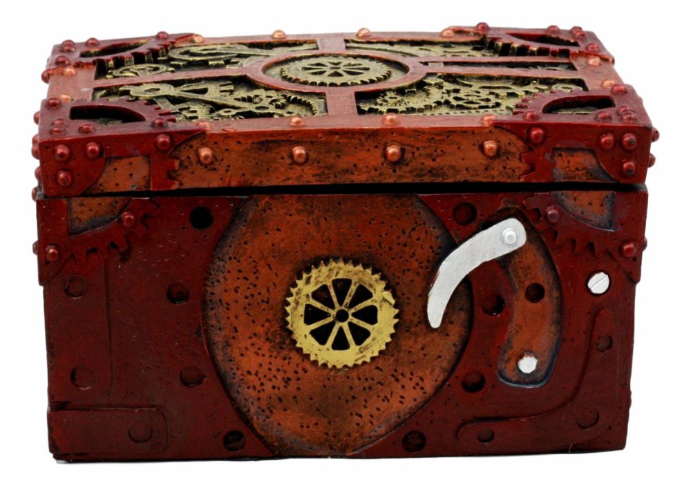
Image Source: https://www.wayfair.com/storage-organization/pdx/world-menagerie-steampunk-mechanical-gears-clockwork-jewelry-box-w001948748.html
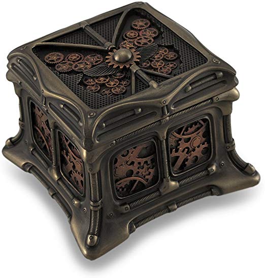
Image Source: https://www.amazon.com/Veronese-Steampunk-Butterfly-Bronze-Trinket/dp/B00JJ6M56I
The jack-in-the-box idea was actually one that I had considered for a while before deciding that it was probably a little outside my scope for what I was willing to commit in terms of energy and resources. However, it would be a really fun aesthetic to play with and make work. It would also lend itself very well to whatever decoration I wanted to make. The box would have a lot of bright colors, and simple patterns such as polka-dots or stars. This would definitely be a very eye catching design.
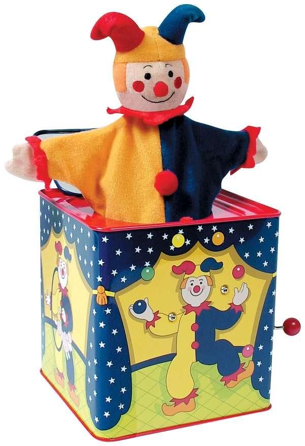
Image Source: https://www.pinterest.dk/pin/48202658487221276/?lp=true

1 Comment. Leave new
Mary, I really like your idea of making a desk toy. There are so many directions to take, do you know how you’ll narrow it down? What types of materials were you looking into? Awesome ideas!