For this project, I wish to create an animation, particularly a fanimation of the old introductions of Kirby games, particularly Kirby: Return to Dreamland introduction or Kirby Super Star Ultra’s intro in the style of the new Kirby: Star Allies game.
For reference, Kirby: Return to Dreamland intro is the following: https://www.youtube.com/watch?v=668QR6aEQyg
Kirby Super Star Ultra’s intro is the following: https://www.youtube.com/watch?v=IvwuAx3AYMI (this is a comparison video to the “normal” Kirby introduction and a secret one)
And Kirby: Star Allies intro is the following: https://www.youtube.com/watch?v=YNNUeJ96Xlw
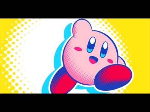
A quick examination of Kirby: Star Allies aesthetic reminds me closely of the more modern Pop Art aesthetic.
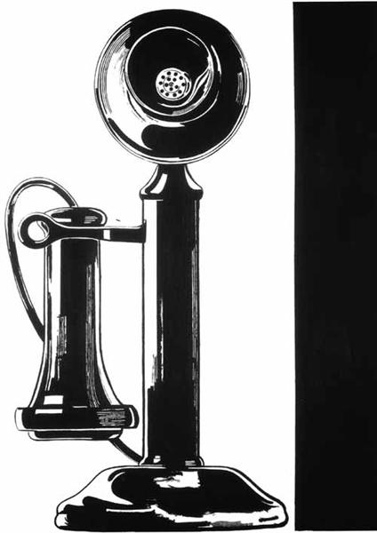
Pop art was initially prominent during the 1950s in the US and the UK. It was mainly inspired as a challenge to traditional “fine art”, and a generally more bold, aggressive, and flat colored tones, and general removal of a product from its traditional background. Pop art was often political.

However, modern pop art has taken a shift, due the rise of prominence of media. Pop art is now more characterized by its highly bright colors and its dot-style shading, seen in old-style comics with cells. Pop art is very bright and often contrasted with a simple, white background.

Unlike most pop art, however, Kirby’s aesthetic was changed to make it more clean and cell shaded, almost comic-like, a step away from the 3-D rendered Kirby we see today. And unlike most modern pop art, Kirby’s aesthetic, while inspired by comics, is far more pastel and “kawaii” than a typical pop art piece, to fit with Kirby’s cute aesthetic of the character.

I wish to recreate the old intro animations in this new style, as I find it fascinating and very cool looking.
[1] https://www.wikiart.org/en/andy-warhol/telephone [2] https://fadmagazine.com/wp-content/uploads/shutterstock_679581043-1024×1024.jpg [3] https://nintendowire.com/wp-content/uploads/2018/02/Banner-KirbyHeart.jpg

3 Comments. Leave new
[…] For my main project, my first chosen aesthetic was Pop Art, as written about in this post. […]
Hi Emi, great post, and an excellent idea.
I think that the animation will be a great way to show off the aesthetic you’ve decided to work on, while also incorporation the dynamic portion; one question I have is how you’re going to display the animation in the end of the project. Will you be constructing a frame of some sort or simply be using a laptop screen or the like to display the final project?
I guess I’ll be using a laptop hooked up to a screen, probably! I can rent one out from the ITLL maybe, or just bring my monitor.