INSPIRATION:
The inspiration for my upcycle project is my mom. Being that she loves trendy art that is suitable for display in our house, I figured I would create her a wall piece to hang in our house. My mom is originally from New Zealand (hence the reason the featured image is the New Zealand flag) and she is also a huge fan of wine!
From these simple facts about my mom, I decided why not make a piece of wall art that incorporates both! So, my plan for my upcycle project is to acquire a large quantity of used Wine Bottle Corks from various different companies with different labels (to add variety and intricacy to the project) and arrange them in the shape of New Zealand.

– image: https://www.enchantedlearning.com/oceania/newzealand/outlinemap/
– image: https://www.mnn.com/food/beverages/blogs/case-cork-bottle-stoppers
The Wine Cork will be arranged atop recycled plywood that will be initially cut in the shape of New Zealand, to act as a “panel” on which I plan to super-glue the cork to. This will enable the cork to be securely fashioned in the shape of New Zealand, as well as provide a “hard” substance on which I can attach “wall hooks” so that my mom can then attach it to her wall. The plywood will most likely be cut into this shape utilizing a template that will be placed on top of the plywood to ensure the accuracy of the cuts being made.
DESIGN / FABRICATION:
As described in the inspiration for my project, I wanted to basically take recycled wine cork, and create the outline/shape of New Zealand. The design for this was fairly simple. I primarily mirrored the shape from an image on my computer (such as the one shown above) and started with an outline of New Zealand on the recycled backboard that I found in the basement of my house. This took a couple tries because initially, I had placed the outline off center of the backboard, which decreased the amount of available space I had to make the island as proportional and to scale as possible. Once I realized this, I scrapped my first try, and re-positioned the outline so that it allowed for the best scaling and proportionality. This process took me roughly one hour before I was satisfied.
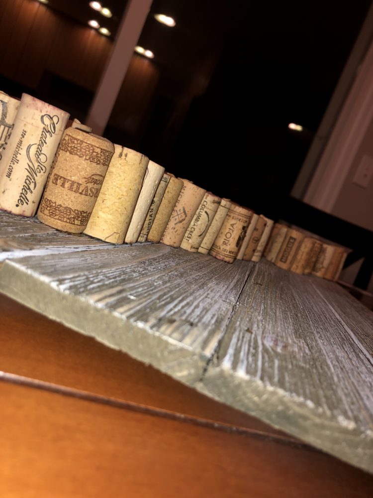
Once the outline of the Island was set in stone, I then started to fill in the outline with the remaining cork. My initial plan was to place the cork tightly together to fill in the outline. However, halfway through this process, I realized I didn’t have as many recycled wine corks as I thought I would need. Therefore, I couldn’t tightly pack the cork together as planned. So, I decided to spread out the cork within the outline to have all area covered as much as possible. By the way, nothing has been glued down yet, which was problematic (I found to my dismay) as I once accidentally bumped the backboard and a quarter of the shape toppled over.
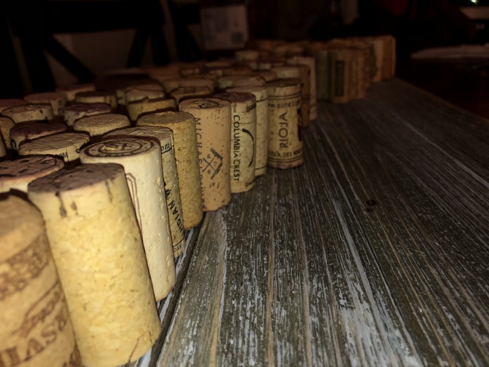
Once everything was finally arranged to my liking, I started to super glue each cork to the backboard piece by piece. This was a tedious process and during the assembly, I realized I had to be very careful at where I placed the glued cork because if I bumped other cork while doing so, the shape would become distorted. The picture below shows the type of super glue I utilized during this process.
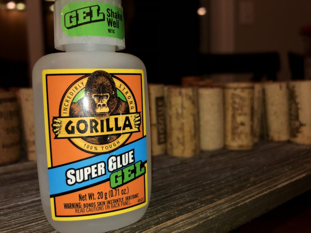
The glue was quick to take hold and dry to the backboard which was very convenient and efficient. The total time spent on securing each piece of cork to the backboard was roughly around one hour and thirty minutes. Each cork quickly dried and became functionally secure in under thirty seconds. Once everything was secure, the project was finally complete and turned out wonderfully! The featured image (displayed below again) depicts the final product. I honestly could not have been more happy with how this turned out!
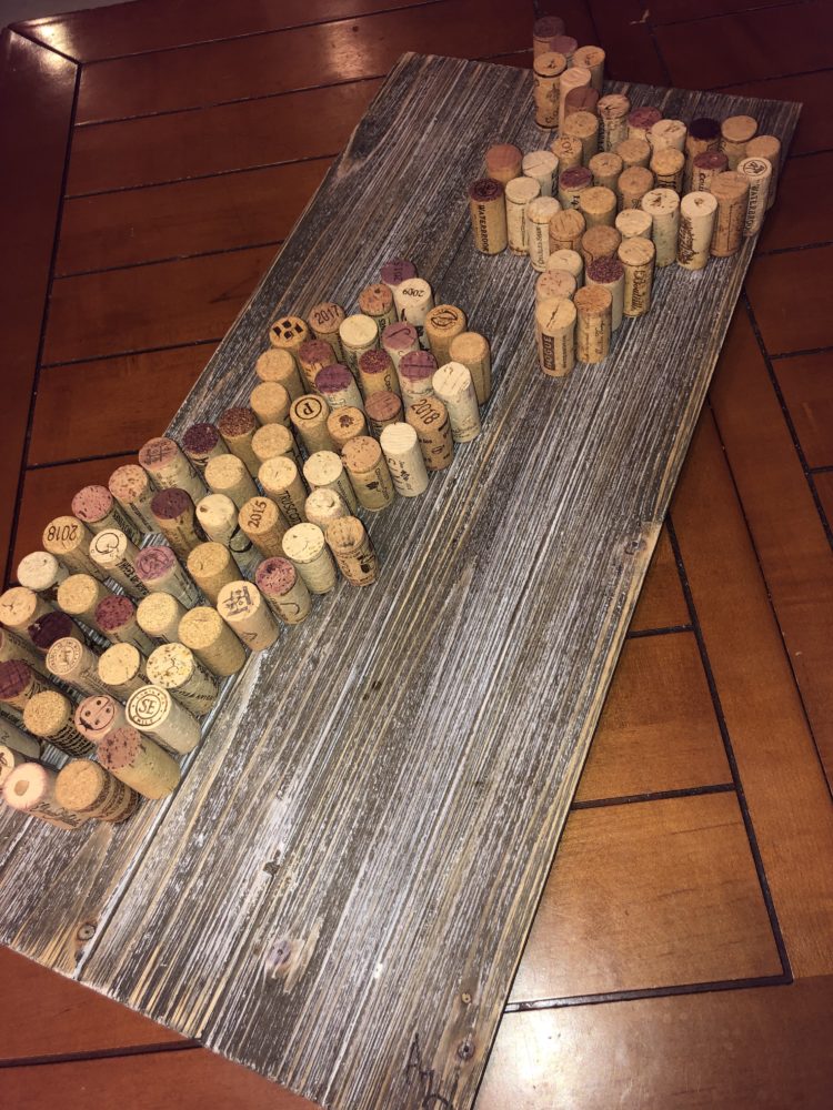
As described in my inspiration for this project, I want to keep this piece for my mom as a gift. I am still going to do so after completing the project, and will most likely hide it away until mother’s day to make it even more special of a gift.
One thing to improve this project, if I had more time and the option to do so, would be to engrave Maori tribal tattoo designs into the background to tie the project even more with New Zealand and it’s rich heritage and culture. Despite not doing this, the rustic look of the backboard still provides a natural look that is aesthetically pleasing.
PRESENTATION LINK:
https://drive.google.com/open?id=1ZeMP2Hm8KPt-2A_jXxP7jCSATTnFKn1n

10 Comments. Leave new
Hello Austin from Pod B! I chose your final report for a more in-depth critique as I was really excited to see the final product and figured I should follow up after my comments on your upcycle progress post. The final product looks excellent, and should look amazing hung prominently against a wall.
Following Liz Lerman’s Critical Response Process, as a statement of meaning: I really appreciate the heterogeneity of the corks, and I feel it adds a lot to the rustic aesthetic of this piece for them to not be all uniform and pristine.
As a neutral question: how did you decide how much spacing to leave between each of the corks, and what influenced that decision?
Please let me know if you have any questions for me regarding your final product to fulfill the “Artist Asks Questions” step of Liz Lerman’s critiquing methods.
And finally, I have an opinion about how you could incorporate the Maori designs into your backdrop if you would like to hear it.
Awesome job with this Upcycling Project, and your mother should be proud to receive this from you!
Austin,
This looks great. It looks like a sellable product and I think it’s a wonderful gift. I think your inspiration is very cool and wonderful. I think my only critique is the board could be a little bigger since the cork is so close to the edge. I love how clean it looks. Although it could have more corks, I don’t think it needs it.
The quality looks great. I am really surprised how good this came out. You cannot see the glue at all which makes it look really clean. Make sure to put picture hanging wire on the back that way it is super easy to hang up on the wall and keep it looking straight. What would you have done differently if you could have? One thing. I could see this leading into making bigger pieces.
Sweet project, Austin! Love that the idea stemmed from your relationship with your mom and you created something that I think she’ll be very excited to get from you. The used wine corks are exactly the kind of material this project is supposed to be about and you nailed it. I think it could be cool if you specifically put the taller corks to align with mountain ranges and tried to mimic some topography but just leaving it as-is is also very cool. Nice work, man.
I really like the look of the choice of wood as the backdrop, the brown-grey color really helps the look of the whole project. The open space in the middle also helps make it feel nice and open.
I love the idea that you drew inspiration from what your mom loves, and the idea of dedicating it to your mom is pretty cool. I am a wine lover too, so I am pretty intrigued seeing that you used cork to come up with your upcycle project. The artifact is pretty accurate when you actually compare it to the New Zealand map, and thats a great job done.
Austin,
You nailed the aesthetic, and I think it turned out great. Overall very tasteful and well done. I think it would be interesting to see what it would look like if the cork was pressed together tighter. Backdrop looks amazing. Well done.
Beautiful project, extremely minimalist. I do enjoy the very “wood” aesthetic, although I am curious about the color blending between the backdrop and the corks.
I’m curious about your choice to forgo all text on the project itself, and your choice on why the wood was left unstained (unless it is!)
All and all, very beautiful project!
You managed to make something with such simple materials – it’s a simple as possible without any extra parts, even markers or signing your name. The different varieties of the corks, and contrasts of how stained they are end up standing out. It looks very well planned out. The wood background is especially beautiful and adds to the aesthetic. It’s very cool that you are going to use it as a gift.
Hey Austin! This project is so cool and genuine, and your inspiration for it makes it even more unique. I think if you wanted to get really specific for the shape, you could cut the corks and make the shape a little more exact, but I think the fact you kept all of them fully round makes it really minimalistic and sleek. Really cool project!