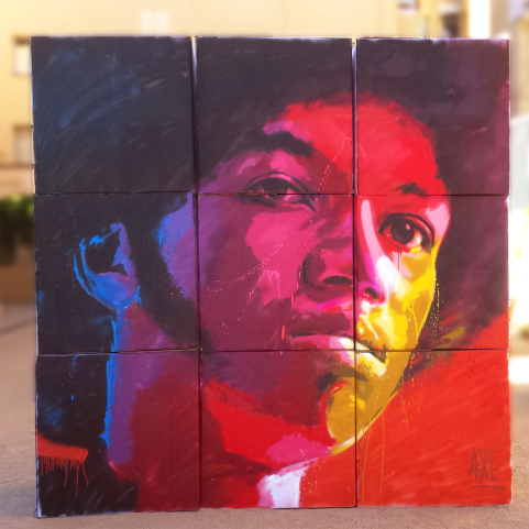
My inspiration for my Upcycling project came from the art collection I started this summer. Driving around Denver I always so there incredible and colorful street art and wanted to explore this aesthetic for a while now. Urban and black communities have expressed themselves through graffiti and street art for a long time and I wanted to explore this nontraditional style in juxtaposition to my trained style from school. For the upcycling portion of the project I decided to make the canvas out of card board and wooden Popsicle sticks, and to use old paint that was going to waste.

The reason I selected street art as the aesthetic is because I’ve always been fascinated by their large scale and vibrant colors. It is something that has captivated me for a long time. I realized there was no way for me to do a large scale painting and be able to bring it in to present it so I am painting on a smaller scale that way it transportable. I will use a color palette that is vibrant and wouldn’t typically be used to paint a person.
The person I have selected to paint is Tracee Ellis Ross. As a black women she was inspired me in many ways. I wanted to focus specifically on black hair and I felt that since she has so many different styles she would have a large variety of selections for me to choose from.
Tracee Ellis Ross:https://www.instagram.com/p/B0kVWYMFtoZ/


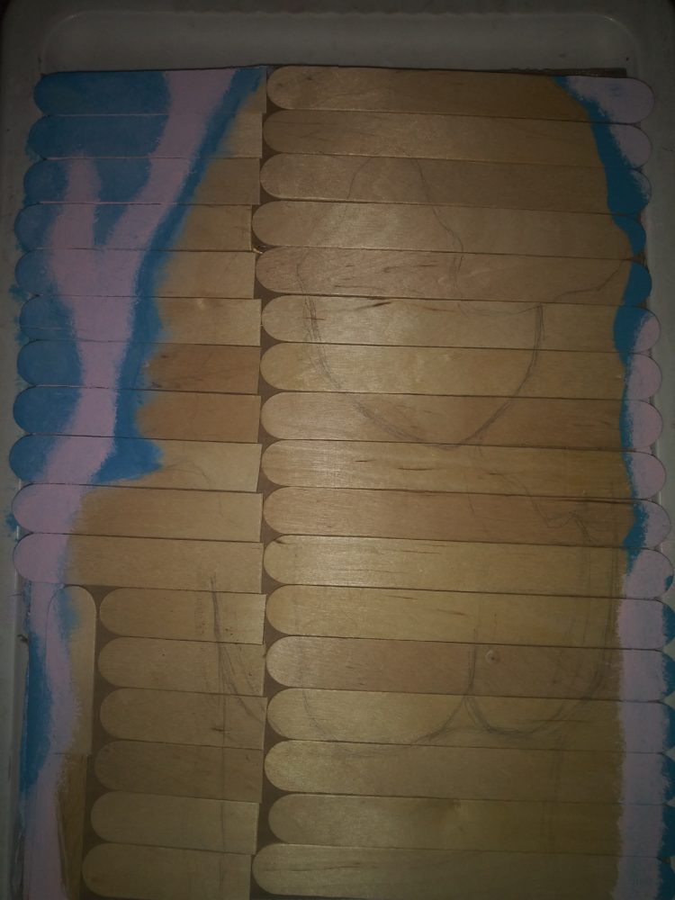
This is an early stage of the painting. I had made the canvas out of three cut up cardboard pieces that I hot-glued together. I then spent a lot of time laying out the Popsicle sticks and finally hot-glued them to the boards. I then drew out an outline of the painting and made the background.
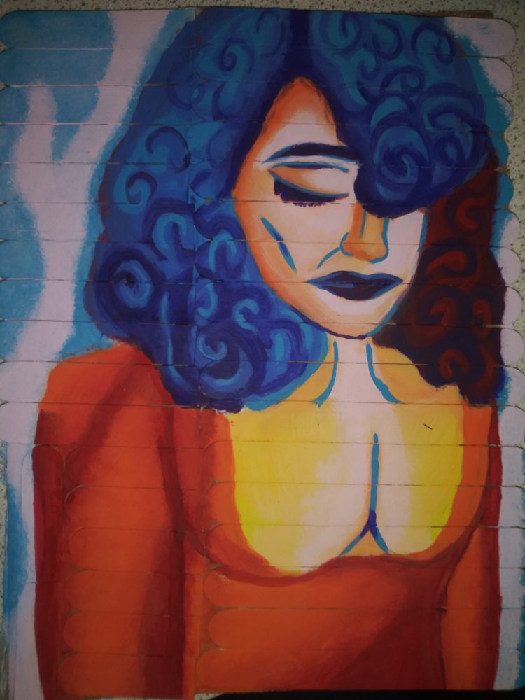
This is what the painting looked like half way through the process. I am trying to use rainbow colors that are vibrant which are popular in street art. I

Design Process: finalupcyle
I started with what my inspiration for the project was and was inspired by street art and my idol Tracee Ellis Ross. I then started to plan what object I am going to upcycle and how to make the objects work as a painting canvas. I then started to create the project. Once the project was “done” I then went back to make improvements. If there was an improvement to my design process graphic it would have a lot more plan and improve, as I went back and forth many times.

The original drawing for my painting, as seen above, started out with a soft almost loving expression on the face. As I was painting especially once I got to her hair, I started to reflect on the black community and hair. I’ve seen a lot of stories lately about how kids are being suspended because of their hair and I realized that the painting would catch more attention if her expression was heavy. Her expression holds the weight of her hair being ridiculed in society.
There wasn’t many functional goals in this project as building it was very simple. The artistic goals however I achieved more than what I thought. The artwork connected with people and the color, the texture, and the form of it gave off the street art aesthetic. I don’t want to continue working on this. There is a point with painting that if you keep working on it you’ll ruin it, and I don’t want to get to that point.
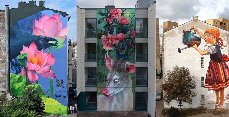
Street Art:
http://globalstreetart.com/blog/the-ethereal-work-of-polish-muralist-natalia-rak
http://globalstreetart.com/blog/interview-with-axe-colours


10 Comments. Leave new
Hey Kaiya,
I really liked your painting today, I especially enjoyed your connection to street art. I find it difficult to represent the idea of street art without an actually street to be challenging. However with the addition of popsicle sticks, they created such a familiar texture, one that I often associate with outside building structure. Having this aesthetic choice helped draw out the nature of intent in your piece. I appreciated not only your thoughtfulness to the piece, but also working with a different size of canvas. Overall, Kaiya I think you made an awesome painting, good job!
I think you nailed the street art aesthetic. The popsicle sticks almost look like the brick on a wall. Also, I enjoyed the fact that the colors weren’t necessarily chosen for realism. For example, the shadow on the hair being red is not representative of what color shadows usually are. But, the choice of red there really expressed a contrast and brought a unique life to the piece.
Neutral questions: What is the meaning of the expression of the face? She appears to be expressing a particular emotion, what is it?
I like the color pallet that you decided to work with. The bright red and bright blue really contrast with each other, which fits your street art aesthetic that you were going for. It is eye catching when placed in an everyday setting where colors are bland, just like large scale street art murals in big cities.
Cool Project! Since you had issues with painting on the ends where the popsicle sticks ended, I would suggest cutting off the round ends and staggering the sticks every row kind of like how bricks are laid down.
Kaiya,
I like the use of the popsicle sticks to make the cardboard more sturdy, it also gave it more of a street art look, as if it were on the side of a building with horizontal planks of wood. I think you did a fantastic job on the head of the person, the hair and curls really stand out to me against the lighter shading of the face. This would look wonderful in a frame on a wall, definitely a good painting.
A statement of meaning for me is actually your inspiration! I guess I didn’t realize how critical street art is to giving a voice to urban communities that otherwise might not be heard. I think that street art as a whole is a great example of upcycling large spaces, building edifices, and even communities as a whole in a non-conventional way. Great job, you really achieved your desired aesthetic!
I love the shading in the hair and the blue accents for the bone/vein structure. I think that the Popsicle sticks make it really dynamic and are reminiscent of bricks. I almost wish that you made little bricks out of Popsicle sticks.
I absolutely love the way you did the hair on this painting. The deep blue color and the swirls give me heavy storm cloud vibes which fits really nicely with the position of the face.
I really enjoyed the textures that the Popsicle sticks bring out. It’s a very colorful and bright artwork and with the texture it deepens the piece even more.